Material3.Wpf
0.9.0
dotnet add package Material3.Wpf --version 0.9.0
NuGet\Install-Package Material3.Wpf -Version 0.9.0
<PackageReference Include="Material3.Wpf" Version="0.9.0" />
<PackageVersion Include="Material3.Wpf" Version="0.9.0" />
<PackageReference Include="Material3.Wpf" />
paket add Material3.Wpf --version 0.9.0
#r "nuget: Material3.Wpf, 0.9.0"
#:package Material3.Wpf@0.9.0
#addin nuget:?package=Material3.Wpf&version=0.9.0
#tool nuget:?package=Material3.Wpf&version=0.9.0
Material3.Wpf
Material 3 (Material You) for WPF. A runtime M3Theme generates the full M3 color-role scheme from one
seed color (HCT) and publishes it as live DynamicResource brushes, so the whole UI recolors on the fly — plus
themed M3 controls, an icon-set-agnostic M3Icon, motion helpers, an app-level M3Modal (scrim + card) and a
centered popup tooltip. Built on Material3.Core.
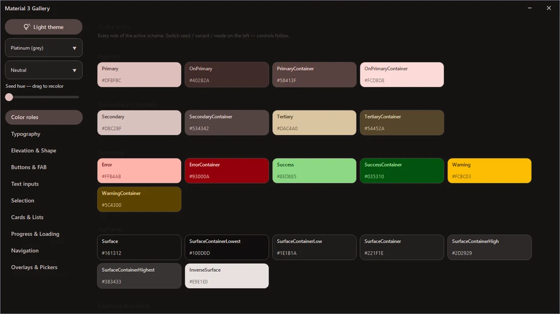
- Dynamic-color theming — one seed → live light/dark, every role as a
DynamicResourcebrush - Controls: filled / tonal / outlined / text / shiny buttons, icon button and icon toggle, FAB (round and extended), text field, chips, switch, radio, three-state checkbox, segmented button, slider, menus, tooltip, scrollbar, linear and circular progress, card, list item, divider, expander
- Page furniture:
PageHeader,NoticeBanner,EmptyState,PopupCard,Snackbar - Loading:
Skeletonshimmer blocks and theBusyspinner - Elevation: shadow effects plus the tinted
SurfaceElevationroles treatment M3Modalapp-level modal + scrim,AnimatedPopup, centeredTiptooltip,M3Icon, motion helpersAutoHideScrolloverlay-scrollbar timing andDwmWindowWindows 11 corner rounding
dotnet add package Material3.Wpf
<Application xmlns:m3="clr-namespace:Material3.Wpf;assembly=Material3.Wpf">
  <Application.Resources>
    <ResourceDictionary Source="pack://application:,,,/Material3.Wpf;component/Controls.xaml" />
  </Application.Resources>
</Application>
The control suite is growing toward WinForms parity.
Full guide: https://github.com/dary1337/material3-dotnet/blob/main/docs/wpf.md · Repo & demo galleries: https://github.com/dary1337/material3-dotnet
| Product | Versions Compatible and additional computed target framework versions. |
|---|---|
| .NET | net8.0-windows7.0 is compatible. net9.0-windows was computed. net10.0-windows was computed. |
| .NET Framework | net472 is compatible. net48 was computed. net481 was computed. |
-
.NETFramework 4.7.2
- Material3.Core (>= 0.9.0)
-
net8.0-windows7.0
- Material3.Core (>= 0.9.0)
NuGet packages
This package is not used by any NuGet packages.
GitHub repositories
This package is not used by any popular GitHub repositories.