Adamantium.UI.Core
0.1.0-alpha
Prefix Reserved
dotnet add package Adamantium.UI.Core --version 0.1.0-alpha
NuGet\Install-Package Adamantium.UI.Core -Version 0.1.0-alpha
<PackageReference Include="Adamantium.UI.Core" Version="0.1.0-alpha" />
<PackageVersion Include="Adamantium.UI.Core" Version="0.1.0-alpha" />
<PackageReference Include="Adamantium.UI.Core" />
paket add Adamantium.UI.Core --version 0.1.0-alpha
#r "nuget: Adamantium.UI.Core, 0.1.0-alpha"
#:package Adamantium.UI.Core@0.1.0-alpha
#addin nuget:?package=Adamantium.UI.Core&version=0.1.0-alpha&prerelease
#tool nuget:?package=Adamantium.UI.Core&version=0.1.0-alpha&prerelease
Adamantium UI
A .NET UI framework for desktop applications, on its own Vulkan renderer: a full set of controls up to docking, a ribbon, a tree data grid, a property grid and an infinite canvas with a node graph; markup compiled to C#; styles and live themes; MVVM and navigation built in - and a 3D scene that is an ordinary element of the markup, drawn by the same renderer as the interface around it.
Alpha. Windows only for now; macOS and Linux are planned. The API will change between releases.
At a glance
- Controls - from buttons and text boxes to tabs, docking, a ribbon, a tree data grid, a property grid and an infinite canvas.
- Shapes and vector graphics - paths, Bézier curves, B-splines and NURBS with dashed strokes, drawn on the GPU.
- Brushes, materials and effects - gradients, mesh gradients, noise, fractals, acrylic, mica and liquid glass, shadows and auras.
- Animations and transitions - eased animations started from triggers, sliding content.
- Markup, styles and themes - AUML compiled to C#; three themes, light and dark, switched live.
- Data binding and MVVM - bindings of every kind; view-models with generated properties and commands.
- Navigation - regions, a navigation journal, dialogs and windows driven from view-models.
- Input and drag and drop - keyboard focus, drag and drop inside the application and with other applications.
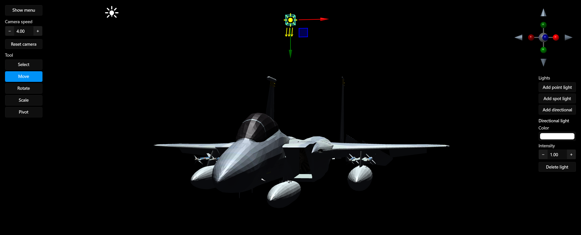
- A 3D scene in the markup - an engine scene as an element of the tree, with no airspace and no copy of the frame.
- Tooling -
dotnet newtemplates and a Rider plugin with a live preview.
Controls
| Buttons and toggles | Button, RepeatButton, ToggleButton, CheckBox, RadioButton, ToggleSwitch |
| Text | TextBlock, TextBox - see Text |
| Numbers and ranges | NumericUpDown for integers or decimals, Slider, RangeSlider with two thumbs, ScrollBar |
| Progress | ProgressBar, RingProgressBar, BusyIndicator |
| Lists and trees | ListBox and a virtualized TreeView, each with single, multiple or extended selection; DropDown; DataPager with arrows, page numbers, a page-size picker and a page box |
| Menus and pop-ups | MenuItem with nested menus, ContextMenu, ToolTip, Popup, Expander |
| Color | ColorPicker with RGB, alpha and hex, ColorPickerButton, ColorWheel |
| Images | Image, nine-slice images |
| Tiles | TilesHost and FlipTile: a board of 3D tiles that tilt toward the pointer and flip on click |
Tabs
TabControl for editors and browsers:
- the tab strip on any side - top, bottom, left or right - with an inner or outer selection indicator;
- pinned tabs, in a row of their own or in the same row;
- tear-off: a tab dragged out of its strip asks for a window of its own;
- an overflow menu, a scrolling strip, and a virtualized strip for a great many tabs;
- close buttons, and content that slides left, right or up on switching.
Docking
A docking workspace in the manner of Visual Studio:
- document and tool panes in tabbed groups, split in any direction;
- a drop compass that docks a dragged pane to any side or into a group;
- panes torn off into floating windows and docked back;
- groups collapsed to the window edge and revealed on demand;
- layouts saved and restored;
- events for closing, restoring and tearing off panes; closing and tearing off can be cancelled.
Ribbon
An Office-style ribbon:
- tabs and groups that shrink step by step and collapse as the window narrows;
- large, medium and small buttons, split buttons, drop-down buttons, toggle buttons and galleries;
- contextual tab groups;
- a quick access toolbar above or below the ribbon, and an application menu;
- key tips: press Alt and type the letters shown.
Data grid
TreeDataGrid shows flat lists and trees in one control:
- sorting by several columns, shown as chips in a sort panel;
- grouping by dragging columns to a group panel;
- filters on every column and a search panel;
- totals and aggregates in a footer;
- columns frozen on the left and right, a column chooser, and a column layout that can be saved;
- cell or full-row selection;
- editing in place, a new-row line, row validation rules and undo;
- row details and row headers;
- cell states derived from values, for the theme to style ("over the limit", "settled");
- export to CSV and XLSX.
Property grid
PropertyGrid is an inspector:
- names and values split by a draggable grip, in folding sections;
- several objects inspected at once: the common value is shown, differing values are marked, and an edit writes to every object;
- every write is reported with all its targets, ready for undo.
Infinite canvas and node graph
InfiniteCanvas is a drawing board and a node editor in one:
- an unbounded plane with pan and zoom, a minimap and a view bar;
- drawing tools: pen, shapes, curves, paths, text, images and an eraser, with selection handles, transforms and alignment;
- a node graph: nodes with typed sockets, wires, groups and a node palette. The graph is kept evaluated while it is edited: only changed nodes are recomputed, in dependency order;
- an inspector and an undo history;
- SVG import and export; scenes and graphs saved and loaded.
Windows, overlays and pop-ups
Windowwith its own title bar, caption buttons on the right or on the left, and commands in the title bar.OverlayWindow: windows inside a window, for dialogs and tool windows.SlidePanel: a panel that slides in over the content from any edge of the window, animated, taking no layout space.- Per-monitor DPI.
Layout
- Panels:
GridwithGridSplitter,StackPanel,WrapPanel,DockPanel,UniformGrid,Canvas, and virtualizing panels for long lists. ScrollViewer,Viewbox,Border.ZoomBox: a zoom and pan viewport - the wheel zooms toward the cursor, dragging pans, and the scale and offset are bindable.RenderTargetPanelfor a 3D scene.
Text
- Its own font stack: TrueType, OpenType with CFF and CFF2, font collections, WOFF and WOFF2. Glyphs are drawn from MSDF atlases, sharp at any scale, with OpenType kerning.
TextBlock: wrapping, trimming, horizontal and vertical alignment, justification, inline runs, and outlined text.TextBox: selection, the clipboard, undo, a placeholder or a floating one, multi-line input, a length limit and a read-only mode.
Shapes and vector graphics
- Shapes:
Rectangle,Ellipse,Line,Polyline,Polygon,RegularPolygonandPath, plus quadratic and cubic Bézier curves, B-splines and NURBS. - Strokes with dashes, flat, square, triangular and round caps, and bevel, miter and round joins.
- Fills and strokes are drawn on the GPU with analytic antialiasing.
DrawingBrushpaints with vector drawings; the infinite canvas reads and writes SVG.FractalViewrenders fractals.
Brushes, materials and effects
- Brushes: solid; linear, radial and conic gradients; mesh gradients; noise; fractals; patterns; images; nine-slice; tiles; visuals; drawings.
- Backdrop materials: acrylic, mica and liquid glass over a real blurred backdrop.
- Effects: drop shadows and auras; opacity, rounded clipping and transforms on any element.
Animations and transitions
DoubleAnimationwith ease-in, ease-out and ease-in-out curves, andPulseAnimation.- Animations started and stopped from triggers in markup.
- Content transitions that slide left, right or up.
- Animated controls: the slide panel, flip tiles, the progress ring and the busy indicator.
Markup, styles and themes
- AUML is XML in the shape of XAML, compiled to C# by a source generator at build time: no parsing at startup, and
a typo in the markup is a build error.
x:Loadbuilds content only when it is needed. - Styles select by type, class and property conditions, and build on each other.
- Triggers: property, data, multi and event triggers.
- Templates: control templates, data templates, hierarchical templates and template selectors.
- Resources, with theme resources that follow a theme switch.
- Behaviors attached in markup.
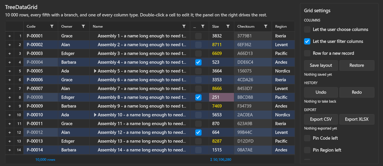
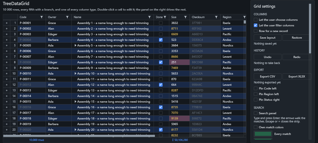
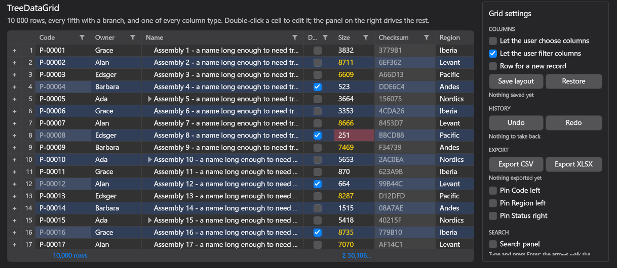
- Themes: Fluent, Editor Pro and macOS, each with light and dark variants, switched live. A control library brings its controls' look into every theme with one call.
The same data grid in the three themes:
| Fluent | Editor Pro | macOS |
|---|---|---|
 |
 |
 |
Data binding and MVVM
- Bindings: one-way and two-way, multi-bindings and converters, and bindings to an ancestor, to the element itself and to the template.
- View-models:
[ViewModel],[Bindable]and[Command]generate the properties and commands. - Views found by view-model, with dependency injection.
Navigation
The Adamantium.Navigation package:
- Regions: named places in the markup filled from view-models, in content controls, items controls, selectors and docking areas.
- A navigation journal with back and forward and navigation parameters. View-models are told when they are navigated to and from, and can refuse to leave.
- Dialogs from view-models, in a window or as an overlay, with results.
- Windows and overlays opened from view-models.
Input, focus and drag and drop
- Keyboard focus with a focus ring and keyboard navigation; key tips in the ribbon.
- Routed events and behaviors.
- Drag and drop inside the application and with other applications through Windows drag and drop, with a drag image and an insertion indicator for reordering. Sources and targets are attached in markup.
A 3D scene in the markup
For applications where a 3D view and the interface around it are one thing: CAD and engineering tools, scientific visualization, simulators, control rooms, industrial panels, level editors.
In WPF and Avalonia the 3D renderer is the application's own, and so is the work of wiring it in: a D3DImage or a
child window (HwndHost) in WPF, GPU interop or a native host (NativeControlHost) in Avalonia. In Adamantium UI the
scene comes from the engine the interface is drawn with, and its panel is an element like any other:
- The scene is an element of the tree.
RenderTargetPanelhosts a universe of the Adamantium Engine's entity-component system. Menus, tooltips and popups draw over it; opacity, transforms and rounded clips apply to it. - No copy of the frame. The scene renders into a surface it exports, and the panel imports it by an OS handle
through a
SharedSurfaceDescriptor. - Input follows focus. The hosted scene gets keyboard and mouse only while its panel has focus, with mouse-look and cursor-capture modes for camera control.
- One renderer for everything, so the interface gets what a game renderer has: the materials, brushes and text rendering above.
| Adamantium UI | WPF | Avalonia | |
|---|---|---|---|
| A 3D scene in the window | an engine scene in a RenderTargetPanel |
your own renderer, through D3DImage or HwndHost |
your own renderer, through GPU interop or NativeControlHost |
| Renderer | its own, on Vulkan | Direct3D 9 | Skia |
| Docking, ribbon, tab tear-off | included | third-party suites | third-party libraries |
| Platforms | Windows; macOS and Linux planned | Windows | Windows, macOS, Linux, iOS, Android, browser |
Tooling
Templates:
dotnet new adamantium-app,adamantium-viewlibandadamantium-controllib.Rider: the Adamantium AUML plugin adds a live preview beside the markup, drawn by the framework itself from the project's own build and in its own theme, plus completion, diagnostics and go to definition.
Visual Studio Code: an extension with completion and diagnostics is in
editors/vscode-auml; it is not in the marketplace yet.
Getting started
Requirements:
.NET 10 SDK.
Windows 10 or 11, x64.
A GPU and driver with Vulkan 1.4,
VK_EXT_shader_objectandVK_EXT_descriptor_heap(the full list is in the engine's requirements). The descriptor heap is recent, and it sets the floor. By the reports on vulkan.gpuinfo.org:- NVIDIA: Turing or newer - GeForce GTX 16 and RTX 20 series and later, Quadro RTX and T series, RTX A, Ada and Blackwell. Ampere and newer report it from driver 582, Turing from driver 595.
- AMD: RDNA 3 or newer - Radeon RX 7000 and RX 9000 series, Radeon PRO W7000, and Radeon 740M, 760M, 780M and newer integrated graphics, with a current driver.
- Intel: no Windows driver reports the descriptor heap yet.
Developed and tested on an NVIDIA Quadro RTX 4000; other GPUs have not been tested.
dotnet new install Adamantium.UI.Templates
dotnet new adamantium-app -n MyApp --theme Fluent
cd MyApp
dotnet run
| Template | Creates |
|---|---|
adamantium-app |
An application: a window bound to its view-model. --theme picks Fluent, EditorPro or macOS. |
adamantium-viewlib |
A library of views, each with its view-model, for an application to place or navigate to. |
adamantium-controllib |
A library of templated controls that bring their look into every theme. |
A window in AUML
A window with a 3D scene beside ordinary controls:
<Window xmlns="http://adamantium/ui"
        xmlns:x="http://adamantium/ui/xaml/extensions"
        xmlns:local="clr-namespace:MyApp"
        xmlns:vm="clr-namespace:MyApp.ViewModels"
        x:ViewModel="{x:Type vm:MainWindowViewModel}"
        Title="Viewer"
        Width="1280"
        Height="720">
    <Grid ColumnDefinitions="*, 280">
        <RenderTargetPanel MouseLookMode="Drag">
            <RenderTargetPanel.Behaviors>
                <local:SceneBehavior/>
            </RenderTargetPanel.Behaviors>
        </RenderTargetPanel>
        <StackPanel Grid.Column="1"
                    Margin="16">
            <TextBlock Text="Camera speed"/>
            <Slider Value="{Binding CameraSpeed, Mode=TwoWay}"
                    Minimum="0.1"
                    Maximum="10"/>
            <Button Content="Reset camera"
                    Command="{Binding ResetCameraCommand}"/>
        </StackPanel>
    </Grid>
</Window>
SceneBehavior is the application's own: it creates the engine universe that draws into the panel. The sandbox's
DemoUniverseBehavior
is a complete one.
The view-model is plain C# with source-generated properties and commands:
[ViewModel]
public partial class MainWindowViewModel
{
    [Bindable]
    private double _cameraSpeed = 4;

    [Command]
    private void ResetCamera() => CameraSpeed = 4;
}
Status
Alpha: what is listed above works, and the API will change. Not there yet:
- macOS and Linux - planned. The macOS code exists but has not been built and run recently;
- accessibility (UI Automation);
- localization with right-to-left layout;
- touch and pen input;
- mobile and the browser.
Packages
| Package | What it is |
|---|---|
Adamantium.UI |
The one to reference: the controls, the themes, the AUML code generator and the designer host, with MVVM |
Adamantium.UI.Core |
The element tree, layout, input, styles, bindings, resources and the AUML runtime loader |
Adamantium.UI.Controls |
The controls and panels |
Adamantium.UI.Themes |
Fluent, Editor Pro and macOS |
Adamantium.UI.FX |
The UI's shaders |
Adamantium.UI.Markup |
The AUML parser and document model |
Adamantium.Navigation |
Navigation, regions and dialogs driven from view-models |
Adamantium.UI.Templates |
The dotnet new templates |
All packages share one version and are released together.
License
Apache-2.0. Third-party components are listed in THIRD-PARTY-NOTICES.md.
| Product | Versions Compatible and additional computed target framework versions. |
|---|---|
| .NET | net10.0 is compatible. net10.0-android was computed. net10.0-browser was computed. net10.0-ios was computed. net10.0-maccatalyst was computed. net10.0-macos was computed. net10.0-tvos was computed. net10.0-windows was computed. |
-
net10.0
- Adamantium.ECS (>= 0.1.0-alpha.4)
- Adamantium.Fonts (>= 0.1.0-alpha.4)
- Adamantium.Mathematics (>= 0.1.0-alpha.4)
- Adamantium.Navigation (>= 0.1.0-alpha)
- Adamantium.UI.Markup (>= 0.1.0-alpha)
NuGet packages (3)
Showing the top 3 NuGet packages that depend on Adamantium.UI.Core:
| Package | Downloads |
|---|---|
|
Adamantium.UI.Controls
Controls of Adamantium UI: buttons, text, lists and trees, tabs, docking, the ribbon, a tree data grid, a property grid, color pickers, shapes, and an infinite canvas for drawing and node graphs. |
|
|
Adamantium.UI
Adamantium UI: a .NET UI framework for desktop applications on its own Vulkan renderer - controls up to docking, a ribbon, a tree data grid and an infinite canvas; AUML markup compiled to C#; styles and live themes; MVVM and navigation; and a 3D scene as an element of the markup. The package to reference: it brings the controls, the themes, the AUML code generator and MVVM with its generator. |
|
|
Adamantium.UI.Themes
Themes of Adamantium UI - Fluent, Editor Pro and macOS - with a style for every control, in light and dark variants. |
GitHub repositories
This package is not used by any popular GitHub repositories.
| Version | Downloads | Last Updated |
|---|---|---|
| 0.1.0-alpha | 48 | 10/2/2026 |