Adj.Blazor.RangeSlider
0.8.1.1
dotnet add package Adj.Blazor.RangeSlider --version 0.8.1.1
NuGet\Install-Package Adj.Blazor.RangeSlider -Version 0.8.1.1
<PackageReference Include="Adj.Blazor.RangeSlider" Version="0.8.1.1" />
<PackageVersion Include="Adj.Blazor.RangeSlider" Version="0.8.1.1" />
<PackageReference Include="Adj.Blazor.RangeSlider" />
paket add Adj.Blazor.RangeSlider --version 0.8.1.1
#r "nuget: Adj.Blazor.RangeSlider, 0.8.1.1"
#:package Adj.Blazor.RangeSlider@0.8.1.1
#addin nuget:?package=Adj.Blazor.RangeSlider&version=0.8.1.1
#tool nuget:?package=Adj.Blazor.RangeSlider&version=0.8.1.1
Adj-Blazor-Range-Slider
Customizable blazor-component with one or two handles respectively minimum and/or maximum value.
Features
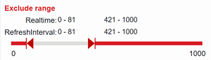
- Minimum and maximum values in slider with two handles
- Moving minimum and maximum at same time
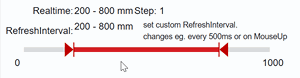
- Realtime preview of values and events on mouseup
- Adjustable update delay for database access or similar
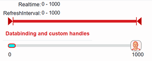
- Custom images/border/sizes for slider-handles
- Adjustable step-value
- Dont't forget: @rendermode InteractiveServer
- Demo website: https://adj-blazor-rangeslider-demo.adjustment.de/
Parameter
| Parameter | Type | Description |
|---|---|---|
MinValue |
int |
defines the minimum of possible values (left side of slider) |
MaxValue |
int |
defines the maximum of possible values (right side of slider) |
StartValue |
int |
defines the value and position of the left handle within MinValue and MaxValue <br>Databinding is possible eg. @bind-StartValue="StartValue1" |
EndValue |
int |
defines the value and position of the right handle within MinValue and MaxValue <br>Databinding is possible eg. @bind-EndValue="EndValue1" |
UseDefaultHandleSvg |
bool |
if true, the default handels with arrows are used |
Step |
int |
defines the step of possible values. |
HandlePosition |
EnHandlePosition |
defines the position of the handle relative to the selected value. Possible values are outside middle inside |
SliderType |
EnSliderType |
Range, SingleStartMin, SingleStartMax |
UseDefaultHandleSvgColor |
string |
color of the default handels if UseDefaultHandleSvg=true. |
UseDefaultHandleSvgHeight |
int |
height of default handels in pixel (width is calculated) if UseDefaultHandleSvg=true. |
UpdateMillisecond |
int |
defines the time in which the StartValue end EndValue is updated when user stops moving the slider without MouseUp |
ColorsAndDimensions |
ColorsAndDimensions |
defines the basic appearance of the slider ⇒ ColorsAndDimensions below |
HandleStart |
HandleDefinition |
defines the appearance of the left handle ⇒ HandleDefinition below |
HandleEnd |
HandleDefinition |
defines the appearance of the right handle ⇒ HandleDefinition below |
ColorsAndDimensions
| Parameter | Type | Description |
|---|---|---|
SliderBackgroundColor |
string |
backround of the whole slider |
SelectedRangeHeightInPx |
int |
height of the selected colored area between StartValue and EndValue |
SelectedRangeColor |
string |
color of the selected area between StartValue and EndValue |
SelectedHoverColor |
string |
Hover color of the background between StartValue and EndValue to move the range |
UnselectedRangeHeightInPx |
int |
height of the area left side of StartValue and right side of EndValue |
UnselectedRangeColor |
string |
height of the area left side of StartValue and right side of EndValue |
Coonstructor of ColorsAndDimensions helps:## HandleDefinition
| Parameter | Type | Description |
| :-------- | :------- | :------------------------- |
| BackgroundUrl | string | url to background-image |
| WidthInPx | int | width of the handle |
| HightInPx | int | height of the handle |
| BorderWidthInPx | int | border width |
| BorderColor | string | border color |
| BorderRadius | string | in percent or px e. 33% or 3px or 0 |
| BackgroundColor | string | background color |
|UseDefaultIcons|bool| use default icons |
Coonstructor of HandleDefinition helps:
<AdjRangeSlider
        HandleStart="@(new HandleDefinition(
                        backgroundUrl: "https://www.motorradtest.de/images/avatar/50/chris.webp"
                        widthInPx:33,
                        heightInPx:63,
                        backgroundColor:"#0ff",
                        backgroundColor:"#0ff",
                        borderRadius:"33%",
                        borderWidthInPx:2.5,
                        borderColor:"#f00"))"

        HandleEnd="@(new HandleDefinition(
                        useDefaultIcons:true,
                        heightInPx:55,
                        color:"green"))"


     [ --- ]
     />
Events
| Parameter | Type | Description |
|---|---|---|
OnMouseMove |
Position |
is triggered when the slider is moved. |
OnMouseUp |
Position |
is triggered on mouse up. |
OnValueChanged |
Position |
is triggered on MouseUp or when user stops moving the slider and UpdateMillisecond has expired. <br>args contain Start end Endvalue |
OnStartValueChanged |
Position |
is triggered on MouseUp or when user stops moving the slider and UpdateMillisecond has expired. <br>args contain Start end Endvalue |
OnEndValueChanged |
Position |
is triggered on MouseUp or when user stops moving the slider and UpdateMillisecond has expired. <br>args contain Start end Endvalue |
Features
- Minimum and maximum values in slider with two handles
- Moving minimum and maximum at same time
- Realtime preview of values and events on mouseup
- Adjustable update delay for database access or similar
- Custom images/border/sizes for slider-handles
- Adjustable step-value
- Dont't forget: @rendermode InteractiveServer
Parameter
| Parameter | Type | Description |
|---|---|---|
MinValue |
int |
defines the minimum of possible values (left side of slider) |
MaxValue |
int |
defines the maximum of possible values (right side of slider) |
StartValue |
int |
defines the value and position of the left handle within MinValue and MaxValue <br>Databinding is possible eg. @bind-StartValue="StartValue1" |
EndValue |
int |
defines the value and position of the right handle within MinValue and MaxValue <br>Databinding is possible eg. @bind-EndValue="EndValue1" |
UseDefaultHandleSvg |
bool |
if true, the default handels with arrows are used |
Step |
int |
defines the step of possible values. |
UseDefaultHandleSvgColor |
string |
color of the default handels if UseDefaultHandleSvg=true. |
UseDefaultHandleSvgHeight |
int |
height of default handels in pixel (width is calculated) if UseDefaultHandleSvg=true. |
UpdateMillisecond |
int |
defines the time in which the StartValue end EndValue is updated when user stops moving the slider without MouseUp |
ColorsAndDimensions |
ColorsAndDimensions |
defines the basic appearance of the slider ⇒ ColorsAndDimensions below |
HandleStart |
HandleDefinition |
defines the appearance of the left handle ⇒ HandleDefinition below |
HandleEnd |
HandleDefinition |
defines the appearance of the right handle ⇒ HandleDefinition below |
ColorsAndDimensions
| Parameter | Type | Description |
|---|---|---|
SliderBackgroundColor |
string |
backround of the whole slider |
SelectedRangeHeightInPx |
int |
height of the selected colored area between StartValue and EndValue |
SelectedRangeColor |
string |
color of the selected area between StartValue and EndValue |
SelectedHoverColor |
string |
Hover color of the background between StartValue and EndValue to move the range |
UnselectedRangeHeightInPx |
int |
height of the area left side of StartValue and right side of EndValue |
UnselectedRangeColor |
string |
height of the area left side of StartValue and right side of EndValue |
Coonstructor of ColorsAndDimensions helps:
@rendermode InteractiveServer

     <AdjRangeSlider
        ColorsAndDimensions= @(new ColorsAndDimensions(
                                selectedRangeColor:"#0f0",
                                unselectedRangeColor:"#00f",
                                sliderBackgroundColor:"yellow",
                                selectedHoverColor:"#f00",
                                selectedRangeHeightInPx:6,
                                unselectedRangeHeightInPx:13)
                                )"
         [ --- ]
         />
HandleDefinition
| Parameter | Type | Description |
|---|---|---|
BackgroundUrl |
string |
url to background-image |
WidthInPx |
int |
width of the handle |
HightInPx |
int |
height of the handle |
BorderWidthInPx |
int |
border width |
BorderColor |
string |
border color |
BorderRadius |
string |
in percent or px e. 33% or 3px or 0 |
BackgroundColor |
string |
background color |
UseDefaultIcons |
bool |
use default icons |
Coonstructor of HandleDefinition helps:
@rendermode InteractiveServer

    <AdjRangeSlider
            HandleStart="@(new HandleDefinition(
                            backgroundUrl: "https://www.motorradtest.de/images/avatar/50/chris.webp"
                            widthInPx:33,
                            heightInPx:63,
                            backgroundColor:"#0ff",
                            backgroundColor:"#0ff",
                            borderRadius:"33%",
                            borderWidthInPx:2.5,
                            borderColor:"#f00"))"

            HandleEnd="@(new HandleDefinition(
                            useDefaultIcons:true,
                            heightInPx:55,
                            color:"green"))"


         [ --- ]
         />
Events
| Parameter | Type | Description |
|---|---|---|
OnMouseMove |
Position |
is triggered when the slider is moved. |
OnMouseUp |
Position |
is triggered on mouse up. |
OnValueChanged |
Position |
is triggered on MouseUp or when user stops moving the slider and UpdateMillisecond has expired. <br>args contain Start end Endvalue |
OnStartValueChanged |
Position |
is triggered on MouseUp or when user stops moving the slider and UpdateMillisecond has expired. <br>args contain Start end Endvalue |
OnEndValueChanged |
Position |
is triggered on MouseUp or when user stops moving the slider and UpdateMillisecond has expired. <br>args contain Start end Endvalue |
| Product | Versions Compatible and additional computed target framework versions. |
|---|---|
| .NET | net8.0 is compatible. net8.0-android was computed. net8.0-browser was computed. net8.0-ios was computed. net8.0-maccatalyst was computed. net8.0-macos was computed. net8.0-tvos was computed. net8.0-windows was computed. net9.0 was computed. net9.0-android was computed. net9.0-browser was computed. net9.0-ios was computed. net9.0-maccatalyst was computed. net9.0-macos was computed. net9.0-tvos was computed. net9.0-windows was computed. net10.0 was computed. net10.0-android was computed. net10.0-browser was computed. net10.0-ios was computed. net10.0-maccatalyst was computed. net10.0-macos was computed. net10.0-tvos was computed. net10.0-windows was computed. |
-
net8.0
- Microsoft.AspNetCore.Components.Web (>= 8.0.0)
NuGet packages
This package is not used by any NuGet packages.
GitHub repositories
This package is not used by any popular GitHub repositories.
Blazor,Blazor Component, Rangeslider, Slider