BlazorBottomSheets 0.1.0
dotnet add package BlazorBottomSheets --version 0.1.0
NuGet\Install-Package BlazorBottomSheets -Version 0.1.0
<PackageReference Include="BlazorBottomSheets" Version="0.1.0" />
<PackageVersion Include="BlazorBottomSheets" Version="0.1.0" />
<PackageReference Include="BlazorBottomSheets" />
paket add BlazorBottomSheets --version 0.1.0
#r "nuget: BlazorBottomSheets, 0.1.0"
#:package BlazorBottomSheets@0.1.0
#addin nuget:?package=BlazorBottomSheets&version=0.1.0
#tool nuget:?package=BlazorBottomSheets&version=0.1.0
BlazorBottomSheets
An iOS / Google Maps-style bottom sheet component for Blazor. Touch-friendly drag gestures, snap points, velocity-based flicks, backdrop, and CSS-variable theming — with no JavaScript setup required.
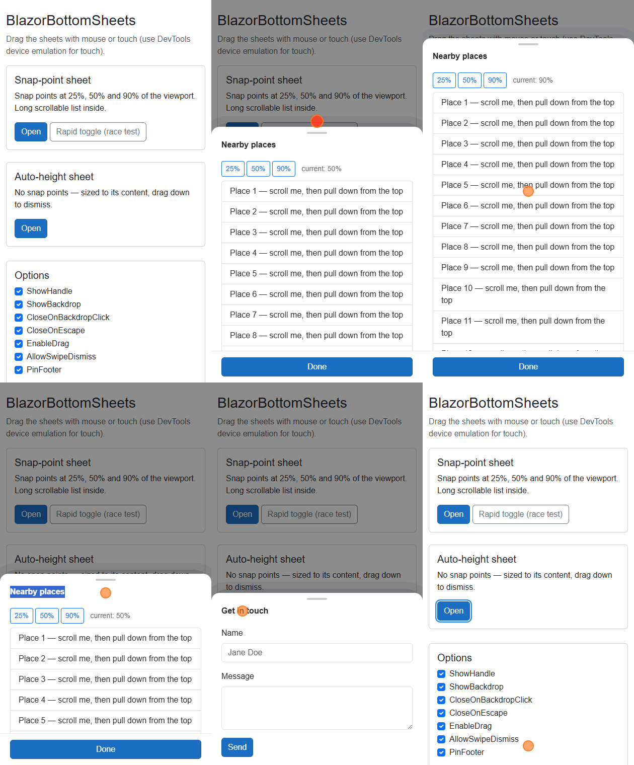
Works in Blazor WebAssembly, Blazor Server, and Blazor Web App interactive render modes (.NET 10).
Features
- 📌 Snap points — e.g.
[0.25, 0.5, 0.9]of the viewport height, with drag + flick between them - 📐 Auto-height mode — no snap points: the sheet sizes to its content, drag down to dismiss
- 🖱️ Pointer + touch — one gesture engine for mouse and touch, with velocity projection and rubber-band overshoot
- 🧭 Smart scroll interplay — content scrolls natively; the sheet only drags when content is scrolled to the top (pull down) or when expanding to a higher snap (pull up)
- 🎭 Backdrop with fade, close on backdrop click and/or Escape
- ♿
role="dialog",aria-modal, focus moved into the sheet on open and restored on close,prefers-reduced-motionsupport - 🔒 Body scroll-lock with scrollbar-width compensation while open
- 🎨 Themeable via
--bbs-*CSS custom properties
Installation
dotnet add package BlazorBottomSheets
Make sure your app links the scoped-CSS bundle (all Blazor templates do this by default):
<link rel="stylesheet" href="YourAppAssemblyName.styles.css" />
That's it — the component loads its JavaScript module on demand; there is nothing else to register.
Usage
@using BlazorBottomSheets

<button @onclick="() => _open = true">Show sheet</button>

<BottomSheet @bind-IsOpen="_open">
    <p>Hello from the bottom sheet!</p>
</BottomSheet>

@code {
    private bool _open;
}
Snap points, header and footer
<BottomSheet @bind-IsOpen="_open"
             SnapPoints="new double[] { 0.25, 0.5, 0.9 }"
             DefaultSnapPoint="0.5"
             OnSnapPointChanged="s => Console.WriteLine($"Snapped to {s}")"
             OnClosed="r => Console.WriteLine($"Closed: {r}")">
    <HeaderContent>Nearby places</HeaderContent>
    <ChildContent>
        <ul>@* long scrollable list *@</ul>
    </ChildContent>
    <FooterContent>
        <button @onclick="() => _open = false">Done</button>
    </FooterContent>
</BottomSheet>
Programmatic control
<BottomSheet @ref="_sheet" @bind-IsOpen="_open" SnapPoints="new double[] { 0.3, 0.9 }">
    ...
</BottomSheet>

@code {
    private BottomSheet? _sheet;
    private Task Expand() => _sheet!.SnapToAsync(0.9);
}
Parameters
| Parameter | Type | Default | Description |
|---|---|---|---|
IsOpen |
bool |
false |
Opens/closes the sheet. Supports @bind-IsOpen. |
SnapPoints |
IReadOnlyList<double>? |
null |
Fractions of viewport height. null/empty = auto-height mode. |
DefaultSnapPoint |
double? |
first snap | The snap point the sheet opens at. |
ChildContent |
RenderFragment |
— | Scrollable body content. |
HeaderContent |
RenderFragment? |
— | Optional header; dragging it always moves the sheet. |
FooterContent |
RenderFragment? |
— | Optional footer pinned to the bottom. |
ShowHandle |
bool |
true |
Show the drag handle. |
ShowBackdrop |
bool |
true |
Render the dimming backdrop. |
CloseOnBackdropClick |
bool |
true |
Clicking the backdrop dismisses the sheet. |
CloseOnEscape |
bool |
true |
Escape dismisses the (topmost) sheet. |
EnableDrag |
bool |
true |
Enable drag gestures. |
AllowSwipeDismiss |
bool |
true |
When false, drags move between snap points but never close the sheet (it springs back). |
PinFooter |
bool |
true |
Keeps the footer visible at the bottom of the screen at every snap point and keeps the content's scroll end reachable. Set to false for Google Maps-style behavior where the footer is only visible at the top snap. |
Class / SheetClass / BackdropClass / ContentClass |
string? |
— | Extra CSS class(es) on the container / sheet / backdrop / content. |
Style |
string? |
— | Extra inline CSS on the sheet element. |
MaxWidth |
string? |
— | Sheet width cap (any CSS length); overrides --bbs-max-width. |
ZIndex |
int? |
— | Stacking order; overrides --bbs-z-index. |
AnimationDuration |
TimeSpan? |
— | Animation duration; overrides --bbs-duration. |
HandleContent |
RenderFragment? |
— | Custom drag-handle content replacing the default pill. |
AriaLabel |
string? |
— | Accessible name for the dialog. |
Events: OnOpened (after the open animation), OnClosed(BottomSheetDismissReason) (after the close animation; reason is Programmatic, Drag, Backdrop, or Escape), OnSnapPointChanged(double).
Members: CurrentSnapPoint (the snap point the sheet rests at, or null), SnapToAsync(double).
Theming
Override any of these CSS custom properties globally (e.g. on :root):
| Variable | Default | Purpose |
|---|---|---|
--bbs-background |
#ffffff |
Sheet background |
--bbs-color |
inherit |
Sheet text color |
--bbs-radius |
16px |
Top corner radius |
--bbs-shadow |
soft top shadow | Sheet box-shadow |
--bbs-backdrop-color |
rgba(0,0,0,0.45) |
Backdrop color |
--bbs-handle-color |
rgba(0,0,0,0.2) |
Drag handle color |
--bbs-divider-color |
rgba(0,0,0,0.08) |
Footer divider |
--bbs-max-width |
640px |
Sheet width cap on large screens |
--bbs-max-height |
calc(100% - 48px) |
Height cap in auto-height mode |
--bbs-duration |
300ms |
Animation duration |
--bbs-easing |
cubic-bezier(0.32, 0.72, 0, 1) |
Animation easing |
--bbs-z-index |
1050 |
Stacking order |
Dark theme example:
:root[data-theme="dark"] {
    --bbs-background: #1e1e20;
    --bbs-color: #f0f0f0;
    --bbs-handle-color: rgba(255, 255, 255, 0.25);
    --bbs-backdrop-color: rgba(0, 0, 0, 0.6);
}
License
MIT
| Product | Versions Compatible and additional computed target framework versions. |
|---|---|
| .NET | net10.0 is compatible. net10.0-android was computed. net10.0-browser was computed. net10.0-ios was computed. net10.0-maccatalyst was computed. net10.0-macos was computed. net10.0-tvos was computed. net10.0-windows was computed. |
-
net10.0
- Microsoft.AspNetCore.Components.Web (>= 10.0.8)
NuGet packages
This package is not used by any NuGet packages.
GitHub repositories
This package is not used by any popular GitHub repositories.
| Version | Downloads | Last Updated |
|---|---|---|
| 0.1.0 | 132 | 7/20/2026 |