Celeste.Wpf
0.2.0-alpha.1
dotnet add package Celeste.Wpf --version 0.2.0-alpha.1
NuGet\Install-Package Celeste.Wpf -Version 0.2.0-alpha.1
<PackageReference Include="Celeste.Wpf" Version="0.2.0-alpha.1" />
<PackageVersion Include="Celeste.Wpf" Version="0.2.0-alpha.1" />
<PackageReference Include="Celeste.Wpf" />
paket add Celeste.Wpf --version 0.2.0-alpha.1
#r "nuget: Celeste.Wpf, 0.2.0-alpha.1"
#:package Celeste.Wpf@0.2.0-alpha.1
#addin nuget:?package=Celeste.Wpf&version=0.2.0-alpha.1&prerelease
#tool nuget:?package=Celeste.Wpf&version=0.2.0-alpha.1&prerelease
Celeste
Celeste is a UI library for WPF applications that need to look current without adopting the Fluent or Material design language. It restyles the controls WPF already ships, adds the few it never did, and drives everything from one set of semantic color tokens that can be swapped at runtime.
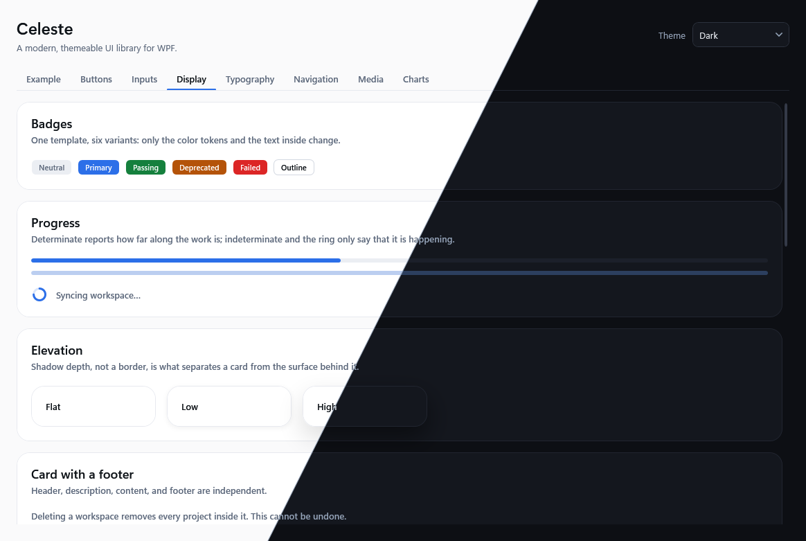
Both halves are the same screen. Every picture here comes out of the sample — ./eng/capture-screenshots.ps1 regenerates them.
What it gives you
- Light and dark themes built from the same token names, switchable while the app runs.
ThemeManager.Apply(ApplicationTheme.System)follows the Windows app theme and keeps following it. - Restyled built-in controls:
Button,ToggleButton,TextBox,PasswordBox,CheckBox,RadioButton,ComboBox,ListBox,TabControl,Slider,ProgressBar,ScrollBar,ToolTip,Label,Separator. - Controls WPF does not have:
Card,Badge,ToggleSwitch,ProgressRing,Avatar, anImageViewthat loads and decodes pictures off the UI thread, aMasonryPanelthat fills the shortest column, and aSidebarthat collapses to an icon rail or slides in over the content. - Button variants —
Celeste.Button.Primary,.Secondary,.Destructive,.Outline,.Ghost,.Link— that all share oneControlTemplate. Defining a new variant means setting three brushes, not copying a template. - A type scale and layout tokens (spacing, radii, control heights) exposed as XAML resources, so your own controls can sit on the same grid as the library's.
Installation
Every release so far is a prerelease, and NuGet hides those unless you ask for them:
dotnet add package Celeste.Wpf --prerelease
Pin the exact version instead once you depend on it — 0.x releases may break the API, which is what the version number is telling you.
Then merge the two dictionaries into App.xaml. Order matters only for readability — control styles reference color tokens through DynamicResource.
<Application x:Class="MyApp.App"
             xmlns="http://schemas.microsoft.com/winfx/2006/xaml/presentation"
             xmlns:x="http://schemas.microsoft.com/winfx/2006/xaml"
             xmlns:celeste="https://celeste-ui.dev/wpf"
             StartupUri="MainWindow.xaml">
    <Application.Resources>
        <ResourceDictionary>
            <ResourceDictionary.MergedDictionaries>
                <celeste:ThemesDictionary Theme="System" />
                <celeste:ControlsDictionary />
            </ResourceDictionary.MergedDictionaries>
        </ResourceDictionary>
    </Application.Resources>
</Application>
Apply Celeste.Window to your window. Every control below it inherits the theme's font, foreground, and background:
<Window x:Class="MyApp.MainWindow"
        xmlns="http://schemas.microsoft.com/winfx/2006/xaml/presentation"
        xmlns:x="http://schemas.microsoft.com/winfx/2006/xaml"
        xmlns:celeste="https://celeste-ui.dev/wpf"
        Style="{StaticResource Celeste.Window}"
        Title="My app" Width="600" Height="400">

    <celeste:Card Header="Workspace" Description="Everyone with the link can view this."
                  Margin="24">
        <StackPanel>
            <TextBox celeste:ControlHelper.PlaceholderText="Workspace name" />
            <celeste:ToggleSwitch Content="Public" Margin="0,12,0,0" />
        </StackPanel>
        <celeste:Card.Footer>
            <Button Content="Save" Style="{StaticResource Celeste.Button.Primary}"
                    HorizontalAlignment="Right" />
        </celeste:Card.Footer>
    </celeste:Card>
</Window>
Switching themes at runtime
using Celeste.Wpf.Theming;

ThemeManager.Apply(ApplicationTheme.Dark);    // pin dark
ThemeManager.Apply(ApplicationTheme.System);  // follow Windows, and keep following it
ThemeManager rewrites the ThemesDictionary you merged in App.xaml. Controls repaint immediately because every built-in style references color tokens through DynamicResource. If your own XAML uses StaticResource for a Celeste brush, it will keep the color it was given at load time.
Buttons
A plain <Button> is the secondary variant. The other five are keyed styles, so a button asks for its variant by name:
<Button Content="Save" Style="{StaticResource Celeste.Button.Primary}" />
<Button Content="Delete" Style="{StaticResource Celeste.Button.Destructive}" />
Celeste.Button.Small and Celeste.Button.Large change the metrics — font size, height, padding — and nothing else. WPF styles do not compose, so a large primary button is a style of your own: BasedOn the variant, then repeat those three setters.
For a row of buttons that is a single choice, use Celeste.ToggleButton.Segment. It is a RadioButton wearing the toggle-button appearance, so one option is checked per GroupName and clicking the checked one keeps it checked instead of leaving the choice empty. A ToggleButton is styled too, for a choice that stands on its own.
Text
Celeste defines no implicit TextBlock style — one would override the font a Button passes down to its own content. Font and foreground come from Celeste.Window by inheritance, and the scale is a set of keyed styles:
| Style | What it is for |
|---|---|
Celeste.TextBlock.Body |
The base. Sets text rendering only, so it looks like inherited text. |
Celeste.TextBlock.Muted |
Secondary text: the same size, the muted foreground. |
Celeste.TextBlock.Caption |
Smaller and muted. Labels under a value, timestamps. |
Celeste.TextBlock.Strong |
Body weight raised to SemiBold. |
Celeste.TextBlock.Subtitle |
A heading inside a section. |
Celeste.TextBlock.Title |
A page or dialog heading, in the display face. |
Celeste.TextBlock.Display |
The largest step, for a number or a single line that is the point of the screen. |
Celeste.TextBlock.Code |
Monospace, with Display formatting so stems stay on the pixel grid. |
<TextBlock Text="Workspace" Style="{StaticResource Celeste.TextBlock.Title}" />
<TextBlock Text="Everyone with the link can view this." Style="{StaticResource Celeste.TextBlock.Muted}" />
Label and Separator are styled implicitly and need no key.
Navigation
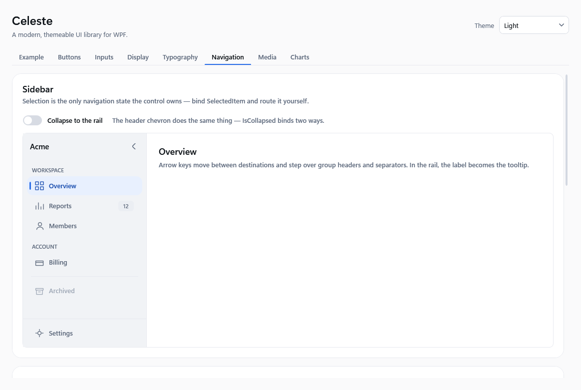
Sidebar is a ListBox, so selection is an ordinary binding and Celeste never owns your navigation state. Setting IsCollapsed switches it to an icon rail; the binding runs both ways, so the built-in header chevron and your own layout rules can drive the same property.
<celeste:Sidebar Header="Acme" SelectedItem="{Binding CurrentPage}" IsCollapsed="{Binding IsRail}">
    <celeste:Sidebar.CollapsedHeader>
        <Path Data="M10,0 L20,10 L10,20 L0,10 Z" Fill="{DynamicResource Celeste.Brush.Primary}" />
    </celeste:Sidebar.CollapsedHeader>

    <celeste:SidebarGroupHeader Content="WORKSPACE" />
    <celeste:SidebarItem Content="Overview">
        <celeste:SidebarItem.Icon>
            <Path Data="M1,1 H7 V7 H1 Z M11,1 H17 V7 H11 Z M1,11 H7 V17 H1 Z M11,11 H17 V17 H11 Z"
                  Style="{StaticResource Celeste.SidebarItem.Icon}" />
        </celeste:SidebarItem.Icon>
    </celeste:SidebarItem>
    <celeste:SidebarItem Content="Reports" Badge="12" />
    <celeste:SidebarSeparator />
    <celeste:SidebarItem Content="Archived" IsEnabled="False" />

    <celeste:Sidebar.Footer>
        <celeste:SidebarItem Content="Settings" />
    </celeste:Sidebar.Footer>
</celeste:Sidebar>
Give every item an Icon if the sidebar can collapse: the rail hides labels and moves them into tooltips, so an item without an icon becomes an empty row. Celeste ships no icon set — Celeste.SidebarItem.Icon is a style that only makes your own Path follow the item's hover, selected, and disabled colors.
Header is hidden in the rail too, and CollapsedHeader is what replaces it — a logo mark rather than a name, since the rail is only CollapsedWidth wide. It does not fall back to Header: a wordmark scaled into 56 pixels is unreadable. If you supply neither a mark nor the toggle button, the rail drops the header band instead of leaving it blank.
Arrow keys move between items and step over SidebarGroupHeader and SidebarSeparator. The sidebar sets its own Width from ExpandedWidth and CollapsedWidth, so put it in an Auto grid column rather than sizing it yourself.
Off-canvas and responsive
SidebarHost decides how the pane is presented instead of leaving it to your layout. Auto reads the host's own width: wide is docked, narrower is the rail, narrow takes the pane out of the layout and slides it in over the content on demand.
<celeste:SidebarHost x:Name="Shell">
    <celeste:SidebarHost.Pane>
        <celeste:Sidebar Header="Acme" SelectedItem="{Binding CurrentPage}">
            <celeste:SidebarItem Content="Overview" />
        </celeste:Sidebar>
    </celeste:SidebarHost.Pane>

    <DockPanel>
        <Button DockPanel.Dock="Top"
                Command="{x:Static celeste:SidebarHost.TogglePaneCommand}"
                Content="Menu" />
        <ContentControl Content="{Binding CurrentPage}" />
    </DockPanel>
</celeste:SidebarHost>
Celeste never opens the pane on its own — it cannot know where your menu button belongs. Bind one to TogglePaneCommand, which routes, so the button has to sit inside the host. The command only executes while the pane is off-canvas, so the button disables itself once the pane is docked; bind Visibility to ActualDisplayMode if you would rather it disappear.
While the overlay is open, a scrim covers the content, Tab stays inside the pane, and Esc or a click on the scrim closes it and returns focus. Set DisplayMode to Docked, Rail, or OffCanvas to drive the presentation yourself; the breakpoints are then ignored. ActualDisplayMode always reports what you are actually looking at.
Pages and history
NavigationHost holds the page and remembers where you have been. It does not navigate: it watches its own Content, so binding that to a selection is the whole integration and Celeste never becomes your router.
<celeste:NavigationHost x:Name="Pages"
                        Content="{Binding SelectedItem, ElementName=Nav, Mode=TwoWay}"
                        ContentTemplate="{StaticResource PageTemplate}" />

<Button Command="NavigationCommands.BrowseBack" CommandTarget="{Binding ElementName=Pages}" Content="Back" />
Bind Content two ways when the pages come from a selection. Going back writes the previous page into Content, and a one-way binding would leave the sidebar highlighting a page the host is no longer showing.
Back is NavigationCommands.BrowseBack, not a command of Celeste's own, so it arrives with the gestures Windows already assigns. It routes, so put the button inside the host or point it at one with CommandTarget, as above. CanGoBack and BackStackDepth are bindable; GoBack() and ClearHistory() are there for code.
Each page is put back where you left it. Going forward is a fresh look and starts at the top — only Back restores a position. The stack is capped by MaxBackStackDepth (10 by default), because an unbounded stack is an unbounded reference to every page the application has ever shown. If your pages scroll themselves, set IsScrollEnabled="False" so they are not nested inside a second scrolling region; positions are then no longer restored, since the host is no longer what scrolls.
There is no forward stack and no transition between pages.
Pictures
ImageView takes a URI and does the rest: the file is read and decoded on a background thread, at the width the control was laid out at rather than at full resolution, and the result is shared with every other view showing the same picture at the same size.
<celeste:ImageView Source="https://example.com/cover.jpg" AspectRatio="1.5" />
It takes the width its layout gives it and derives its height from the aspect ratio — AspectRatio when you set one, the picture's own once it is known, and a square until then. That is what lets it sit in a masonry column, where the width is the column and only the picture knows the height. For a picture that should be its own natural size, set Width and Height, or use a plain Image.
Setting AspectRatio removes the reflow that happens when the real ratio arrives, so it is worth setting whenever you know the shape in advance. Stretch defaults to UniformToFill, which crops rather than distorts.
State reports None, Loading, Loaded, or Failed, and is bindable. A failure also raises ImageFailed with the exception — the library never writes to a log of yours, so that event is the only place the reason exists. Placeholder is whatever should occupy the tile until the picture is there.
http, https, file, and pack URIs work, and a relative URI resolves against the element's base URI the way it does on Image — so Assets/cover.png behaves as you would expect. A resource compiled into an assembly is pack://application:,,,/Assembly;component/path.
Remote pictures go through Celeste.Wpf.Media.ImageLoader, whose HttpClient you can replace at startup with one that carries your handler, proxy, or authentication. Two limits are applied before any memory is committed to pixels: MaxSourceBytes (32 MiB) bounds the file, and MaxDecodedPixels (64 million, about 244 MiB of pixel data) bounds what the file expands into. They are different numbers for a reason — a few hundred kilobytes of compressed data can describe an image tens of thousands of pixels on a side.
Avatars
<celeste:Avatar Source="{Binding PhotoUri}" Initials="NS" Size="Large" />
The initials are the fallback for every case where there is no picture: none set, still loading, or a URI that failed. Celeste will not derive them from a name — which letters stand for a person depends on their language and their name order, and a two-letter rule that reads well in one script mangles another. Size is Small, Medium, or Large; setting Width and Height overrides all three.
Masonry
MasonryPanel puts each child into whichever column is shortest at the time, so tiles of unequal height leave no ragged gap.
<celeste:MasonryPanel MinColumnWidth="220" ColumnSpacing="12" RowSpacing="12">
    <celeste:ImageView Source="one.jpg" />
    <celeste:ImageView Source="two.jpg" />
    <celeste:Card Header="Any content">…</celeste:Card>
</celeste:MasonryPanel>
The column count comes from the panel's own width unless you set Columns: it fits as many MinColumnWidth columns as it can and shares what is left between them, so a resize reflows. Children are measured with an unconstrained height, so each has to decide its own — anything that stretches to fill instead measures to nothing.
Two things to know before using it. Shortest-column placement changes reading order: the third tile can end up beside the first rather than under it, which is the point of the layout and the reason not to use it for content that has to be read in sequence. And nothing here virtualizes: every child is measured and arranged on every pass, which is right for the tens of tiles a gallery view shows and wrong for thousands.
Theming it
Colors are semantic, not literal. Celeste.Brush.Primary is "the brand action color", and the light and dark dictionaries define it differently. To recolor the library, override the tokens after merging Celeste:
<ResourceDictionary.MergedDictionaries>
    <celeste:ThemesDictionary Theme="System" />
    <celeste:ControlsDictionary />
</ResourceDictionary.MergedDictionaries>

<SolidColorBrush x:Key="Celeste.Brush.Primary" Color="#FF7C3AED" />
<SolidColorBrush x:Key="Celeste.Brush.PrimaryHover" Color="#FF6D28D9" />
The full token list lives in src/Celeste.Wpf/Themes/Light.xaml. Every key defined there also exists in Dark.xaml; a test enforces that, because a key present in only one theme becomes a missing brush the moment a user toggles.
For per-control tweaks without retemplating, Celeste.Wpf.Controls.ControlHelper exposes attached properties: CornerRadius, PlaceholderText, and IconContent.
When Celeste is the wrong choice
- You want Windows 11 Fluent. WPF-UI implements that design language properly, including Mica and the Fluent icon set. Celeste has its own look and will never match Windows chrome.
- You want Material Design. Use MaterialDesignInXamlToolkit.
- You need a data grid, docking, ribbons, or charts. Celeste has none of these and is not trying to become a control suite.
- You are on .NET Framework. The package targets
net8.0-windowsandnet10.0-windowsonly.
Status
Alpha. The token names and the public control API are still open to change; treat 0.x releases as breaking. What exists is covered by tests that apply every control's template in both themes on a real WPF dispatcher, so the styles load and measure — but they have not been through a wide range of real applications yet.
Not covered yet: Menu / ContextMenu, DataGrid, TreeView, Expander, Calendar / DatePicker, and dialogs. Those controls keep their default WPF appearance in a Celeste application, which is visible and jarring. Contributions in that direction are the most useful ones right now. Two areas are filled in: navigation — Sidebar, a SidebarHost that presents it docked, as a rail, or off-canvas, and a NavigationHost that holds pages and a back stack — and pictures, with ImageView, Avatar, and MasonryPanel.
ROADMAP.md has the order those gaps are being closed in, plus what is deliberately out of scope. CHANGELOG.md has what changed since the last published package.
Repository layout
| Path | Contents |
|---|---|
src/Celeste.Wpf |
The library. Custom controls in Controls/, styles and tokens in Themes/. |
samples/Celeste.Gallery |
A WPF app showing every control in both themes. dotnet run --project samples/Celeste.Gallery |
tests/Celeste.Wpf.Tests |
Theme parity and template-application tests. |
Building
dotnet build
dotnet test
dotnet run --project samples/Celeste.Gallery
Requires Windows and a .NET 10 SDK, 10.0.100 or newer — global.json asks for that version with rollForward: latestFeature, so any later release band works too. The library itself also builds for net8.0-windows.
Contributing
See CONTRIBUTING.md. New control styles need an entry in the gallery and a row in the template-application test; that is what keeps a style from silently breaking in one of the two themes.
License
MIT. See LICENSE.
| Product | Versions Compatible and additional computed target framework versions. |
|---|---|
| .NET | net8.0-windows7.0 is compatible. net9.0-windows was computed. net10.0-windows was computed. net10.0-windows7.0 is compatible. |
-
net10.0-windows7.0
- No dependencies.
-
net8.0-windows7.0
- No dependencies.
NuGet packages
This package is not used by any NuGet packages.
GitHub repositories
This package is not used by any popular GitHub repositories.
| Version | Downloads | Last Updated |
|---|---|---|
| 0.2.0-alpha.1 | 53 | 8/18/2026 |