Lcars_Final 1.2.0
dotnet add package Lcars_Final --version 1.2.0
NuGet\Install-Package Lcars_Final -Version 1.2.0
<PackageReference Include="Lcars_Final" Version="1.2.0" />
<PackageVersion Include="Lcars_Final" Version="1.2.0" />
<PackageReference Include="Lcars_Final" />
paket add Lcars_Final --version 1.2.0
#r "nuget: Lcars_Final, 1.2.0"
#:package Lcars_Final@1.2.0
#addin nuget:?package=Lcars_Final&version=1.2.0
#tool nuget:?package=Lcars_Final&version=1.2.0
LCARS UI Components for WinForms
Bring the 24th-century to your .NET applications.
This library provides a comprehensive suite of 40 Windows Forms controls styled after the Star Trek LCARS (Library Computer Access/Retrieval System) interface. It is designed to be drop-in ready, dependency-free, and fully customizable at design time.
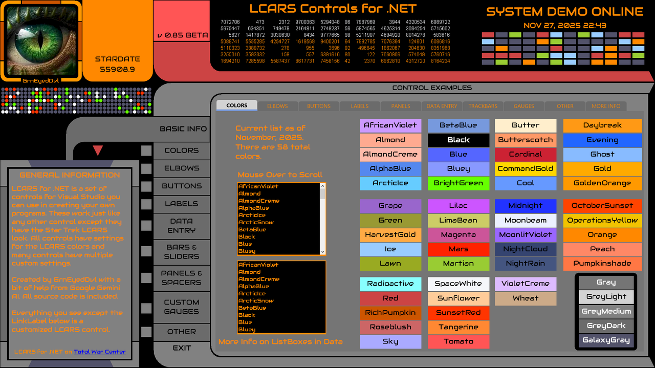
Features
- LCARS Colors: Colors taken from Star Trek The Next Generation and later movies.
- No Native Artifacts: All controls are custom-painted to eliminate standard Windows borders, 3D bevels, and system background colors.
- Design-Time Integration: Fully integrated with the Visual Studio Designer. Properties like
LcarsColor,LcarsFont, and alignment are editable directly in the Property Grid. - Responsive: Controls scale and align automatically.
The Cornerstone: LcarsElbow
The Elbow is the base element of the LCARS interface. It serves as the connector between headers, button bars, and content areas.
- Versatile Geometry: Supports 4 orientations (Top-Left, Top-Right, Bottom-Left, Bottom-Right) to frame your UI.
- Seamless Connection: Designed to align perfectly with
LcarsButtonandLcarsPanelto create continuous sweeping curves. - Various End Styles: Angled and rounded end styles for a varied look.
- Dynamic Sizing: Adjusts arm lengths and corner radii to fit any layout requirement.
Control Library
The suite includes 39 controls covering the most used controls.
Layout & Structure
- Elbow - The primary structural connector.
- Panel - A container for grouping controls with LCARS borders.
- Bar - Horizontal and vertical separators with various end shapes.
- GroupBox - Grouping with a 6 position header. Header can be Top or Botton and Left, Right, or Center
- TabControl - A flat, tabbed interface container.
- PictureBox - Display images with rounded corners.
Data Entry (Standard)
- Button - A button with various shapes that has OnMouse and OnClick shading and color changes.
- Toggle - A binary on/off switch styled as a pill button.
- TextBox - Bordered TextBox
- MaskedTextBox - Input with specific formatting constraints.
- RichTextBox - Multi-line text input with LCARS styling.
- ComboBox - Custom dropdown selection.
- NumericUpDown - Numeric input with custom up/down arrows.
- CheckBox - Standard check functionality with custom indicators.
- RadioButton - Selection option with LCARS circular indicator.
- DateTimePicker - Standard date control with LCARS colors.
Lists & Grids
- ListBox - A simple list of selectable items.
- ListViewBox - Custom painted ListViewBox
- CheckedListPanel - A robust replacement for CheckedListBox with custom drawing.
- DataGridView - A fully themed data grid with alternating row colors and custom headers.
Gauges & Sliders
- TrackBar - Custom shaped trackbar control with vertical and horizontal options.
- Slider - A specialized horizontal or vertical linear input.
- ScrollBar - Custom-drawn scrollbar for panels or containers.
- Gauge - Vertical linear gauge.
- GaugeHorizontal - Horizontal linear gauge.
- GaugeArced - Speedometer type percentage gauge.
- GraduatedGauges - Gauges that change color as the value goes up.
Progress Indicators
- ProgressBar - Standard segmented progress bar.
- ProgressBarVertical - Vertical variation.
- ProgressBarDual - Bidirectional bar (diverging from center).
- ProgressBarGraduated - Bar changes color as the value goes up.
Navigation & Decorative
- Directional 5 Way - Four directions and a center button.
- Directional 9 Way - Eight directions and a center button.
- DotSequence - Animated decorative LED pattern for that "computer is thinking" look.
- BlockSequence - Animated blocks for that "computer is thinking" look.
- NumberSequence - Animated random number display similar to the one on many Star Trek screens.
Text Display
- Label - Standard text label.
- LabelTransparent - Label with transparent background for layering.
- LabelStardate - Specialized label that grabs the current date and time from the system and displays it as a Standard date or a Stardate.
Installation
Grab the NuGet package or the entire codebase. I am releasing this as open source to the public do so with it what you will.
https://github.com/GrnEyedDvl/LCARS
Changelog
12.6.2025
Updated GroupBox to account for header width change on Bold or Oblique
Added ListViewBox control
12.11.2025
TextBox issue fixed with Text property not always updating properly.
RichTextBox issue fixed with Text property not always updating properly.
Various default properties streamlined. Mostly Margin and Padding for all controls.
12.12.2025
Added DateTimePicker control.
| Product | Versions Compatible and additional computed target framework versions. |
|---|---|
| .NET | net8.0-windows7.0 is compatible. net9.0-windows was computed. net10.0-windows was computed. |
-
net8.0-windows7.0
- No dependencies.
NuGet packages
This package is not used by any NuGet packages.
GitHub repositories
This package is not used by any popular GitHub repositories.