Majorsoft.Blazor.Components.Collapse
2.2.0
dotnet add package Majorsoft.Blazor.Components.Collapse --version 2.2.0
NuGet\Install-Package Majorsoft.Blazor.Components.Collapse -Version 2.2.0
<PackageReference Include="Majorsoft.Blazor.Components.Collapse" Version="2.2.0" />
<PackageVersion Include="Majorsoft.Blazor.Components.Collapse" Version="2.2.0" />
<PackageReference Include="Majorsoft.Blazor.Components.Collapse" />
paket add Majorsoft.Blazor.Components.Collapse --version 2.2.0
#r "nuget: Majorsoft.Blazor.Components.Collapse, 2.2.0"
#:package Majorsoft.Blazor.Components.Collapse@2.2.0
#addin nuget:?package=Majorsoft.Blazor.Components.Collapse&version=2.2.0
#tool nuget:?package=Majorsoft.Blazor.Components.Collapse&version=2.2.0
Blazor Collapse Components


About
Blazor component that renders customizable Collapsible/Expandable panel and Accordion with many but only one active panel also custom content and header. All components work with WebAssembly and Server hosted models. For code examples see usage.
You can try it out by using the demo app.
Components
CollapsePanel: RendersCollapsePanelcomponent which is an Expandable and Collapsible panel with customizable header and content.Accordion: Renders a set ofCollapsePanelcomponents which is an Expandable and Collapsible panel with customizable header and content. ButAccordionallows only one Expanded (active) panel.
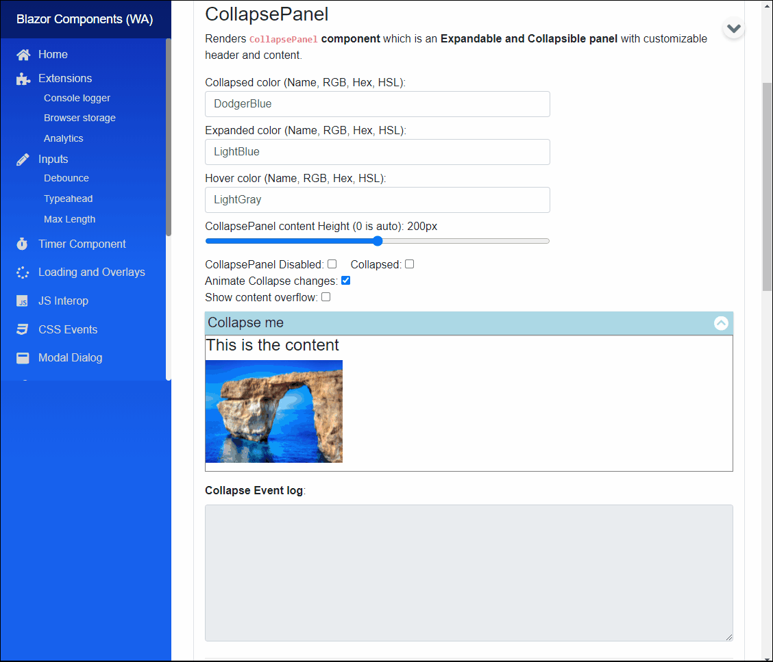
CollapsePanel component (See: demo app)
Blazor component that renders CollapsePanel component which is an Expandable and Collapsible panel with customizable header and content.
Multiple components can be added to a Balzor component each will act and work independently.
Properties
CommonHeader:RenderFragmentHTML content - Required or see specific headers <br /> Common header for Collapse control it will be shown for any collapsed state. It overridesExpandedHeaderContent,CollapsedHeaderContent.ExpandedHeaderContent:RenderFragmentHTML content <br /> Special header for Collapse control it is shown when item Expanded. Note: ifCommonHeaderdeclared it will override specific headers.CollapsedHeaderContent:RenderFragmentHTML content <br /> Special header for Collapse control it is shown when item Collapsed. Note: ifCommonHeaderdeclared it will override specific headers.Content:RenderFragmentHTML content - Required <br /> HTML Content of the collapse panel.Collapsed:bool { get; set; }(default: false) - Required <br /> Can be set if panel should be collapsedtrueor expandedfalse.ExpandedColor:string { get; set; }(default: "lightGray") - Required <br /> Sets thestyleof thebackground-colorwhen tab is Active. Use HTML specified: Color Names, RGB, HEX or with HSL values.CollapsedColor:string { get; set; }(default: "lightGray") - Required <br /> Sets thestyleof thebackground-colorwhen tab is not the Active tab. Use HTML specified: Color Names, RGB, HEX or with HSL values.HoverColor:string { get; set; }(default: "WhiteSmoke") - Required <br /> Sets thestyleof thebackground-colorwhen button is hovered over with mouse. Use HTML specified: Color Names, RGB, HEX or with HSL values.ContentHeight:int { get; set; }(default: 200) - Required <br /> Sets the height (in reality sets max-height because of CSS transition issues) of Content panel inpx. 0 is auto.MaxAllowedContentHeight:int { get; set; }(default: 200) - Required <br /> Sets the max-height if Content panelContentHeightis set to 0 (auto).Animate:bool { get; set; }(default: true) <br /> Determines to apply CSS animation and transition on Collapse state changes or not. Note: in case of Content panelContentHeightis set to 0 (auto), then useMaxAllowedContentHeightto set max-height CSS property which will be animated. Also important based on max-height value transition speed for expand/collapse might differ!.Disabled:bool { get; set; }(default: false) <br /> Determines whether the rendered HTML<input>element should be disabled or not.InnerElementReference:ElementReference { get; }<br /> Exposes a BlazorElementReferenceof the wrapped around HTML element. It can be used e.g. for JS interop, etc.
Arbitrary HTML attributes e.g.: tabindex="1" will be passed to the corresponding rendered HTML element <div>.
Events
OnCollapseChanged:EventCallback<bool>delegate <br /> Callback function called when panel collapsed or expanded. Collapsed state is the callback parameter.
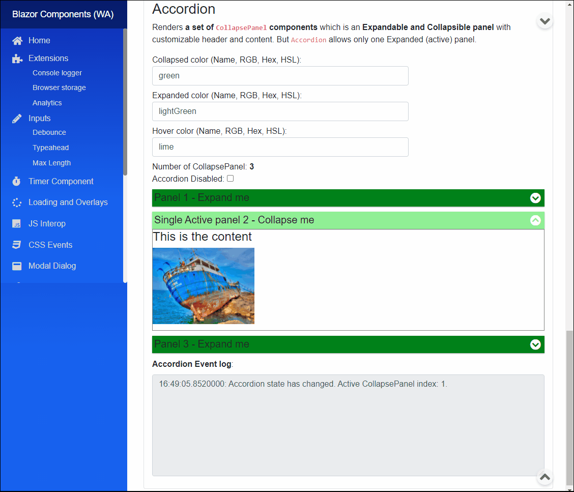
Accordion component (See: demo app)
Blazor component that renders a set of CollapsePanel components. It is only a wrapper element for CollapsePanels.
Each CollapsePanel act as individual components so they should be configured directly (use variables to change parameter for all at once).
Accordion allows only one Expanded (active) panel.
Properties
CollapsePanels:RenderFragmentHTML content - Required Required HTML content to setCollapsePanels asRenderFragment.CollapsePanelItems:IEnumerable<CollapsePanel> { get; }Returns all theCollapsePanelreference added to the group. It can be used for activating any of the panels.CollapsePanelCount:int { get; }Returns the number ofCollapsePanelint the givenAccordion.ActiveCollapsePanel:CollapsePanel { get; set; }(default: NULL) Returns currently activeCollapsePanelelement ref also can be used to set which panel should be Expanded "active".Disabled:bool { get; set; }(default: false) <br /> Determines whether the rendered HTML elements should be disabled or not.InnerElementReference:ElementReference { get; }<br /> Exposes a BlazorElementReferenceof the wrapped around HTML element. It can be used e.g. for JS interop, etc.
Events
OnCollapsePanelChanged:EventCallback<CollapsePanel>delegate <br /> Callback function called when otherCollapsePanelactivated. ActiveCollapsePanelis the callback parameter.
Arbitrary HTML attributes e.g.: id="ac1" will be passed to the corresponding rendered HTML element <input>.
Configuration
Installation
Majorsoft.Blazor.Components.Collapse is available on NuGet.
dotnet add package Majorsoft.Blazor.Components.Collapse
Use the --version option to specify a preview version to install.
Usage
Add using statement to your Blazor <component/page>.razor file. Or globally reference it into _Imports.razor file.
@using Majorsoft.Blazor.Components.Collapse
CollapsePanel usage
Following code example shows how to use CollapsePanel component in your Blazor App.
<CollapsePanel CollapsedColor="@_collapsedColor"
				ExpandedColor="@_expandedColor"
				HoverColor="@_hoverColor"
				Disabled="@_isCollapseDisabled"
				Collapsed="@_isCollapsed"
				ContentHeight="@_height"
				Animate="@_isAnimated"
				ShowContentOverflow="@_showOverflow"
				OnCollapseChanged="OnCollapsed">
	<CollapsedHeaderContent>
		<div class="w-100">
			<h5>Expand me</h5>
			<span class="fa fa-lg fa-chevron-circle-down" aria-hidden="true"></span>
		</div>
	</CollapsedHeaderContent>
	<ExpandedHeaderContent>
		<div class="w-100">
			<h5>Collapse me</h5>
			<span class="fa fa-lg fa-chevron-circle-up" aria-hidden="true"></span>
		</div>
	</ExpandedHeaderContent>
	<Content>
		<div style="border: 1px solid gray; height: 100%;">
			<h4>This is the content</h4>
		</div>
	</Content>
</CollapsePanel>

@code {
	private string _collapsedColor = "DodgerBlue";
	private string _expandedColor = "LightBlue";
	private string _hoverColor = "LightGray";
	private bool _isAnimated = true;
	private bool _isCollapseDisabled = false;
	private bool _isCollapsed = false;
	private bool _showOverflow = false;
	private int _height = 200;

	private string _collapseLog;

	private async Task OnCollapsed(bool state)
	{
		_isCollapsed = state;
		_collapseLog = WriteLog(_collapseLog, $"Collapse panel state has changed event Collapsed: {state}");
	}
}
Accordion usage
Following code example shows how to use Accordion component in your Blazor App.
<Accordion @ref="_accordion" id="ac1"
			ActiveCollapsePanel="@_activePanel"
			Disabled="@_isAccordionDisabled"
			OnCollapsePanelChanged="OnAccordionChanged">
	<CollapsePanels>
		<CollapsePanel @ref="_panel1" style="margin-bottom: 10px;" CollapsedColor="@_accordionCollapsedColor"
						ExpandedColor="@_accordionExpandedColor"
						HoverColor="@_accordionHoverColor">
			<CollapsedHeaderContent>
				<div class="w-100">
					<h5>Panel 1 - Expand me</h5>
					<span class="fa fa-lg fa-chevron-circle-down" aria-hidden="true"></span>
				</div>
			</CollapsedHeaderContent>
			<ExpandedHeaderContent>
				<div class="w-100">
					<h5>Active panel 1 - Collapse me</h5>
					<span class="fa fa-lg fa-chevron-circle-up" aria-hidden="true"></span>
				</div>
			</ExpandedHeaderContent>
			<Content>
				<div style="border: 1px solid gray; height: 100%;">
					<h4>This is the content</h4>
				</div>
			</Content>
		</CollapsePanel>
		<CollapsePanel @ref="_panel2" style="margin-bottom: 10px;" CollapsedColor="@_accordionCollapsedColor"
						ExpandedColor="@_accordionExpandedColor"
						HoverColor="@_accordionHoverColor">
			<CollapsedHeaderContent>
				<div class="w-100">
					<h5>Panel 2 - Expand me</h5>
					<span class="fa fa-lg fa-chevron-circle-down" aria-hidden="true"></span>
				</div>
			</CollapsedHeaderContent>
			<ExpandedHeaderContent>
				<div class="w-100">
					<h5>Active panel 2 - Collapse me</h5>
					<span class="fa fa-lg fa-chevron-circle-up" aria-hidden="true"></span>
				</div>
			</ExpandedHeaderContent>
			<Content>
				<div style="border: 1px solid gray; height: 100%;">
					<h4>This is the content</h4>
				</div>
			</Content>
		</CollapsePanel>
		<CollapsePanel @ref="_panel3" style="margin-bottom: 10px;" CollapsedColor="@_accordionCollapsedColor"
						ExpandedColor="@_accordionExpandedColor"
						HoverColor="@_accordionHoverColor">
			<CollapsedHeaderContent>
				<div class="w-100">
					<h5>Panel 3 - Expand me</h5>
					<span class="fa fa-lg fa-chevron-circle-down" aria-hidden="true"></span>
				</div>
			</CollapsedHeaderContent>
			<ExpandedHeaderContent>
				<div class="w-100">
					<h5>Active panel 3 - Collapse me</h5>
					<span class="fa fa-lg fa-chevron-circle-up" aria-hidden="true"></span>
				</div>
			</ExpandedHeaderContent>
			<Content>
				<div style="border: 1px solid gray; height: 100%;">
					<h4>This is the content</h4>
				</div>
			</Content>
		</CollapsePanel>
	</CollapsePanels>
</Accordion>

@code {
	protected override async Task OnAfterRenderAsync(bool firstRender)
	{
		if (firstRender)
		{
			//Accordion
			_activePanel = _panel2;
			_collapseCount = _accordion.CollapsePanelCount;
			StateHasChanged();
		}
	}

	private string _accordionCollapsedColor = "green";
	private string _accordionExpandedColor = "lightGreen";
	private string _accordionHoverColor = "lime";
	private bool _isAccordionDisabled = false;
	private int _collapseCount;

	private Accordion _accordion;
	private CollapsePanel _activePanel;
	private CollapsePanel _panel1;
	private CollapsePanel _panel2;
	private CollapsePanel _panel3;

	private async Task OnAccordionChanged(CollapsePanel active)
	{
		_activePanel = active;
		var index = _accordion.CollapsePanelItems.ToList().IndexOf(active);
	}
}
| Product | Versions Compatible and additional computed target framework versions. |
|---|---|
| .NET | net8.0 is compatible. net8.0-android was computed. net8.0-browser was computed. net8.0-ios was computed. net8.0-maccatalyst was computed. net8.0-macos was computed. net8.0-tvos was computed. net8.0-windows was computed. net9.0 is compatible. net9.0-android was computed. net9.0-browser was computed. net9.0-ios was computed. net9.0-maccatalyst was computed. net9.0-macos was computed. net9.0-tvos was computed. net9.0-windows was computed. net10.0 is compatible. net10.0-android was computed. net10.0-browser was computed. net10.0-ios was computed. net10.0-maccatalyst was computed. net10.0-macos was computed. net10.0-tvos was computed. net10.0-windows was computed. |
-
net10.0
- Microsoft.AspNetCore.Components.Web (>= 10.0.8)
-
net8.0
- Microsoft.AspNetCore.Components.Web (>= 8.0.27)
-
net9.0
- Microsoft.AspNetCore.Components.Web (>= 9.0.16)
NuGet packages
This package is not used by any NuGet packages.
GitHub repositories
This package is not used by any popular GitHub repositories.
See Releases here: https://github.com/majorimi/blazor-components/releases