Material3.WinForms 0.7.0

dotnet add package Material3.WinForms --version 0.7.0
                    
NuGet\Install-Package Material3.WinForms -Version 0.7.0
                    
This command is intended to be used within the Package Manager Console in Visual Studio, as it uses the NuGet module's version of Install-Package.
<PackageReference Include="Material3.WinForms" Version="0.7.0" />
                    
For projects that support PackageReference, copy this XML node into the project file to reference the package.
<PackageVersion Include="Material3.WinForms" Version="0.7.0" />
                    
Directory.Packages.props
<PackageReference Include="Material3.WinForms" />
                    
Project file
For projects that support Central Package Management (CPM), copy this XML node into the solution Directory.Packages.props file to version the package.
paket add Material3.WinForms --version 0.7.0
                    
#r "nuget: Material3.WinForms, 0.7.0"
                    
#r directive can be used in F# Interactive and Polyglot Notebooks. Copy this into the interactive tool or source code of the script to reference the package.
#:package Material3.WinForms@0.7.0
                    
#:package directive can be used in C# file-based apps starting in .NET 10 preview 4. Copy this into a .cs file before any lines of code to reference the package.
#addin nuget:?package=Material3.WinForms&version=0.7.0
                    
Install as a Cake Addin
#tool nuget:?package=Material3.WinForms&version=0.7.0
                    
Install as a Cake Tool

Material3.WinForms

Material3.Core Material3.WinForms Material3.Wpf

Download WinForms gallery Download WPF gallery GitHub stars

Material 3 (Material You) for Windows Forms — drop-in design tokens and owner-drawn controls. Dynamic color from a single seed, runtime light/dark switching, the full M3 type scale, elevation, state layers and motion. No mandatory base form, no native dependencies.

<p align="center"> <img src="https://raw.githubusercontent.com/dary1337/material3-winforms/main/docs/img/dynamic-color.gif" alt="Dragging the seed hue recolors the whole palette live in the Material 3 gallery" width="820"> </p> <p align="center"><sub>Drag the seed hue — the entire palette recolors live through the HCT pipeline.</sub></p>

Existing "Material for WinForms" libraries implement Material 2 and are largely unmaintained. This project targets the current spec: HCT tonal palettes, color roles, surface containers and the 2023+ component look.

Status (0.7): WinForms — foundation, component catalog and designer support complete. WPF — the shared HCT engine, live dynamic-color theming, M3Icon, motion helpers, and a core set of M3 controls (filled/tonal/outlined/text buttons, text field, chips, menus, tooltip, scrollbar, progress, card, expander) all ship and work; the control suite is still growing toward WinForms parity (selection, navigation and overlay components come next).

Packages

One HCT engine, three packages — a shared Core plus two UI stacks:

Package Target Status
Material3.Core netstandard2.0 HCT/CAM16 engine, tonal palettes, color roles, MaterialTheme — platform-neutral Argb, no UI deps
Material3.WinForms net472 / net8 Full M3 control catalog + Visual Studio designer support — preview, usable
Material3.Wpf net472 / net8 Dynamic-color M3Theme (live DynamicResource brushes from one seed), M3Icon, motion helpers, plus a core M3 control set (see coverage) — usable; growing toward WinForms parity

Two demo galleries are published with each release: Material3.WinForms.Gallery (WinForms) and Material3.Wpf.Gallery (WPF).

Upgrading from 0.6 (breaking): the color engine moved out of Material3.WinForms.Theming into the new Material3.Core package (Hct, CorePalette, TonalPalette, SchemeVariant, the scheme math). This is a breaking type-identity change: public members that surface engine types — e.g. MaterialThemeManager.Variant (now Material3.Core.SchemeVariant) and MaterialTheme.Palette — resolve to the Core types, so 0.6 code referencing them under Material3.WinForms.Theming fails to compile. Material3.Core comes in as a dependency automatically — fix the errors by adding using Material3.Core;. The engine's color type is now the UI-neutral Argb; convert at the boundary with color.ToM3() / argb.ToGdi() (Material3.WinForms.Theming.GdiColor).

WPF control coverage

The shared engine (dynamic color, type/shape scale, M3Icon, motion) is the same on both stacks. The control suite is where WPF is still catching up to WinForms — this is what ships today vs what's next. Legend: ✓ shipped · – planned.

Category Component WPF WinForms
Foundation Dynamic color (M3Theme / ThemeManager)
Type scale · Shape scale
Icon (icon-set-agnostic)
Motion helpers
Painted elevation (levels 0–5)
Actions Buttons — filled · tonal · outlined · text
Buttons — warning · shiny (attention)
Icon button
FAB
Inputs & selection Text field (box + placeholder) (filled/outlined, floating label)
Chips (status) (assist/filter/input/suggestion)
Checkbox · Radio · Switch
Segmented button
Slider
Containers Card (elevated/filled/outlined)
Expander
List item · Divider
Feedback Linear progress
Circular progress · Skeleton
Snackbar
Tooltip
Nav & overlays Menu · Context menu
Scrollbar
Dropdown select
Dialog (+ date/time pickers)
Modal host + scrim (M3Modal)
Tabs
Navigation bar · rail · drawer
Badge · Title bar

Screenshots

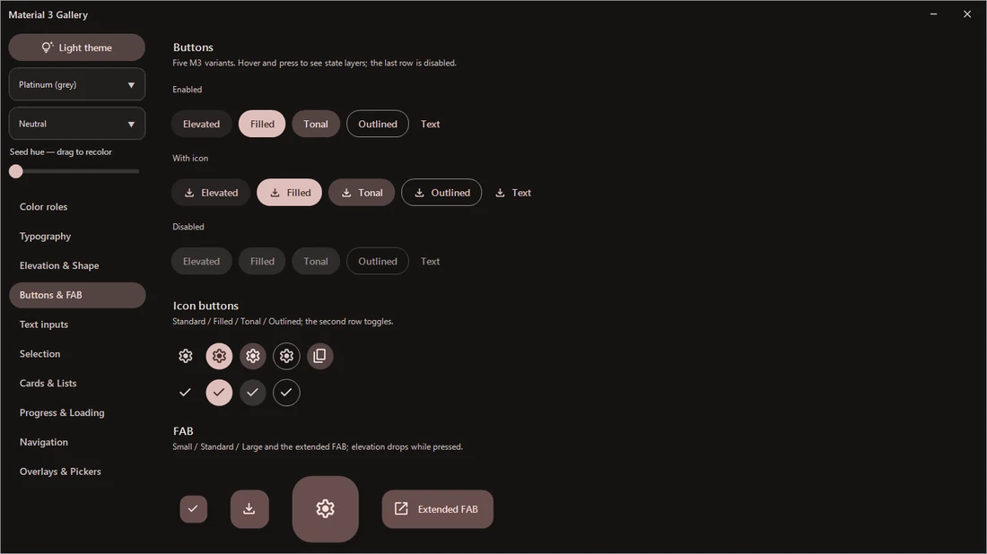
The same gallery pages in light and dark — every control follows the active scheme. Rows: color roles · buttons & FAB · selection · cards & lists · overlays & pickers.

Light Dark
Color roles, light theme Color roles, dark theme
Buttons & FAB, light theme Buttons & FAB, dark theme
Selection controls, light theme Selection controls, dark theme
Cards & lists, light theme Cards & lists, dark theme
Overlays & pickers, light theme Overlays & pickers, dark theme

<sub>Screenshots and demos captured on v0.5.</sub>

Features

  • Dynamic color — full light + dark ColorScheme generated from one seed color through a C# port of the HCT/CAM16 pipeline (no native dependencies). Three variants: TonalSpot (M3 default), Neutral (near-monochrome), Vibrant.
  • Runtime theme switchingThemeManager.IsDark = false repaints every subscribed control; no restart, no per-control wiring.
  • Color roles — all M3 roles including the six surface containers, inverse roles, outline pair, plus shared Success/Warning extensions.
  • Type scale — all 15 styles (Display → Label) on Segoe UI with letter-spacing and line-height metadata GDI fonts can't carry.
  • Elevation 0–5 — painted soft shadows (WinForms has no compositor) + per-level surface tint.
  • State layers — spec opacities for hover / focus / pressed / dragged, used consistently by every control.
  • Motion tokens — M3 duration scale and cubic-bezier easings (standard + emphasized) evaluated exactly like CSS timing functions.
  • Material Symbols — 30+ icons embedded as SVG, rasterized with caching and tinted to any role color.
  • Designer support — controls drop from the toolbox with their M3 properties grouped under a Material Design category, and a non-visual MaterialThemeManager component drives the theme from the property grid — no ThemeManager.Apply in Main — while previewing it live on the design surface. SmartTags and a glyph picker on key controls (.NET Framework designer).

Controls

Family Included
Actions MaterialButton (5 variants), MaterialIconButton (4 styles + toggle), MaterialFab (small / standard / large / extended), MaterialSegmentedButton
Text inputs MaterialTextField (filled + outlined, floating label, error state, icons), MaterialSearchBar
Selection MaterialSwitch, MaterialCheckBox (incl. indeterminate), MaterialRadioButton, MaterialChip (assist / filter / input / suggestion), MaterialSlider, MaterialOptionCard, DropdownSelect
Navigation MaterialTabs (primary / secondary), MaterialNavigationBar, MaterialNavigationRail, MaterialNavigationDrawer
Communication MaterialProgressBar (linear), MaterialCircularProgress (determinate + indeterminate), MaterialSnackbar, MaterialBadge, MaterialTooltip (plain + rich), MaterialSkeleton (compose any shimmer placeholder) + SkeletonCard preset, StepChecklist
Containment MaterialCard (elevated / filled / outlined), MaterialListItem, MaterialDivider, RoundedPanel, MaterialScrollPanel (overlay scrollbar), MaterialMenu
Dialogs MaterialDialog, MaterialMessageBox (themed info / error / confirm), MaterialDatePickerDialog (calendar grid), MaterialTimePickerDialog (time input)
Window BorderlessForm (native resize/snap without chrome), MaterialTitleBar (minimize / maximize / close, each hideable), WindowChrome (DWM caption theming), FormDragAnywhere, TaskbarProgress, FormAnimation
Text SoftLabel (consistent GDI+ rendering)

Quickstart

using Material3.WinForms.Theming;

[STAThread]
static void Main() {
    Application.EnableVisualStyles();

    // One line of theming: every Material control follows this scheme.
    ThemeManager.Apply(MaterialTheme.FromSeed(Color.FromArgb(0x67, 0x50, 0xA4)), isDark: true);

    Application.Run(new MainForm());
}

Prefer the designer? Drop a MaterialThemeManager onto your form and set Seed / Variant / IsDark in the property grid — it applies the theme at run time (so you can skip the Main call above) and previews it on the design surface.

// Switch mode at runtime — all controls repaint themselves.
ThemeManager.IsDark = !ThemeManager.IsDark;

// Or swap the whole palette.
ThemeManager.Theme = MaterialTheme.FromSeed(Color.SeaGreen, SchemeVariant.Vibrant);
var save = new MaterialButton {
    Text = "Save",
    Variant = MaterialButtonVariant.Filled,
    IconGlyph = MaterialIcons.Check,
};

Custom drawing uses the same tokens the stock controls do:

using Material3.WinForms.Theming;   // MaterialColors — current scheme roles
using Material3.WinForms.Tokens;    // Shape, Spacing, StateLayers, Motion, Elevation
using Material3.WinForms.Typography; // MaterialType — the 15-style type scale

samples/Material3.WinForms.Gallery is a live component catalog: every color role, the full type scale, elevation levels, all button variants and every control in both modes. Run it to smoke-test changes or to grab screenshots.

dotnet build Material3.WinForms.sln
samples\Material3.WinForms.Gallery\bin\Debug\net472\Material3.WinForms.Gallery.exe

samples/Material3.Wpf.Gallery is the WPF counterpart (preview): pick a seed and the whole scheme regenerates and recolors live, with role swatches, a light/dark toggle and an M3-motion demo. It tracks what Material3.Wpf can do today (dynamic-color theming) while its control suite is built out.

dotnet build samples\Material3.Wpf.Gallery\Material3.Wpf.Gallery.csproj
samples\Material3.Wpf.Gallery\bin\Debug\net472\Material3.Wpf.Gallery.exe

Designer support

The controls are built for the Visual Studio designer, not just code:

  • Toolbox & property grid — every control is a [ToolboxItem]; its M3 properties sit under a Material Design category with descriptions and defaults, and the design surface paints with the live theme instead of a blank rectangle.
  • MaterialThemeManager component — drop it on a form and pick Seed / Variant / IsDark in the grid; it applies the theme at run time (no manual ThemeManager.Apply) and repaints the preview so design-time matches the running app.
  • SmartTags & editors (.NET Framework designer) — quick Variant / glyph actions on MaterialButton and MaterialTextField, plus a Material Symbols picker for IconGlyph.

On .NET 8 the toolbox, property grid and live preview work the same; the SmartTag/editor extras are .NET Framework-only for now (the out-of-process .NET designer would need a separate design-time assembly).

High-DPI

The controls scale their owner-drawn geometry to the monitor DPI (via Control.DeviceDpi), so they stay crisp at 125/150/200%. DPI awareness is a process-level setting that the host application must opt into — a referenced DLL cannot set it. In your app:

  • declare awareness in your app.manifest: <dpiAware>true</dpiAware> (System-DPI) is enough for Control.DeviceDpi to report the real DPI. For Per-Monitor V2, add <dpiAwareness>PerMonitorV2</dpiAwareness> to the manifest — or, on .NET Framework, an app.config <System.Windows.Forms.ApplicationConfigurationSection> with <add key="DpiAwareness" value="PerMonitorV2" />. On .NET 8 you can instead call Application.SetHighDpiMode(...).
  • set AutoScaleMode = AutoScaleMode.Dpi on your forms.

That's all — the Material controls then render crisply with no extra code. See samples/Material3.WinForms.Gallery/app.manifest for a working example. If you do your own owner-drawing with the shared tokens, Material3.WinForms.Dpi.Scale(control, px) is the same helper the controls use.

Requirements

  • .NET Framework 4.7.2+ or .NET 8 (net8.0-windows)
  • Windows 10+ recommended (DWM caption theming and rounded corners degrade gracefully on older builds)

Acknowledgements

The HCT color pipeline is a C# port of Google's material-color-utilities (Apache 2.0). Icons are Material Symbols (Apache 2.0).

License

MIT © dary1337

Product Compatible and additional computed target framework versions.
.NET net8.0-windows7.0 is compatible.  net9.0-windows was computed.  net10.0-windows was computed. 
.NET Framework net472 is compatible.  net48 was computed.  net481 was computed. 
Compatible target framework(s)
Included target framework(s) (in package)
Learn more about Target Frameworks and .NET Standard.

NuGet packages

This package is not used by any NuGet packages.

GitHub repositories

This package is not used by any popular GitHub repositories.

Version Downloads Last Updated
0.7.0 105 7/2/2026
0.6.0 108 6/10/2026
0.5.0 111 6/8/2026
0.4.0 107 6/8/2026
0.3.0 114 6/7/2026