MudShadcn 1.0.0
dotnet add package MudShadcn --version 1.0.0
NuGet\Install-Package MudShadcn -Version 1.0.0
<PackageReference Include="MudShadcn" Version="1.0.0" />
<PackageVersion Include="MudShadcn" Version="1.0.0" />
<PackageReference Include="MudShadcn" />
paket add MudShadcn --version 1.0.0
#r "nuget: MudShadcn, 1.0.0"
#:package MudShadcn@1.0.0
#addin nuget:?package=MudShadcn&version=1.0.0
#tool nuget:?package=MudShadcn&version=1.0.0
<p align="center"> <img src="https://raw.githubusercontent.com/sardar97/MudShadcn/master/docs/images/logo.svg" alt="MudShadcn logo" width="88"> </p>
<h1 align="center">MudShadcn</h1>
<p align="center">The <a href="https://ui.shadcn.com">shadcn/ui</a> look for every <a href="https://mudblazor.com">MudBlazor</a> component: a <code>MudTheme</code> and one stylesheet.</p>
<p align="center"> <a href="https://github.com/sardar97/MudShadcn/actions/workflows/ci.yml"><img src="https://github.com/sardar97/MudShadcn/actions/workflows/ci.yml/badge.svg" alt="CI"></a> <a href="https://www.nuget.org/packages/MudShadcn"><img src="https://img.shields.io/nuget/v/MudShadcn.svg" alt="NuGet"></a> <a href="https://www.nuget.org/packages/MudShadcn"><img src="https://img.shields.io/nuget/dt/MudShadcn.svg" alt="NuGet downloads"></a> <a href="https://github.com/sardar97/MudShadcn/blob/master/LICENSE"><img src="https://img.shields.io/badge/License-MIT-blue.svg" alt="License: MIT"></a> </p>
Showcase and docs: mudshadcn.pages.dev, every page and example of mudblazor.com's component docs, running on MudShadcn.
A shadcn/ui look and feel for MudBlazor: neutral palette, flat bordered surfaces, shadcn's radius scale, 3px focus rings, labels above inputs, no ripple, no uppercase buttons.
MudShadcn is a theme and a stylesheet, nothing more. Every MudBlazor component is still the original MudBlazor component with its full API. MudBlazor comes along as a dependency, so MudShadcn is the only package you reference.
| Light | Dark |
|---|---|
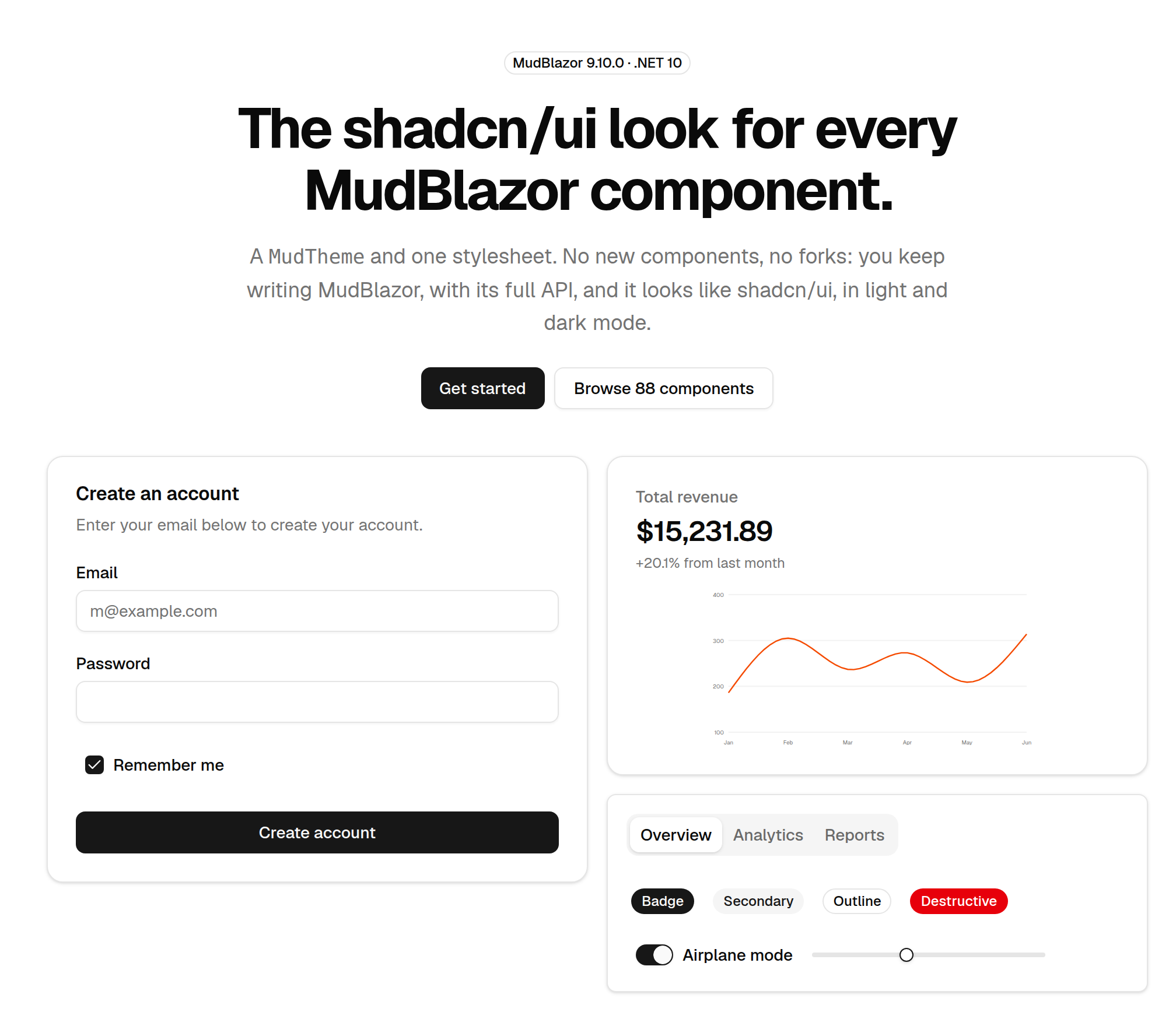 |
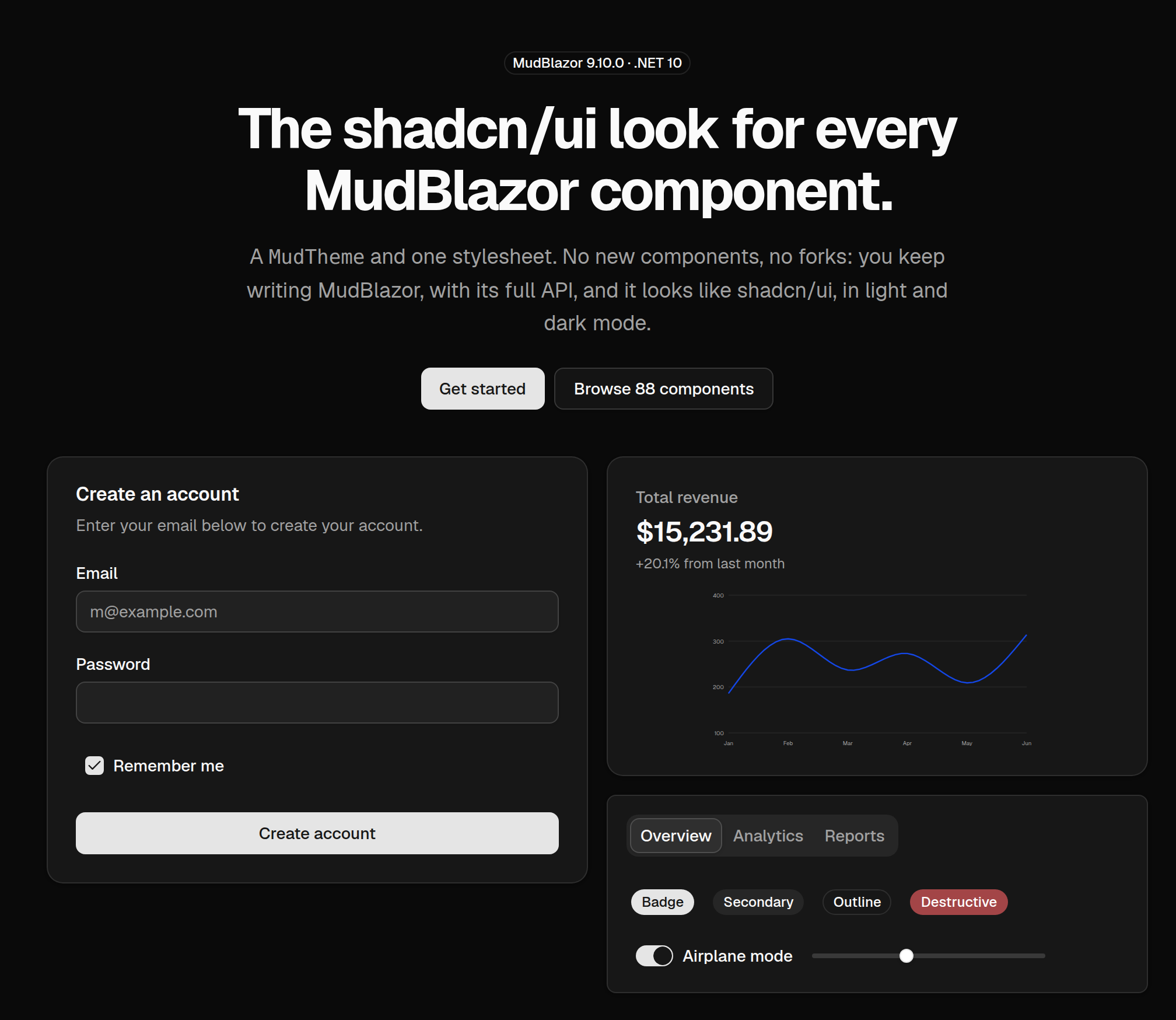 |
Using an AI coding assistant? MudShadcn publishes an agent skill and plain-text docs, so tools like Claude Code, Cursor or Copilot set it up correctly. See For AI agents and LLMs.
Highlights
- Every component, charts included. All 88 component pages of MudBlazor's documentation are restyled, from buttons and inputs to the data grid, the date and time pickers and every chart type.
- Nothing to learn. No new components and no fork: you write ordinary MudBlazor, and MudBlazor's documentation, API and upgrades still apply.
- One package. MudBlazor comes along as a dependency, with its own stylesheet and script.
- Light and dark. Both of shadcn's palettes; the app starts in the operating system's colour
scheme and follows it, or you bind
IsDarkModeyourself. - Charts in shadcn's colours without any options, in both modes.
- Your theme, not ours. Change the palette, radius or font through
MudTheme; the stylesheet reads MudBlazor's palette variables, so your colours flow through. shadcn's own tokens are there as--shadcn-*CSS variables. - Checked against MudBlazor on every build. A stylesheet override that stops matching does not fail a build, so CI checks every class, variable, chart colour and icon the stylesheet relies on.
Install
dotnet add package MudShadcn
Do not add a separate MudBlazor reference. If you already have one, remove it so the version
MudShadcn was written against is the one that gets used.
Set up
1. Program.cs — register services. AddMudShadcn calls MudBlazor's AddMudServices for you
and sets sonner-style snackbar defaults. It accepts the same configuration callback.
using MudShadcn;

builder.Services.AddMudShadcn();
2. App.razor — link both stylesheets, MudBlazor's first, and MudBlazor's script.
<link rel="stylesheet" href="@Assets["_content/MudBlazor/MudBlazor.min.css"]" />
<link rel="stylesheet" href="@Assets["_content/MudShadcn/MudShadcn.min.css"]" />
...
<script src="@Assets["_content/MudBlazor/MudBlazor.min.js"]"></script>
The order matters: MudShadcn's stylesheet overrides MudBlazor rules at equal specificity and has to
come second. You do not need MudBlazor's Roboto font link. MudShadcn.min.css is MudShadcn.css
without comments and whitespace (about 14 KB instead of 26 KB over Brotli); link MudShadcn.css
instead when you want to read the rules in the browser's dev tools.
3. _Imports.razor
@using MudBlazor
@using MudShadcn
4. Your layout — one provider replaces MudThemeProvider, MudPopoverProvider,
MudDialogProvider and MudSnackbarProvider.
<MudShadcnProvider @bind-IsDarkMode="_isDarkMode" />

<MudLayout>
    ...
</MudLayout>

@code {
    private bool _isDarkMode;
}
The provider has to be rendered interactively, like MudBlazor's own providers. Besides the theme it
emits the --shadcn-* tokens for the active mode and sets color-scheme on the root element, as
shadcn's next-themes does, so native scrollbars, form controls and CSS light-dark() follow the
mode too.
| Parameter | Default | |
|---|---|---|
Theme |
MudShadcnTheme.Default |
Any MudTheme. |
IsDarkMode |
false |
Bindable. |
FollowSystemDarkMode |
true |
Start in the OS colour scheme and follow changes to it. |
IncludeProviders |
true |
Set false if you place the popover, dialog and snackbar providers yourself. |
Without the provider
MudShadcnProvider is a convenience. This works too:
<MudThemeProvider Theme="MudShadcnTheme.Default" @bind-IsDarkMode="_isDarkMode" />
<MudPopoverProvider />
<MudDialogProvider />
<MudSnackbarProvider />
You lose one thing: the provider is what re-emits the --shadcn-* tokens for dark mode. Without it
the focus ring, input background and destructive button keep their light-mode values in dark mode.
Using it
Write ordinary MudBlazor. The mapping to shadcn's vocabulary:
| shadcn | MudBlazor |
|---|---|
Button default |
Variant.Filled Color.Primary |
Button secondary |
Variant.Filled Color.Secondary (or Color.Default) |
Button destructive |
Variant.Filled Color.Error |
Button outline / ghost |
Variant.Outlined / Variant.Text |
| Input, Select, Textarea | Variant="Variant.Outlined" — 36px; Margin.Dense gives 32px |
| Badge | MudChip |
| Tabs | MudTabs with MinimumTabWidth="0px" for content-width tabs |
| Sheet / Sidebar | MudDrawer temporary / persistent |
| Sonner | ISnackbar |
| Accordion | MudExpansionPanels |
| Chart | MudChart / the chart components, with the default palette |
| muted text | Color.Tertiary on MudText, or Typo.body2 with Color.Tertiary |
Variant.Outlined is the shadcn input: a bordered 36px box with its label above it. Filled is
a borderless bg-muted box and Text a single underline; both keep MudBlazor's floating label,
since shadcn has no such variants. Checkboxes, radios, switches, sliders and the select's dropdown
arrow are redrawn as shadcn's controls, whatever the variant.
Charts
Charts need no options. MudBlazor's default chart palette is replaced with shadcn's chart-1 to
chart-5 (each with its own light and dark value), followed by tints and shades of them for series
6 to 20; heat maps get a ramp of the primary colour. Axis labels are muted, grid lines take the
border colour, tooltips and Sankey labels look like shadcn's chart tooltip, and legend markers are
small squares. If you set ChartPalette yourself, your colours are used as given. The colours
series receive are available to your CSS as --shadcn-chart-series-1 to --shadcn-chart-series-20.
Customising
var theme = MudShadcnTheme.Create(["Geist", .. MudShadcnTheme.DefaultFontFamily]);
theme.PaletteLight.Primary = "#2563eb";
theme.LayoutProperties.DefaultBorderRadius = "0.375rem";
<MudShadcnProvider Theme="theme" />
The stylesheet reads colours from MudBlazor's --mud-palette-* variables, so palette changes flow
through. shadcn's own tokens are available to your CSS as --shadcn-* (--shadcn-border,
--shadcn-muted-foreground, --shadcn-ring, --shadcn-radius-lg, --shadcn-shadow-md, …) and as
ShadcnTokens.Light / ShadcnTokens.Dark in C#. To change the radius scale:
:root { --shadcn-radius: 0.5rem; }
How the palette is mapped
| shadcn token | MudBlazor palette |
|---|---|
background / foreground |
Background / TextPrimary |
card, popover |
Surface |
primary / primary-foreground |
Primary / PrimaryContrastText |
secondary / secondary-foreground |
Secondary / SecondaryContrastText |
muted / muted-foreground |
BackgroundGray / TextSecondary, Tertiary |
accent |
hover surfaces (in the stylesheet) |
destructive |
Error |
border / input |
LinesDefault, Divider, TableLines / LinesInputs |
sidebar* |
DrawerBackground, DrawerText |
ring |
no MudBlazor slot — --shadcn-ring |
Secondary is shadcn's light grey surface, not an accent colour. Where MudBlazor uses it as a
foreground (text buttons, icons), the stylesheet substitutes secondary-foreground so it stays
legible. shadcn has no info, success or warning; those come from Tailwind's blue, green and amber.
Where it differs from shadcn
MudShadcn restyles MudBlazor; it does not change what MudBlazor renders. Where the markup, an inline style or a component parameter decides something, MudBlazor's version stays.
General
- Icons are MudBlazor's Material icons, not Lucide. The exceptions are the default checkbox,
radio and select-arrow glyphs, which are recognised and redrawn as shadcn's controls; custom
CheckedIcon/UncheckedIconrender as given. Other Material shapes you can swap with parameters: the nav group arrow (ExpandIcon), the breadcrumb ellipsis (ExpanderIcon) and separator (Separator). Color.Secondaryis shadcn's light grey surface, not an accent. Where it would be a foreground (text, icons, a checked control) the stylesheet usessecondary-foregroundinstead.Color.Darkis near-black (#171717) in light mode and a mid grey (#737373) in dark mode: the darkest grey that still reads as a text or icon colour on the dark background and behind white text. UseColor.Default(or no colour) for text that should simply follow the mode.- shadcn defines no info, success or warning; they come from Tailwind's blue, green and amber, and
components with a semantic colour keep it (a ghost button with
Color.Infohas blue text). <mark>(whatMudHighlighterrenders) gets a soft warning tint everywhere on the page.- The destructive reds are just outside sRGB; the
MudThemeholds the gamut-clipped hex (#e7000b,#ff6467), which is what an sRGB display shows for the OKLCH original anyway. - The default font is the system UI stack. To use Geist or Inter, load the font yourself and pass
it to
MudShadcnTheme.Create(...).
Inputs and pickers
- Floating labels are gone from
Variant.Outlined: the label is pinned above the field and the notch is closed, so a labelled outlined input takes 22px more vertical space than in stock MudBlazor.TextandFilledkeep a floating label; shadcn has no such variants. MudSliderdraws a range only withVariant.Filled. Its track usesinputrather thanmutedso it stays visible on cards.UncheckedColoron checkboxes and radios is not shown: unchecked is always the input border.- The calendar keeps MudBlazor's 40px cell pitch, so days are 32px squares with gaps rather than
touching cells, and the panel is about 310px wide (shadcn's is about 250px). It always shows six
weeks unless adjacent-month days are hidden. The toolbar above it has no shadcn counterpart
(
ShowToolbar="false"gives the bare calendar), and the month caption opens month and year grids rather than dropdowns. Static pickers are always rounded. - The time picker and colour picker have no shadcn counterpart; they are dressed in its style. The clock face and colour field keep MudBlazor's fixed sizes.
Buttons
- Icons inside a
MudButtonare alwayssize-4;IconSizehas no visible effect. - FABs have no shadcn counterpart: they get the button variants on a round button and keep MudBlazor's sizes.
- In a toggle group with a semantic colour, the selected item is filled with that colour rather
than
bg-accent. - A disabled
MudLinkkeeps MudBlazor's disabled colour (set with!important), not 50% opacity.
Data
- Row selection is highlighted from the selection checkbox; single-select tables without one need
RowClassFuncto show the selected row. - The data grid's group header text is bold (an inline style), and its loading bar takes
LoadingProgressColor(defaultColor.Info). - Pagination previous/next are icon-only buttons, and
Rectangularlooks like the default, since both arerounded-md.
Layout, navigation and feedback
MudTabs'Colortints only the active label; the tab list stays neutral.- Expansion panels are always flat:
ElevationandSquarehave no visible effect. - The carousel's arrows sit inside the slide at the 75% opacity MudBlazor sets inline. Only the default bullet icons become dots.
MudAlert's defaultVariant.Textis a tinted alert;Variant.Outlinedis shadcn's plain Alert. Alerts and snackbars have no separate title and description.MudAvatarGroup's overlap comes from itsSpacingparameter, and its ring fromOutlineColor.- A selected
MudChipswaps variant as MudBlazor does; shadcn's badge is not selectable.
Charts
- The default palette is recognised by value: a chart is restyled when it uses MudBlazor's default
colours (a palette of your own that happens to start with
#2979FFgets that one colour mapped). - Tooltips are MudBlazor's SVG title and subtitle in shadcn's tooltip box: there is no colour indicator, no row per series and no cursor band.
- Bars are drawn as thick strokes, so their corners stay square. Line width, fill opacity and
marker size are
ChartOptionsparameters (MudBlazor's lines are 3px; shadcn's are 2px). - Labels on pie, donut and rose segments use the background colour, as in shadcn's examples, which is low-contrast on light segments.
Versions
| MudShadcn | MudBlazor | .NET |
|---|---|---|
| 1.x | 9.10.0 | 10 (net10.0) |
MudShadcn follows Semantic Versioning; moving to a new MudBlazor major version is a new MudShadcn major version. What changed in each release is in the changelog and on the Releases page.
For AI agents and LLMs
The showcase is a Blazor WebAssembly app, so fetching one of its pages returns an empty shell. These plain-text files are served next to it for AI coding assistants:
| Resource | URL | What it is |
|---|---|---|
| Agent skill | /skill.md |
How to set up and use MudShadcn, with the frontmatter of a Claude Code / agent skill. |
| Full docs | /llms-full.txt |
This README as one Markdown file. |
| Index | /llms.txt |
An llms.txt index of the above and the showcase pages. |
The NuGet package carries the skill too, as docs/skill.md. To use it as a Claude Code skill:
mkdir -p ~/.claude/skills/mudshadcn
curl -fsSL https://mudshadcn.pages.dev/skill.md -o ~/.claude/skills/mudshadcn/SKILL.md
or save it as .claude/skills/mudshadcn/SKILL.md in a repository to scope it to that project.
Repository
| Path | What |
|---|---|
src/MudShadcn |
The package: MudShadcnTheme, ShadcnTokens, MudShadcnProvider, AddMudShadcn() and wwwroot/MudShadcn.css. |
samples/MudShadcn.Showcase |
The showcase site (Blazor WebAssembly). |
samples/MudShadcn.TestApp |
A Blazor Server app with one page per component category, for quick checks. |
tools/verify-mudblazor.sh |
Checks the stylesheet against MudBlazor (also run by CI). |
dotnet build MudShadcn.sln                                              # 0 warnings
dotnet run --project samples/MudShadcn.Showcase --launch-profile http   # http://localhost:5153
dotnet run --project samples/MudShadcn.TestApp --launch-profile http    # http://localhost:5152
tools/verify-mudblazor.sh
In development both apps serve MudShadcn.css straight from src/, so a stylesheet change needs only
a browser reload.
Contributing
Issues and pull requests are welcome on GitHub. If a
component does not look like its shadcn/ui counterpart, an issue with the MudBlazor component, the
variant and a screenshot (light or dark) is the most useful report. Styling changes go in
src/MudShadcn/wwwroot/MudShadcn.css; check them on the component's showcase page in both modes and
run tools/verify-mudblazor.sh.
Support the project
MudShadcn is free and open source, maintained in spare time. If it saves you work and you would like to support its development, donations are gratefully received:
Starring the repository and reporting issues help just as much and cost nothing.
License
MIT © Sardar Qaslany.
MudShadcn is not affiliated with shadcn/ui, Tailwind CSS or MudBlazor. It reproduces shadcn/ui's design tokens and Tailwind's scales under their MIT licences; see THIRD-PARTY-NOTICES.md.
| Product | Versions Compatible and additional computed target framework versions. |
|---|---|
| .NET | net10.0 is compatible. net10.0-android was computed. net10.0-browser was computed. net10.0-ios was computed. net10.0-maccatalyst was computed. net10.0-macos was computed. net10.0-tvos was computed. net10.0-windows was computed. |
-
net10.0
- MudBlazor (>= 9.10.0)
NuGet packages
This package is not used by any NuGet packages.
GitHub repositories
This package is not used by any popular GitHub repositories.
| Version | Downloads | Last Updated |
|---|---|---|
| 1.0.0 | 90 | 10/3/2026 |