RedEye.Maui.SkeletonLoader
1.1.0
dotnet add package RedEye.Maui.SkeletonLoader --version 1.1.0
NuGet\Install-Package RedEye.Maui.SkeletonLoader -Version 1.1.0
<PackageReference Include="RedEye.Maui.SkeletonLoader" Version="1.1.0" />
<PackageVersion Include="RedEye.Maui.SkeletonLoader" Version="1.1.0" />
<PackageReference Include="RedEye.Maui.SkeletonLoader" />
paket add RedEye.Maui.SkeletonLoader --version 1.1.0
#r "nuget: RedEye.Maui.SkeletonLoader, 1.1.0"
#:package RedEye.Maui.SkeletonLoader@1.1.0
#addin nuget:?package=RedEye.Maui.SkeletonLoader&version=1.1.0
#tool nuget:?package=RedEye.Maui.SkeletonLoader&version=1.1.0
MAUI SkeletonLoader

A lightweight, customizable Skeleton Loader for .NET MAUI that provides animated placeholder UI elements while content is loading.
This library supports both rectangular and circular (ellipse) skeleton loaders with smooth gradient wave animations.
✨ Features
- 🚀 Smooth shimmer / wave animation
- 🟦 Rectangular skeleton loader (
BSkeletonLoader) - ⚪ Circular skeleton loader (
ESkeletonLoader) - ⚙️ Fully customizable speed, delay, and size
- 🧩 Easy XAML usage
- ♻️ Automatic start / stop based on view lifecycle
📦 Namespace
xmlns:sk="clr-namespace:SkeletonLoader;assembly=MauiSkeletonLoader"
🔧 Bindable Properties
Common Properties (BSkeletonLoader, ESkeletonLoader)
| Property | Type | Default | Description |
|-------------------|----------|-------------------|-----------------------------------------------------|
| Speed | double | 1.0 | Controls the animation speed (higher = faster wave) |
| DelaySecond | double | 1.0 | Delay before the animation restarts (in seconds) |
| BackgroundColor | Color | RGB(60, 60, 60) | Base background color of the skeleton loader |
| WaveColor | Color | RGB(70, 70, 70) | Highlight color used for the wave animation |
ESkeletonLoader Specific Properties
| Property | Type | Default | Description |
|---|---|---|---|
Size |
int |
10 |
Controls both width and height of the circular skeleton |
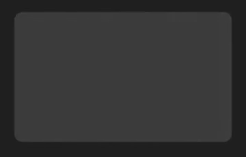
🟦 BSkeletonLoader (Border-based)
A rectangular skeleton loader built on top of Border. Ideal for text lines, cards, and content blocks.
Example
<sk:BSkeletonLoader WidthRequest="400"
HeightRequest="250"
StrokeShape="RoundRectangle 15" />
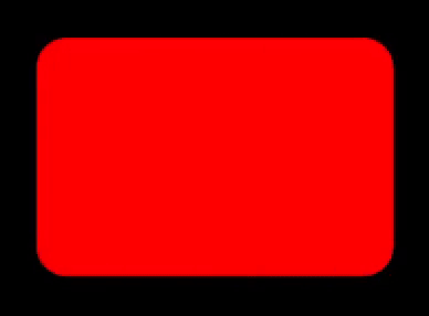
<sk:BSkeletonLoader WidthRequest="400"
HeightRequest="250"
StrokeShape="RoundRectangle 15"
BackgroundColor="Red"
WaveColor="Blue"/>
⚪ ESkeletonLoader (Ellipse-based)
A circular skeleton loader implemented as a ContentView wrapping an Ellipse. Perfect for avatars or profile images.


Example
<sk:ESkeletonLoader Size="50" />

<sk:ESkeletonLoader Size="50"
                    BackgroundColor="Orange"
                    WaveColor="Aqua"/>
🧩 Multiple Skeleton Loaders Example
You can easily combine multiple skeleton loaders to simulate complex layouts.

<VerticalStackLayout
    HorizontalOptions="Center"
    VerticalOptions="Center"
    Spacing="15">

    <HorizontalStackLayout Spacing="10">

        <sl:ESkeletonLoader Size="50" />

        <VerticalStackLayout Spacing="10" Margin="0,15,0,0">
            <sl:BSkeletonLoader
                WidthRequest="300"
                HeightRequest="8"
                StrokeShape="RoundRectangle 50" />

            <sl:BSkeletonLoader
                WidthRequest="150"
                HeightRequest="8"
                StrokeShape="RoundRectangle 50"
                HorizontalOptions="Start" />
        </VerticalStackLayout>
    </HorizontalStackLayout>

    <sl:BSkeletonLoader
        WidthRequest="400"
        HeightRequest="240"
        StrokeShape="RoundRectangle 15" />

    <VerticalStackLayout Spacing="10" Margin="0,15,0,0">
        <sl:BSkeletonLoader
            WidthRequest="300"
            HeightRequest="8"
            StrokeShape="RoundRectangle 50"
            HorizontalOptions="Start" />

        <sl:BSkeletonLoader
            WidthRequest="200"
            HeightRequest="8"
            StrokeShape="RoundRectangle 50"
            HorizontalOptions="Start" />
    </VerticalStackLayout>
</VerticalStackLayout>
⚙️ Lifecycle & Animation Handling
- Animation starts automatically when the control is loaded
- Animation stops and cleans up when the control is unloaded
- Uses
CancellationTokenSourcefor safe async animation control - Prevents animation leaks when views are removed
🛠 Implementation Notes
BSkeletonLoaderinherits fromBorderESkeletonLoaderwraps anEllipseinside aContentView(Shapes cannot be inherited directly)- Gradient animation is handled via
Animation.Commit - Self-referencing bindings are used for clean XAML-to-code interaction
🚫 Error Handling
If an unexpected lifecycle issue occurs (e.g., animation started before initialization), a diagnostic message is emitted:
SkeletonLoader Error : CancellationTokenSource was Null, Report to Developer!
(Recommended to replace this with ILogger for production NuGet packages.)
📄 License
MIT License
Copyright (c) 2026 RedEye-Developers
Permission is hereby granted, free of charge, to any person obtaining a copy of this software and associated documentation files (the "Software"), to deal in the Software without restriction, including without limitation the rights to use, copy, modify, merge, publish, distribute, sublicense, and/or sell copies of the Software, and to permit persons to whom the Software is furnished to do so, subject to the following conditions:
The above copyright notice and this permission notice shall be included in all copies or substantial portions of the Software.
THE SOFTWARE IS PROVIDED "AS IS", WITHOUT WARRANTY OF ANY KIND, EXPRESS OR IMPLIED, INCLUDING BUT NOT LIMITED TO THE WARRANTIES OF MERCHANTABILITY, FITNESS FOR A PARTICULAR PURPOSE AND NONINFRINGEMENT. IN NO EVENT SHALL THE AUTHORS OR COPYRIGHT HOLDERS BE LIABLE FOR ANY CLAIM, DAMAGES OR OTHER LIABILITY, WHETHER IN AN ACTION OF CONTRACT, TORT OR OTHERWISE, ARISING FROM, OUT OF OR IN CONNECTION WITH THE SOFTWARE OR THE USE OR OTHER DEALINGS IN THE SOFTWARE.
🙌 Contributions
Contributions, issues, and feature requests are welcome! Feel free to open a PR or submit an issue.
Happy coding 🚀
RedEye-Developers
| Product | Versions Compatible and additional computed target framework versions. |
|---|---|
| .NET | net10.0-android36.0 is compatible. net10.0-ios26.0 is compatible. net10.0-maccatalyst26.0 is compatible. net10.0-windows10.0.19041 is compatible. |
-
net10.0-android36.0
- Microsoft.Maui.Controls (>= 10.0.1)
-
net10.0-ios26.0
- Microsoft.Maui.Controls (>= 10.0.1)
-
net10.0-maccatalyst26.0
- Microsoft.Maui.Controls (>= 10.0.1)
-
net10.0-windows10.0.19041
- Microsoft.Maui.Controls (>= 10.0.1)
NuGet packages
This package is not used by any NuGet packages.
GitHub repositories
This package is not used by any popular GitHub repositories.
Version : 1.0.0
- Initial release
Version : 1.0.1
- Namespace Rename:
MauiSkeletonLoader => SkeletonLoader.
Version : 1.0.2
- README.MD:
Changed.
Version : 1.1.0
- New Features
Added Background and Wava Color Support for both B and E SkeletonLoader.
- README.md
wrong namespace changed to correct namespace.