S8C.WheelPicker.Maui
1.0.3
dotnet add package S8C.WheelPicker.Maui --version 1.0.3
NuGet\Install-Package S8C.WheelPicker.Maui -Version 1.0.3
This command is intended to be used within the Package Manager Console in Visual Studio, as it uses the NuGet module's version of Install-Package.
<PackageReference Include="S8C.WheelPicker.Maui" Version="1.0.3" />
For projects that support PackageReference, copy this XML node into the project file to reference the package.
<PackageVersion Include="S8C.WheelPicker.Maui" Version="1.0.3" />
<PackageReference Include="S8C.WheelPicker.Maui" />
For projects that support Central Package Management (CPM), copy this XML node into the solution Directory.Packages.props file to version the package.
paket add S8C.WheelPicker.Maui --version 1.0.3
The NuGet Team does not provide support for this client. Please contact its maintainers for support.
#r "nuget: S8C.WheelPicker.Maui, 1.0.3"
#r directive can be used in F# Interactive and Polyglot Notebooks. Copy this into the interactive tool or source code of the script to reference the package.
#:package S8C.WheelPicker.Maui@1.0.3
#:package directive can be used in C# file-based apps starting in .NET 10 preview 4. Copy this into a .cs file before any lines of code to reference the package.
#addin nuget:?package=S8C.WheelPicker.Maui&version=1.0.3
#tool nuget:?package=S8C.WheelPicker.Maui&version=1.0.3
The NuGet Team does not provide support for this client. Please contact its maintainers for support.
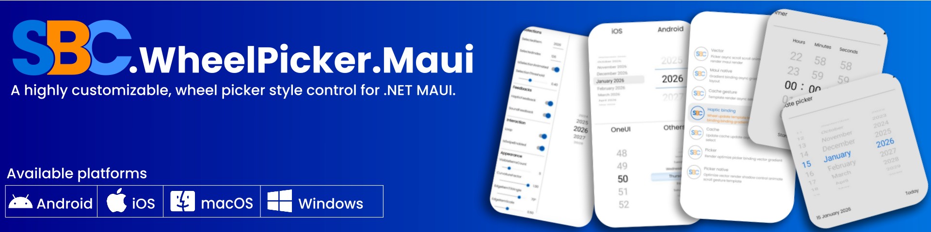
Features
- ItemTemplate
- Loop mode (infinite wheel)
- Selection threshold band (controls how “strict” the center selection is)
- Visual states for selected/non-selected items (
CurrentItem/DefaultItem) - Curvature / 3D wheel effect with configurable
tilt,scale,opacity - Overlay view (selection band, highlight, etc.)
- Haptic and sound feedbacks on selection change
- Mouse wheel support for macOS and Windows
- Parent ScrollView support (disables parent scrolling when interacting with the wheel)
- Exposes
IsDragging,IsSpinning, and computedItemHeight
Requirements
- .NET 10+
Installation
dotnet add package S8C.WheelPicker.Maui
Quick start (XAML)
Add the namespace:
xmlns:wp="clr-namespace:WheelPicker.Maui;assembly=SBC.WheelPicker.Maui"
Use the control:
<wp:WheelPicker ItemsSource="{Binding Years}"
                SelectedItem="{Binding SelectedYear}">
...
</wp:WheelPicker>
ItemTemplate + Visual States
The WheelPicker uses VisualStateManager to switch between:
CurrentItem(selected)DefaultItem(non-selected)
These names are defined by the control constants:
public const string DefaultItemVisualState = "DefaultItem";
public const string CurrentItemVisualState = "CurrentItem";
Example
<wp:WheelPicker x:Name="WheelPicker"
                ItemsSource="{Binding Years}"
                SelectedItem="{Binding SelectedYear}">
    <wp:WheelPicker.ItemTemplate>
        <DataTemplate>
            <Label Text="{Binding .}" >
                <VisualStateManager.VisualStateGroups>
                    <VisualStateGroup x:Name="SelectionStates">
                        <VisualState x:Name="DefaultItem" />
                        <VisualState x:Name="CurrentItem">
                            <VisualState.Setters>
                                <Setter Property="TextColor"
                                        Value="DarkOrange" />
                            </VisualState.Setters>
                        </VisualState>
                    </VisualStateGroup>
                </VisualStateManager.VisualStateGroups>
            </Label>
        </DataTemplate>
    </wp:WheelPicker.ItemTemplate>
</wp:WheelPicker>
Overlay (selection band)
Use Overlay to place a highlight or “selection window” on top of the wheel.
<wp:WheelPicker x:Name="WheelPicker"
                ItemsSource="{Binding Years}"
                SelectedItem="{Binding SelectedYear}">

.....

    <wp:WheelPicker.Overlay>
        <Grid>
            <Grid.RowDefinitions>
                <RowDefinition Height="*" />
                <RowDefinition Height="{Binding Source={x:Reference WheelPicker}, Path=ItemHeight}" />
                <RowDefinition Height="*" />
            </Grid.RowDefinitions>

            <Border StrokeThickness="0"
                    BackgroundColor="#1affffff"
                    Grid.Row="1">
                <Border.StrokeShape>
                    <RoundRectangle CornerRadius="8" />
                </Border.StrokeShape>
                <Border.Shadow>
                    <Shadow Brush="Black"
                            Offset="0,0"
                            Radius="1"
                            Opacity="0.8" />
                </Border.Shadow>
            </Border>

        </Grid>
    </wp:WheelPicker.Overlay>
</wp:WheelPicker>
Public API
Methods
// Scrolls the wheel so that the item at the specified "index" becomes centered and selected,
// optionally animating the transition.
wheelPicker.SpinTo(index, animated: true);

// Scrolls the wheel so that the item at the specified "index" becomes centered and selected.
// This is a convenience overload that behaves the same as "SpinTo(int, bool)" with animated controlled by "IsSelectionAnimated".
wheelPicker.SpinTo(index);

// Scrolls the wheel so that the specified "item" becomes centered and selected,
// optionally animating the transition.
wheelPicker.SpinTo(item, animated: true);

// Scrolls the wheel so that the specified "item" becomes centered and selected.
// This is a convenience overload that behaves the same as "SpinTo(object?, bool)" with animated controlled by "IsSelectionAnimated".
wheelPicker.SpinTo(item);
Selections
| Property | Type | Default | Description |
|---|---|---|---|
SelectedIndex |
int | -1 | Index of the currently selected item within ItemsSource. This property supports two-way data binding. |
SelectedItem |
object | null | Currently selected item within ItemsSource. This property supports two-way data binding. |
IsSelectionAnimated |
bool | true | A value indicating whether selection changes are animated when the selected item changes. |
SelectionThreshold |
double | 0.4 | The relative size of the selection band around the vertical center of the wheel, used when determining which item is considered selected. Valid range: 0.0 – 1.0. |
Feedbacks
| Property | Type | Default | Description |
|---|---|---|---|
HapticFeedback |
bool | true | Haptic feedback (vibration) when selection changes. |
SoundFeedback |
bool | true | Play a tick sound when selection changes. |
Interactions
| Property | Type | Default | Description |
|---|---|---|---|
Loop |
bool | true | Whether the wheel loops when the user scrolls past the first or last item. |
IsSwipeEnabled |
bool | true | Enable/disable drag interaction |
Appearance
| Property | Type | Default | Description |
|---|---|---|---|
VisibleItemsCount |
int | 5 | Number of items visible at once in the wheel (typically an odd number so the center item is the selection). Valid range: odd integers from 3 to 11. |
CurvatureFactor |
double | 1.0 | Intensity of the wheel's curvature / 3D bend effect. Lower values make the wheel flatter higher values increase the perceived curve. Valid range: 0.0 – 1.0. |
EdgeItemTiltAngle |
double | 70 | Maximum tilt (rotation) angle, in degrees, applied to items near the edges of the wheel. Valid range: 0.0 – 90.0. |
EdgeItemScale |
double | 0.5 | Minimum scale applied to items near the top and bottom edges of the wheel. Valid range: 0.1 – 1.0. |
EdgeItemOpacity |
double | 0.1 | Minimum opacity applied to items near the top and bottom edges of the wheel. Valid range: 0.1 – 1.0. |
| Product | Versions Compatible and additional computed target framework versions. |
|---|---|
| .NET | net10.0-android36.0 is compatible. net10.0-ios26.0 is compatible. net10.0-maccatalyst26.0 is compatible. net10.0-windows10.0.19041 is compatible. |
Compatible target framework(s)
Included target framework(s) (in package)
Learn more about Target Frameworks and .NET Standard.
-
net10.0-android36.0
- Microsoft.Maui.Controls (>= 10.0.1)
-
net10.0-ios26.0
- Microsoft.Maui.Controls (>= 10.0.1)
-
net10.0-maccatalyst26.0
- Microsoft.Maui.Controls (>= 10.0.1)
-
net10.0-windows10.0.19041
- Microsoft.Maui.Controls (>= 10.0.1)
NuGet packages
This package is not used by any NuGet packages.
GitHub repositories
This package is not used by any popular GitHub repositories.