SamsungUi.Wpf
1.0.1
dotnet add package SamsungUi.Wpf --version 1.0.1
NuGet\Install-Package SamsungUi.Wpf -Version 1.0.1
<PackageReference Include="SamsungUi.Wpf" Version="1.0.1" />
<PackageVersion Include="SamsungUi.Wpf" Version="1.0.1" />
<PackageReference Include="SamsungUi.Wpf" />
paket add SamsungUi.Wpf --version 1.0.1
#r "nuget: SamsungUi.Wpf, 1.0.1"
#:package SamsungUi.Wpf@1.0.1
#addin nuget:?package=SamsungUi.Wpf&version=1.0.1
#tool nuget:?package=SamsungUi.Wpf&version=1.0.1
Samsung One UI for WPF
🇬🇧 A beautiful, modern, and fluid UI component library for WPF, inspired by Samsung One UI design guidelines. 🇮🇹 Una libreria di componenti UI bella, moderna e fluida per WPF, ispirata alle linee guida del design Samsung One UI.
Disclaimer: This is not an official Samsung library. It is a third-party open-source library created according to their public guidelines: Samsung One UI Guidelines.<br> Disclaimer: Questa non è una libreria ufficiale di Samsung. È una libreria open-source di terze parti creata secondo le loro linee guida pubbliche: Samsung One UI Guidelines.



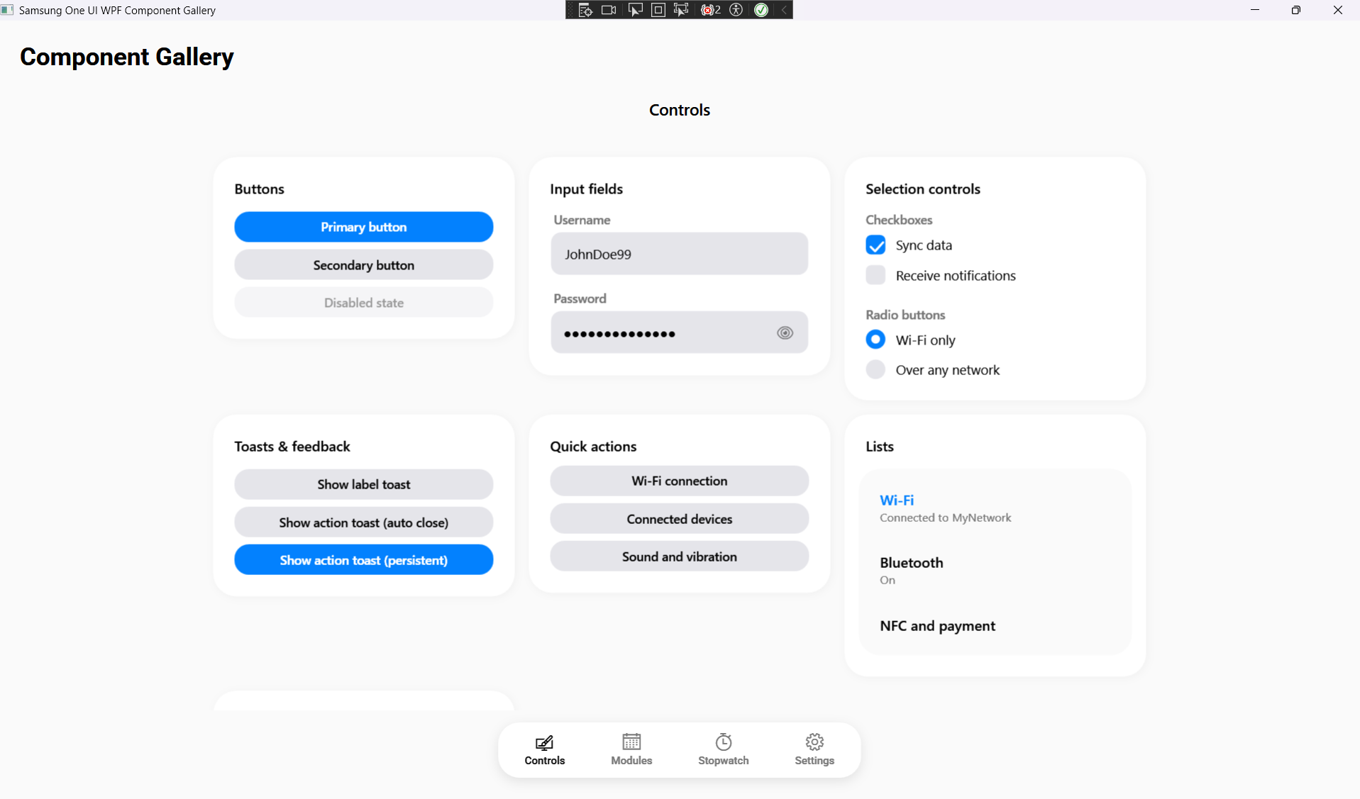
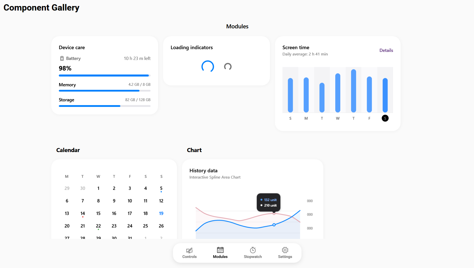
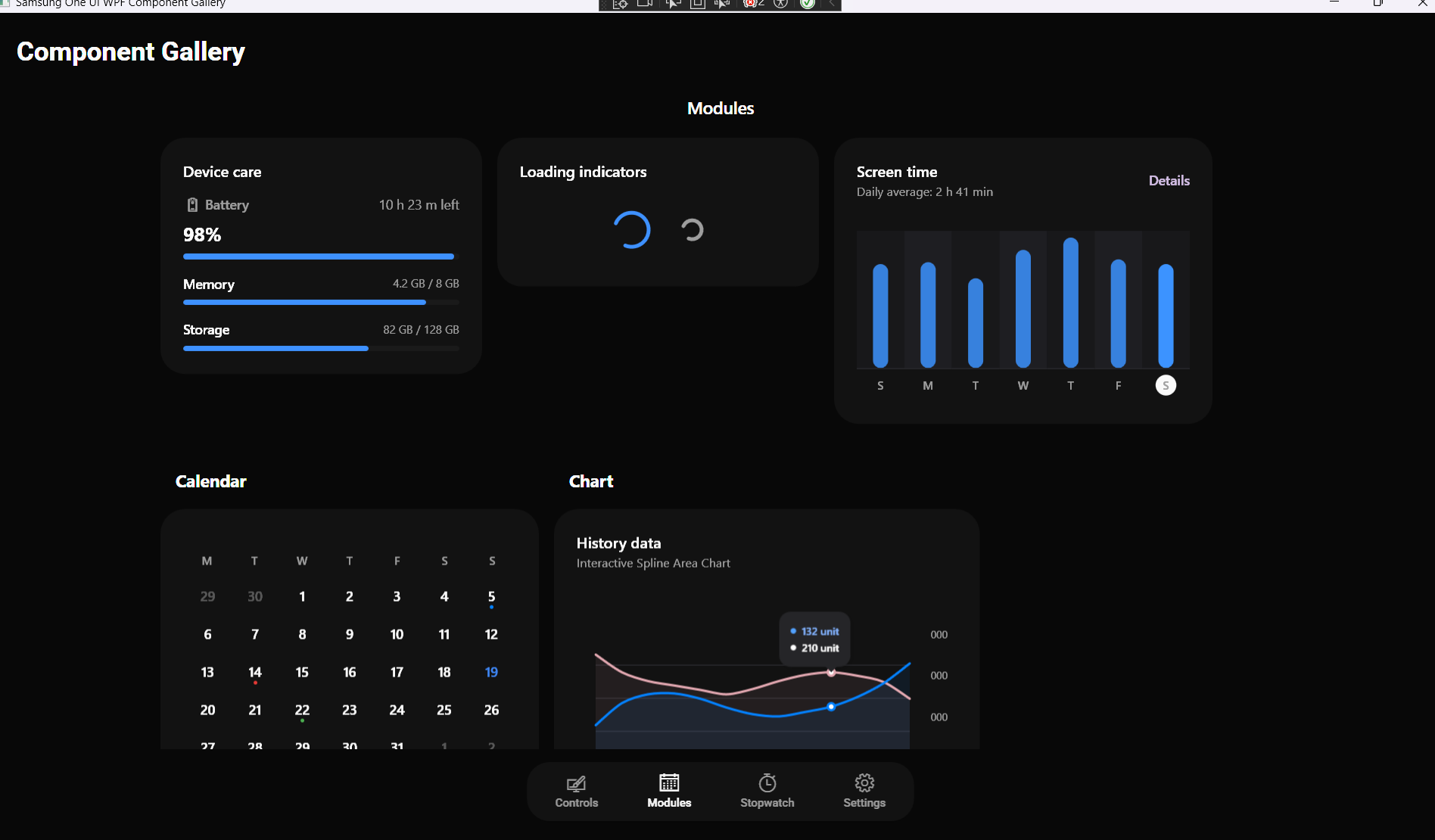
📸 Screenshots
| Light Mode | Dark Mode |
|---|---|
 |
 |
 |
 |
 |
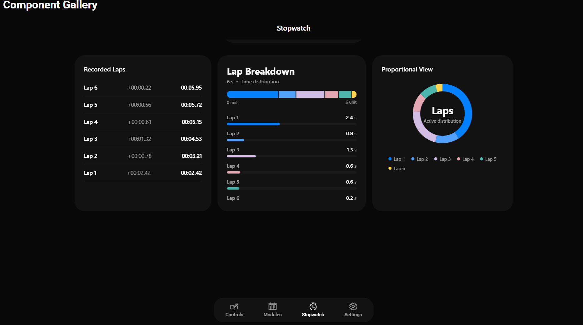 |
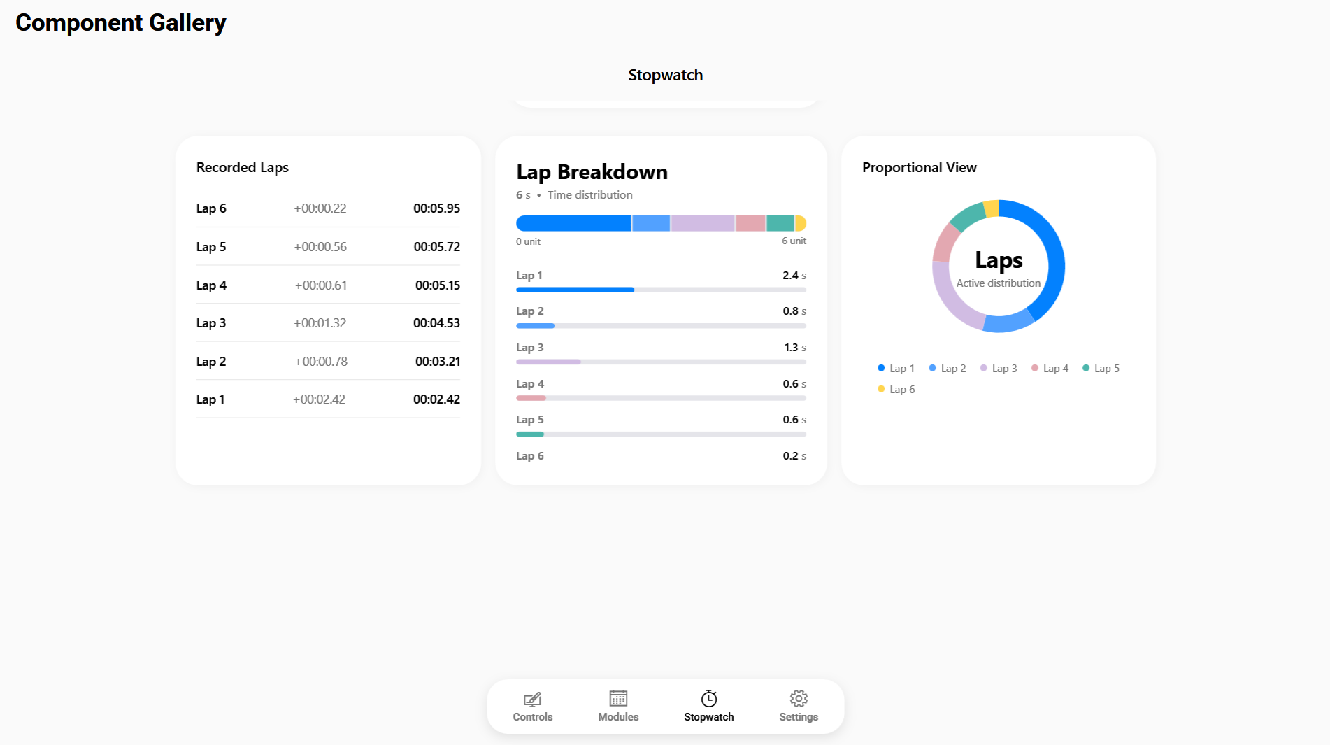
Other App Pages:

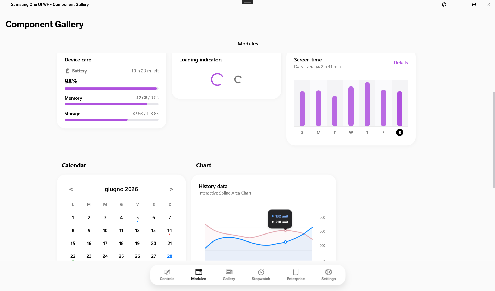

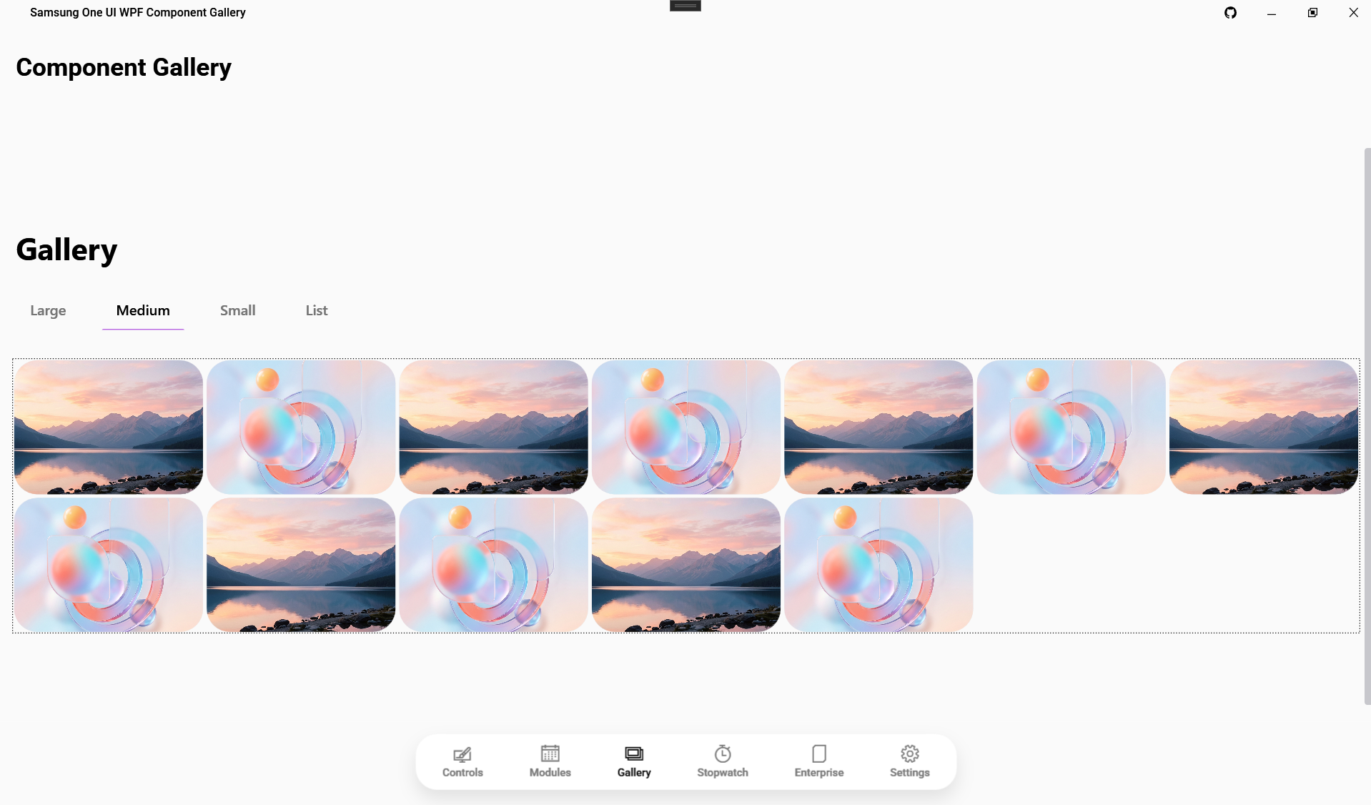
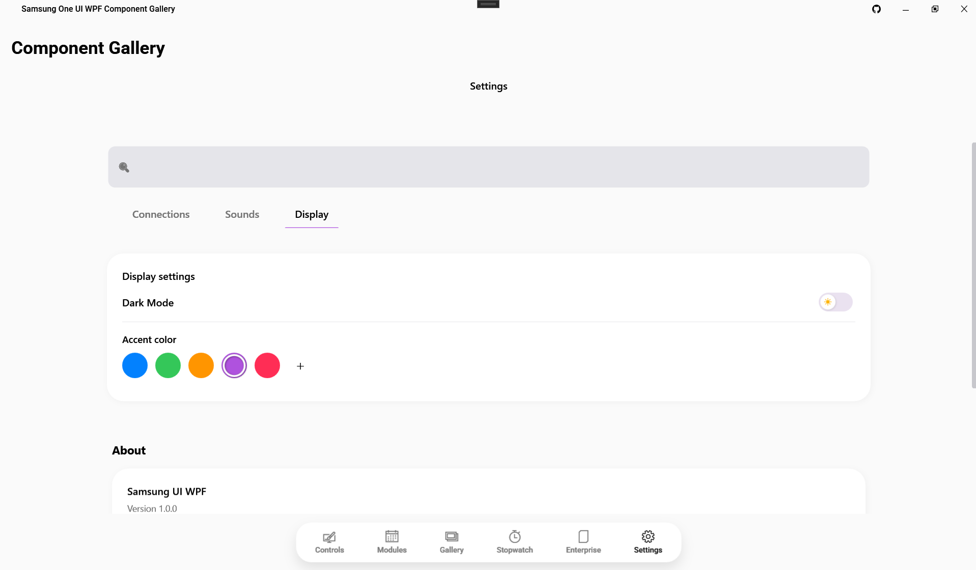

🇬🇧 English
📖 About this project
Bring the clean, rounded aesthetics of Samsung devices directly to your Windows desktop applications. This library provides a comprehensive set of custom controls for WPF, designed to mimic the fluid animations, dynamic theming, and modern feel of Samsung's One UI.
✨ Key Features
- Plug & Play: Fully compliant with MVVM. Just drop the components in your XAML.
- Fluid Animations: Smooth transitions and micro-interactions typical of One UI.
- Dynamic Theming: Easily switch between Light and Dark mode using the built-in
ThemeManager. - Rich Components: Cards, Buttons, Calendar with dot-indicators, Animated Bar Charts, and more.
⚙️ Compatibility
| Framework | Supported |
|---|---|
| .NET 10.0 | ✅ Yes |
| .NET 9.0 | ✅ Yes |
| .NET 8.0 | ✅ Yes |
| .NET 7.0 | ✅ Yes |
| .NET 6.0 | ✅ Yes |
| .NET Framework 4.8 | ⚠️ Partial (Recommended .NET 6+) |
🚀 Getting Started
Step 1: Installation
(Soon available on NuGet)
For now, clone this repository and add a ProjectReference to the SamsungUi library in your Visual Studio solution.
Step 2: Setup Resources (App.xaml)
Open your App.xaml and include the unified control dictionary along with your preferred starting color scheme.
<Application.Resources>
    <ResourceDictionary>
        <ResourceDictionary.MergedDictionaries>

            <ResourceDictionary Source="pack://application:,,,/SamsungUi;component/Themes/ColorsLight.xaml"/>

            <ResourceDictionary Source="pack://application:,,,/SamsungUi;component/Themes/Generic.xaml"/>
        </ResourceDictionary.MergedDictionaries>
    </ResourceDictionary>
</Application.Resources>
Step 3: Your First Component
Add the xmlns:sui namespace to your Window and start using the components!
<Window x:Class="MyApp.MainWindow"
        xmlns="http://schemas.microsoft.com/winfx/2006/xaml/presentation"
        xmlns:x="http://schemas.microsoft.com/winfx/2006/xaml"
        xmlns:sui="clr-namespace:SamsungUi.Controls;assembly=SamsungUi"
        Title="My One UI App" Height="450" Width="800">

    <Grid Background="{DynamicResource OneUiBackgroundBrush}">
        <sui:SamsungButton Content="Click Me!" Variant="Primary" HorizontalAlignment="Center" VerticalAlignment="Center" />
    </Grid>
</Window>
Step 4: Changing Themes at Runtime
You can easily switch the application theme at runtime:
using SamsungUi.Appearance;

// Switch to Dark Mode
ThemeManager.ApplyTheme(ThemeType.Dark);
🧩 Components Status
| Component Name | XAML Tag | Status |
|---|---|---|
| Button | <sui:SamsungButton> |
🟢 Ready |
| EditBox | <sui:SamsungEditBox> |
🟢 Ready |
| PasswordBox | <sui:SamsungPasswordBox> |
🟢 Ready |
| CheckBox | <sui:SamsungCheckBox> |
🟢 Ready |
| DataGrid | <sui:SamsungDataGrid> |
🟢 Ready |
| DateTimePicker | <sui:SamsungDateTimePicker> |
🟢 Ready |
| ColorPicker | <sui:SamsungColorPicker> |
🟢 Ready |
| Chart (Bar/Donut) | <sui:SamsungChart> |
🟢 Ready |
| LineChart | <sui:SamsungLineChart> |
🟢 Ready |
| Modal | <sui:SamsungModal> |
🟢 Ready |
| Notification | <sui:SamsungNotification> |
🟢 Ready |
| Gallery | <sui:Gallery> (Concept) |
🟡 WIP |
For the full list of components, check the Wiki.
🇮🇹 Italiano
📖 Il progetto
Porta l'estetica pulita e tondeggiante dei dispositivi Samsung direttamente sulle tue applicazioni desktop Windows. Questa libreria fornisce un set completo di controlli personalizzati per WPF, progettati per replicare le animazioni fluide, i temi dinamici e il feeling moderno della One UI di Samsung.
✨ Funzionalità Chiave
- Plug & Play: Piena compatibilità con MVVM. Trascina e usa i componenti nel tuo XAML.
- Animazioni Fluide: Transizioni morbide e micro-interazioni tipiche di One UI.
- Temi Dinamici: Passa facilmente dalla modalità Chiara a Scura usando il
ThemeManagerintegrato. - Componenti Ricchi: Card, Pulsanti, Calendario con indicatori, Grafici a barre animati e altro ancora.
⚙️ Compatibilità
| Framework | Supportato |
|---|---|
| .NET 10.0 | ✅ Sì |
| .NET 9.0 | ✅ Sì |
| .NET 8.0 | ✅ Sì |
| .NET 7.0 | ✅ Sì |
| .NET 6.0 | ✅ Sì |
| .NET Framework 4.8 | ⚠️ Parziale (Consigliato .NET 6+) |
🚀 Getting Started (Guida Rapida)
Step 1: Installazione
(Presto disponibile su NuGet)
Per ora, clona questa repository e aggiungi una ProjectReference alla libreria SamsungUi nella tua soluzione Visual Studio.
Step 2: Setup Risorse (App.xaml)
Apri il file App.xaml e includi il dizionario dei controlli unificato insieme alla combinazione di colori preferita.
<Application.Resources>
    <ResourceDictionary>
        <ResourceDictionary.MergedDictionaries>

            <ResourceDictionary Source="pack://application:,,,/SamsungUi;component/Themes/ColorsLight.xaml"/>

            <ResourceDictionary Source="pack://application:,,,/SamsungUi;component/Themes/Generic.xaml"/>
        </ResourceDictionary.MergedDictionaries>
    </ResourceDictionary>
</Application.Resources>
Step 3: Il tuo primo componente
Aggiungi il namespace xmlns:sui alla tua Window e inizia a usare i componenti!
<Window x:Class="MyApp.MainWindow"
        xmlns="http://schemas.microsoft.com/winfx/2006/xaml/presentation"
        xmlns:x="http://schemas.microsoft.com/winfx/2006/xaml"
        xmlns:sui="clr-namespace:SamsungUi.Controls;assembly=SamsungUi"
        Title="La mia App One UI" Height="450" Width="800">

    <Grid Background="{DynamicResource OneUiBackgroundBrush}">
        <sui:SamsungButton Content="Cliccami!" Variant="Primary" HorizontalAlignment="Center" VerticalAlignment="Center" />
    </Grid>
</Window>
Step 4: Cambiare tema a runtime
Puoi cambiare il tema dell'applicazione dinamicamente:
using SamsungUi.Appearance;

// Passa alla modalità Scura
ThemeManager.ApplyTheme(ThemeType.Dark);
Samsung One UI for WPF - Created by Violet Miller.
| Product | Versions Compatible and additional computed target framework versions. |
|---|---|
| .NET | net10.0-windows7.0 is compatible. |
-
net10.0-windows7.0
- No dependencies.
NuGet packages
This package is not used by any NuGet packages.
GitHub repositories
This package is not used by any popular GitHub repositories.