UiTools.WinForms.UiThemes
1.0.1
dotnet add package UiTools.WinForms.UiThemes --version 1.0.1
NuGet\Install-Package UiTools.WinForms.UiThemes -Version 1.0.1
<PackageReference Include="UiTools.WinForms.UiThemes" Version="1.0.1" />
<PackageVersion Include="UiTools.WinForms.UiThemes" Version="1.0.1" />
<PackageReference Include="UiTools.WinForms.UiThemes" />
paket add UiTools.WinForms.UiThemes --version 1.0.1
#r "nuget: UiTools.WinForms.UiThemes, 1.0.1"
#:package UiTools.WinForms.UiThemes@1.0.1
#addin nuget:?package=UiTools.WinForms.UiThemes&version=1.0.1
#tool nuget:?package=UiTools.WinForms.UiThemes&version=1.0.1
UiTools.WinForms.UiThemes
UiTools.WinForms.UiThemes is a lightweight, extensible theme management toolkit for Windows Forms applications. It allows you to style your controls easily using external XML configurations, offering full support for high-DPI scaling, visual editing, and real-time (runtime) preview.
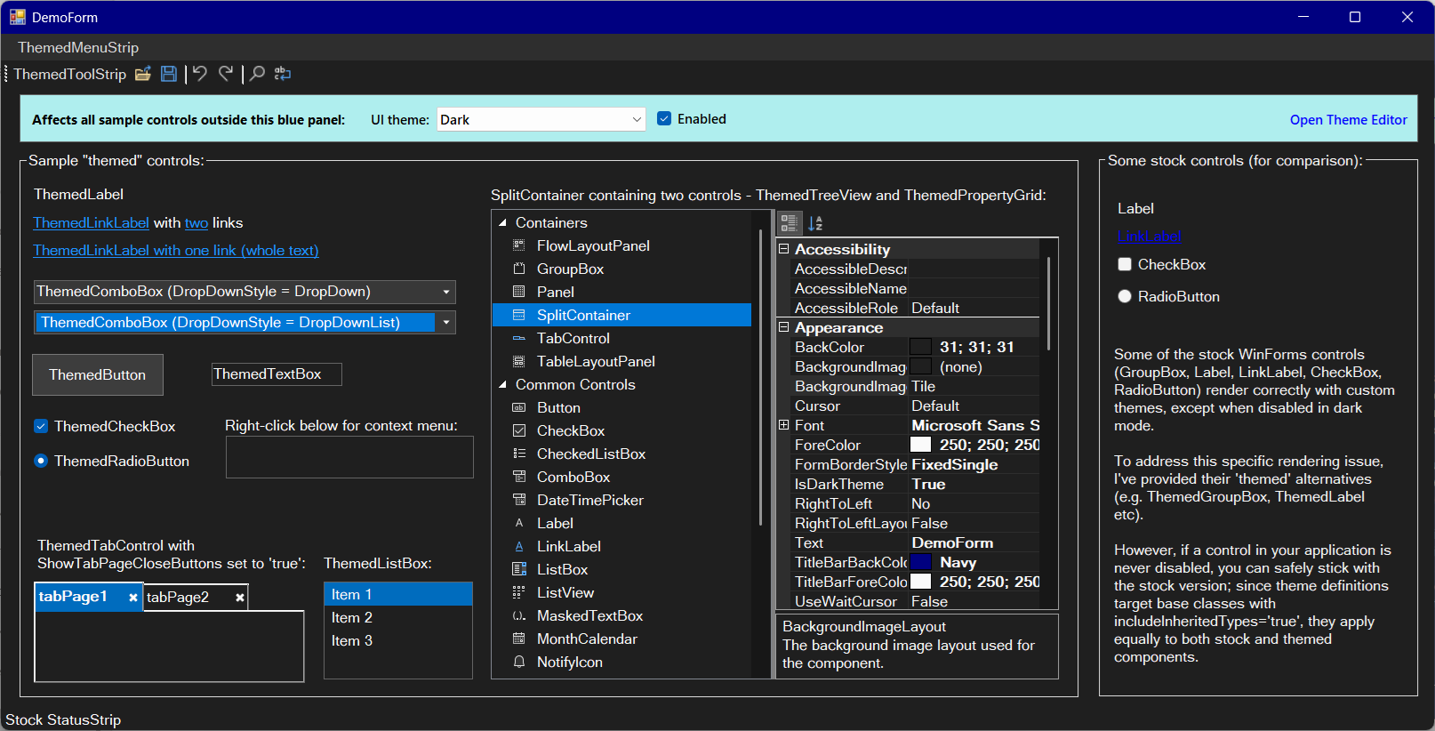
"Dark" theme example:
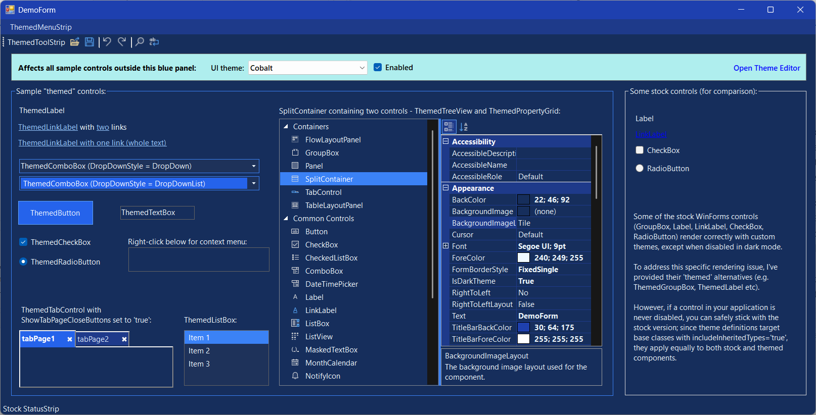
"Cobalt" theme example:
Quick Start (UI Themes Recipe)
- Add a reference to UiTools.WinForms.UiThemes.dll in your project.
- Use the themed controls provided in this DLL throughout your forms.
- Load the predefined themes and set the current active theme during your application startup:
// Load pre-defined themes embedded within the DLL resources:
var knownUiThemes = KnownUiThemes.Load();
// Alternatively, load themes from a custom XML file:
// var knownUiThemes = KnownUiThemes.Load("Path.To.Xml.File");

if (knownUiThemes != null)
    KnownUiThemes.CurrentUiTheme = knownUiThemes.GetUiTheme("Dark");
- Apply the selected theme to your form using the
ThemeApplier.Apply()method:
if (KnownUiThemes.CurrentUiTheme != null)
{
    ThemeApplier.Apply(this, KnownUiThemes.CurrentUiTheme, applyProcessWideSettings: true);
    // NOTE: set 'applyProcessWideSettings' to 'true' if this call is made in the MAIN form of your app.
    BeginInvoke(Refresh);
}
On the very first launch of your application, an XML file containing pre-defined theme definitions, along with its corresponding XSD schema, will be extracted from the DLL resources and saved next to the executable.
The parameterless KnownUiThemes.Load() overload reads themes directly from this XML file. If the file is accidentally deleted, it will be automatically re-extracted from the resources (providing a "self-healing" mechanism).
Predefined Themes & Native Mode
The toolkit includes four predefined themes available out of the box:
- Light: A clean, classic light theme.
- Dark: An elegant dark theme using charcoal and deep grey tones, intentionally designed to mimic the Microsoft Visual Studio Dark theme as closely as possible.
- Cobalt: A rich, gorgeous blue-and-indigo theme providing a modern, vibrant look.
- Barbie: A flashy, high-contrast pink-and-magenta theme - included purely for kicks! 🎀
Native Mode (The "None" Option)
The "None" option reverts all controls to their standard, un-themed Windows Forms colors.
- Note 1: Switching to "None" requires an application restart to fully restore native OS rendering styles.
- Note 2: The "Light" theme is visually almost identical to the "None" (Native) option, but it uses the theme engine's styling rather than the unmanaged OS style.
Modifying Themes
The quick start guide above is sufficient for working with static XML-defined themes. If you need to modify existing themes or add your own, you have two options:
Option 1: Manual XML Editing
Open the extracted (or custom) XML file in any XML/text editor and make the necessary changes manually.
Option 2: Visual Editor (Recommended)
Run the ThemeEditor.exe application (which opens the ThemeEditor form from the DLL) and perform the following:
- Click Open on the toolbar to load your XML file.
- Edit themes, control types, and color properties using the visual editor.
- Click Save on the toolbar to write your changes back to the XML file.
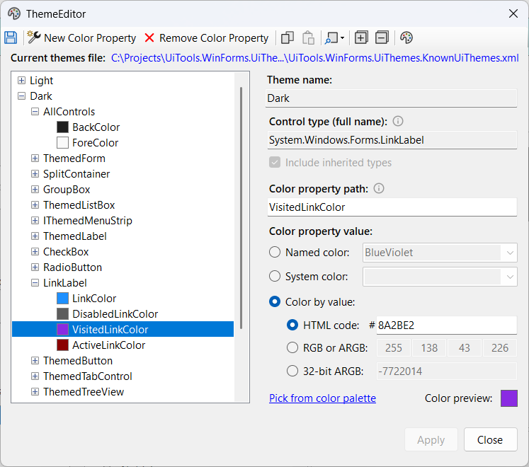
When working with the editor (or modifying the XML file manually), keep in mind several key concepts and features:
Mandatory
AllControlsNode: Every theme requires a root-level<AllControls>child element (which can be empty). This is a reserved, special value used to apply color properties globally to all controls. TheThemeEditorautomatically generates this node when creating a new theme and blocks its deletion - a rule strictly enforced by the accompanying XSD schema.The color properties are applied using a cascading precedence logic:
1. Global application: First, global properties defined in the
<AllControls>section (if any) are applied to all controls (in all out-of-the-box themes, these are onlyBackColorandForeColor).2. Control-specific application: Next, properties specified for individual control types are applied. If a specific control type defines a property that is already specified in
<AllControls>(such asBackColor), the control-specific value will override (take precedence over) the global one.Flexible Control Type Targeting: In the Control type (full name) field, you can specify either a concrete control type or a base class/interface (e.g.
System.Windows.Forms.CheckBoxorUiTools.WinForms.UiThemes.Controls.IThemedMenuStrip). The latter is useful if you wish to apply styles to several derived controls at once - which requires checking the Include inherited types box.Nested Property Paths: The Color property path field supports nested sub-properties (paths), rather than just top-level property names. For example, you can specify
FlatAppearance.MouseOverBackColorto target the corresponding sub-property of theUiTools.WinForms.UiThemes.Controls.ThemedButtoncontrol.
To speed up your workflow, the editor's toolbar offers two highly useful productivity features:
- Node Copy & Paste: You can copy and paste elements at any of the three hierarchical levels - an entire Theme, a specific Control Type, or an individual Color Property. This makes duplicating complex styles or creating new themes incredibly fast.
- Locate in Other Theme: This allows you to instantly jump to the equivalent node of your currently selected element in another theme. It is perfect for quick cross-theme comparisons, easily answering questions like: "What is the color of LinkLabel.LinkColor in the Dark theme?" while you are currently focused on that exact property in the Light theme.
Regardless of whether you choose manual XML editing (Option 1) or the visual editor (Option 2), you will only see the results of your edits (e.g., updated colors on themed controls) after restarting your application, so that it re-runs KnownUiThemes.Load().
Real-Time (Runtime) Live Preview
If you want to preview color and font changes instantly on your live forms without restarting the application, you can integrate the editor directly into your project:
a) Create a button (which can be temporary) such as "Open Theme Editor" on the form you want to style.
b) Implement the button's click event to open the theme editor form directly from the DLL (rather than running it as a standalone ThemeEditor.exe). You must pass your active knownUiThemes object to it (the exact same instance you used with ThemeApplier.Apply()).
using (var editor = new ThemeEditor.ThemeEditor(knownUiThemes, "Optional_Current_Theme_Name", "Optional.Path.To.Xml.File"))
{
    // "Optional_Current_Theme_Name" can be set to 'KnownUiThemes.CurrentUiTheme?.Name'
    // (e.g., if KnownUiThemes.CurrentUiTheme can be assigned during form load).
    // For convenience, this immediately selects and focuses the current theme in the editor's TreeView upon opening.
    editor.ShowDialog(this);
}
Note: The "Open" button on the editor's toolbar will be disabled in this mode.
c) Now, clicking the Apply button within the ThemeEditor form will immediately update all themed controls on your active form - with no need to save the XML file and then restart your project. This works provided you are editing the theme that is currently applied to your active form via ThemeApplier.Apply().
💡 Color Conversion Pro-Tip
Sometimes you may need to convert (or at least attempt to convert) colors between different formats - such as HTML hex codes to named colors, RGB/ARGB to hex, or system colors to raw ARGB values.
Instead of cluttering the UI with a dedicated conversion utility, you can easily achieve this using the following built-in workaround:
- Enter your known color value into any of the available fields in the
ThemeEditor(e.g., type or paste a hex code into the "HTML code" field). - Click the "Pick from color palette" link. This opens the standard Windows
ColorDialogwith your entered color already selected. - Click "OK" immediately without changing the selection.
- The result: The editor will automatically synchronize and populate all other fields. The "RGB or ARGB" and "32-bit ARGB" fields will show the converted values instantly. The "Named color" and "System color" fields will be updated only if a standard color matching your exact ARGB value is found.
Project Structure and Distribution
The solution comprises three projects:
UiTools.WinForms.UiThemes(DLL) - This is the core library, implementing the main functionalities:ThemeApplier: A class enabling the application of a specified theme to a form or control.KnownUiThemes: Manages available themes loaded from an XML configuration file.ThemeEditor: A visual editor for theme configurations, useful for avoiding manual XML file editing, and offering an instant preview mode when launched appropriately.- Enhanced Controls: A suite of standard Windows Forms controls, modified to support theme integration:
ThemedButtonThemedCheckBoxThemedComboBoxThemedContextMenuStripThemedFormThemedGroupBoxThemedLabelThemedLinkLabelThemedListBoxThemedMenuStripThemedPropertyGridThemedRadioButtonThemedTabControlThemedTextBoxThemedToolStripThemedTreeView- 💡 Missing a control? If a standard Windows Forms control you need is missing from this list, contributions are highly welcome! Feel free to extend the toolkit by submitting a Pull Request or opening an Issue.
UiTools.WinForms.UiThemes.ThemeEditor(EXE) - This executable launches theThemeEditorform (from the DLL) in standalone mode. In this mode, no built-in themes are preloaded, and the "instant preview" feature is unavailable; users must manually click the "Open" button in the toolbar to load the desired XML theme definition file. It references the core library DLL.UiTools.WinForms.UiThemes.Demo(EXE) - This executable provides a sample themed form, demonstrating the usage of the themed controls and the "instant preview" mode of theThemeEditorform. It also has a reference to the core DLL.
Consequently, the distribution package (available at GitHub) includes these three files:
UiTools.WinForms.UiThemes.dllUiTools.WinForms.UiThemes.ThemeEditor.exeUiTools.WinForms.UiThemes.Demo.exe
Real-World Usage Example
In addition to the included UiTools.WinForms.UiThemes.Demo project, a real-world application of this theme engine can be seen in the UiTools.WinForms.Designer project.
While the UiTools.WinForms.Designer project does not currently reference UiTools.WinForms.UiThemes.dll directly, it embeds the identical ThemeApplier and KnownUiThemes classes (with minor variations that do not affect core behavior) and utilizes an XML theme configuration file of the exact same structure, validated against the same XSD schema.
Historically, the UiTools.WinForms.UiThemes project was born out of the development of the UiTools.WinForms.Designer: the theme engine was initially implemented within the Designer codebase, and was subsequently decoupled and spun off into this standalone library. In the future, the Designer project is planned to be transitioned to explicitly reference this library via its NuGet package.
Technical Implementation & Legacy Challenges:
Supporting custom themes in WinForms is a notoriously difficult task. Many WinForms controls are thin wrappers around "ancient" Win32 or ActiveX components dating back to Windows 95. Since many of these controls do not natively support modern skinning, the library employs several low-level techniques:
- Owner Draw & WndProc: For many elements, the only way to "repaint" them is to use "owner draw" mode or, where that is unavailable, to override the control's window procedure (WndProc) to intercept and manually handle painting messages.
- Modern Windows APIs: While the core UI is handled via low-level hooks, the library utilizes specific Windows APIs to apply dark themes to the "system" parts of the interface (title bars, scrollbars, etc.):
DWMWA_USE_IMMERSIVE_DARK_MODE: Supported on Windows 10 v1809+. This tells the Desktop Window Manager to apply the dark system style to the window's frame (making the title bar black and the caption text white).- Title Bar Customization: Setting a specific background color (
DWMWA_CAPTION_COLOR) or text color (DWMWA_TEXT_COLOR) for the title bar requires Windows 11+. On Windows 10 v1809+, these custom colors are ignored, and the title bar simply defaults to solid black when the immersive dark mode is active. - Scrollbars: Dark scrollbars are enabled by calling the
SetWindowThemefunction fromuxtheme.dllwith the "DarkMode_Explorer" theme parameter (requires Windows 10 v1809+). - System Context Menus: The dark style for the title bar's right-click menu (or Alt+Space menu) is handled via
SetPreferredAppModeandFlushMenuThemes(requires Windows 10 v1809+).
A Note on Stability:
While great care has been taken to avoid flickering during runtime theme switching and to prevent layout breakage due to font changes, some minor visual glitches may occur.
- Font Size: Increase the theme's font size with caution; excessively large fonts may disrupt the layout in certain areas despite auto-scaling efforts.
- Fallback: Given the complexity of skinning legacy Win32 components, you may encounter errors or visual bugs; in such case please report it on GitHub.
| Product | Versions Compatible and additional computed target framework versions. |
|---|---|
| .NET Framework | net48 is compatible. net481 was computed. |
-
.NETFramework 4.8
- No dependencies.
NuGet packages
This package is not used by any NuGet packages.
GitHub repositories
This package is not used by any popular GitHub repositories.
| Version | Downloads | Last Updated |
|---|---|---|
| 1.0.1 | 102 | 6/22/2026 |