WpfxCustomControls.DrawerWindow
0.1.0-alpha.2
dotnet add package WpfxCustomControls.DrawerWindow --version 0.1.0-alpha.2
NuGet\Install-Package WpfxCustomControls.DrawerWindow -Version 0.1.0-alpha.2
<PackageReference Include="WpfxCustomControls.DrawerWindow" Version="0.1.0-alpha.2" />
<PackageVersion Include="WpfxCustomControls.DrawerWindow" Version="0.1.0-alpha.2" />
<PackageReference Include="WpfxCustomControls.DrawerWindow" />
paket add WpfxCustomControls.DrawerWindow --version 0.1.0-alpha.2
#r "nuget: WpfxCustomControls.DrawerWindow, 0.1.0-alpha.2"
#:package WpfxCustomControls.DrawerWindow@0.1.0-alpha.2
#addin nuget:?package=WpfxCustomControls.DrawerWindow&version=0.1.0-alpha.2&prerelease
#tool nuget:?package=WpfxCustomControls.DrawerWindow&version=0.1.0-alpha.2&prerelease
DrawerWindow custom control
WPF custom control built entirely in C# with WPFX.
DrawerWindow
Custom window control with a side drawer, based on the standard WPF Window.
Properties
Content(object), inherited fromWindowDrawerContent(object)DrawerSide(DrawerSide), Default:DrawerSide.RightDrawerLength(double), Default:400DrawerBackground(Brush), Default:Brushes.LightGrayIsDrawerVisible(bool)IsDrawerPinned(bool)IsDrawerClosed(bool)
Notes
If a Button is used to open the drawer (see example app below),
IsDrawerClosed is useful for binding to Button.IsEnabledProperty to act as a 'gate' to prevent repeat-setting the state IsDrawerVisible=true during the drawer open animation.
When the drawer is open, clicking on any part of the DrawerWindow client area that is not part of the drawer surface, will close the drawer.
Example demo app
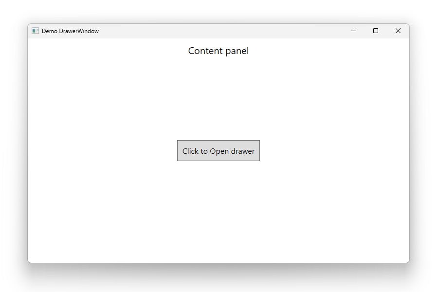
[0] Template part: PART_Drawer, VisualState: Collapsed
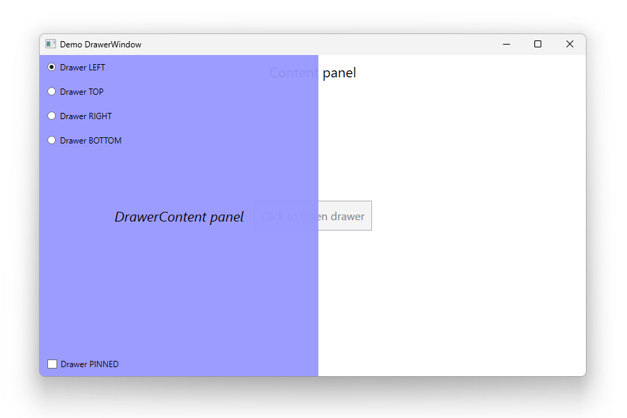
[1] Template part: PART_Drawer, VisualState: Visible
DrawerSide = DrawerSide.LeftDrawerLength = 400
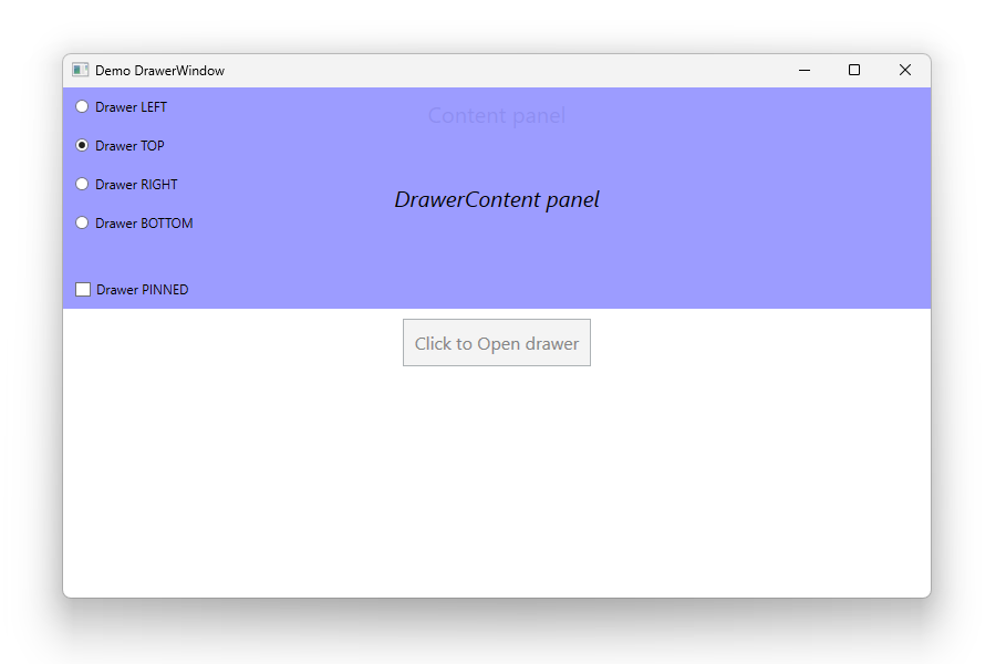
[2] Template part: PART_Drawer, VisualState: Visible
DrawerSide = DrawerSide.TopDrawerLength = 200
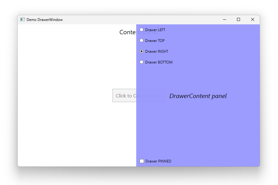
[3] Template part: PART_Drawer, VisualState: Visible
DrawerSide = DrawerSide.RightDrawerLength = 400
[4] Template part: PART_Drawer, VisualState: Visible
DrawerSide = DrawerSide.BottomDrawerLength = 200
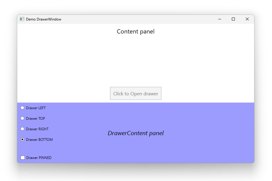
Example demo app source code
The demo app uses WPFX to create the UIElement tree.
The DrawerWindow has two dependency properties for content:
Content: The client area contentDrawerContent: The drawer content
using System.Windows;
using System.Windows.Controls;
using System.Windows.Data;
using System.Windows.Media;
using WpfxCustomControls;
using WpfxCustomControls.DrawerWindowTypes;

namespace Demo_DrawerWindow;

public class MainWindow : DrawerWindow
{
    private Button? _button;

    public MainWindow()
    {
        Title = "Demo DrawerWindow";
        Width = 800;
        Height = 500;
        Content = Build();
        DrawerContent = BuildDrawer();
    }

    private UIElement Build() { ... }

    private UIElement BuildDrawer() { ... }
}
| Product | Versions Compatible and additional computed target framework versions. |
|---|---|
| .NET | net10.0-windows7.0 is compatible. |
-
net10.0-windows7.0
- UserExtensions.Wpfx (>= 0.1.0-alpha.12)
NuGet packages
This package is not used by any NuGet packages.
GitHub repositories
This package is not used by any popular GitHub repositories.
| Version | Downloads | Last Updated |
|---|---|---|
| 0.1.0-alpha.2 | 54 | 9/13/2026 |
| 0.1.0-alpha.1 | 77 | 8/30/2026 |