nutui 1.0.4
dotnet add package nutui --version 1.0.4
NuGet\Install-Package nutui -Version 1.0.4
<PackageReference Include="nutui" Version="1.0.4" />
<PackageVersion Include="nutui" Version="1.0.4" />
<PackageReference Include="nutui" />
paket add nutui --version 1.0.4
#r "nuget: nutui, 1.0.4"
#:package nutui@1.0.4
#addin nuget:?package=nutui&version=1.0.4
#tool nuget:?package=nutui&version=1.0.4
nutui




nutui is a pure C# / .NET terminal‑UI (TUI) framework for building rich, keyboard‑ and mouse‑driven console applications — file managers, dashboards, database browsers, editors, wizards.
It renders 24‑bit truecolor and degrades gracefully to 256‑color, 16‑color‑less monochrome, and ASCII box‑drawing depending on what the terminal (or the SSH session on the other end) can do. There are no native dependencies and no P/Invoke on the render path — just managed code that talks ANSI — so it runs the same on Windows, Linux, and macOS, is safe over SSH, and is NativeAOT‑compatible.
┌ nutui ───────────────────────────────────┐
│                                          │
│   Hello, terminal!  Press Esc to quit.   │
│                                          │
└──────────────────────────────────────────┘
 |
 |
 |
|---|---|---|
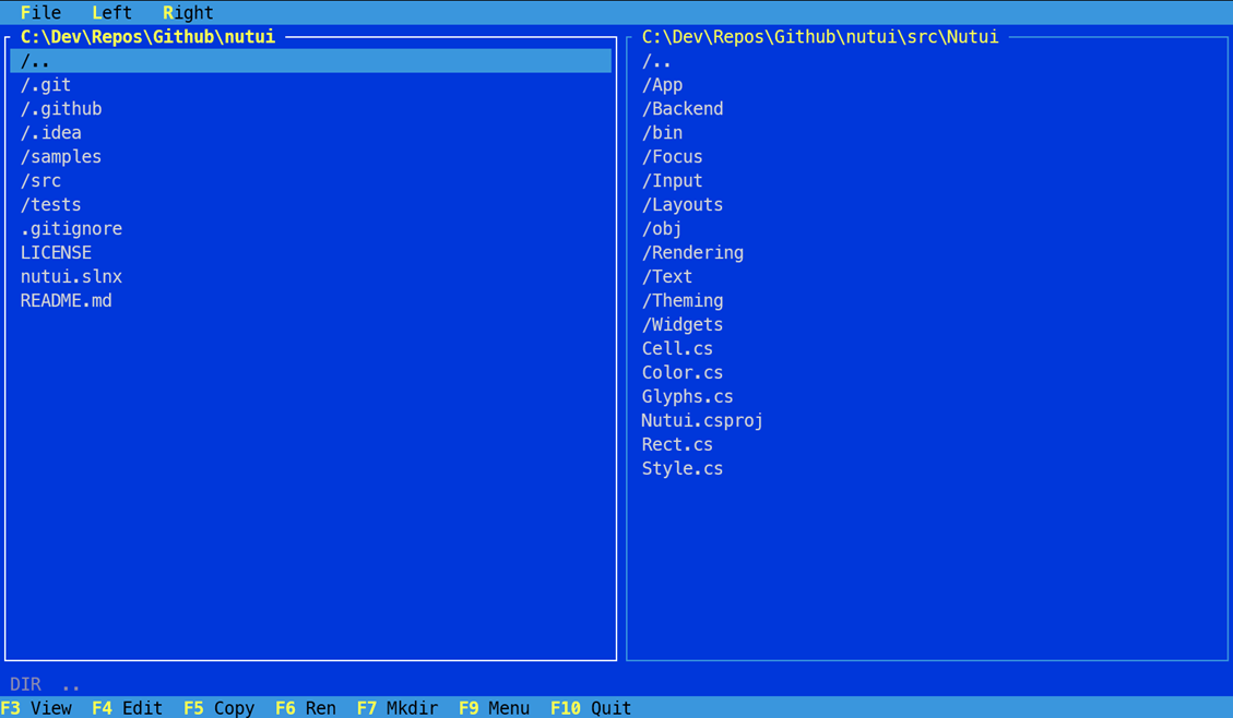
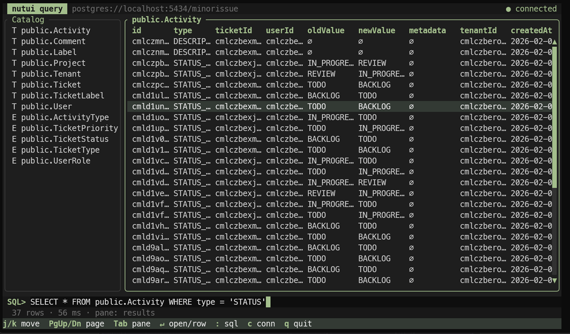
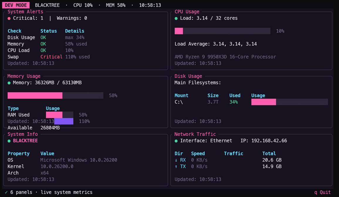
| Commander · DosBlue | Query · Dusk | Dashboard · Bombshell |
Table of contents
- Features
- Installation
- Quick start
- Core concepts
- Documentation
- Samples
- Building from source
- NativeAOT
- Cross‑platform & SSH
- Design philosophy
- License
Features
- Truecolor rendering with automatic degradation to 256‑color / monochrome and Unicode → ASCII box glyphs.
- Diff‑based repaint — only changed cell runs are written each frame; steady state is close to zero allocations.
- Two‑level theming — every widget renders against semantic tokens, so swapping one palette reskins the whole UI. Three built‑in themes; roll your own with a record
with. - A widget toolbox — lists, data grids, dialogs, dropdowns, menus, text/hex viewers and editors, gauges, sparklines, scrollbars, hotkey bars.
- Deterministic layout — a constraint solver (
Length,Percentage,Ratio,Fill,Min) whose splits always sum exactly to the area. - Focus model — nestable focus scopes with modal focus traps; the framework provides the mechanism, your app chooses the policy.
- Keyboard & mouse — a portable VT input parser (SGR mouse, function keys, modifiers) with a safe fallback when no real TTY is present.
- Async‑friendly — a UI dispatcher lets background threads feed widgets without locks.
- Cross‑platform & SSH‑safe, NativeAOT‑ready, no reflection, no native dependencies.
Installation
dotnet add package nutui
nutui targets .NET 10. Add the namespaces you need:
using Nutui;            // Color, Style, Rect, Cell
using Nutui.App;        // NutuiApp, IAppView, IUiDispatcher
using Nutui.Backend;    // ConsoleBackend, TerminalCapabilities
using Nutui.Rendering;  // ScreenBuffer, ColorDepth
using Nutui.Theming;    // Theme, Themes, Palette, BorderType
using Nutui.Widgets;    // Block, ListView, DataGrid, Dialog, ...
using Nutui.Layouts;    // Layout, Constraint
using Nutui.Focus;      // IFocusable, FocusScope, FocusManager
using Nutui.Input;      // KeyEvent, MouseEvent, InputEvent
Quick start
A complete app is an IAppView handed to NutuiApp.Run. Render paints a full‑screen ScreenBuffer; HandleKey returns false to quit.
using System;
using Nutui;
using Nutui.App;
using Nutui.Backend;
using Nutui.Input;
using Nutui.Rendering;
using Nutui.Theming;
using Nutui.Widgets;

var backend = new ConsoleBackend();          // auto-detects terminal capabilities
new NutuiApp(backend).Run(new HelloView());

sealed class HelloView : IAppView
{
    private static readonly Theme Theme = Themes.Dusk;

    public void Render(ScreenBuffer buf)
    {
        var block = Block.Panel(Theme, "nutui", focused: true);
        block.Render(buf.Area, buf);

        var inner = block.Inner(buf.Area);
        var msg = "Hello, terminal!  Press Esc to quit.";
        var x = inner.Left + Math.Max(0, (inner.Width - msg.Length) / 2);
        var y = inner.Top + inner.Height / 2;
        buf.SetString(x, y, msg, Theme.Panel);
    }

    // Return false to quit the run loop.
    public bool HandleKey(KeyEvent key) => !key.Is(ConsoleKey.Escape);
}
NutuiApp.Run enters the alternate screen, hides the cursor, switches the terminal to raw input mode (with a cooked fallback when stdin is redirected), then loops: it renders a frame and re‑renders whenever a key/mouse event arrives, the terminal is resized, or a background producer posts an update. It always restores the terminal on exit, even on exceptions or Ctrl‑C.
Core concepts
| Concept | What it is |
|---|---|
IAppView |
Your application: Render(ScreenBuffer), HandleKey(KeyEvent), optional HandleMouse / OnMounted. |
NutuiApp |
The run loop. Owns a backend and a UI dispatcher. |
ITerminalBackend |
The I/O seam (ConsoleBackend is the built‑in). Init/Present/read‑input/size/shutdown. |
ScreenBuffer |
A grid of Cells (char + Style). Widgets paint into it; the renderer diffs and flushes it. |
Theme / Palette |
Semantic color/border tokens. Widgets never see raw colors — only named roles. |
| Widgets | Plain objects you construct, mutate, and Render(area, buffer). They don't auto‑render. |
Layout / Constraint |
Split a Rect into child rects deterministically. |
FocusManager / FocusScope |
Track which widget is focused; support modal focus traps. |
Two things worth internalizing:
- Widgets are explicit. You call
widget.Render(area, buf)yourself inIAppView.Render. There is no retained tree — you decide layout and paint order every frame. This keeps the model tiny and predictable. - Colors are always 24‑bit in your code (
Color(r,g,b)/Color.FromHex). The renderer degrades them to the terminal's actual depth at the single output choke point — you never branch on capabilities in widget code.
Documentation
The application & run loop
public interface IAppView
{
    void Render(ScreenBuffer buf);                  // paint a full-screen buffer
    bool HandleKey(KeyEvent key);                   // return false to quit
    void HandleMouse(MouseEvent mouse) { }          // optional (default no-op)
    void OnMounted(IUiDispatcher dispatcher) { }    // optional: start background work
}

public sealed class NutuiApp
{
    public NutuiApp(ITerminalBackend backend, int idlePollMs = 16);
    public IUiDispatcher Dispatcher { get; }
    public void Run(IAppView view);
}
ConsoleBackend is the built‑in backend:
public sealed class ConsoleBackend : ITerminalBackend
{
    public ConsoleBackend(TerminalCapabilities? capabilities = null); // null = auto-detect
    public TerminalCapabilities Capabilities { get; }
}
Rendering primitives
public readonly record struct Color(byte R, byte G, byte B);
Color.FromHex("#3A96DD");          // or "3A96DD"

[Flags] public enum CellAttributes { None, Bold, Dim, Italic, Underline, Reverse }

public readonly record struct Style(
    Color? Foreground = null,      // null = inherit
    Color? Background = null,
    CellAttributes Attributes = CellAttributes.None);

public readonly record struct Rect(int X, int Y, int Width, int Height)
{
    // Left, Top, Right, Bottom, IsEmpty, Inner(margin), Inner(h, v), Contains(x, y)
}

public readonly record struct Cell(char Symbol, Style Style);
ScreenBuffer is the drawing surface:
var buf = new ScreenBuffer(width, height);         // optionally a fill Style
buf.Set(x, y, Glyphs.FullBlock, style);             // single cell (clips silently)
buf.Fill(new Rect(0, 0, 10, 3), ' ', style);        // a rectangle
buf.SetString(x, y, "hello", style);                // a run of text
Cell c = buf[x, y];                                 // indexer (throws out of bounds)
Rect area = buf.Area;                               // (0, 0, Width, Height)
Build styles fluently:
var s = new Style(Color.FromHex("#FFFFFF"), Color.FromHex("#0037DA"), CellAttributes.Bold);
var t = Style.Default.Fg(Color.FromHex("#FFFF55")).Plus(CellAttributes.Underline);
Glyphs. Rather than pasting raw box‑drawing/block characters into your code, use the named
constants in Glyphs — blocks, shades, box lines, arrows, and symbols. Every glyph there is covered
by the renderer's ASCII fold, so drawing with them still degrades cleanly on a non‑Unicode terminal.
buf.Set(x, y, Glyphs.FullBlock, style);          // █  (was '█')
buf.Set(x, y, Glyphs.TriangleRight, style);      // ►
buf.SetString(x, y, $"{Glyphs.Bullet} item", style);

// Draw a fractional bar column from the 0..8 vertical fill levels:
var level = Glyphs.VerticalEighths[fraction8];   // " ▁▂▃▄▅▆▇█"[0..8]
Available families: FullBlock, LightShade/MediumShade/DarkShade, the half blocks and
VerticalEighths/HorizontalEighths; box lines Horizontal/Vertical/TopLeft/… /TeeRight/CrossLine;
TriangleUp/Down/Left/Right and ArrowUp/Down/Left/Right; and Bullet, Ellipsis,
Check, Cross, Degree.
Theming
Theming is two levels:
Level 1 — semantic tokens. A Palette names the roles every generic widget renders against; a Theme exposes them as ready‑made Styles:
public sealed record Palette
{
    // Surfaces & text
    public required Color Base, Surface, Text, Muted, Accent { get; init; }
    // Selection / highlight
    public required Color SelectionBg, SelectionText { get; init; }
    // Text inputs
    public required Color InputBg, InputText { get; init; }
    // Modal dialogs (may differ from panels)
    public required Color DialogBg, DialogText, DialogBorder { get; init; }
    // Menus (optional — fall back to panel/selection defaults when null)
    public Color? MenuBg, MenuText, MenuBorder, MenuSelectionBg, MenuSelectionText { get; init; }
    // Borders
    public required Color BorderIdle, BorderFocus { get; init; }
}
Theme turns those into style roles that widgets consume — a sampling:
Desktop  Panel  MutedText  Border(focused)  Title(focused)  Selection
Header   Footer FooterKey  ScrollTrack ScrollThumb  Input InputCaret  Button(focused)
DialogFill DialogBorderStyle DialogTitle DialogLabel
MenuFill MenuBorderStyle MenuSelection MenuKey ...
Because widgets only ever reference these roles, swapping a palette reskins everything at once.
Built‑in themes (Themes.All lists them):
| Theme | Look |
|---|---|
Themes.DosBlue |
Classic DOS file‑manager: deep blue desktop, sky‑blue frames/menus, yellow accents. |
Themes.Dusk |
Modern muted dark, rounded frames, soft green accent. |
Themes.Bombshell |
High‑contrast dark, hot‑pink accent, violet selection. |
Border styles (BorderType): None, Ascii, Single, Rounded, Double, Thick.
A custom theme is just a record copy — override a token or two:
var mine = Themes.Dusk with
{
    Name = "Ocean",
    Palette = Themes.Dusk.Palette with
    {
        Accent      = Color.FromHex("#38BDF8"),
        SelectionBg = Color.FromHex("#0EA5E9"),
    },
};
Widgets
Every widget is a plain object you construct (often via a ForTheme factory), mutate, and render with widget.Render(area, buffer).
| Widget | Purpose | Construct with |
|---|---|---|
Block |
Bordered, optionally‑titled panel — the workhorse container | Block.Panel(theme, title?, focused?) |
ListView |
Scrollable single‑selection list (+ scrollbar) | ListView.ForTheme(theme, items, focused?) |
DataGrid |
Table with fixed‑width columns, header row, ellipsis truncation | DataGrid.ForTheme(theme, columns, rows, focused?) |
TextField |
Single‑line editable input (caret, h‑scroll) | TextField.ForTheme(theme, label) |
Button |
Focusable push button | new Button { Text = "OK" } |
Dialog |
Modal form with fields + OK/Cancel (focus trap) | new Dialog(theme, title, fields…) |
Dropdown |
Focusable combo box with a scrollable popup | Dropdown.ForTheme(theme, label?, placeholder?) |
MenuBar / Menu / MenuItem |
Horizontal menu bar with dropdowns (F9 / Alt) | new MenuBar(new Menu("File", items…)) |
TextViewer |
Read‑only text with syntax highlighting, gutter, scrollbar | TextViewer.ForTheme(theme) |
TextEditor |
Multi‑line plain‑text editor | TextEditor.ForTheme(theme) |
HexView |
Hex dump viewer/editor (offset + hex + ASCII panes) | HexView.ForTheme(theme) |
Gauge |
Horizontal progress bar with optional % label | Gauge.ForTheme(theme) |
Sparkline |
One‑row bar chart (eighth‑block glyphs) | Sparkline.ForTheme(theme) |
ScrollBar |
Vertical scrollbar with arrows + thumb | ScrollBar.ForTheme(theme, total, visible, offset) |
HotkeyBar |
Single‑row footer of hotkey hints | HotkeyBar.ForTheme(theme, hints) |
A list and a footer:
var theme = Themes.DosBlue;

var list = ListView.ForTheme(theme, new[] { "one", "two", "three" });
list.Render(new Rect(0, 0, 20, 10), buf);
list.MoveDown();                 // also MoveUp(), Selected, etc.

var footer = HotkeyBar.ForTheme(theme, new[]
{
    new HotkeyHint("F3", "View"),
    new HotkeyHint("F10", "Quit"),
});
footer.Render(new Rect(0, 23, 80, 1), buf);
A data grid:
var columns = new[] { new GridColumn("Name", 20), new GridColumn("Size", 10) };
var rows = new[]
{
    new[] { "README.md", "15917" },
    new[] { "LICENSE",   "1107"  },
};
var grid = DataGrid.ForTheme(theme, columns, rows);
grid.Render(new Rect(0, 0, 32, 12), buf);
A menu bar (open with F9 / Alt+letter; activation raises OnActivate with the item id):
var menu = new MenuBar(
    new Menu("File",
        new MenuItem("View", "view", "F3"),
        new MenuItem("Edit", "edit", "F4"),
        MenuItem.Separator,
        new MenuItem("Quit", "quit", "F10")));
menu.OnActivate = id => { if (id == "quit") { /* … */ } };
menu.Render(new Rect(0, 0, 80, 1), buf);   // draws the bar (+ dropdown if open)
A modal dialog (a capturing focus scope traps Tab; Esc cancels, Enter confirms):
var dialog = new Dialog(theme, "Connect",
    TextField.ForTheme(theme, "Host"),
    TextField.ForTheme(theme, "Port"));

// In HandleKey: forward keys while open, then read the result.
dialog.HandleKey(key);
if (!dialog.IsOpen && dialog.Result == DialogResult.Ok) { /* read fields */ }
Layout
Layout splits a Rect into child rects using constraints that always sum exactly to the area (deterministic largest‑remainder distribution):
var rows = Layout.Vertical(
        Constraint.Length(1),   // fixed: menu bar
        Constraint.Fill(1),     // takes the rest
        Constraint.Length(1))   // fixed: status bar
    .Split(area);
var (menu, body, status) = (rows[0], rows[1], rows[2]);

var cols = Layout.Horizontal(Constraint.Percentage(50), Constraint.Percentage(50))
    .WithSpacing(1)
    .Split(body);
Constraint kinds: Constraint.Length(cells), Percentage(pct), Ratio(num, den), Fill(weight = 1), Min(cells). There's also an allocation‑free Split(area, Span<Rect> dest) overload for hot paths.
Focus
The framework provides the mechanism; your app chooses the policy (which key moves between panes vs. fields).
public interface IFocusable { bool Focused { get; set; } }
Build a tree of FocusScopes (mark one capturing: true to make it a modal trap that Tab cannot escape), then drive it with a FocusManager:
var scope = new FocusScope()
    .Add(leftList)
    .Add(rightList);

var focus = new FocusManager(scope);
focus.Next();        // Tab within traps, wraps
focus.Prev();        // Shift+Tab
focus.NextGlobal();  // ignore traps
focus.Focus(rightList);
var current = focus.Current;
ListView, DataGrid, TextField, Button, and Dropdown implement IFocusable.
Input
The run loop routes each event to HandleKey or HandleMouse. If you read raw events yourself, an InputEvent discriminates the two:
public readonly record struct KeyEvent(ConsoleKey Key, char Char, bool Ctrl, bool Alt, bool Shift)
{
    public bool Is(ConsoleKey key);   // key.Is(ConsoleKey.Enter)
    public bool Is(char ch);          // key.Is('q')
    public static KeyEvent Type(char ch);
    public static KeyEvent Of(ConsoleKey key, char ch = '\0');
}

public readonly record struct MouseEvent(int X, int Y, MouseButton Button,
    MouseEventKind Kind, bool Ctrl, bool Alt, bool Shift)
{
    public bool IsWheel { get; }
    public int WheelDelta { get; }    // +1 up, -1 down, 0 otherwise
}

if (ev.IsKey && ev.Key.Is(ConsoleKey.Enter)) { /* … */ }
if (ev.IsMouse && ev.Mouse.IsWheel)          { int d = ev.Mouse.WheelDelta; }
MouseButton: None, Left, Right, Middle, WheelUp, WheelDown. MouseEventKind: Down, Up, Move, Drag. Mouse coordinates are 0‑based cells. Mouse reporting is enabled only when a real console is present; headless/redirected runs simply never call HandleMouse.
Async & background updates
Start background producers in OnMounted and marshal their results back to the UI thread with the dispatcher — no locks in widget code:
public void OnMounted(IUiDispatcher dispatcher)
{
    _ = Task.Run(async () =>
    {
        while (true)
        {
            var rows = await LoadRowsAsync();
            dispatcher.Post(() => _grid.Rows = rows);  // runs on the UI thread; triggers a redraw
            await Task.Delay(1000);
        }
    });
}
The loop wakes on a producer signal, a key/mouse event, or the idle poll, drains posted mutations on the UI thread, and repaints only if something changed.
Terminal capabilities & graceful degradation
nutui detects what the terminal can do from the environment (NO_COLOR, COLORTERM, TERM, LANG) and degrades at the single output choke point — your widget code never branches on it.
public enum ColorDepth { None, Truecolor, Ansi256 }

public readonly record struct TerminalCapabilities(ColorDepth Depth, bool Unicode)
{
    public static TerminalCapabilities Detect();
}

var caps = TerminalCapabilities.Detect();
var backend = new ConsoleBackend(caps);   // or new ConsoleBackend() to auto-detect
- Color collapses
Truecolor → Ansi256 → None(attributes only) as needed. - Unicode = false folds box‑drawing/blocks/arrows down to ASCII (
┌│└ → +|+,█ → #, …), so adumbterminal orNO_COLORsession still renders a clean, readable UI.
Custom backends
All terminal I/O sits behind a narrow interface, so you can host nutui somewhere other than the console (tests, a recording harness, a remote pipe) without touching widget code:
public interface ITerminalBackend
{
    (int Width, int Height) Size { get; }
    void Init();
    void Present(ScreenBuffer frame);
    bool TryReadInput(out InputEvent ev);
    void Shutdown();
}
Samples
Each sample has a headless --snapshot path (renders one frame and exits) for CI and screenshots.
dotnet run --project samples/Commander        # dual-pane file manager (DosBlue theme)
dotnet run --project samples/Query            # Postgres browser (catalog + results grid)
dotnet run --project samples/Dashboard        # live system monitor (gauges, sparklines)
dotnet run --project samples/ThemeGallery     # the same panel across every built-in theme

dotnet run --project samples/Commander -- --snapshot     # one static frame, no TTY needed
| Sample | Demonstrates |
|---|---|
| Commander | Real‑filesystem dual‑pane browser, menu bar wired to F‑keys, copy/rename/mkdir dialogs, F3 view (text or hex) / F4 edit, focus switching between panes. |
| Query | A real Npgsql connection, a connect dialog with a database dropdown, a catalog sidebar, streaming result rows fed via the dispatcher, row‑detail popups. Pass --conn "Host=…;…" or set NUTUI_PG. |
| Dashboard | Auto‑refreshing 2×3 panel of CPU / memory / disk / network / system metrics using gauges, a sparkline, and semantic status colors — driven by a background timer + dispatcher. |
| ThemeGallery | A Level‑1 token showcase: one panel rendered with every built‑in theme. |
Building from source
git clone https://github.com/JessieWadman/nutui
cd nutui

dotnet build   nutui.slnx -c Release      # build library + samples + tests
dotnet test    nutui.slnx -c Release      # run the xUnit suite
Requires the .NET 10 SDK. The solution file is nutui.slnx.
Project layout:
src/Nutui            the framework (this is the NuGet package)
tests/Nutui.Tests    xUnit tests
samples/             Commander, Query, Dashboard, ThemeGallery
NativeAOT
The library is IsAotCompatible — no reflection, no dynamic code. Publish a sample as a small self‑contained native binary:
dotnet publish samples/Commander -c Release -r linux-x64 \
    -p:PublishAot=true -p:InvariantGlobalization=true
Cross‑platform & SSH
nutui runs on Windows, Linux, and macOS, and is designed to work over SSH to whatever terminal is on the other end:
- Output is plain ANSI written as raw bytes — no console‑specific APIs on the render path.
- Raw input mode is set via
SetConsoleModeon Windows andtermioson Unix, with a cooked fallback when stdin is redirected (headless/CI), so tests and pipelines still work. - On Unix the keyboard/mouse byte stream is read directly from the file descriptor (not through
System.Console, which interferes with raw TTY input), so keys, arrows, function keys, and mouse escapes all arrive correctly over a real pseudo‑terminal. - Capability detection + degradation mean a
TERM=dumborNO_COLORsession still gets a usable, correctly‑bordered UI.
On minimal Linux hosts without ICU, publish/run with
InvariantGlobalization(orDOTNET_SYSTEM_GLOBALIZATION_INVARIANT=1) as you would for any .NET app.
Design philosophy
- Pure C#, no native core. Terminal work at TUI scale is ANSI text plus a couple of OS syscalls (
termios/ console mode) that .NET reaches natively — not a case for a Rust engine and per‑platform binaries. Staying managed keeps the package a single dependency‑free assembly that AOT‑compiles cleanly. - A narrow I/O seam. Everything above
ITerminalBackendis pure rendering and state; the backend is the only thing that touches the outside world. Swap it for tests, recordings, or an alternate transport. - Two‑level theming. Widgets render only against semantic tokens, so a theme is portable data and a reskin is a one‑line palette swap.
- Mechanism, not magic. No retained widget tree, no hidden reflection. You lay out and paint every frame; the framework gives you fast primitives (diffing, a constraint solver, a focus model) and stays out of the way.
License
MIT © 2026 Jessie Wadman
| Product | Versions Compatible and additional computed target framework versions. |
|---|---|
| .NET | net10.0 is compatible. net10.0-android was computed. net10.0-browser was computed. net10.0-ios was computed. net10.0-maccatalyst was computed. net10.0-macos was computed. net10.0-tvos was computed. net10.0-windows was computed. |
-
net10.0
- No dependencies.
NuGet packages
This package is not used by any NuGet packages.
GitHub repositories
This package is not used by any popular GitHub repositories.
| Version | Downloads | Last Updated |
|---|---|---|
| 1.0.4 | 399 | 7/20/2026 |