uHeroSlider 1.4.0
dotnet add package uHeroSlider --version 1.4.0
NuGet\Install-Package uHeroSlider -Version 1.4.0
<PackageReference Include="uHeroSlider" Version="1.4.0" />
<PackageVersion Include="uHeroSlider" Version="1.4.0" />
<PackageReference Include="uHeroSlider" />
paket add uHeroSlider --version 1.4.0
#r "nuget: uHeroSlider, 1.4.0"
#:package uHeroSlider@1.4.0
#addin nuget:?package=uHeroSlider&version=1.4.0
#tool nuget:?package=uHeroSlider&version=1.4.0
uHeroSlider
Advanced hero slider component for Umbraco 17+ with animations and responsive design.
Features
- ✅ Image and video support
- ✅ Auto-slide with configurable intervals
- ✅ Responsive design (mobile, tablet, desktop)
- ✅ Fallback images for video errors
- ✅ Block List-based unlimited slides
- ✅ Optional shuffle of slide order on each page load
- ✅ Optional video controls / sound: native controls on background HTML5 videos; YouTube/Vimeo embed parameters when enabled (browser and provider policies apply)
- ✅ Swipe/Touch Sensitivity Controls: Configuration for swipe resistance and velocity on mobile devices
- ✅ RTL (Right-to-Left) Support: Automatic reversal of slide transition directions and navigation placement for RTL languages
- ✅ Scroll-To-Next Arrow: Floating scroll-to-next arrow with smart layout/thumbnail-skipping navigation, offset spacing, and mobile-responsive scaling
- ✅ Adaptive Height (Auto-Height): Dynamic container sizing to match the content height of the active slide. Layout adjustments ensure clean absolute-overlay separation with responsive clearances.
- ✅ Play Video Once: Configure slides to stop background videos on the last frame instead of looping infinitely, automatically integrated with the slider timing.
- ✅ Custom Slide Transitions: Support for transitions including Flip, Slide Down, Slide Up, Zoom Rotate, Crossfade, Coverflow, Fade, and Slide.
Installation
Via NuGet
dotnet add package uHeroSlider
Prerequisites
- Umbraco 17.1.0+
- .NET 10.0
Quick Start
1. Backend Setup
Package automatically provisions schema on startup. Create a "heroSlider" document in Umbraco:
- Go to Content section
- Create new heroSlider document
- Add slides using the Block List editor
- Configure slider settings (auto-slide, loop, speed, etc.)
- Save & Publish
2. Frontend Usage
Include the partial view in your layout or template:
@await Html.PartialAsync("~/Views/Partials/HeroSlider.cshtml")
The view automatically fetches the heroSlider content and renders it.
Slide Properties
Each slide in the Block List supports:
| Property | Description |
|---|---|
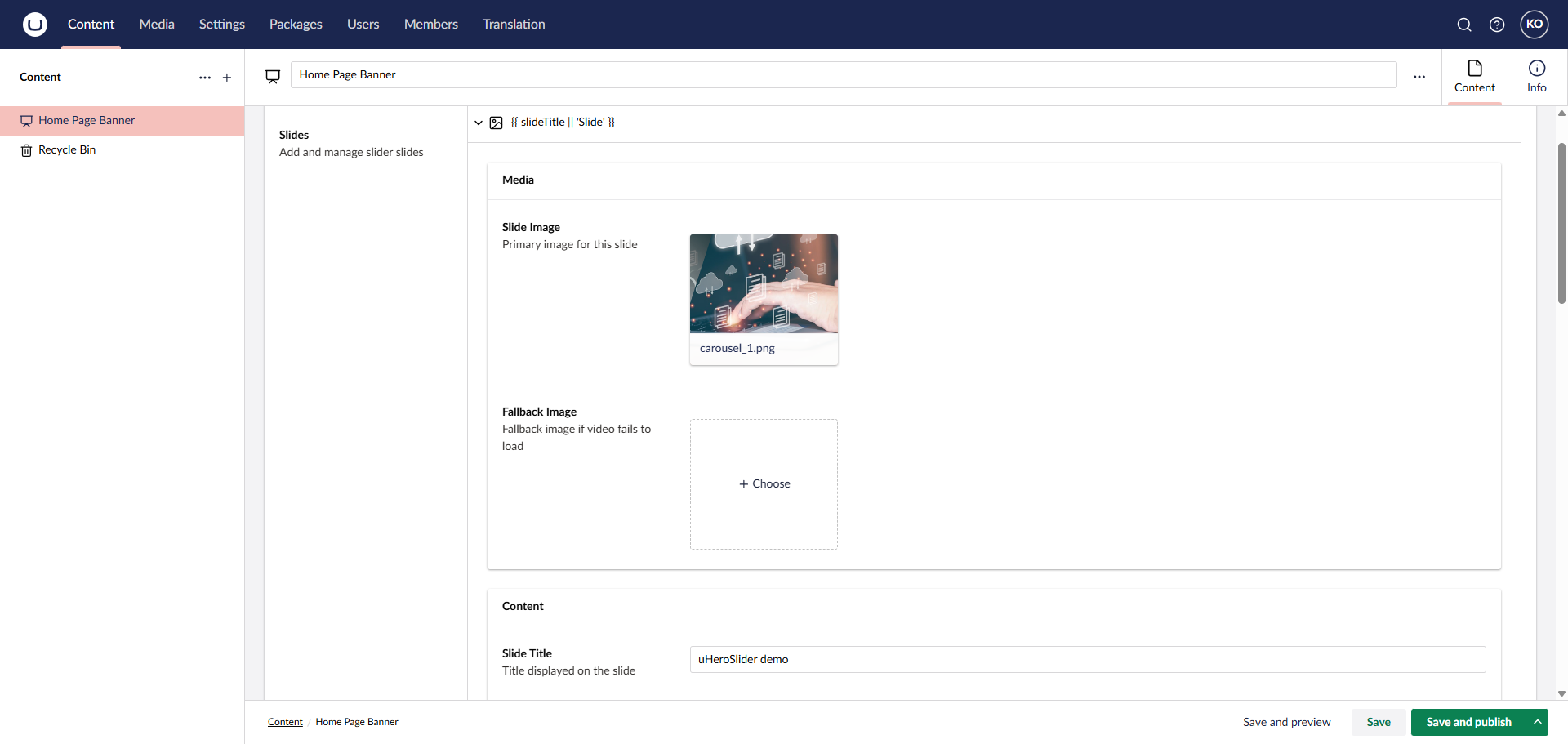
| Slide Image | Primary image for the slide |
| Fallback Image | Shown if video fails to load |
| Slide Title | Title displayed on slide |
| Slide Description | Description text |
| Link URL | Optional link destination |
| Alt Text | Accessibility text |
| Button Text | Button value |
| Button Link | Button Click URL |
| Overlay Color | Tint color for the slide background |
| Overlay Opacity | Opacity level (0–100, defaults to 40) |
| Overlay Gradient | Gradient overlays (None, Vertical Bottom-to-Top, Top-to-Bottom, Horizontal Left-to-Right, Right-to-Left, Radial) |
| Overlay Vignette | Enables radial vignette edge darkening |
| Overlay Pattern | Overlay pattern overlay grid (None, Dots, Lines, Grid) |
| Play Video Once | Plays the video once and stops on the last frame instead of looping infinitely |
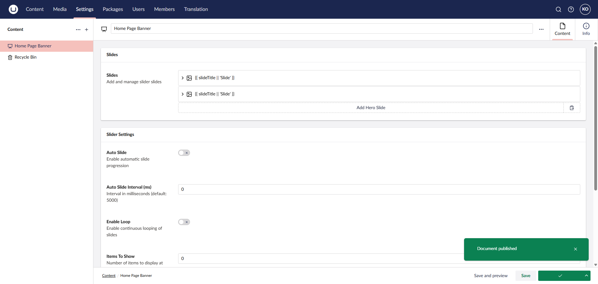
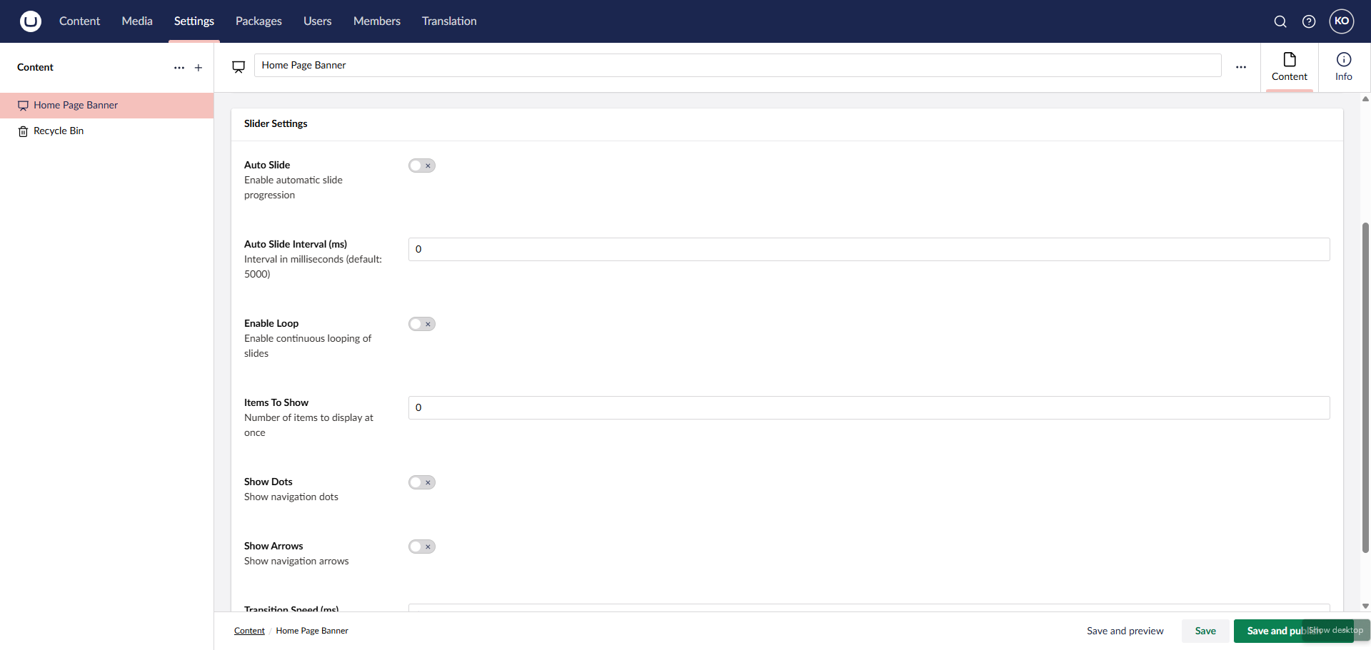
Slider Settings
Configure at the slider level:
| Setting | Description | Default |
|---|---|---|
| Auto Slide | Automatic progression | false |
| Auto Slide Interval | Time between slides (ms) | 5000 |
| Enable Loop | Continuous looping | true |
| Items To Show | Slides visible at once | 1 |
| Show Dots | Navigation dots | true |
| Show Arrows | Navigation arrows | true |
| Transition Speed | Animation speed (ms) | 300 |
| Show Progress Bar | Animated progress bar during auto-slide | false |
| Shuffle Slide Order | Randomize slide order on each page load (partial + GetActiveSlides when using the model) |
false |
| Show Video Controls / Sound | Adds native controls on autoplay background <video> slides; for YouTube/Vimeo, adds autoplay/muted/controls query parameters to the iframe src |
false |
| Touch Sensitivity | Adjusts swipe resistance and velocity on mobile (prevents accidental changes) | 1.0 |
| Enable RTL | Reverses transition direction and navigation for RTL languages | false |
| Show Scroll Arrow | Displays a scroll-to-next section arrow | false |
| Adaptive Height | Dynamically scales slider height to fit the active slide's height | false |
| Transition Type | Transition animation style (Slide, Fade, Zoom, Crossfade, Coverflow, Flip, Slide Up, Slide Down, Zoom Rotate) | Slide |
Video controls and sound
When Show Video Controls / Sound is off, hero videos keep the previous minimal embed/HTML5 behaviour. When it is on:
- Slide image as video file (MP4/WebM/etc.): the
<video>element includes controls while remainingautoplayandmutedfor policy reasons; visitors can use the browser controls to adjust volume or unmute where the browser allows. - YouTube / Vimeo (
videoUrl): the iframe URL includes provider parameters such as autoplay, muted, and controls so the embedded player chrome can be used. Actual playback and unmute behaviour still depend on the provider, embed settings, and the visitor’s browser. - The progress bar is hidden automatically on video slides only when this toggle is on, so hovering the carousel does not half-pause an invisible bar while the video plays.
- HTML5
<video>slides: auto-advance is paused while the video is playing and restarts from a full interval afterpauseorended. Withloop, the slide typically stays on that video until the visitor pauses playback or uses navigation. YouTube/Vimeo iframes are not tied to carousel timing (noplaying/pausehooks without provider APIs).
Accessibility
- The carousel renders as a region with a fixed
aria-label="Hero carousel"andtabindex="0", so keyboard users can focus the slider and operate it directly. - Arrow keys: focus the carousel (or navigate with prev/next arrows and dots); Left / Right change slides unless focus is inside a link, editable field, or form control inside a slide (so embedded links and CTAs keep normal behaviour).
- Home / End: jump to the first or last slide.
- Space: toggles autoplay only when focus is on the carousel wrapper itself (not on links or buttons inside a slide), and only when Auto Slide is enabled in Umbraco.
- Dots expose
aria-labelandaria-currenton the active dot; thumbnail strip usesaria-currentand labeled buttons. aria-live="polite"announces the slide position (and slide title when set) after each transition.- If the visitor has
prefers-reduced-motion: reduce, autoplay does not start initially (even when Auto Slide is on); they can still start it with Space when focus is on the carousel wrapper.
Progress Bar
When Auto Slide is enabled and Show Progress Bar is toggled on, a thin animated bar appears at the top of the slider. It fills from left to right over the configured Auto Slide Interval, giving visitors a visual cue of when the next slide will appear.
Behaviour
- Fills left → right over the full auto-slide interval
- Pauses automatically when the user hovers over the slider
- Resets on every slide change
- Shows as a static full-width bar when auto-slide is disabled (decorative only)
CSS Classes
| Class | Element |
|---|---|
.slider-progress-bar |
Outer progress bar container |
.slider-progress-bar.top |
Positions the bar at the top of the slider |
.progress-bar-fill |
The animated fill element |
.is-animating |
Applied to .progress-bar-fill while animating |
Advanced Media Overlays
Each slide supports rich overlay styles to enhance text contrast and visual appeal:
- Base Colors: Custom overlay tint colors configurable directly in the backoffice.
- Opacity Controls: Smooth percentage opacity slider (0–100, defaults to 40) mapped to CSS Custom Properties for clean rendering.
- Gradient Overlays:
- Vertical (Bottom to Top / Top to Bottom)
- Horizontal (Left to Right / Right to Left)
- Radial Gradients
- Vignette Effect: Adds dark radial vignette edges to focus the viewer's eye on the slide content.
- Pattern Textures: Overlay subtle geometric pattern meshes:
- Dots Pattern: Subtle dot mesh.
- Lines Pattern: Dynamic diagonal striping.
- Grid Pattern: Clean architectural layout grids.
RTL Support
When Enable RTL is toggled on, the slider automatically adapts for Right-to-Left languages:
- Transition Direction: Slide transitions are reversed (next slide appears from the left).
- Navigation Placement: Navigation arrows and dots are mirrored to match RTL reading patterns.
- Content Alignment: Slide titles and descriptions automatically align to the right.
Touch Sensitivity
The Touch Sensitivity setting allows you to configure swipe resistance and velocity on mobile devices. This is crucial for improving user experience by preventing accidental slide changes when users are simply trying to scroll down the page.
- Swipe Resistance: Higher values make the slider more "stiff," requiring a more intentional gesture to trigger a slide change.
- Velocity Tracking: Fine-tunes how quickly the slider responds to fast flicking motions.
- Vertical Scroll Protection: Ensures that vertical page scrolling remains fluid without being interrupted by hypersensitive horizontal slide triggers.
Scroll-To-Next Section Arrow
When Show Scroll Arrow is enabled in the slider settings:
- Smart Sibling Navigation: Clicking the arrow smoothly scrolls to the next actual content section on the page, automatically skipping the thumbnails strip (if enabled) as well as script/style blocks.
- Smooth Scroll with Spacing Offset: Uses a manual window scroll calculation with a +50px depth offset to ensure the target section's top is nicely positioned in the viewport without being cut off or obscured by sticky headers.
- End-to-End Mobile Responsiveness: The arrow button automatically scales down to a compact 36px size with a 20px icon on small screens (max-width: 768px) for clean integration, and the navigation dots dynamically shift up to prevent any overlap.
Customization
CSS Styling
Override styles by targeting these classes:
.hero-slider { }           /* Main container */
.hero-slide { }            /* Individual slide */
.slide-content-overlay { } /* Content overlay */
.owl-nav { }               /* Navigation arrows */
.owl-dots { }              /* Navigation dots */
Animations
Default animation is fadeIn. All animations use CSS transforms for smooth performance.
Browser Support
- Chrome 90+
- Firefox 88+
- Safari 14+
- Edge 90+
- Mobile browsers (iOS 12+, Android Chrome)
Troubleshooting
Slider not showing?
- Verify
heroSliderdocument exists and is published - Check that slides are added and published
- Inspect browser console for errors
Progress bar not appearing?
- Ensure Auto Slide is enabled — the progress bar requires auto-slide to animate
- Confirm Show Progress Bar is toggled on in Slider Settings
- The bar renders above the slider (
.slider-progress-bar.top); check nothing in your CSS is hiding it
Videos not playing?
- Verify video URL is correct and accessible
- Check browser autoplay policy
- Ensure fallback image is provided
Support
Author: Atharva IT Services Pvt. Ltd.
Email: contact@atharvaits.com
License
Proprietary - See LICENSE file for details
Steps to Use
1. Initial Setup
After installing the package, initialize your new backoffice project.
2. Configure Master Layout
Go to the Settings tab and open your Master.cshtml (or main layout file).
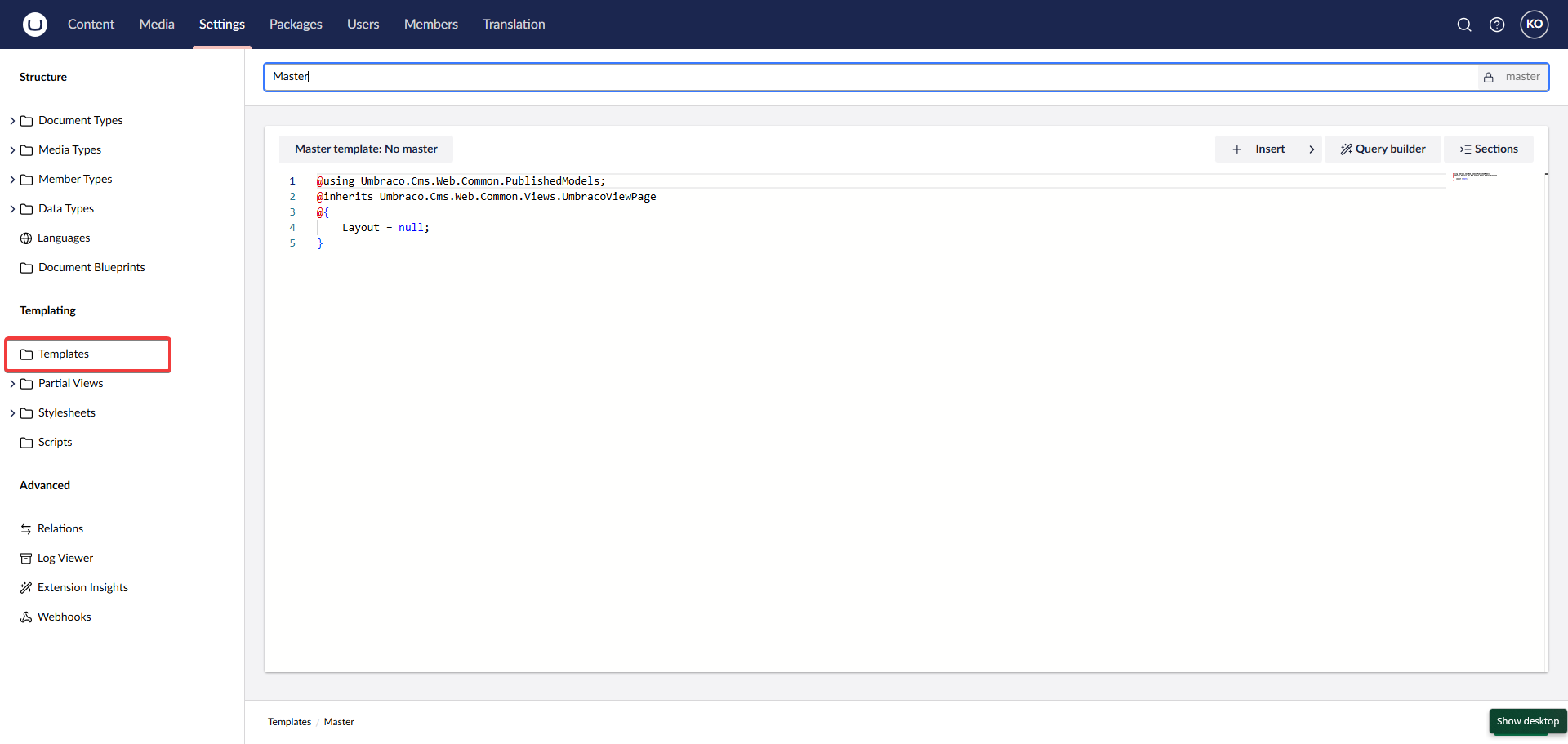
Add the required CSS reference in the <head>:
<link rel="stylesheet" href="~/css/hero-slider.css" />
Ensure your Master.cshtml looks similar to this:
@inherits Umbraco.Cms.Web.Common.Views.UmbracoViewPage
@{
    Layout = null;
}
<!DOCTYPE html>
<html>
<head>
    <meta charset="utf-8" />
    <title>@ViewBag.Title</title>
    <meta name="viewport" content="width=device-width, initial-scale=1" />
    <link rel="stylesheet" href="~/App_Plugins/uHeroSlider/content/wwwroot/css/hero-slider.css" />
</head>
<body>
    <header>
        <h1>Site Header</h1>
    </header>

    @RenderBody()
</body>
</html>
3. Assign Template to Document Type
To render the page correctly, you need to assign your Master template to your Document Type.
- Go to Settings section.
- Expand Document Types.
- Select your document type (e.g., Home or Hero Slider Page).
- Click on Permissions (or Structure in older versions).
- Enabling Allow as root if this is your homepage.
- Under Allowed Templates, select your
Mastertemplate (or the specific template where you added the CSS). - Save the document type.
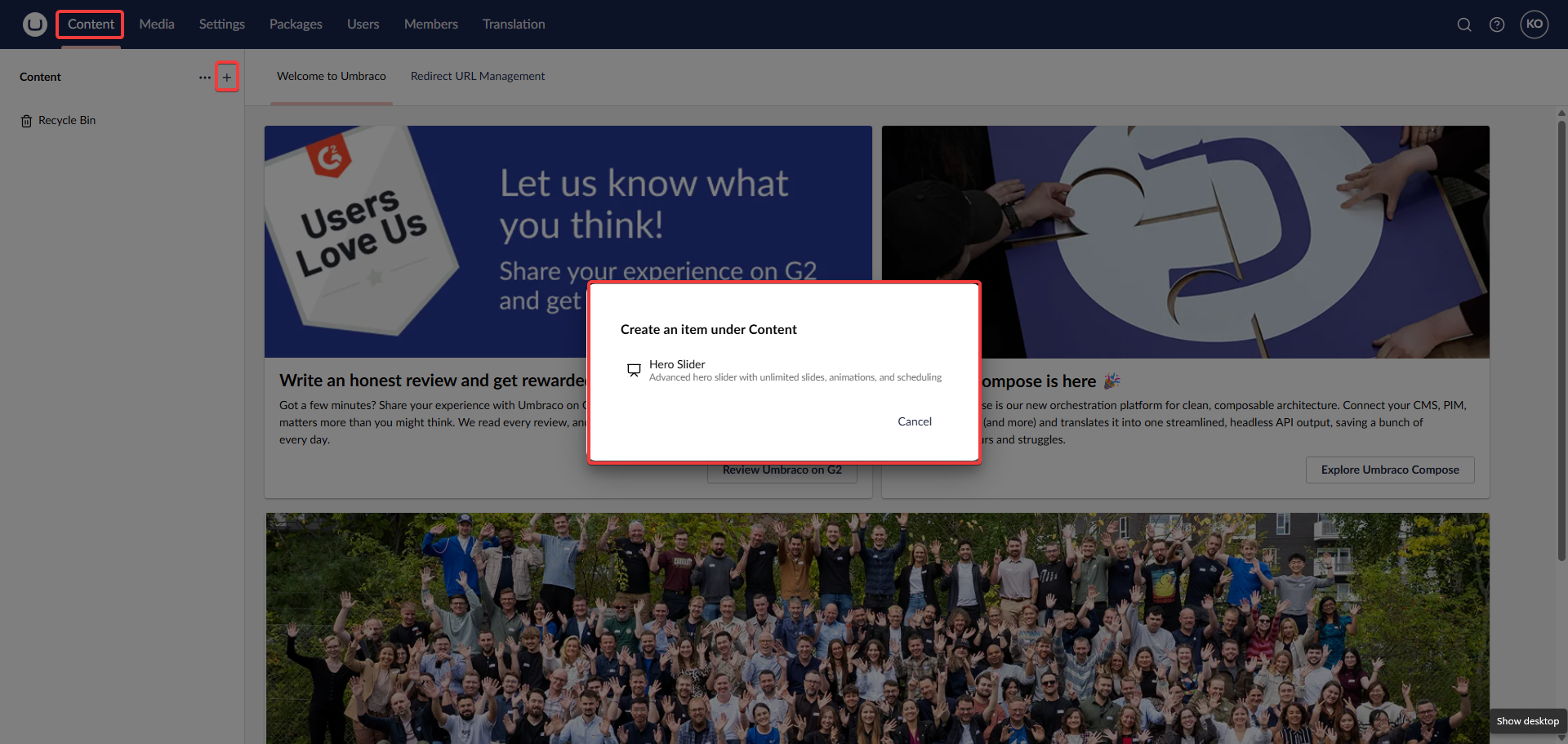
4. Add Hero Document
Go to the Content tab and create a new Hero Slider document.
5. Render in View
In your view (e.g., Home.cshtml), render the hero slider partial:
@await Html.PartialAsync("~/App_Plugins/uHeroSlider/content/Views/Partials/HeroSlider.cshtml")
6. Configure Slides
Click on the Slides block list editor to add your slides.
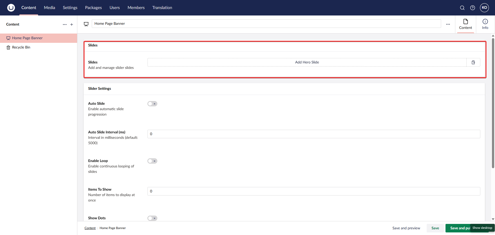
Populate the slide details (Image, Title, Description, Buttons, etc.).
7. Publish
Save and publish your changes.
You can also specific global settings like Loop, Auto-Slide, and Speed.
Final Result
Your slider should now be working correctly!

Links
🤝 Support
For support, feature requests, or bug reports:
- Website: https://www.atharvaits.com
- Email: contact@atharvaits.com
- Company: Atharva IT Services Pvt. Ltd.
📄 License
Copyright © Atharva IT Services Pvt. Ltd.
This package is free to use for the Umbraco community.
🏢 About Atharva IT Services
Atharva IT Services Pvt. Ltd. a global software development company in Ahmedabad, excels in e-commerce solutions, web development, and software testing.
Made with ❤️ by Atharva IT Services
| Product | Versions Compatible and additional computed target framework versions. |
|---|---|
| .NET | net10.0 is compatible. net10.0-android was computed. net10.0-browser was computed. net10.0-ios was computed. net10.0-maccatalyst was computed. net10.0-macos was computed. net10.0-tvos was computed. net10.0-windows was computed. |
-
net10.0
- Umbraco.Cms.Infrastructure (>= 17.1.0)
- Umbraco.Cms.Web.Common (>= 17.1.0)
- Umbraco.Cms.Web.Website (>= 17.1.0)
NuGet packages
This package is not used by any NuGet packages.
GitHub repositories
This package is not used by any popular GitHub repositories.