BlazorTUI 1.0.1
dotnet add package BlazorTUI --version 1.0.1
NuGet\Install-Package BlazorTUI -Version 1.0.1
<PackageReference Include="BlazorTUI" Version="1.0.1" />
<PackageVersion Include="BlazorTUI" Version="1.0.1" />
<PackageReference Include="BlazorTUI" />
paket add BlazorTUI --version 1.0.1
#r "nuget: BlazorTUI, 1.0.1"
#:package BlazorTUI@1.0.1
#addin nuget:?package=BlazorTUI&version=1.0.1
#tool nuget:?package=BlazorTUI&version=1.0.1
BlazorTUI
BlazorTUI is a Razor Class Library for building retro text user interfaces in Blazor Server applications. It provides a fixed-size character grid with keyboard and mouse interaction, nested layouts, menus, dialogs, colors, and animated controls.


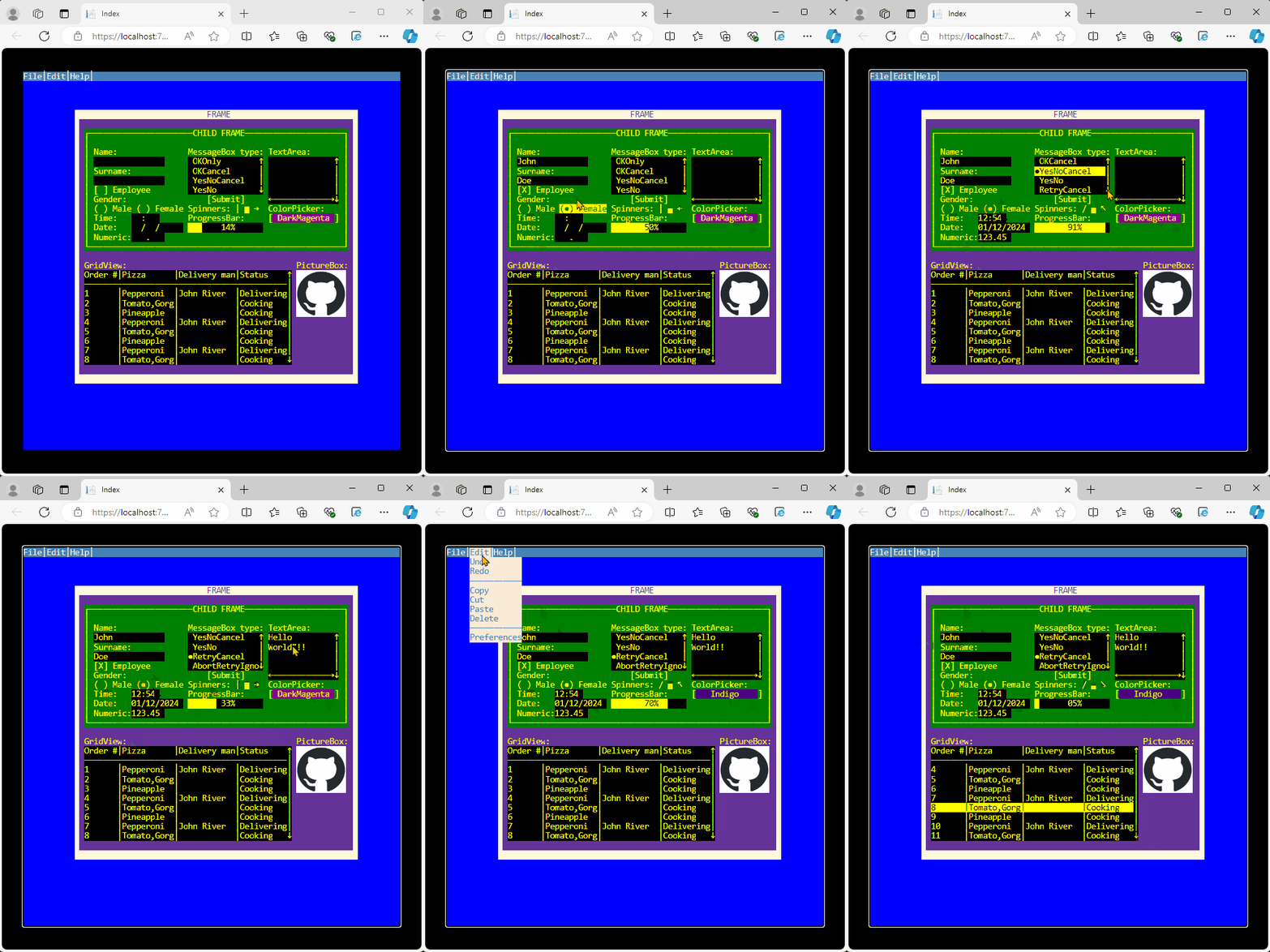
Features
- Character-cell rendering with foreground and background colors.
- Nested frames and split panels with relative coordinates and z-order.
- Keyboard focus,
Tab/Shift+Tabnavigation, and mouse interaction. - Additive mouse drag gestures for splitters, grid columns, list ranges, scrollbars, and calendars.
- Required fields, custom validation rules, inline error messages, and first-invalid focus.
- Menu bars with shortcuts and keyboard navigation.
- Modal dialogs and configurable message boxes.
- Status bars for persistent messages, shortcuts, and context.
- Optional virtual data providers for large lists, grids, trees, and command palettes.
- Responsive terminal scaling.
Requirements
- A Blazor Server application.
- The .NET 10 SDK.
Installation
Install BlazorTUI from NuGet:
dotnet add package BlazorTUI
Optionally add the analyzer package to catch common BlazorTUI mistakes while you code:
dotnet add package BlazorTUI.Analyzers
For project files, keep it private so it does not flow transitively to consumers:
<PackageReference Include="BlazorTUI.Analyzers" Version="1.0.0" PrivateAssets="all" />
The analyzer package currently reports:
BTUI001: duplicate control or container names in the analyzed scope.BTUI002: invalid width, height, or length literals.BTUI003: duplicate menu, item, or tree node names in the analyzed scope.BTUI004:SetFocustargets that do not match a control created in the analyzed scope.
Quick start
Add the BlazorTUI namespace to a Razor page, create a Screen, and render it with the component:
@page "/terminal"
@using global::BlazorTUI.TUI
@using Color = System.Drawing.Color

<BlazorTUI.BlazorTUI Screen="@screen" />

@code {
    private readonly Screen screen = CreateScreen();

    private static Screen CreateScreen()
    {
        var screen = new Screen(80, 40);

        var frame = new Frame(
            "mainFrame",
            "CUSTOMER",
            12,
            5,
            56,
            12,
            Frame.BorderStyle.Line,
            Color.Yellow,
            Color.DarkBlue);

        screen.TopContainer.AddContainer(frame);

        frame.AddControl(new Label(
            "nameLabel", "Name:", 2, 2, 12, Color.White, Color.DarkBlue));

        frame.AddControl(new TextBox(
            "nameInput", "", 14, 2, 24, Color.Yellow, Color.Black));

        var saveButton = new Button(
            "saveButton", "Save", 14, 5, 10, Color.White, Color.DarkGreen);

        saveButton.Clicked += (_, _) =>
        {
            var message = new MessageBox(
                "Saved",
                "Result",
                MessageBox.Buttons.OKOnly,
                BorderStyle.Line,
                Color.White,
                Color.DarkGreen,
                screen);

            message.Show();
        };

        frame.AddControl(saveButton);
        screen.SetFocus("nameInput");

        return screen;
    }
}
Click inside the terminal before using the keyboard so the screen element receives browser focus. The focused terminal has a visible outline.
Screen and layout
A Screen defines the terminal dimensions. Character cells keep a 1:2 width-to-height ratio at any supported screen size; there is no predefined row limit. A screen twice as wide as it is high—for example, 80 × 40—forms a square terminal, while other dimensions preserve their natural aspect ratio.
The terminal grows to the available host size without overflowing the viewport. To embed it in a smaller area, give its parent an explicit width and height; the grid will fit inside that area automatically.
Coordinates are zero-based. Controls use coordinates relative to their parent container, which makes it possible to move a complete group by repositioning its Frame.
Every control must have a non-empty, unique name. Add elements through:
AddContainerfor nested frames and containers.AddControlfor controls inside a container.
These methods initialize parent references, tab order, and z-order. Use screen.SetFocus("controlName") to select the initial control.
Layout panels
Use layout panels when you want the library to calculate child coordinates for common layouts instead of manually assigning every X and Y:
StackPanelplaces children vertically or horizontally with optional spacing and cross-axis alignment.GridPanelplaces children in rows and columns using fixed, auto, and star-likeGridPanelLengthdefinitions.DockPaneldocks children toTop,Bottom,Left,Right, orFill.WrapPanelflows children across lines when the current row or column is full.ScrollViewerclips oversized content, exposesScrollToandScrollByoffsets, and renders draggable scrollbar thumbs.
var form = new GridPanel(
    "formGrid",
    new[] { GridPanelLength.Fixed(12), GridPanelLength.Star() },
    new[] { GridPanelLength.Auto, GridPanelLength.Auto },
    2,
    3,
    36,
    6,
    Color.White,
    Color.Black);

form.AddControl(new Label(
    "nameLabel", "Name:", 0, 0, 8,
    Color.White, Color.Black), row: 0, column: 0);

form.AddControl(new TextBox(
    "nameInput", "", 0, 0, 16,
    Color.Yellow, Color.Black), row: 0, column: 1);

frame.AddContainer(form);
Panels are still containers: add them with AddContainer, place controls inside them with AddControl, and keep using explicit unique control names.
Split panels
SplitPanel divides a rectangular area into two child containers separated by one splitter cell. A vertical split creates left and right panes; a horizontal split creates top and bottom panes:
var split = new SplitPanel(
    "mainSplit",
    2,
    3,
    46,
    15,
    SplitPanelOrientation.Vertical,
    splitterPosition: 18,
    Color.Yellow,
    Color.DarkBlue);

frame.AddContainer(split);

split.FirstPanel.AddControl(new Label(
    "navigationLabel", "Navigation", 1, 1, 12,
    Color.White, Color.DarkBlue));

split.SecondPanel.AddControl(new TextArea(
    "detailsText", "Details", 1, 1, 24, 5, 24, 5,
    Color.Yellow, Color.Black));

split.MoveSplitter(2);
Use FirstPanel and SecondPanel as normal containers for controls or nested containers. SplitterPosition is the size of the first pane, measured in columns for vertical splits and rows for horizontal splits. Users can drag the splitter with the mouse; set EnableMouseResize = false when you want programmatic-only resizing. MoveSplitter clamps movement to the configured pane minimums, while direct SplitterPosition assignment validates the requested position. SplitterMoved reports previous and current splitter positions through SplitPanelResizedEventArgs.
Available controls
| Category | Controls |
|---|---|
| Layout | Frame, StackPanel, GridPanel, DockPanel, WrapPanel, ScrollViewer, SplitPanel, TabControl, TabPage |
| Forms | DataForm<TModel>, FormField<TModel>, ValidationSummary |
| Text and input | Label, TextBox, SearchBox, AutoCompleteBox, MaskedTextBox, PasswordBox, TextArea, NumericBox, DateBox, Calendar, DatePicker, DateRangePicker, MonthPicker, TimeBox |
| Selection | CheckBox, ToggleSwitch, RadioButton, RadioGroup, ComboBox, MultiSelectComboBox, ListBox, TreeView, Slider, ColorPicker |
| Actions and navigation | Breadcrumb, BreadcrumbItem, Button, CommandPalette, CommandPaletteItem, ContextMenu, ContextMenuItem, MenuBar, Menu, MenuItem |
| Data and feedback | GridView, Sparkline, BarChart, Gauge, Timeline, KeyValueList, ProgressBar, Spinner, StatusBar, Toast, PictureBox |
| Modal and transient UI | Dialog, MessageBox, ModalPanel, Popover, Tooltip |
| Shared services and options | TuiCultureOptions, TuiCommand, TuiCommandRegistry, TuiShortcutMap, TuiTheme, TuiWizard, TuiWizardStep |
Control constructors accept System.Drawing.Color values for foreground and background colors.
Public API conventions
The recommended API follows standard .NET naming and event conventions:
- Use properties such as
Screen.Width,Screen.Rows,Screen.TopContainer,Control.Name,Control.Width, andTextBox.Value. - Pass the terminal model to the Razor component with
Screen="@screen". - Use
IClipboardControlwhen application code needs to select, inspect, cut, or paste text programmatically. - Use
IUndoableControlto inspect, clear, undo, or redo a text control's bounded edit history programmatically. - Subscribe to
Clicked,GotFocus, andLostFocuswith+=. These events work consistently for mouse and keyboard activation. - Use
MenuBar.AddMenuandMenu.AddItemto build menus. TheirMenusandItemsproperties provide read-only views. - Use PascalCase enum members such as
BorderStyle.LineandFrame.BorderStyle.Solid.
1.0 API migration
BlazorTUI 1.0 exposes the PascalCase API only. Compatibility shims from pre-1.0 releases were removed: lowercase members, legacy callback properties, lowercase enum values, and the lowercase screen component attribute are no longer part of the public contract.
When upgrading from 0.8.x, migrate old source patterns before referencing the 1.0 package:
| Pre-1.0 style | 1.0 style |
|---|---|
<BlazorTUI.BlazorTUI screen="@screen" /> |
<BlazorTUI.BlazorTUI Screen="@screen" /> |
screen.topContainer |
screen.TopContainer |
screen.rows |
screen.Rows |
screen.menuBar |
screen.MenuBar |
control.name, control.width, control.height |
control.Name, control.Width, control.Height |
control.foreColor, control.backgroundColor |
control.ForeColor, control.BackgroundColor |
textBox.value |
textBox.Value |
row.Cells[x].character |
row.Cells[x].Character |
button.OnClick = ... |
button.Clicked += ... |
control.OnFocus, control.OnLostFocus |
control.GotFocus, control.LostFocus |
menu.menuItems |
menu.Items |
menuBar.menus |
menuBar.Menus |
BorderStyle.line, Frame.BorderStyle.solid |
BorderStyle.Line, Frame.BorderStyle.Solid |
Use the optional BlazorTUI.Analyzers package during migration to catch duplicate control names, invalid literal dimensions, duplicate menu/item/node names, and static SetFocus targets that do not exist in the analyzed scope.
Form validation
Controls can validate required values and custom rules. Call screen.Validate() before saving or submitting; it validates the active dialog when one is open, otherwise it validates the main screen. All invalid controls keep their validation message, and the first focusable invalid control receives focus:
var nameInput = new TextBox(
    "nameInput", "", 14, 2, 24,
    Color.Yellow, Color.Black)
{
    IsRequired = true,
    RequiredMessage = "Name is required."
};

nameInput.ValidationRules.Add(
    value => value is string text && text.Length >= 2,
    "Use at least two characters.");

saveButton.Clicked += (_, _) =>
{
    if (!screen.Validate())
        return;

    string submittedName = nameInput.Value;
    _ = submittedName;
};
Validation messages are rendered inline beside the control when there is room, or below it when the right side is full. Use ShowValidationMessage, ValidationMessageForeColor, and ValidationMessageBackgroundColor to control that display. Use GetInvalidControls() when application code needs to inspect the current invalid controls after validation.
TextBox, SearchBox, AutoCompleteBox, MaskedTextBox, PasswordBox, TextArea, DateBox, Calendar, DatePicker, DateRangePicker, MonthPicker, TimeBox, NumericBox, CheckBox, ToggleSwitch, RadioButton, ComboBox, MultiSelectComboBox, RadioGroup, ListBox, TreeView, Slider, and ColorPicker expose their current value to validation rules. For checkboxes, toggle switches, and radio buttons, a required field means the value must be selected.
Focus scopes and workflow navigation
Use focus scopes when a form section or modal workflow should keep Tab and Shift+Tab inside a container. Set Container.IsFocusScope = true; the normal global focus behavior remains unchanged for containers that are not explicit scopes. FocusFirstControl() and FocusLastControl() move focus to the first or last focusable control inside a container, including visible child containers:
var step = new Frame(
    "customerStep", "CUSTOMER", 2, 2, 40, 10,
    Frame.BorderStyle.Line, Color.Yellow, Color.DarkBlue)
{
    IsFocusScope = true
};

step.FocusFirstControl();
step.FocusLastControl();
Validation groups let workflows validate one section at a time. Assign Control.ValidationGroup, then call screen.Validate("groupName") or container.Validate("groupName"):
nameInput.ValidationGroup = "customer";
streetInput.ValidationGroup = "address";

if (!screen.Validate("customer"))
    return;
TuiWizard is a non-visual helper for step-based screens. Each step owns a normal container, automatically becomes a focus scope, can be tied to a validation group, and is shown or hidden as the wizard moves:
var wizard = new TuiWizard();
wizard.AddStep("customer", customerStep, "customer");
wizard.AddStep("address", addressStep, "address");

nextButton.Clicked += (_, _) =>
{
    if (wizard.MoveNext())
        status.Value = $"Step: {wizard.CurrentStep?.Name}";
};
Localization and culture
Use TuiCultureOptions when date, time, number, currency, or validation text should follow a specific culture. Existing explicit formats such as DateBox.DateFormat.YYYYMMDD remain invariant. Use DateBox.DateFormat.CultureShortDate and MonthPicker.MonthFormat.CultureMonthYear when the rendered value should follow the configured culture:
var culture = new TuiCultureOptions("ca-ES")
{
    RequiredMessage = "Camp obligatori.",
    InvalidNumberMessage = "El valor ha de ser numèric."
};

var deliveryDate = new DatePicker(
    "deliveryDate",
    new DateOnly(2026, 7, 1),
    DateBox.DateFormat.CultureShortDate,
    2, 2,
    Color.Yellow, Color.Black,
    width: 14,
    cultureOptions: culture);

var billingMonth = new MonthPicker(
    "billingMonth",
    new DateOnly(2026, 7, 1),
    MonthPicker.MonthFormat.CultureMonthYear,
    2, 4,
    Color.Yellow, Color.Black,
    width: 18,
    cultureOptions: culture);

var amount = new NumericBox(
    "amount",
    1234.56,
    integerPlaces: 5,
    decimalPlaces: 2,
    X: 2,
    Y: 6,
    Color.Yellow,
    Color.Black,
    culture);

string total = culture.FormatCurrency(1234.56m);
Calendar, DatePicker, DateRangePicker, and MonthPicker use the configured culture for month names, abbreviated day names, first day of week, and accessible summaries. TimeBox uses the configured time separator, and NumericBox can use the configured decimal separator through its culture-aware constructor or UseCultureDecimalSeparator.
Validation messages can be set directly on CultureOptions, or generated per rule:
amount.ValidationRules.Add(
    value => value is double number && number >= 25,
    (_, options) => $"Minimum amount is {options.FormatCurrency(25m)}.");
Use TuiCultureOptions.Invariant in tests or screenshot generation when deterministic invariant output is required.
Additional input controls
Use the specialized input controls when plain text fields need common UI behavior:
var search = new SearchBox(
    "orderSearch", "pizza", 3, 4, 22,
    Color.Yellow, Color.Black);
search.SearchRequested += (_, args) =>
    status.Value = $"Search: {args.Value}";
search.Cleared += (_, _) =>
    status.Value = "Search cleared";
frame.AddControl(search);

var city = new AutoCompleteBox(
    "cityInput",
    "",
    new[] { "Barcelona", "Berlin", "Brussels", "Madrid" },
    3,
    6,
    22,
    Color.Yellow,
    Color.Black);
city.SuggestionSelected += (_, args) =>
    status.Value = $"City: {args.Item}";
frame.AddControl(city);

var phone = new MaskedTextBox(
    "phoneInput",
    "000-000-000",
    "",
    3,
    8,
    Color.Yellow,
    Color.Black)
{
    IsRequired = true,
    RequiredMessage = "Phone incomplete"
};
frame.AddControl(phone);

var alerts = new ToggleSwitch(
    "alertsToggle",
    "Enable alerts",
    true,
    3,
    10,
    24,
    Color.Yellow,
    Color.DarkBlue);
alerts.ValueChanged += (_, args) =>
    status.Value = args.Value ? "Alerts on" : "Alerts off";
frame.AddControl(alerts);

var tags = new MultiSelectComboBox(
    "tagsInput",
    new[] { "Online", "VIP", "Late", "Paid" },
    3,
    12,
    22,
    Color.Yellow,
    Color.Black,
    selectedItems: new[] { "Online" });
tags.SelectionChanged += (_, args) =>
    status.Value = $"{args.Item}: {(args.IsSelected ? "selected" : "removed")}";
frame.AddControl(tags);
SearchBox raises SearchRequested on Enter or the search glyph and clears with Escape or the clear glyph. AutoCompleteBox filters suggestions as users type and commits the highlighted suggestion with Enter. MaskedTextBox uses masks such as 000-000-000; 0/9 accept digits, A/a/L/? accept letters, and * accepts letters or digits. ToggleSwitch is a compact boolean input. MultiSelectComboBox opens with Enter, Space, or F4 and toggles highlighted items with Space or Enter.
Data forms
DataForm<TModel> builds a form from FormField<TModel> definitions while still using normal BlazorTUI controls. Each field defines how to read and write a model property, which editor to create, and which validation rules apply:
var order = new OrderModel
{
    Customer = "",
    Priority = "Normal",
    SendEmail = true
};

var form = new DataForm<OrderModel>(
    "orderForm", "ORDER", order,
    3, 3, 48, 18,
    Frame.BorderStyle.Line,
    Color.Yellow,
    Color.DarkBlue)
{
    LabelWidth = 12,
    EditorWidth = 20
};

var customer = new FormField<OrderModel>(
    "customer",
    "Customer:",
    model => model.Customer,
    (model, value) => model.Customer = Convert.ToString(value) ?? "")
{
    IsRequired = true,
    RequiredMessage = "Customer required"
};
customer.ValidationRules.Add(
    value => value is string text && text.Trim().Length >= 3,
    "Use at least 3 chars");
form.AddField(customer);

form.AddField(new FormField<OrderModel>(
    "priority",
    "Priority:",
    model => model.Priority,
    (model, value) => model.Priority = Convert.ToString(value) ?? "Normal",
    FormFieldEditorKind.ComboBox)
{
    Options = new[] { "Low", "Normal", "High" }
});

form.AddField(new FormField<OrderModel>(
    "sendEmail",
    "Notify:",
    model => model.SendEmail,
    (model, value) => model.SendEmail = value is bool enabled && enabled,
    FormFieldEditorKind.CheckBox));

form.SetValidationSummary(new BlazorTUI.TUI.ValidationSummary(
    "orderSummary", 2, 11, 40, 3,
    Color.White,
    Color.DarkRed));

form.ModelUpdated += (_, args) =>
    status.Value = $"{args.FieldName}: {args.CurrentValue}";

screen.TopContainer.AddContainer(form);
Call form.Submit() to validate the generated controls, focus the first invalid editor, update the ValidationSummary, and copy valid editor values back to the model. Use UpdateModelFromControls() when you need to copy values without validating. For custom editors, assign FormField.EditorFactory, pass an explicit Control to AddField(field, editor), or provide FormField.ValueReader when the editor value is not one of the built-in control value types.
Calendar
Calendar is a standalone month view for direct date selection. It supports keyboard navigation, mouse click or drag selection, optional MinDate and MaxDate, disabled dates, and typed date-selection events:
var bookingCalendar = new Calendar(
    "bookingCalendar",
    new DateOnly(2026, 6, 15),
    3,
    5,
    Color.Yellow,
    Color.Black,
    minDate: new DateOnly(2026, 6, 1),
    maxDate: new DateOnly(2026, 6, 30));

bookingCalendar.AddDisabledDate(new DateOnly(2026, 6, 18));

bookingCalendar.DateSelected += (_, args) =>
    status.Value = args.Value.HasValue
        ? $"Selected: {args.Value:yyyy-MM-dd}"
        : "No date selected";

frame.AddControl(bookingCalendar);
Use Value or SelectedDate, DisplayedMonth, HighlightedDate, DisplayMonth, MinDate, MaxDate, AddDisabledDate, RemoveDisabledDate, ClearDisabledDates, and IsDateEnabled to control it programmatically.
Date picker
DatePicker is a compact date input that opens a monthly calendar popup. Users open it with Enter, Space, F4, or ArrowDown, move with the arrow keys, change month with PageUp and PageDown, select with Enter, Space, click, or drag, and cancel with Escape:
var deliveryDate = new DatePicker(
    "deliveryDate",
    new DateOnly(2026, 6, 29),
    DateBox.DateFormat.YYYYMMDD,
    14,
    5,
    Color.Yellow,
    Color.Black);

deliveryDate.ValueChanged += (_, args) =>
    status.Value = args.Value.HasValue
        ? $"Selected: {args.Value:yyyy-MM-dd}"
        : "No date selected";

frame.AddControl(deliveryDate);
Use Value, Format, OpenCalendar, CloseCalendar, ToggleCalendar, DisplayedMonth, and HighlightedDate to control it programmatically. The selected value is a nullable DateOnly, so required validation works the same way as other input controls.
Date range picker
DateRangePicker is a compact range input that opens a monthly calendar popup. Users select the start date first, then the end date, or drag across days to select a range in one gesture. The control keeps StartValue and EndValue ordered, so selecting an end date before the start date normalizes the range automatically:
var travelRange = new DateRangePicker(
    "travelRange",
    new DateOnly(2026, 6, 10),
    new DateOnly(2026, 6, 14),
    DateBox.DateFormat.YYYYMMDD,
    14,
    5,
    Color.Yellow,
    Color.Black);

travelRange.ValueChanged += (_, args) =>
    status.Value = args.StartValue.HasValue && args.EndValue.HasValue
        ? $"Selected: {args.StartValue:yyyy-MM-dd} to {args.EndValue:yyyy-MM-dd}"
        : "Select the end date";

frame.AddControl(travelRange);
Use StartValue, EndValue, SetRange, ClearRange, Format, OpenCalendar, CloseCalendar, ToggleCalendar, DisplayedMonth, HighlightedDate, and SelectionTarget to control it programmatically. Required validation succeeds only when both dates are selected. Custom validation rules receive a DateRangePickerValue containing StartValue and EndValue.
Month picker
MonthPicker is a compact month input for period-based workflows such as billing, reporting, or scheduling. Its Value is a nullable DateOnly normalized to the first day of the selected month. Users open it with Enter, Space, F4, or ArrowDown, move between months with the arrow keys, change year with PageUp and PageDown, select with Enter or Space, and cancel with Escape:
var billingMonth = new MonthPicker(
    "billingMonth",
    new DateOnly(2026, 6, 1),
    MonthPicker.MonthFormat.YYYYMM,
    14,
    5,
    Color.Yellow,
    Color.Black);

billingMonth.ValueChanged += (_, args) =>
    status.Value = args.Value.HasValue
        ? $"Selected: {args.Value:yyyy-MM}"
        : "No month selected";

frame.AddControl(billingMonth);
Use Value, Format, OpenMonthGrid, CloseMonthGrid, ToggleMonthGrid, DisplayedYear, and HighlightedMonth to control it programmatically. Supported display formats are YYYYMM, MMYYYY, and MMMYYYY.
Data visualizations
BlazorTUI includes terminal-friendly display controls for dashboards and detail panes:
var trend = new Sparkline(
    "trend",
    new[] { 12.0, 18.0, 15.0, 22.0, 28.0 },
    3,
    4,
    20,
    Color.Yellow,
    Color.Black);

var orders = new BarChart(
    "orders",
    new[]
    {
        new BarChartItem("open", "Open", 12),
        new BarChartItem("ready", "Ready", 18)
    },
    3,
    6,
    28,
    4,
    Color.Yellow,
    Color.Black);

var cpu = new Gauge(
    "cpu",
    0,
    100,
    68,
    3,
    11,
    24,
    Color.Yellow,
    Color.Black);

var events = new Timeline(
    "events",
    new[]
    {
        new TimelineItem("planned", "Planned"),
        new TimelineItem("built", "Built")
    },
    3,
    13,
    20,
    3,
    Color.Cyan,
    Color.Black);

var details = new KeyValueList(
    "details",
    new[]
    {
        new KeyValueListItem("status", "Status", "Ready"),
        new KeyValueListItem("owner", "Owner", "Ops")
    },
    28,
    13,
    20,
    3,
    Color.White,
    Color.Black);
Sparkline renders compact trends from numeric sequences. BarChart supports horizontal and vertical bars. Gauge renders a bounded value with an optional percentage. Timeline shows ordered events with markers. KeyValueList aligns labels and values for details panes. All five controls render into the normal cell buffer, respect parent clipping, support theme roles, and participate in state persistence.
Themes
Use Screen.ApplyTheme to apply a reusable color palette to all current containers, controls, dialogs, and the menu bar. Built-in themes are available through TuiTheme.Classic, TuiTheme.Dark, TuiTheme.Light, and TuiTheme.HighContrast:
screen.ApplyTheme(TuiTheme.Dark);
Controls can opt into a specific role or state before the theme is applied:
nameInput.ThemeRole = TuiThemeRole.Input;
nameInput.ThemeState = TuiThemeState.Error;

saveButton.ThemeRole = TuiThemeRole.Action;

screen.ApplyTheme(TuiTheme.HighContrast);
Available roles include Surface, Border, Input, Action, Selection, Status, Dialog, and Accent. Available states include Normal, Focus, Disabled, Error, and Selected.
Create custom palettes with TuiTheme and TuiColorPair:
var corporateTheme = new TuiTheme(
    "Corporate",
    normal: new TuiColorPair(Color.White, Color.DarkBlue),
    input: new TuiColorPair(Color.Yellow, Color.Black),
    action: new TuiColorPair(Color.White, Color.DarkGreen),
    error: new TuiColorPair(Color.White, Color.DarkRed),
    status: new TuiColorPair(Color.Black, Color.Cyan));

screen.ApplyTheme(corporateTheme);
Call ApplyTheme again to switch themes at runtime. Explicit colors assigned after applying a theme remain under application control until the next theme application.
State persistence
Use Screen.ExportState and Screen.RestoreState when the application needs to preserve the current terminal state, for example before navigating away or refreshing data:
TuiScreenState state = screen.ExportState();

// Recreate or update the same screen structure.
screen.RestoreState(state);
For storage in a database, browser storage, or a user profile, use the JSON helpers:
string json = screen.ExportStateJson(indented: true);
screen.RestoreStateJson(json);
Snapshots include a schema version and support custom payload slots:
TuiScreenState state = screen.ExportState();
state.SetPayload("route", "/orders/42");
state.SetProtectedPayload("token", token, ProtectForStorage);

if (state.TryGetPayload("route", out string route))
    Navigation.NavigateTo(route);

if (state.TryGetProtectedPayload("token", UnprotectFromStorage, out string restoredToken))
    UseToken(restoredToken);
Use restore options when you need partial restore, migration hooks, or event suppression:
screen.RestoreState(
    state,
    new TuiStateRestoreOptions
    {
        RestoreFocus = false,
        SuppressEvents = true,
        ControlNames = new[] { "name", "priority" },
        Migrations = new[]
        {
            new TuiStateMigration(0, TuiScreenState.CurrentSchemaVersion, oldState =>
            {
                oldState.Controls["priority"] = oldState.Controls["legacyPriority"];
                oldState.Controls.Remove("legacyPriority");
                return oldState;
            })
        }
    });
The snapshot restores current control values, focus, text selections, selected items, active tabs, split-panel position, calendar state, date-picker, date-range-picker, and month-picker popup state, data-visualization values/items, tree expansion and selection, grid row values, grid sorting, text/exact grid filters, grid pagination, column layout, grid grouping, filter-row UI state, and command-palette search state. Predicate-based grid filters, row filters, footer callbacks, and custom delegates keep their exported description metadata when available, but delegate functions are not restored because arbitrary delegates are not serializable. Virtual providers remain application-owned; state persistence restores keys, focus, paging, and search where applicable, not the provider's backing data.
Keyboard and mouse interaction
Tab: move to the next focusable control.Shift+Tab: move to the previous focusable control.F2: open the first availableCommandPalette.Ctrl+KorCommand+K: alternative command-palette shortcut when the browser does not reserve it.Alt+PageDownorAlt+PageUp: move to the next or previous page of the focusedTabControl.Ctrl+Tabis also supported when the browser does not reserve it for browser-tab navigation.EnterorSpace: activate buttons and selection controls, open or confirm aComboBox,DatePicker,DateRangePicker, orMonthPicker, toggle the selectedTreeViewnode, and start editing an editableGridViewcell.Escape: cancel an activeGridViewcell edit or close controls that support cancellation.F4: open or close the focusedComboBox,DatePicker,DateRangePicker, orMonthPicker;Escapecloses it without changing the selection.- Arrow keys: navigate text, breadcrumbs, combo boxes, calendars, date/date-range/month pickers, trees, lists, grids, color pickers, and menus where applicable. In a
TreeView, left and right collapse, expand, or move between parent and child nodes. HomeandEnd: move to the first or last item, or set aSliderto its minimum or maximum.PageUpandPageDown: move between pages in a focusedGridView, change the displayed month in a focusedCalendarorDatePicker, change the displayed year in a focusedMonthPicker, or apply the configuredLargeChangeto a focusedSlider.Shiftplus the arrow,Home, orEndkeys: select text inTextBoxandTextArea.Ctrl+A,Ctrl+C,Ctrl+X, andCtrl+V: select all, copy, cut, and paste in text controls. UseCommandinstead ofCtrlon macOS.Ctrl+ZandCtrl+Y: undo and redo text edits. On macOS, useCommand+ZandCommand+Shift+Z.Alt: show menu shortcut keys.- Mouse click: focus or activate the control under the selected cell.
- Mouse drag: resize split panels, resize or reorder
GridViewcolumns, select ranges in multi-selectListBox, moveScrollViewerthumbs, and select dates or date ranges in calendar controls. Drag behavior is additive; keyboard navigation and simple clicks keep their normal behavior.
When a dialog is open, it receives input until it is closed.
The component exposes the terminal as a labelled interactive region and provides a text representation for screen readers. Give each terminal a meaningful label and, when useful, a short description:
<BlazorTUI.BlazorTUI
    Screen="@screen"
    AriaLabel="Order entry terminal"
    AriaDescription="Enter customer and delivery details, then submit the order." />
BlazorTUI also exposes hidden semantic summaries for the controls in the screen. Simple controls report their type and name; complex controls add state such as the selected combo-box item, active tab, GridView page/filter/sort state, selected tree node, calendar month, chart range, or status-bar message.
Use ScreenReaderDescription when a visual label is not enough, and ScreenReaderSummary when you want to replace the generated summary:
var orders = new GridView(
    "ordersGrid",
    columns,
    rows,
    1, 3, 48, 10,
    Color.White,
    Color.Black)
{
    ScreenReaderDescription = "Open orders awaiting delivery."
};

var submit = new Button(
    "submitOrder", "Submit", 1, 15, 10,
    Color.White,
    Color.DarkGreen)
{
    ScreenReaderSummary = "Submit order button"
};
Focus changes are announced through a polite live region. The component also keeps the latest focus announcements in FocusHistoryAnnouncements, which is useful for tests, diagnostics, or custom assistive UI.
Recommended accessibility patterns:
- Set a meaningful
AriaLabelon every terminal instance. - Add
AriaDescriptionfor the task-level workflow, not implementation details. - Add
ScreenReaderDescriptionto dense controls such asGridView,TreeView, calendars, charts, and command palettes. - Do not rely only on color to communicate validation or state; use visible labels, validation messages, status text, or summaries.
- Keep shortcuts configurable and avoid replacing browser or assistive-technology shortcuts unless the user explicitly opts in.
Clipboard and edit-history shortcuts are intercepted only while a compatible TextBox or TextArea has focus. Other browser and assistive-technology shortcuts that use Ctrl, Command, or modified Alt combinations remain available to the browser. Clipboard access follows browser security and permission rules; use HTTPS outside local development.
Shortcuts are configurable through screen.Shortcuts. Use TuiKeyGesture.Parse or shortcut strings to replace or add bindings:
screen.Shortcuts.SetBindings(
    TuiShortcutAction.ToggleCommandPalette,
    "F9",
    "Control+J");

screen.Shortcuts.SetBindings(TuiShortcutAction.SelectNextTab, "Alt+N");
screen.Shortcuts.SetBindings(TuiShortcutAction.SelectPreviousTab, "Alt+P");
screen.Shortcuts.AddBinding(TuiShortcutAction.ControlOpen, "Control+O");
Configurable actions cover screen navigation, menu navigation, tab switching, command palette activation, common control actions, clipboard operations, and undo/redo. If a shortcut is removed from screen.Shortcuts, it is also removed from the component's advertised aria-keyshortcuts and from the JavaScript interception layer.
Each text control retains its latest 100 text-changing operations. Undo and redo restore the text, cursor, selection, and TextArea scroll position. Assigning Value or calling ClearHistory() starts a new history.
Pasting into a TextBox converts line breaks to spaces and respects the control width. TextArea preserves line breaks and applies its MaxTextWidth and MaxLines limits.
Dialog service
Use screen.DialogService when application logic should wait for a modal choice without wiring button callbacks manually:
MessageBox.Result result = await screen.DialogService.ShowMessageAsync(
    "Order saved.",
    "Result",
    MessageBox.Buttons.OKOnly);

bool confirmed = await screen.DialogService.ConfirmAsync(
    "Submit this order?",
    "Confirm");
ShowMessageAsync returns the selected MessageBox.Result. ConfirmAsync returns true for confirmation and false for rejection. The dialog is still modal: while it is open, keyboard and mouse input are routed to the top dialog until it closes. Both APIs accept an optional CancellationToken; cancellation closes the dialog and cancels the returned task.
Unified command model
Use TuiCommand and TuiCommandRegistry when the same application action should appear in several controls. A command owns its ID, label, description, enabled/visible state, shortcuts, handler, and Executed event. Buttons, menus, command palettes, context menus, status bars, and tooltips can all bind to the same command object:
var commands = new TuiCommandRegistry();
TuiCommand save = commands.AddCommand(
    "saveOrder",
    "Save",
    "Save the current order",
    _ => status.Value = "Saved");
save.SetShortcuts("Control+S");

frame.AddControl(new Button(
    "saveButton", save, 3, 4, 10,
    Color.White, Color.DarkGreen));

var menu = new Menu("File", 'F');
menu.AddCommand(save, 'S');
screen.MenuBar = new MenuBar(Color.White, Color.DarkBlue, screen);
screen.MenuBar.AddMenu(menu);

frame.AddControl(new CommandPalette(
    "commands", commands, 30, 4, 28,
    Color.Yellow, Color.Black));

frame.AddControl(new ContextMenu(
    "actionsMenu",
    new[] { save },
    3, 5, 16,
    Color.Yellow, Color.Black,
    new[] { "saveButton" }));

frame.AddControl(new Tooltip(
    "saveTip", save, "saveButton", 14, 4, 26,
    Color.Black, Color.Cyan));

status.AddCommand(save);
Changing save.Label, save.Description, save.Enabled, or save.Visible updates bound controls the next time they render or execute. Enabled = false prevents execution; Visible = false hides command-backed entries from palettes, context menus, status bars, tooltips, and buttons. For one-off actions, subscribe to standard events such as Button.Clicked, MenuItem.Clicked, ContextMenuItem.Clicked, and CommandPaletteItem.Executed.
Transient and contextual UI
Use transient controls for short-lived interactions that should not become permanent layout. ContextMenu can be attached to one or more controls and opened with a right click or with Shift+F10 / the keyboard menu key when the target control has focus:
var actions = new Button(
    "actionsButton", "Actions", 3, 4, 12,
    Color.White, Color.DarkGreen);
frame.AddControl(actions);

var refreshItem = new ContextMenuItem("refresh", "Refresh");
refreshItem.Clicked += (_, _) => status.Value = "Refresh";

var archiveItem = new ContextMenuItem("archive", "Archive");
archiveItem.Clicked += (_, _) => status.Value = "Archive";

var menu = new ContextMenu(
    "actionsMenu",
    new[]
    {
        refreshItem,
        new ContextMenuItem("separator", "", ContextMenuItemType.Separator),
        archiveItem
    },
    3,
    5,
    14,
    Color.Yellow,
    Color.Black,
    new[] { "actionsButton" });

menu.ItemClicked += (_, args) =>
    status.Value = $"Selected: {args.Item.Text}";

frame.AddControl(menu);
Tooltip renders compact help text when its target has focus, or when you call Show(). Popover is a small floating panel that can be shown, hidden, and closed by outside clicks. Toast displays a non-modal notification stack with optional per-item timeouts. ModalPanel is a reusable modal Dialog subclass for custom content:
frame.AddControl(new Tooltip(
    "actionsTip", "Right-click for actions", "actionsButton",
    17, 4, 24,
    Color.Black, Color.Cyan));

var toast = new Toast(
    "notifications", 3, 18, 40, 2,
    Color.Black, Color.Cyan);
toast.AddToast("saved", "Order saved", TimeSpan.FromSeconds(5));
frame.AddControl(toast);

var details = new Popover(
    "detailsPopover", "DETAILS", "Short contextual text",
    26, 8, 24, 5,
    Color.Yellow, Color.DarkGreen);
details.Show();
frame.AddControl(details);

var panel = new ModalPanel(
    "editPanel", "EDIT ORDER", 34, 10, BorderStyle.Line,
    Color.Yellow, Color.DarkMagenta, screen);
panel.Closed += (_, args) => status.Value = $"Closed: {args.Reason}";
Command palettes
CommandPalette provides a searchable list of actions that users can open with the configured command-palette shortcut. By default this is F2, with Ctrl+K and Command+K also supported when the browser does not reserve those shortcuts:
var focusNameCommand = new CommandPaletteItem("focusName", "Focus name", "Move focus");
focusNameCommand.Executed += (_, _) => screen.SetFocus("nameInput");

var saveCommand = new CommandPaletteItem("save", "Save", "Submit form");
saveCommand.Executed += (_, _) => status.Value = "Saved";

var commands = new CommandPalette(
    "commands",
    new[]
    {
        focusNameCommand,
        saveCommand
    },
    28,
    17,
    28,
    Color.Yellow,
    Color.Black)
{
    Title = "Commands"
};

commands.CommandExecuted += (_, args) =>
    status.Value = $"Executed: {args.Command.Title}";

frame.AddControl(commands);
Use OpenPalette, ClosePalette, TogglePalette, AddCommand, RemoveCommand, ClearCommands, and GetCommand to control the palette and command list. SearchText filters by command name, title, or description. Users type to filter, use arrows, Home, and End to move through results, press Enter to execute the highlighted command, or press Escape to close the palette.
Breadcrumbs
Breadcrumb displays a hierarchical path as one focusable navigation control. Users move between segments with the left and right arrows, jump with Home and End, and activate the selected segment with Enter, Space, or a mouse click:
var path = new Breadcrumb(
    "path",
    new[]
    {
        new BreadcrumbItem("home", "Home", "/"),
        new BreadcrumbItem("docs", "Docs", "/docs"),
        new BreadcrumbItem("controls", "Controls", "/docs/controls"),
        new BreadcrumbItem("breadcrumb", "Breadcrumb", "/docs/controls/breadcrumb")
    },
    3,
    5,
    44,
    Color.Yellow,
    Color.Black)
{
    Separator = " > "
};

path.SelectionChanged += (_, args) =>
    status.Value = $"Selected: {args.SelectedItem?.Text}";

path.ItemActivated += (_, args) =>
    Navigation.NavigateTo(args.Item.Value);

frame.AddControl(path);
Use AddItem, RemoveItem, ClearItems, GetItem, SelectIndex, SelectItem, SelectValue, ActivateSelectedItem, and ActivateItem to manage the path. Items exposes a read-only view. If the path is wider than the control, it is clipped from the left and prefixed with OverflowText, keeping the latest segments visible.
Grid views
GridView displays tabular data and supports column sorting, filtering, row selection, pagination, and optional cell editing. Grids are read-only by default; set IsReadOnly = false and mark individual columns with IsEditable = true when users should be able to edit cells:
var orders = new GridView(
    "ordersGrid",
    new[]
    {
        new GridView.GridColumn { Title = "Order", Width = 8 },
        new GridView.GridColumn
        {
            Title = "Pizza",
            Width = 12,
            IsEditable = true,
            EditorKind = GridViewCellEditorKind.ComboBox,
            EditorOptions = new[] { "Pepperoni", "Calzone", "Veggie" }
        },
        new GridView.GridColumn { Title = "Status", Width = 10 }
    },
    new[]
    {
        new GridView.GridRow { Cells = new[] { "1", "Pepperoni", "Cooking" } },
        new GridView.GridRow { Cells = new[] { "2", "Calzone", "Ready" } },
        new GridView.GridRow { Cells = new[] { "3", "Veggie", "Hold" } }
    },
    2,
    17,
    32,
    6,
    Color.Yellow,
    Color.Black,
    pageSize: 4);

orders.Sorted += (_, args) =>
    status.Value = $"Sorted: {args.Column?.Title} {args.Direction}";

orders.PageChanged += (_, args) =>
    status.Value = $"Page {args.PageIndex + 1} of {args.PageCount}";

orders.SelectionChanged += (_, args) =>
    status.Value = $"Selected order: {args.Row?.Cells[0]}";

orders.FilterChanged += (_, args) =>
    status.Value = $"Filter rows: {args.FilteredRowCount}";

orders.CellEditStarted += (_, args) =>
    status.Value = $"Editing: {args.Column.Title}";

orders.CellEditCommitted += (_, args) =>
    status.Value = $"Updated: {args.Column.Title} = {args.Value}";

orders.CellEditCanceled += (_, args) =>
    status.Value = $"Canceled: {args.Column.Title}";

orders.IsReadOnly = false;
orders.Columns[1].ValidationRules.Add(
    value => value is string text && text.Length > 0,
    "Pizza is required.");

orders.SetTextFilter(2, "Ready");
orders.SetExactFilter(1, new[] { "Pepperoni", "Veggie" });
orders.SetColumnFilter(1, value => value.Length > 6, "Long pizza names");
orders.SetRowFilter(row => row.Cells[0] != "2", "Exclude order 2");
orders.ClearFilters();

frame.AddControl(orders);
Use SortByColumn(columnIndex) to toggle ascending/descending sorting, or SortByColumn(columnIndex, direction) for an explicit GridSortDirection. ClearSort restores the original row order. Use SetTextFilter, SetExactFilter, SetColumnFilter, SetRowFilter, ClearFilter, ClearRowFilter, and ClearFilters to control filtering. Filters, RowFilter, HasActiveFilters, and FilteredRowCount expose the current filtered state. Filtered columns show a ◊ marker in the header; sorted columns show ▲ or ▼. NextPage, PreviousPage, GoToPage, PageIndex, PageSize, and PageCount manage pagination. SelectedRow, SelectedRowIndex, SelectedSourceRowIndex, SelectedColumnIndex, SelectRow, SelectSourceRow, and SelectCell manage selection. Use BeginEdit, CommitEdit, and CancelEdit for programmatic cell editing; users can start editing an editable cell with Enter, commit with Enter, and cancel with Escape. Column editors support TextBox, ComboBox, CheckBox, NumericBox, and DateBox modes through GridViewCellEditorKind, plus per-column validation rules and typed CellEditStarted, CellEditCommitted, and CellEditCanceled events. Clicking a column header sorts it, dragging a header separator resizes that column, dragging a header cell reorders columns, clicking the up/down glyphs changes pages, and PageUp/PageDown work from the keyboard. Set EnableMouseColumnResize or EnableMouseColumnReorder to false when those mouse gestures should be disabled.
Advanced grid operations are available without changing the existing row and column model:
orders.ShowFilterRow = true;
orders.BeginFilterEdit(columnIndex: 1); // type and press Enter, or call SetTextFilter directly

orders.HideColumn(2);
orders.MoveColumn(3, visibleIndex: 0);
orders.SetColumnWidth(1, 16);
orders.ShowAllColumns();

orders.GroupByColumn(3);
orders.AddCountFooter("Rows", columnIndex: 3);

string csv = orders.ExportCsv();

await orders.LoadRowsAsync(async cancellationToken =>
{
    OrderDto[] rows = await client.GetFromJsonAsync<OrderDto[]>("/api/orders", cancellationToken) ?? [];
    return rows.Select(order => new GridView.GridRow
    {
        Cells = new[] { order.Id, order.Pizza, order.Status }
    });
});
Use ShowFilterRow, BeginFilterEdit, CommitFilterEdit, and CancelFilterEdit for the built-in filter row. Use VisibleColumnIndexes, VisibleColumns, IsColumnVisible, SetColumnVisible, ShowColumn, HideColumn, ShowAllColumns, MoveColumn, SetColumnOrder, and SetColumnWidth to control column visibility, order, and width. Grouping is controlled with GroupByColumn, ClearGrouping, and GroupColumnIndex; grouped columns show a ◆ marker. Aggregate footers are configured with AddAggregateFooter, AddCountFooter, AddSumFooter, ClearAggregateFooters, and AggregateFooters. ExportCsv, ExportTsv, and ExportDelimited export the current filtered/sorted view, using visible columns by default. LoadRowsAsync replaces materialized rows from an asynchronous loader while preserving filtering, sorting, paging, selection rules, and validation of row shape.
Large data virtualization
For data-heavy screens, use virtual data providers instead of passing a fully materialized list. The control keeps the same terminal rendering model but asks the provider only for the visible rows or items it needs:
var virtualOrders = new GridView(
    "ordersGrid",
    new[]
    {
        new GridView.GridColumn { Title = "Order", Width = 8 },
        new GridView.GridColumn { Title = "Status", Width = 10 }
    },
    new VirtualGridViewDataProvider(
        count: 50_000,
        getRow: index => new GridView.GridRow
        {
            Cells = new[] { index.ToString("D5"), index % 2 == 0 ? "Open" : "Closed" }
        },
        getRowKey: index => $"order-{index}"),
    2,
    17,
    24,
    6,
    Color.Yellow,
    Color.Black);

virtualOrders.SelectRowKey("order-1000");
frame.AddControl(virtualOrders);
The virtual provider types are:
VirtualGridViewDataProvider/IVirtualGridViewDataProviderVirtualListBoxDataProvider/IVirtualListBoxDataProviderVirtualTreeViewDataProvider/IVirtualTreeViewDataProviderVirtualCommandPaletteDataProvider/IVirtualCommandPaletteDataProvider
Virtual controls expose stable key-based helpers such as SelectedRowKey, SelectRowKey, SelectedKey, SelectKey, SelectedNodeKey, and SelectNodeKey. Existing non-virtual constructors continue to work unchanged.
When the provider should own filtering, sorting, searching, grouping, or paging, use the operations-provider variants. The control sends the current query to the provider and then asks for rows or items from the provider's view instead of building a materialized index list inside the control:
GridView.GridRow CreateOrderRow(int index) => new()
{
    Cells = new[] { index.ToString("D5"), index % 2 == 0 ? "Open" : "Closed" }
};

int MapOrderIndex(VirtualGridViewQuery query, int viewIndex) =>
    IsOpenOnly(query)
        ? NormalizeViewIndex(query, viewIndex) * 2
        : NormalizeViewIndex(query, viewIndex);

bool IsOpenOnly(VirtualGridViewQuery query) =>
    query.ColumnFilters.Any(filter =>
        filter.ColumnIndex == 1 &&
        filter.Values.Contains("Open", StringComparer.OrdinalIgnoreCase));

int CountOrders(VirtualGridViewQuery query) =>
    IsOpenOnly(query) ? 25_000 : 50_000;

int NormalizeViewIndex(VirtualGridViewQuery query, int viewIndex)
{
    int count = CountOrders(query);
    return query.SortColumnIndex == 0 && query.SortDirection == GridSortDirection.Descending
        ? count - 1 - viewIndex
        : viewIndex;
}

var columns = new[]
{
    new GridView.GridColumn { Title = "Order", Width = 8 },
    new GridView.GridColumn { Title = "Status", Width = 10 }
};

var provider = new VirtualGridViewDataOperationsProvider(
    count: 50_000,
    getRow: CreateOrderRow,
    getViewCount: CountOrders,
    getViewRow: (query, viewIndex) => CreateOrderRow(MapOrderIndex(query, viewIndex)),
    getRowKey: index => $"order-{index}",
    getViewRowKey: (query, viewIndex) => $"order-{MapOrderIndex(query, viewIndex)}",
    getSourceIndex: MapOrderIndex,
    findViewIndexByKey: (query, key) =>
        key.StartsWith("order-") && int.TryParse(key["order-".Length..], out int sourceIndex)
            ? FindOrderViewIndex(query, sourceIndex)
            : -1);

int FindOrderViewIndex(VirtualGridViewQuery query, int sourceIndex)
{
    if (IsOpenOnly(query) && sourceIndex % 2 != 0)
        return -1;

    int normalizedIndex = IsOpenOnly(query) ? sourceIndex / 2 : sourceIndex;
    return query.SortColumnIndex == 0 && query.SortDirection == GridSortDirection.Descending
        ? CountOrders(query) - 1 - normalizedIndex
        : normalizedIndex;
}

var orders = new GridView(
    "ordersGrid",
    columns,
    provider,
    2,
    17,
    32,
    8,
    Color.Yellow,
    Color.Black);

orders.SetExactFilter(columnIndex: 1, "Open");
orders.SortByColumn(columnIndex: 0, GridSortDirection.Descending);
await orders.RefreshVirtualQueryAsync();
Operations providers are available for the virtual data controls:
VirtualGridViewDataOperationsProvider/IVirtualGridViewDataOperationsProviderVirtualListBoxDataOperationsProvider/IVirtualListBoxDataOperationsProviderVirtualTreeViewDataProvider/IVirtualTreeViewDataOperationsProviderVirtualCommandPaletteDataProvider/IVirtualCommandPaletteDataOperationsProvider
VirtualGridViewQuery carries active column filters, row-filter metadata, sort state, grouping, page index, and page size. VirtualListBoxQuery carries search text and the visible page. VirtualTreeViewQuery carries the current visible window. VirtualCommandPaletteQuery carries search text and the visible command window. Use RefreshVirtualQueryAsync when your provider prepares remote data asynchronously or needs cancellation support.
Radio groups
RadioGroup provides one selected value from a named list of options:
var contactMethod = new RadioGroup(
    "contactMethod",
    new[]
    {
        new RadioGroupOption("emailContact", "Email", "email"),
        new RadioGroupOption("phoneContact", "Phone", "phone")
    },
    14,
    12,
    24,
    Color.Yellow,
    Color.DarkBlue,
    selectedIndex: 0,
    RadioGroupOrientation.Horizontal);

contactMethod.SelectionChanged += (_, args) =>
    status.Value = $"Contact: {args.SelectedOption?.Text}";

frame.AddControl(contactMethod);
Use SelectedIndex, SelectedOption, SelectedItem, or SelectedValue to inspect the current choice. SelectIndex, SelectOption, SelectItem, and SelectValue change it programmatically. Options is read-only; update it through AddOption, RemoveOption, and ClearOptions. Users can change the selected option with arrow keys, Home, End, or mouse clicks.
Combo box
ComboBox displays one selected value and opens a scrollable list over the controls below it:
var priority = new ComboBox(
    "priority",
    new[] { "Low", "Normal", "High", "Urgent" },
    14,
    9,
    22,
    Color.Yellow,
    Color.Black,
    selectedIndex: 1,
    maxDropDownItems: 4);

priority.SelectedIndexChanged += (_, _) =>
    status.Value = $"Priority: {priority.SelectedItem}";

frame.AddControl(priority);
Use SelectedIndex, SelectedItem, SelectIndex, or SelectItem to control the selection. Items is read-only; update it through AddItem, RemoveItem, and ClearItems. Users can change a closed combo box with the arrow, Home, and End keys, or open it with Enter, Space, or F4. While open, Enter confirms the highlighted item and Escape cancels it.
Hierarchical data
TreeView displays expandable TreeNode hierarchies with automatic scrolling and keyboard navigation:
var tree = new TreeView(
    "projectTree", 3, 4, 28, 14,
    Color.Yellow, Color.Black);

TreeNode workspace = tree.AddNode("workspace", "Workspace", true);
TreeNode source = workspace.AddNode("source", "src", true);
source.AddNode("programFile", "Program.cs");
source.AddNode("componentsFolder", "Components");

TreeNode documentation = workspace.AddNode("documentation", "docs");
documentation.AddNode("readmeFile", "README.md");

tree.SelectedNodeChanged += (_, args) =>
    status.Value = args.SelectedNode?.Text ?? "No selection";

frame.AddControl(tree);
Node names must be unique within a tree. Nodes and Children expose read-only views; use AddNode, RemoveNode, and ClearNodes to change the hierarchy. Use SelectNode, ToggleNode, ExpandAll, and CollapseAll for programmatic control. SelectedNodeChanged exposes the previous and new selections through TreeNodeSelectionChangedEventArgs; NodeExpanded, NodeCollapsed, and NodeActivated identify the affected node through TreeNodeEventArgs.
Users navigate visible nodes with ArrowUp, ArrowDown, Home, and End. ArrowRight expands a node or enters its first child; ArrowLeft collapses it or selects its parent. Enter and Space toggle and activate the selected node.
Numeric sliders
Slider provides horizontal and vertical numeric selection with configurable small and large changes:
var volume = new Slider(
    "volumeSlider",
    minimum: 0,
    maximum: 100,
    value: 50,
    step: 5,
    X: 4,
    Y: 7,
    length: 30,
    SliderOrientation.Horizontal,
    Color.Yellow,
    Color.Black,
    largeChange: 20);

volume.ValueChanged += (_, args) =>
    status.Value = $"Volume: {args.Value}";

frame.AddControl(volume);
Omit the orientation argument to create a horizontal slider. For a vertical slider, maximum is at the top and minimum at the bottom. Value, Minimum, and Maximum always preserve a valid range; invalid assignments throw ArgumentOutOfRangeException. Use Increase, Decrease, or SetValue for programmatic changes. Percentage exposes the current position from 0 to 100.
Users can click directly on the track. Arrow keys apply Step, PageUp and PageDown apply LargeChange, and Home and End select the limits. ValueChanged receives both the previous and current values through SliderValueChangedEventArgs.
Status bars
StatusBar renders a one-line, non-focusable bar for persistent application state, hints, and shortcuts:
var status = new StatusBar(
    "statusBar",
    "Ready",
    0,
    19,
    60,
    Color.Black,
    Color.Cyan)
{
    Separator = "  "
};

status.AddItem("helpHint", "F1 Help");
status.AddItem("saveHint", "Ctrl+S Save");
frame.AddControl(status);

status.Value = "Order saved";
Use Text, Message, or Value to update the main message. MessageChanged reports previous and current text through StatusBarMessageChangedEventArgs. AddItem, RemoveItem, GetItem, and ClearItems manage optional StatusBarItem entries. Items are right-aligned by default; pass StatusBarItemAlignment.Left for contextual left-side entries.
Password input
PasswordBox provides the selection, paste, and undo/redo behavior of TextBox while rendering a mask instead of the stored value:
var password = new PasswordBox(
    "password",
    "",
    14,
    6,
    22,
    Color.Yellow,
    Color.Black,
    '*');

frame.AddControl(password);
The default mask is •. Use IsRevealed or ToggleReveal() to show the value explicitly. Copying and cutting are disabled by default, while pasting remains enabled; configure AllowCopy and AllowPaste when different behavior is required. Value always contains the unmasked text and should be handled as sensitive data.
Tabbed layouts
TabControl is a container whose TabPage children each own an independent control tree. Add the tab control to a frame or screen before populating its pages so control-name validation covers the complete screen:
var tabs = new TabControl(
    "settingsTabs", 3, 4, 40, 14,
    Color.Yellow, Color.DarkBlue);
frame.AddContainer(tabs);

TabPage profile = tabs.AddTab("profileTab", "Profile");
profile.AddControl(new TextBox(
    "userName", "", 2, 2, 18,
    Color.Yellow, Color.Black));

TabPage options = tabs.AddTab("optionsTab", "Options");
options.AddControl(new CheckBox(
    "notifications", "Enable notifications", 2, 2, 28,
    Color.Yellow, Color.DarkBlue));
Select pages with SelectedIndex, SelectTab, SelectNextTab, or SelectPreviousTab. Users can click headers or press Alt+PageDown and Alt+PageUp; focus moves to the first focusable control on the new page. Ctrl+Tab remains available in browsers that deliver that shortcut to web content.
Images
PictureBox accepts encoded image bytes. The default constructor treats the data as PNG:
byte[] imageData = File.ReadAllBytes("logo.png");

var picture = new PictureBox(
    "logo",
    imageData,
    47,
    17,
    10,
    5,
    Color.White,
    Color.Black);

frame.AddControl(picture);
For another browser-supported format, provide its MIME type after the byte array:
var picture = new PictureBox(
    "photo",
    jpegData,
    "image/jpeg",
    47,
    17,
    10,
    5,
    Color.White,
    Color.Black);
BlazorTUI displays the encoded image without resizing or converting the source data. If you are upgrading from an earlier version, replace the previous System.Drawing.Image constructor with one of the byte-array constructors above.
Executable examples
The repository contains focused pages that can be run directly:
The sample app also includes a documentation site at /docs. It summarizes the README, links to runnable examples, includes screenshot-ready terminal previews, API notes, common snippets, and migration guidance.
| Example | Demonstrates |
|---|---|
| Controls and events | Text and password input, validation, combo-box and radio-group selection, command palette actions, checkbox state, callbacks, focus order, and status messages |
| Additional inputs | Search boxes, autocomplete suggestions, masked input, toggle switches, and multi-select combo boxes |
| Form validation | Required fields, custom validation rules, inline error messages, and first-invalid focus |
| DataForm | Model-bound generated form fields, validation summary, submit-time updates, and editor factories |
| Workflow navigation | Focus scopes, validation groups, first-control focus, and wizard-step navigation |
| GridView | Sorting, pagination, row selection, filter row UI, editable cells, mouse column resize/reorder, grouping, aggregate footers, export helpers, async loading, validation, and edit events |
| Data visualizations | Sparklines, bar charts, gauges, timelines, and aligned key/value details |
| Dialogs and menus | Menu shortcuts, custom modal dialogs, and message boxes |
| Images | Loading encoded image bytes into a PictureBox |
| TabControl | Tab pages, nested controls, focus changes, mouse selection, and keyboard navigation |
| TreeView | Hierarchical nodes, dynamic expansion, selection events, mouse input, and keyboard navigation |
| Slider | Horizontal and vertical ranges, direct mouse selection, small and large keyboard changes, and value events |
| SplitPanel | Vertical and horizontal panes, nested layouts, shared focus navigation, mouse splitter dragging, and programmatic resizing |
| StackPanel | Vertical and horizontal child flow with spacing and alignment |
| GridPanel | Fixed, auto, and star-like rows and columns |
| DockPanel | Top, bottom, left, right, and fill regions |
| WrapPanel | Flow layout that wraps items across lines |
| ScrollViewer | Clipped viewport over larger content with scroll offsets and draggable thumbs |
| Calendar | Standalone month view with min/max dates, disabled dates, keyboard navigation, drag selection, and typed selection events |
| DatePicker | Compact date input with popup calendar navigation, drag selection, and typed value-change events |
| DateRangePicker | Compact date range input with two-step or drag calendar selection and typed value-change events |
| MonthPicker | Compact month input with popup month-grid navigation and typed value-change events |
| Breadcrumb | Hierarchical path navigation, keyboard selection, mouse activation, item mutation, and activation events |
| Localization | Culture-aware date, time, month, number, currency, and validation-message formatting |
| Themes | Runtime theme switching, predefined palettes, control roles, and visual states |
| Transient UI | Context menus, tooltips, toast notifications, popovers, and reusable modal panels |
| State persistence | Full restore, partial restore, schema migrations, payload slots, protected payloads, and silent restore |
| Complete showcase | All controls, nested frames, z-order, callbacks, and animation |
Run dotnet run --project SampleApp from the repository root and open /, /examples, or /docs to browse them. The example and documentation routes are exercised by the automated test suite so API changes cannot silently leave the documentation out of date.
Changelog
1.0.1 — 2026-07-01
- Added focus scopes, validation groups, first/last focus helpers, and
TuiWizardstep navigation for form and modal workflows. - Added additive mouse drag gestures for splitters,
GridViewcolumn resizing/reordering, multi-selectListBoxrange selection,ScrollViewerthumbs, andCalendar/DatePicker/DateRangePickerdate selection.
1.0.0 — 2026-07-01
- Added provider-driven virtual data operations for large
GridView,ListBox,TreeView, andCommandPalettedata sources. - Added query objects and operations-provider interfaces so consumers can push filtering, sorting, grouping, searching, paging, and visible-window prefetching into their own data layer.
- Added async/cancellable
RefreshVirtualQueryAsynchooks for virtual controls using operations providers. - Added a unified command model with
TuiCommandandTuiCommandRegistry, plus command binding for buttons, menus, command palettes, context menus, status bars, and tooltips. - Added localization and culture support with
TuiCultureOptions, culture-aware date/month/time/number/currency formatting, localized validation messages, and a focused localization example. - Removed pre-1.0 compatibility shims: lowercase public members, legacy callback properties, lowercase enum values, and the lowercase
screencomponent attribute. - Updated NuGet consumer coverage and virtualization regression tests for the new provider-driven API.
0.8.15 — 2026-06-30
- Added optional
ScreenReaderSummaryandScreenReaderDescriptionmetadata to controls and containers. - Added semantic accessibility summaries for complex controls, including combo boxes, multi-select combo boxes, radio groups, breadcrumbs, sliders, tabs, lists, trees, grids, date/month/range pickers, calendars, command palettes, status bars, charts, gauges, timelines, key/value lists, toggle switches, and progress bars.
- Added a hidden control-summary region to the Blazor component and included it in the terminal's accessibility description.
- Added polite focus-change announcements and a bounded
FocusHistoryAnnouncementslist for diagnostics and automated tests. - Documented accessible terminal patterns for consumer applications and added regression coverage for semantic summaries, custom descriptions, validation summaries, and focus announcements.
- Added
BlazorTUI.Analyzers, an optional Roslyn analyzer package for duplicate control/container names, invalid dimensions, duplicate menu/item/node names, and missing staticSetFocustargets. - Added analyzer package documentation, CI artifact publishing, and regression tests for diagnostics
BTUI001throughBTUI004. - Prepared 1.0 API migration guidance around the PascalCase
Screencomponent parameter and standard .NET event patterns.
0.8.14 — 2026-06-30
- Added
DataForm<TModel>for model-bound form composition with generated field labels and editors. - Added
FormField<TModel>,FormFieldEditorKind,FormFieldEditorFactory<TModel>,FormFieldEditorContext<TModel>,DataFormModelUpdatedEventArgs<TModel>, andValidationSummary. - Added submit-time validation, first-invalid focus, validation-summary updates, model-update events, default editor generation, custom editor factories, explicit editor binding, focused executable examples, regression tests, and NuGet consumer coverage.
- Added input controls:
SearchBox,AutoCompleteBox,MaskedTextBox,ToggleSwitch, andMultiSelectComboBox. - Added typed events, validation values, popup handling, theme integration, state persistence, focused executable examples, regression tests, and NuGet consumer coverage for the additional input controls.
- Added advanced
GridViewdata operations: built-in filter row editing, column visibility, column resizing, column reordering, row grouping, aggregate footer rows, CSV/TSV/delimited export helpers, and async materialized row loading. - Updated the GridView example, regression tests, and NuGet consumer coverage for the expanded GridView API.
- Added a
/docsdocumentation site in the sample app with README-derived guidance, runnable example links, terminal previews, API notes, common snippets, migration guidance, styling, and smoke-test coverage. - Added state-persistence extensions:
SchemaVersion,CurrentSchemaVersion, opaque payload slots, protected payload slots, versioned migration hooks, partial restore options, focus restore control, and optional event suppression during restore. - Added a focused executable State persistence example covering full restore, partial restore, migration hooks, payloads, protected payloads, and silent restore.
0.8.13 — 2026-06-29
- Added
DatePicker, a compact nullableDateOnlyinput with a popup monthly calendar. - Added keyboard and mouse calendar navigation, typed
ValueChangedevents, validation integration, theme integration, and state persistence forDatePicker. - Added a focused executable DatePicker example and NuGet consumer coverage for the new public API.
- Added
MonthPicker, a compact nullable month input with a popup month grid. - Added keyboard and mouse month navigation, typed
ValueChangedevents, validation integration, theme integration, and state persistence forMonthPicker. - Added a focused executable MonthPicker example and NuGet consumer coverage for the new public API.
- Added
DateRangePicker, a compact nullable date-range input with two-step popup calendar selection. - Added range normalization, tentative range highlighting, typed
ValueChangedevents, validation integration, theme integration, and state persistence forDateRangePicker. - Added a focused executable DateRangePicker example and NuGet consumer coverage for the new public API.
- Added
Calendar, a standalone month view with day selection,MinDate/MaxDate, disabled dates, keyboard and mouse navigation, typed selection events, validation integration, theme integration, and state persistence. - Added a focused executable Calendar example and NuGet consumer coverage for the new public API.
- Added data visualization controls:
Sparkline,BarChart,Gauge,Timeline, andKeyValueList. - Added clipping, theme integration, state persistence, focused executable examples, regression tests, and NuGet consumer coverage for the visualization controls.
- Added transient and contextual UI controls:
ContextMenu,Tooltip,Toast,Popover, andModalPanel. - Added right-click and keyboard context-menu opening, popup outside-click closing, theme integration, state persistence, focused executable examples, regression tests, and NuGet consumer coverage for the transient UI controls.
0.8.12 — 2026-06-29
- Added optional virtual data providers for
GridView,ListBox,TreeView, andCommandPalette. - Added key-based virtual selection helpers such as
SelectedRowKey,SelectRowKey,SelectedKey,SelectKey,SelectedNodeKey, andSelectNodeKey. - Preserved existing non-virtual constructors while allowing large controls to fetch only visible rows, nodes, items, or commands during normal rendering.
- Added virtualization regression tests and NuGet consumer coverage for the new public API.
- Added higher-level layout containers:
StackPanel,GridPanel,DockPanel,WrapPanel, andScrollViewer. - Added focused executable examples for each new layout container.
0.8.11 — 2026-06-28
- Added
Screen.ExportState,Screen.RestoreState,Screen.ExportStateJson, andScreen.RestoreStateJsonfor saving and restoring terminal state. - Added serializable
TuiScreenStateandTuiElementStatesnapshots covering focus, text selections, values, selected items, active tabs, split-panel positions, tree expansion, command-palette search, and GridView state. - Added state-persistence regression tests and NuGet consumer coverage for the new public API.
0.8.10 — 2026-06-28
- Added
GridViewfiltering with text filters, exact-value filters, custom column predicates, row predicates, filter state inspection, filtered-row counts, and typedFilterChangedevents. - Added filtered-column header indicators and preserved sorting, pagination, and selection behavior when filters change the visible row set.
- Added optional
GridViewcell editing with per-column editor types, validation rules, selection helpers, and typed start/commit/cancel events. Grids remain read-only by default. - Added a dedicated GridView example page and moved the sample app root page to the redesigned BlazorTUI example catalog.
- Moved the complete all-controls showcase to
/examples/showcase.
0.8.9 — 2026-06-27
- Added Unicode-aware text handling for combining characters, accented text, emoji, and double-width characters.
- Updated text editing in
TextBox,PasswordBox, andTextAreaso cursor movement, selection, delete/backspace, paste clipping, and undo/redo state operate on text elements instead of UTF-16 code units. - Updated text rendering in common controls, menus, frames, dialogs, grids, breadcrumbs, status bars, and list-style controls to clip and align by visual cell width.
- Added regression coverage for Unicode editing, selection, paste clipping, and cell rendering.
- Added configurable keyboard shortcuts through
Screen.Shortcuts,TuiShortcutAction,TuiKeyGesture, andTuiShortcutMap, including dynamic Blazor and JavaScript routing plus dynamicaria-keyshortcuts. - Added
Screen.DialogServicewith task-basedShowMessageAsyncandConfirmAsyncAPIs that preserve modal dialog input and support cancellation. - Added form validation with required fields, custom rules, inline error messages, invalid styling, validation-change events, invalid-control inspection, and first-invalid focus.
- Added a focused form-validation example page and updated the controls-and-events example and NuGet consumer validation to exercise the public validation API.
0.8.8 — 2026-06-26
- Added
Breadcrumb,BreadcrumbItem, typed selection-change events, and typed item-activation events. - Added keyboard navigation with arrows,
Home,End,Enter, andSpace, plus mouse activation and focus-visible selected segment rendering. - Added left-side overflow clipping so the latest path segments remain visible in narrow layouts.
- Added a focused executable Breadcrumb example and NuGet consumer coverage for the new public API.
- Added
GridViewcolumn sorting, logical pagination, row selection helpers, typed sorting/page/selection events, and NuGet consumer coverage for the advanced grid API. - Added reusable themes, predefined
Classic,Dark,Light, andHighContrastpalettes, runtime theme switching throughScreen.ApplyTheme, and role/state color mapping for existing controls.
0.8.7 — 2026-06-25
- Added
StatusBar,StatusBarItem, item alignment options, and typed message-change events. - Added left and right status segments for persistent messages, shortcuts, and contextual hints.
- Added
SplitPanelwith vertical and horizontal pane layouts, nested containers, configurable splitter position, pane minimums, and resize events. - Ensured content rendered through nested containers is clipped by every ancestor frame or pane.
- Added
RadioGroup, named options, typed selection-change events, horizontal and vertical layouts, and keyboard/mouse selection. - Added
CommandPalette, searchable commands, typed execution events, keyboard/mouse execution, globalF2routing, and browser-dependentCtrl+K/Command+Krouting. - Added focused sample coverage and NuGet consumer validation for the new public API.
- Added deterministic package builds, Source Link metadata,
.snupkgsymbol packages, package validation, and a tagged release workflow that verifies version/tag consistency and generates release notes from this changelog.
0.8.6 — 2026-06-24
- Added horizontal and vertical
Slidercontrols with configurable ranges, steps, large changes, direct mouse selection, and typed value-change events. - Added conventional arrow,
Home,End,PageUp, andPageDownslider navigation plus an executable example. - Added
TreeView,TreeNode, typed node and selection event arguments, nested read-only collections, and unique node names. - Added mouse selection, expand/collapse markers, automatic scrolling, and conventional tree keyboard navigation.
- Added selection, expansion, collapse, and activation events plus programmatic selection and bulk expand/collapse APIs.
- Added a focused executable TreeView example and NuGet consumer coverage for the new public API.
0.8.5 — 2026-06-24
- Added
ComboBoxwith a bounded scrollable drop-down, mouse selection, keyboard navigation, collection helpers, and selection-change events. - Added
TabControlandTabPagecontainers with independent page contents, mouse selection, programmatic selection, and change events. - Added focus-aware
Ctrl+TabandCtrl+Shift+Tabnavigation with screen-reader announcements. - Added
Alt+PageDownandAlt+PageUpnavigation for browsers that reserveCtrl+Taband do not expose it to web pages. - Preserved tab navigation when the selected page has no focusable controls, including wrap-around from the final page.
- Prevented hidden containers from receiving keyboard input and preserved unique control-name validation across prebuilt tab pages.
0.8.4 — 2026-06-24
- Added
PasswordBoxwith configurable masking and explicit reveal support. - Preserved text selection and bounded undo/redo behavior while keeping the unmasked value out of the cell buffer by default.
- Added configurable copy and paste policies; password copying and cutting are disabled by default while pasting remains enabled.
- Removed the unused
ExampleJsInteroptemplate class, which referenced a JavaScript file that is not part of the package.
0.8.3 — 2026-06-24
- Added text selection and clipboard support to
TextBoxandTextAreathroughCtrl/Command+A,C,X, andV. - Added the public
IClipboardControlAPI for programmatic selection, inspection, cutting, and pasting. - Added multiline paste normalization, configured text-limit enforcement, visible selection colors, and browser clipboard fallbacks.
- Added bounded undo and redo history for
TextBoxandTextArea, includingCtrl/Commandkeyboard shortcuts and the publicIUndoableControlAPI.
0.8.2 — 2026-06-23
- Added a consistent PascalCase public API, standard .NET events, read-only collection views, and precise argument validation while retaining the legacy
0.8.xmembers. - Added focused executable examples for controls, events, dialogs, menus, and images.
- Added accessible terminal semantics, screen-reader text, live menu and dialog announcements, visible focus, and selective keyboard interception that preserves browser shortcuts.
0.8.1 — 2026-06-23
- Added revision-based incremental rendering, unchanged-row skipping, cached cell CSS, and synchronization-safe timer updates.
- Added responsive rendering for arbitrary positive screen dimensions without a predefined row limit.
- Corrected cursor visibility and duplicate frame-title rendering regressions.
0.8.0 — 2026-06-23
- Upgraded the library, sample, dependencies, and package to .NET 10.
- Removed the
System.Drawing.Commondependency and changedPictureBoxto consume encoded image bytes for cross-platform use. - Eliminated compiler, analyzer, nullable, package, and platform warnings.
- Added automated unit, component, HTTP, and NuGet-consumer tests with Windows and Linux CI validation.
- Reworked the README around installing and using the library from NuGet.
License
BlazorTUI is available under the MIT License.
| Product | Versions Compatible and additional computed target framework versions. |
|---|---|
| .NET | net10.0 is compatible. net10.0-android was computed. net10.0-browser was computed. net10.0-ios was computed. net10.0-maccatalyst was computed. net10.0-macos was computed. net10.0-tvos was computed. net10.0-windows was computed. |
-
net10.0
- Microsoft.AspNetCore.Components.Web (>= 10.0.9)
NuGet packages
This package is not used by any NuGet packages.
GitHub repositories
This package is not used by any popular GitHub repositories.
| Version | Downloads | Last Updated |
|---|---|---|
| 1.0.1 | 113 | 7/2/2026 |
| 1.0.0 | 102 | 7/1/2026 |
| 0.8.15 | 108 | 7/1/2026 |
| 0.8.14 | 110 | 6/30/2026 |
| 0.8.13 | 115 | 6/29/2026 |
| 0.8.12 | 110 | 6/29/2026 |
| 0.8.10 | 102 | 6/28/2026 |
| 0.8.9 | 119 | 6/27/2026 |
| 0.8.8 | 105 | 6/26/2026 |
| 0.8.7 | 116 | 6/25/2026 |
| 0.8.6 | 106 | 6/24/2026 |
| 0.8.5 | 107 | 6/24/2026 |
| 0.8.4 | 106 | 6/24/2026 |
| 0.8.3 | 110 | 6/24/2026 |
| 0.8.2 | 109 | 6/23/2026 |
| 0.8.1 | 117 | 6/23/2026 |
| 0.8.0 | 116 | 6/23/2026 |
| 0.7.1 | 232 | 5/18/2025 |
| 0.7.0 | 216 | 9/2/2024 |
| 0.6.11 | 232 | 8/27/2024 |