BlazorVirtualTreeView 1.0.2
dotnet add package BlazorVirtualTreeView --version 1.0.2
NuGet\Install-Package BlazorVirtualTreeView -Version 1.0.2
<PackageReference Include="BlazorVirtualTreeView" Version="1.0.2" />
<PackageVersion Include="BlazorVirtualTreeView" Version="1.0.2" />
<PackageReference Include="BlazorVirtualTreeView" />
paket add BlazorVirtualTreeView --version 1.0.2
#r "nuget: BlazorVirtualTreeView, 1.0.2"
#:package BlazorVirtualTreeView@1.0.2
#addin nuget:?package=BlazorVirtualTreeView&version=1.0.2
#tool nuget:?package=BlazorVirtualTreeView&version=1.0.2
Blazor Virtual Tree View
A high-performance, virtualized tree view component for Blazor with lazy-loading support. This repository contains the reusable VirtualTreeView component and a demo app showing how to use it at scale. As the Blazor ecosystem continues to mature, this project helps address a gap in available open-source components.
Project: BlazorVirtualTreeView.csproj
Target Framework: .NET 10+
If viewing from NuGet, GitHub Respository can be found here.
NuGet has a basic README rendering engine - hence the alarming red text in places. For the full README experience, please visit the GitHub repository linked above.
💫 Key Features
- <u>Virtualization (<u>Key Feature</u>)</u>: Only visible rows are rendered, keeping the DOM small and scrolling responsive with both small and large datasets.
- <u>Lazy Loading</u>: Children are requested on expansion using a
LoadChildrencallback method. - <u>Programmatic Navigation</u>: Expands ancestors, selects, and focuses a given node via
SelectNodeAsync. - <u>Keyboard Navigation</u>: Full keyboard support for navigating, expanding/collapsing, and selecting nodes.
- <u>Context Menu Support</u>: Integrate with custom or third-party right-click context menus via
OnNodeContextMenu. - <u>Performance & Style Customizations</u>: A variety of exposed parameters to fine-tune look and feel.
See the demo app in examples/BlazorTreeView.Demo for a working example.
The demo app included here was built using Radzen demo components (buttons, sliders, menus, etc.) for convenience; however, any Blazor component library should work with this component.
🖼️ Demo
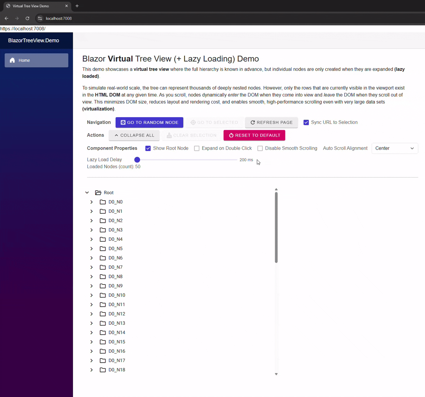
Description: The GIF shows expanding to a deep node, node navigation via URL query string, real-time lazy loading, and virtual scrolling with smooth scrolling enabled.
Run Demo (Optional)
In your IDE, navigate to the demo source folder: examples/BlazorTreeView.Demo.
Open the BlazorTreeView.Demo.csproj file, set it as the startup project, then build and run the application.
🚀 VirtualTreeView Component - Getting Started
Prerequisites
This component uses Google Material Design for built-in icons. Make sure the following stylesheet is included in your host page else default icons will not render.
Add:
<link href="https://fonts.googleapis.com/css2?family=Material+Symbols+Outlined" rel="stylesheet" />
to either Pages/App.razor for Blazor Server or wwwroot/index.html for Blazor WebAssembly (Standalone or Hosted)
ℹ️ Basic Usage
- Provide root nodes via
Roots. - Supply a child-loading callback via
LoadChildren="LoadChildrenAsync". - Use component API methods on the
@ref-edVirtualTreeView<T>instance as needed:SelectNodeAsync(..)- programmatically expand ancestors, select, and scroll to a node.AddNode(..)- add a node under an explicit parent or to root if not specified.RemoveNode(..)- remove a node.RefreshSelectedAsync()- reload children of the currently selected node.ClearSelection()- clear the current selection.CollapseAll(..)- collapse all root nodes and any loaded descendants.
- Common properties to set:
Size- Affects tree view content dentisty via node height, icon size, indentation, etc...DisableSmoothScrolling- disable smooth scrolling behavior (go instantly to target position).AutoScrollAlignment- control how selected nodes are aligned when programmatically scrolled into view.SelectedNode- current selection (supports@bind-SelectedNode).SelectedNodeExpression- supportsEditForm/ validation scenarios when using@bind-SelectedNode.
- Common events to listen for:
SelectedNodeChanged- notified when selection changes.OnNodeContextMenu- invoked for right-click/context menu actions.
Example:
<VirtualTreeView @ref="_treeView"
                 Height="650px"
                 Width="30%"
                 T="string"
                 Roots="@Roots"
                 LoadChildren="LoadChildrenAsync"
                 ShowRootNode="@_showRootNode"
                 Size="VirtualTreeViewSize.Medium"
                 DisableSmoothScrolling="@_disableSmoothScroll"
                 AutoScrollAlignment="@_scrollAlignment"
                 ExpandNodeOnDoubleClick="@_expandOnDoubleClick"
                 SelectedNodeChanged="OnSelectedNodeChanged"
                 OnNodeContextMenu="OnNodeContextMenu"/>
See examples/BlazorTreeView.Demo/Components/Pages/Home.razor for a full usage example.
🔑 Node Identity (Key / Path)
Each VirtualTreeViewNode<T> must have a valid Key. The tree uses Key segments to compute Path and navigate programmatically.
Key rules (enforced by the component at attach-time):
- Must be non-empty (not null/whitespace)
- Must not contain leading or trailing whitespace
- Must not contain
/(reserved as the path separator) - Must be unique among siblings, case-insensitive (OrdinalIgnoreCase)
The component builds Path from the Parent chain using Key segments (e.g. parent/child/grandchild).
Programmatic navigation (SelectNodeAsync) relies on these Path segments to find and expand nodes.
🏃🏽♂️ Node Flexibility
Although the demo shows a folder / subfolder style tree, the component is data-agnostic and can represent any hierarchical model.
Examples beyond filesystem-style folders:
- Case management:
cases/2025/12345/documents - Organizational charts:
company/division/team/member - Product categories and SKUs:
electronics/phones/brand/model - Time-based buckets:
2025/Q1/Week12/Events
How To:
Each VirtualTreeViewNode<T> must provide a stable Key that is unique among siblings. The component computes each node’s Path from the parent chain and Key segments, and that Path is what you use for navigation (for example, SelectNodeAsync(path)). Node look and feel is controlled by IsLeafNode.
Additional Information about expandability and icons (IsLeafNode)
VirtualTreeViewNode<T>.IsLeafNode controls both whether a node is considered expandable and which built-in icons the component displays:
IsLeafNode == true- the node is a leaf: it cannot be expanded, the expand/collapse affordance is hidden, andLeafIconis used for the main node icon.IsLeafNode == false- the node may have children: the expand affordance is shown (when appropriate) and the component selectsCollapsedIconorExpandedIcondepending on loaded/expanded state.
👕 Node Customization
The tree uses Google Material Design icons for all built-in node rendering.
Each icon is defined by a Material icon name (string), and you can override icons per node via properties on VirtualTreeViewNode<T>.
- Per-node properties (Material icon names):
VirtualTreeViewNode<T>.CollapsedIcon– icon used for nodes that can have children but are currently collapsed
(default:"folder")VirtualTreeViewNode<T>.ExpandedIcon– icon used for nodes that have children and are expanded
(default:"folder_open")VirtualTreeViewNode<T>.LeafIcon– icon used for leaf nodes
(default:"unknown_document")
These properties are used by the component's internal icon resolver to choose which icon string to render for each row. <br/>
NodeTemplate (Render Fragment)
This virtual tree view component offers further customization by exposing a NodeTemplate render fragrment should you want full freedom to customize look and feel.
Example:
<VirtualTreeView ...>

    <NodeTemplate Context="node">
        <div style="display:flex;align-items:center;gap:8px;">

            <span class="material-symbols-outlined" style="font-size:20px;">
                @(node.IsLeafNode
                                ? node.LeafIcon
                                : node.IsExpanded
                                ? node.ExpandedIcon
                                : node.CollapsedIcon)
            </span>


            <span>@node.Text</span>


            <span>
                (@(node.Children?.Count.ToString() ?? "?"))
            </span>
        </div>
    </NodeTemplate>
</VirtualTreeView>
<br/>
Note: The Expand Icon (Expand/Collapse Arrow) is still rendered by the component outside of the node template. No customization of this icon is publicly supported or planned at this time.
📖 Project Background
This project began out of necessity.
For my day job, I needed a virtualized TreeView for .NET Blazor that could handle very large data sets in a Blazor Server application. While popular Open Source Blazor Component Libraries like MudBlazor and Radzen offer feature rich TreeView components, none provided true tree view render virtualization - at least as of the time of this writing.
With limited time to study their project structures and source code in order to design such a feature, I decided to build a prototype myself, believing it would be faster. Within a day, I had a promising rough prototype, and after a number of days of testing and refinement, it was released to a production environment.
Afterward, I wanted to take the concept further and give something back to the open-source community. I set out to turn the prototype into a clean, reusable component that others could adapt or extend in their own Blazor applications. After many hours of iteration and refinement, the project was published to GitHub - just in time for Christmas 2025. Hopefully a nice Christmas gift to someone!
The original VirtualTreeView prototype used MudBlazor; however, for this project, even though the demo is built with Radzen, the core VirtualTreeView was intentionally designed to be library-agnostic and should work with virtually any Blazor UI framework. More refinement to come.
📃 Contributing
Contributions are very welcome.
Feel free to submit a pull request or open a GitHub issue. If you’re short on time, issues are just as appreciated, and I’ll do my best to address them when I can 😊
🤵🏽 License
This project is licensed under the MIT License - see the LICENSE file for details.
| Product | Versions Compatible and additional computed target framework versions. |
|---|---|
| .NET | net10.0 is compatible. net10.0-android was computed. net10.0-browser was computed. net10.0-ios was computed. net10.0-maccatalyst was computed. net10.0-macos was computed. net10.0-tvos was computed. net10.0-windows was computed. |
-
net10.0
- Microsoft.AspNetCore.Components.Web (>= 10.0.1)
NuGet packages
This package is not used by any NuGet packages.
GitHub repositories
This package is not used by any popular GitHub repositories.