C1.Xaml.WPF.Input
4.6.20252.919
dotnet add package C1.Xaml.WPF.Input --version 4.6.20252.919
NuGet\Install-Package C1.Xaml.WPF.Input -Version 4.6.20252.919
This command is intended to be used within the Package Manager Console in Visual Studio, as it uses the NuGet module's version of Install-Package.
<PackageReference Include="C1.Xaml.WPF.Input" Version="4.6.20252.919" />
For projects that support PackageReference, copy this XML node into the project file to reference the package.
<PackageVersion Include="C1.Xaml.WPF.Input" Version="4.6.20252.919" />
<PackageReference Include="C1.Xaml.WPF.Input" />
For projects that support Central Package Management (CPM), copy this XML node into the solution Directory.Packages.props file to version the package.
paket add C1.Xaml.WPF.Input --version 4.6.20252.919
The NuGet Team does not provide support for this client. Please contact its maintainers for support.
#r "nuget: C1.Xaml.WPF.Input, 4.6.20252.919"
#r directive can be used in F# Interactive and Polyglot Notebooks. Copy this into the interactive tool or source code of the script to reference the package.
#:package C1.Xaml.WPF.Input@4.6.20252.919
#:package directive can be used in C# file-based apps starting in .NET 10 preview 4. Copy this into a .cs file before any lines of code to reference the package.
#addin nuget:?package=C1.Xaml.WPF.Input&version=4.6.20252.919
#tool nuget:?package=C1.Xaml.WPF.Input&version=4.6.20252.919
The NuGet Team does not provide support for this client. Please contact its maintainers for support.
About
The ComponentOne WPF Input library includes several advanced editors for capturing special input including C1NumericBox, C1MaskedTextBox, C1MultiSelect, C1ComboBox, C1DropDown, C1RangeSlider, C1FilePicker, C1Rating and C1TagEditor.
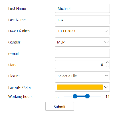
Key Features:
- Format and parse numbers and masked text
- Select multiple items from a checklist
- Type or select items like a tag editor
- Edit a numeric range visually using a two-thumb slider
- Design a custom drop-down UI with ease
- Create a custom shape rating control (five stars) to let users provide feedback
Note: Date, time and color input controls are in separate libraries. Learn more at developer.mescius.com/componentone/wpf-ui-controls/custom-input-controls-wpf.
Resources
| Product | Versions Compatible and additional computed target framework versions. |
|---|---|
| .NET Framework | net462 is compatible. net463 was computed. net47 was computed. net471 was computed. net472 was computed. net48 was computed. net481 was computed. |
Compatible target framework(s)
Included target framework(s) (in package)
Learn more about Target Frameworks and .NET Standard.
-
.NETFramework 4.6.2
- C1.Xaml.WPF (= 4.6.20252.919)
NuGet packages
This package is not used by any NuGet packages.
GitHub repositories
This package is not used by any popular GitHub repositories.
| Version | Downloads | Last Updated |
|---|---|---|
| 4.6.20252.919 | 142 | 3/20/2026 |
| 4.6.20252.915 | 139 | 2/12/2026 |
| 4.6.20252.903 | 119 | 2/12/2026 |
| 4.6.20252.900 | 555 | 12/1/2025 |
| 4.6.20251.887 | 381 | 9/18/2025 |
| 4.6.20251.882 | 214 | 7/11/2025 |
| 4.6.20251.877 | 309 | 5/16/2025 |
| 4.6.20242.870 | 246 | 2/26/2025 |
| 4.6.20242.863 | 278 | 12/27/2024 |
| 4.6.20242.858 | 230 | 11/9/2024 |
| 4.6.20241.853 | 317 | 9/3/2024 |
| 4.6.20241.844 | 290 | 7/8/2024 |
| 4.6.20241.839 | 6,064 | 5/29/2024 |
| 4.6.20233.827 | 261 | 4/1/2024 |
| 4.6.20233.821 | 263 | 3/12/2024 |
| 4.6.20233.804 | 399 | 1/19/2024 |
| 4.6.20233.801 | 330 | 11/10/2023 |
| 4.6.20232.796 | 293 | 9/11/2023 |
| 4.6.20232.790 | 309 | 7/17/2023 |
| 4.6.20231.786 | 310 | 5/10/2023 |
Loading failed