CascadiaUI 0.1.4
dotnet add package CascadiaUI --version 0.1.4
NuGet\Install-Package CascadiaUI -Version 0.1.4
<PackageReference Include="CascadiaUI" Version="0.1.4" />
<PackageVersion Include="CascadiaUI" Version="0.1.4" />
<PackageReference Include="CascadiaUI" />
paket add CascadiaUI --version 0.1.4
#r "nuget: CascadiaUI, 0.1.4"
#:package CascadiaUI@0.1.4
#addin nuget:?package=CascadiaUI&version=0.1.4
#tool nuget:?package=CascadiaUI&version=0.1.4
Avalonia Cascadia Theme







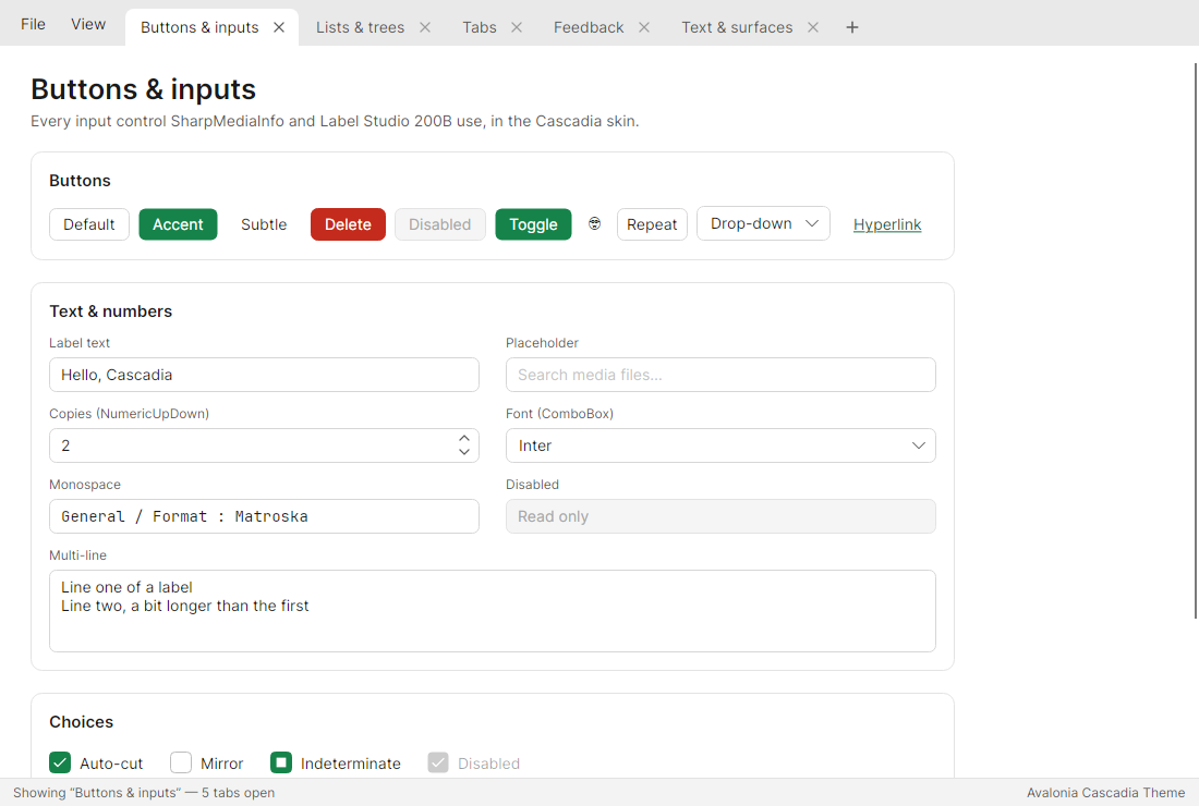
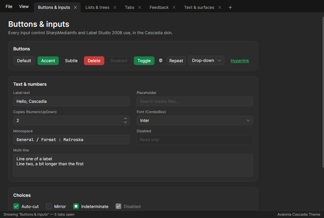
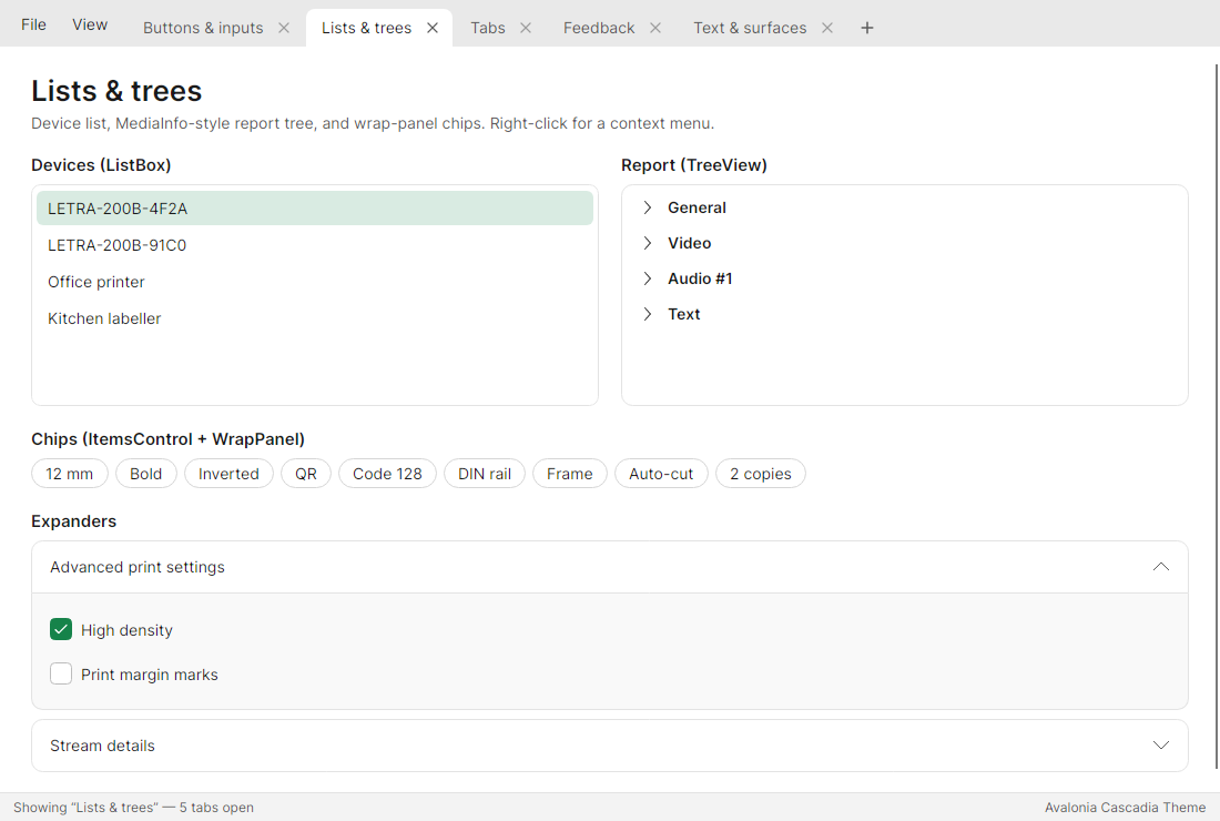
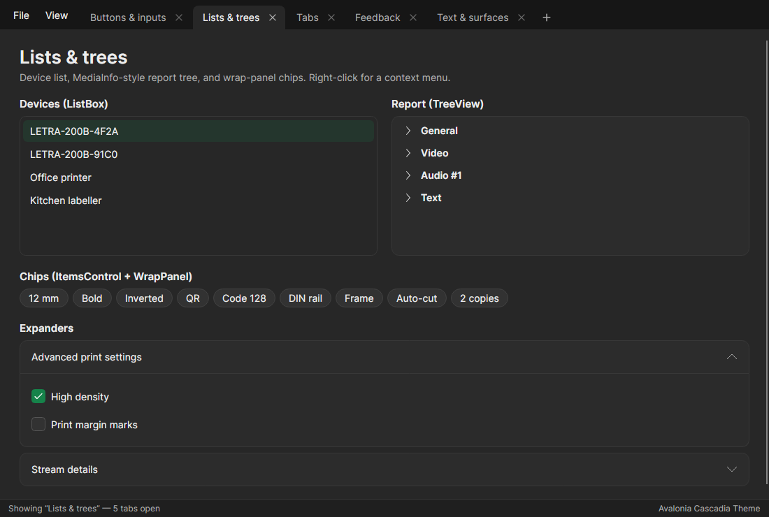
CascadiaUI is a theme for Avalonia 12 that mixes Fluent and macOS into one look that feels at home on Windows, macOS, Linux and Android:
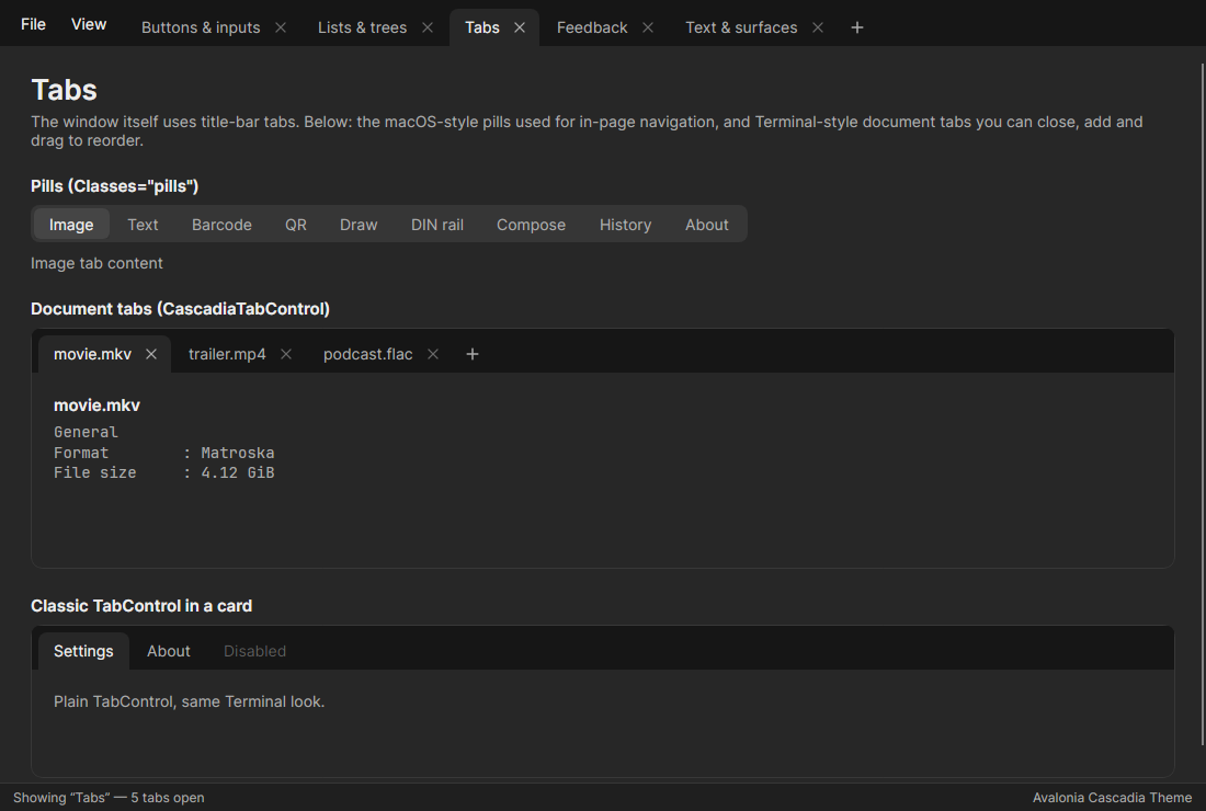
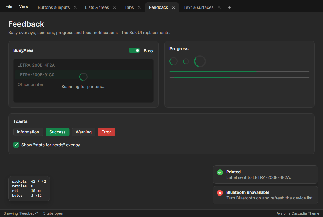
- Neutral light and dark palettes. Light uses soft greys around white surfaces; dark uses deep greys, never pure black.
- One customisable accent. Every hover, pressed, selection, focus-ring and link shade is derived from it, and it can be changed at runtime. The default is a deep green.
- Accessible accent fills. Accent backgrounds that carry text (the
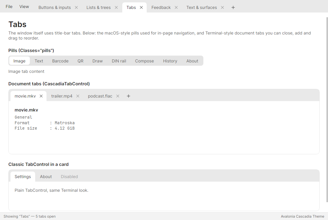
accentbutton, checked toggle buttons) use the accent adjusted just enough to keep that text at WCAG AA (4.5:1). Text-free uses (focus ring, checkboxes, toggle switches, selection tints) keep the exact brand colour. So a bright accent such as#0A84FFstill gives accessible buttons. - Windows Terminal / SourceGit-style tabs. The tabs sit in the title bar. They can be closed (× or middle click), added (+) and reordered by dragging. A tab dragged off the strip raises an event, so the app can move it to another window.
- macOS touches. Segmented "pill" tabs, rounded inset list rows, a soft focus ring on text fields, flat cards.
- Native caption buttons. Windows keeps its own (snap layouts work), macOS keeps the traffic lights, and on Linux the theme draws flat Terminal-like ones.
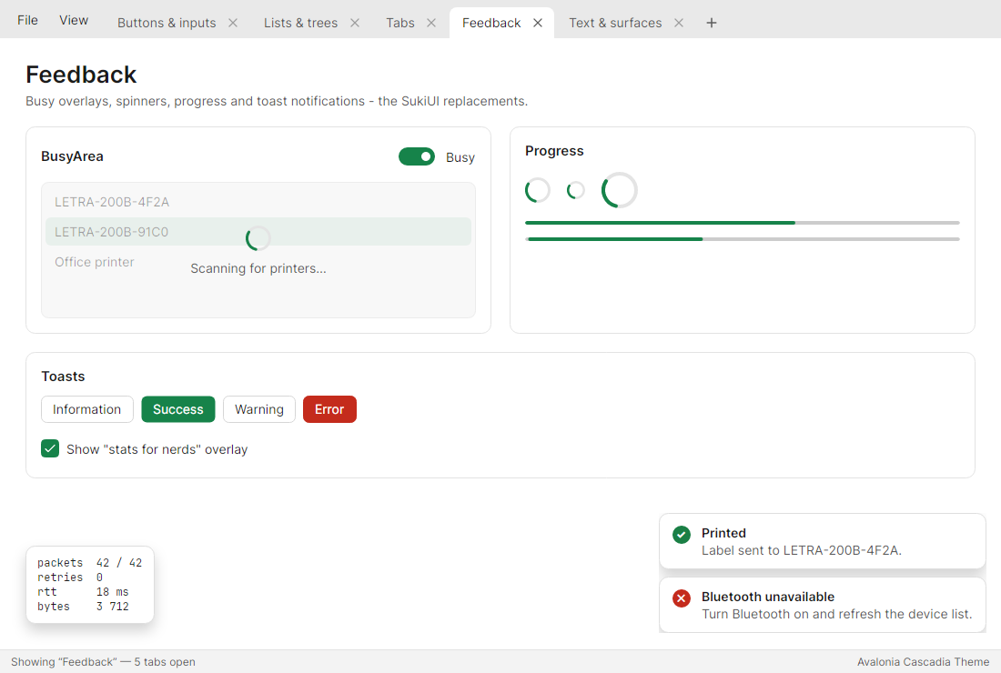
- Feedback controls.
BusyArea,ProgressRingand toast notifications (ToastHost+ToastManager).
It is built on top of Avalonia's FluentTheme. Every stock control keeps Fluent's tested templates,
and Cascadia re-skins them through resources. Cascadia's own templates replace only the controls whose look
differs too much (tabs, window, busy overlay, toasts).
| Light | Dark |
|---|---|
 |
 |
 |
 |
 |
 |
 |
 |
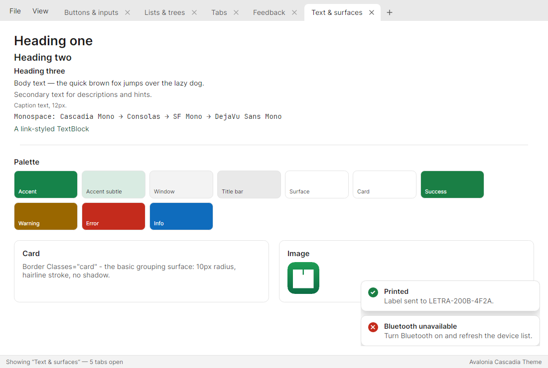 |
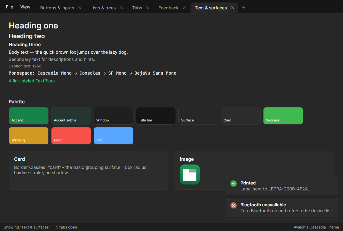 |
In use
| SharpMediaInfo | Label Studio 200B |
|---|---|
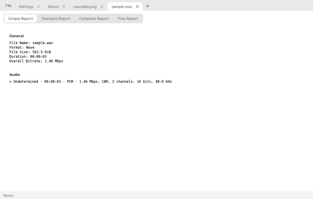 |
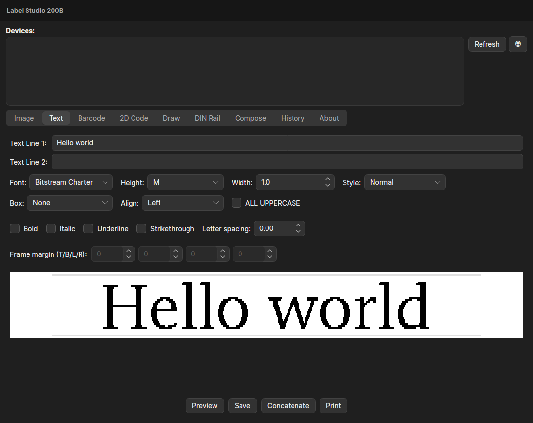 |
Getting started
<Application xmlns:cascadia="https://github.com/simonebortolin/CascadiaUI"
             RequestedThemeVariant="Default">
  <Application.Styles>
    <cascadia:CascadiaTheme Accent="#16834A" Density="Comfortable" />
  </Application.Styles>
</Application>
CascadiaTheme replaces <FluentTheme /> (it includes it), so remove that line.
The font defaults to Inter: call .WithInterFont() on your AppBuilder, or
override ContentControlThemeFontFamily.
Change the accent, density or light/dark at runtime:
CascadiaTheme.Current!.Accent = Color.Parse("#0A72D1");
CascadiaTheme.Current!.Density = CascadiaDensity.Compact;   // 13px text, SourceGit-dense
Application.Current!.RequestedThemeVariant = ThemeVariant.Dark;
Tabs in the title bar
<cascadia:CascadiaWindow ExtendContentIntoTitleBar="True" Title="My app">
  <cascadia:CascadiaTabControl IsInTitleBar="True"
                               CanCloseTabs="True"
                               ShowAddButton="True"
                               ItemsSource="{Binding Tabs}"
                               SelectedItem="{Binding SelectedTab}"
                               AddTabCommand="{Binding NewTabCommand}"
                               CloseTabCommand="{Binding CloseTabCommand}">
    <cascadia:CascadiaTabControl.StripHeader>
      <Menu> … </Menu>
    </cascadia:CascadiaTabControl.StripHeader>
  </cascadia:CascadiaTabControl>
</cascadia:CascadiaWindow>
- Reordering moves the item in your
ItemsSource.ObservableCollection<T>.Moveis used, so tab views aren't recreated.TabReorderedreports the move. - Closing:
TabCloseRequestedis raised first (setHandledto veto), thenCloseTabCommandruns with the item. With neither, the item is removed from the collection.CascadiaTabControl.IsClosable="False"on aTabItempins it. - Tear-out: dragging a tab well above or below the strip raises
TabDraggedOutwith thePointerPressedEventArgsthat started the drag, ready forDragDrop.DoDragDropAsync. - Without
ExtendContentIntoTitleBar,CascadiaWindowdraws its own title bar (title plusTitleBarContent). Anything in your own title-bar content that needs clicks should setcascadia:CascadiaWindow.IsTitleBarInteractive="True". Mark extra drag areas withIsTitleBarDragArea.
A plain TabControl gets the same Terminal look. Use Classes="pills" for the macOS segmented
look used for in-page navigation.
Feedback
<Panel>
  <cascadia:BusyArea IsBusy="{Binding IsScanning}" BusyText="Scanning…">
    <ListBox ItemsSource="{Binding Devices}" />
  </cascadia:BusyArea>


  <cascadia:ToastHost Manager="{Binding Toasts}" />
</Panel>
public ToastManager Toasts { get; } = new();
Toasts.Show("Printed", "Label sent.", ToastSeverity.Success);    // auto-dismisses; click to dismiss
Style classes
| Class | On | Effect |
|---|---|---|
accent, subtle, danger, icon |
Button (subtle/icon also ToggleButton) |
primary, borderless, destructive, square |
h1 h2 h3 caption secondary mono link |
TextBlock |
type ramp, secondary text, monospace (Cascadia Mono → Consolas → SF Mono → DejaVu), link |
card, statusbar, overlay |
Border |
grouping surface, bottom status bar, floating panel |
pills |
TabControl |
macOS segmented tabs |
flat |
ListBox |
no frame |
Every colour is a resource you can override in Application.Resources, e.g.
CascadiaWindowBackgroundBrush, CascadiaSurfaceBrush, CascadiaTitleBarBackgroundBrush,
CascadiaCardBrush, CascadiaTextSecondaryBrush, CascadiaAccentSubtleBrush. See
Tokens.axaml.
Gallery
samples/CascadiaUI.Gallery shows every control
SharpMediaInfo and
Label Studio 200B use:
dotnet run --project samples/CascadiaUI.Gallery
The test suite (dotnet test) renders every gallery page in light and dark through real Skia into
artifacts/screenshots. CI uploads those images on every run.
Releases
The version lives in BuildVersion.props (<VersionPrefix>). CI does the rest:
- Pull request: builds, tests, packs
X.Y.Z-pr.<PR>.<run>and attaches the package plus the Windows/Linux/macOS gallery builds to a pre-release, which is replaced on every push and deleted when the PR closes. It warns ifvX.Y.Zis already released. - Merge to
main: ifvX.Y.Zdoesn't exist yet, CI tags it, creates the GitHub Release (with the package, the gallery builds and checksums) and publishesCascadiaUI X.Y.Zto GitHub Packages and to nuget.org via Trusted Publishing, which needs theNUGET_USERrepository variable. A change that should not release, such as a docs or CI change, carries[no-new-version]in its commit message.
License
MIT. Window-chrome ideas come from SourceGit (MIT) and Windows Terminal. "Cascadia" is the theme's name only; this project is not affiliated with Microsoft.
| Product | Versions Compatible and additional computed target framework versions. |
|---|---|
| .NET | net10.0 is compatible. net10.0-android was computed. net10.0-browser was computed. net10.0-ios was computed. net10.0-maccatalyst was computed. net10.0-macos was computed. net10.0-tvos was computed. net10.0-windows was computed. |
-
net10.0
- Avalonia (>= 12.1.4)
- Avalonia.Themes.Fluent (>= 12.1.4)
NuGet packages
This package is not used by any NuGet packages.
GitHub repositories
This package is not used by any popular GitHub repositories.