Joufflu 0.8.0
dotnet add package Joufflu --version 0.8.0
NuGet\Install-Package Joufflu -Version 0.8.0
<PackageReference Include="Joufflu" Version="0.8.0" />
<PackageVersion Include="Joufflu" Version="0.8.0" />
<PackageReference Include="Joufflu" />
paket add Joufflu --version 0.8.0
#r "nuget: Joufflu, 0.8.0"
#:package Joufflu@0.8.0
#addin nuget:?package=Joufflu&version=0.8.0
#tool nuget:?package=Joufflu&version=0.8.0
Joufflu
The core of the Joufflu WPF component library — a design system that makes your desktop apps look good by default.
Joufflu gives .NET WPF apps a cohesive design system of themed brushes, dimensions
and layout helpers, plus restyled native controls and a small set of custom ones.
Every control reads its colours through DynamicResource, so the whole UI re-themes
live between Light and Dark — no restart, no flicker.


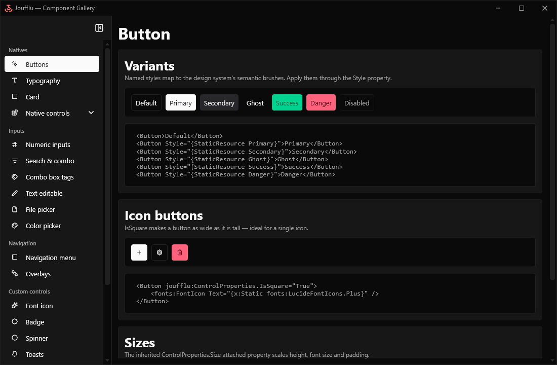
What's inside
- 🌗 Live Light / Dark theming — flip the theme at runtime and every control follows instantly.
- 🎨 A real design system — semantic colours, dimensions, sizing and spacing exposed as override-able resource keys.
- 🪟 Custom-chrome window & natives — a themed application shell (
ThemedWindow) plus restyled built-in WPF controls (buttons, text boxes, combo boxes, data grid, …) that match out of the box. - 🧰 Toolkit — sizing, spacing, tooltip and drop target attached properties in the
Joufflu.Toolkitnamespace, plusThemeManagerand live theme customization.
This is the core package. Three optional packages build on it:
Joufflu.Feedback— badges, spinner & toasts.Joufflu.Inputs— input controls.Joufflu.Navigation— navigation, overlays & paging.
Getting started
Add the package:
dotnet add package JouffluMerge the control styles in
App.xaml:<Application.Resources> <ResourceDictionary> <ResourceDictionary.MergedDictionaries> <ResourceDictionary Source="pack://application:,,,/Joufflu;component/Resources.xaml" /> </ResourceDictionary.MergedDictionaries> </ResourceDictionary> </Application.Resources>Initialize the theme manager once at startup, before the first window shows:
// App.xaml.cs — OnStartup
ThemeManager.Instance.Initialize();
Design system
The design system is exposed as resource keys you can override in your own dictionary (merged after the Joufflu resources):
- Colours / brushes —
joufflu:Colors.*andjoufflu:Brushes.*, including the semantic families (primary, secondary, success, info, warning, danger). - Dimensions —
joufflu:Dimensions.*(corner radius, border thickness, spacing, control heights, font sizes and padding per size).
Run the gallery and open Customize theme to tweak these interactively and generate a ready-to-merge dictionary.
Documentation
📖 Full documentation: https://ndegheselle.github.io/Joufflu/
Acknowledgments
- Lucide icon font
- CommunityToolkit.Mvvm for MVVM boilerplate
| Product | Versions Compatible and additional computed target framework versions. |
|---|---|
| .NET | net10.0-windows7.0 is compatible. |
-
net10.0-windows7.0
- CommunityToolkit.Mvvm (>= 8.4.0)
NuGet packages (5)
Showing the top 5 NuGet packages that depend on Joufflu:
| Package | Downloads |
|---|---|
|
Joufflu.Inputs
WPF input controls for Joufflu: numeric / decimal / timespan pickers, searchable and tag combo boxes, file and color pickers, inline-editable text, and a dropdown. |
|
|
Joufflu.Navigation
WPF navigation for Joufflu: a navigation menu, a view-model-first navigator, and awaitable modal overlays hosted by a container wrapping your app. |
|
|
Joufflu.Feedback
WPF feedback controls for Joufflu: semantic badges, an indeterminate spinner, and stackable toasts driven by a service and shown by a container in any corner. |
|
|
Joufflu.FileExplorer
WPF file explorer for Joufflu: a control bar with a breadcrumb, a folder tree and a file list sharing a source, with shell-backed copy / move / rename / delete, drag and drop, and templatable nodes of your own. |
|
|
Joufflu.Data
JSON Schema for Joufflu: edit a schema, and fill a value against one, as themed WPF trees instead of a raw JSON text box. |
GitHub repositories
This package is not used by any popular GitHub repositories.