Majorsoft.Blazor.Components.Inputs
1.6.1
dotnet add package Majorsoft.Blazor.Components.Inputs --version 1.6.1
NuGet\Install-Package Majorsoft.Blazor.Components.Inputs -Version 1.6.1
<PackageReference Include="Majorsoft.Blazor.Components.Inputs" Version="1.6.1" />
<PackageVersion Include="Majorsoft.Blazor.Components.Inputs" Version="1.6.1" />
<PackageReference Include="Majorsoft.Blazor.Components.Inputs" />
paket add Majorsoft.Blazor.Components.Inputs --version 1.6.1
#r "nuget: Majorsoft.Blazor.Components.Inputs, 1.6.1"
#:package Majorsoft.Blazor.Components.Inputs@1.6.1
#addin nuget:?package=Majorsoft.Blazor.Components.Inputs&version=1.6.1
#tool nuget:?package=Majorsoft.Blazor.Components.Inputs&version=1.6.1
Blazor Components Inputs controls


About
Blazor components that renders an HTML <input>, <textarea> elements also extending InputText and InputTextArea Blazor provided components with maxlength set and counter to show remaining characters.
All components work with WebAssembly and Server hosted models.
For code examples see usage.
You can try it out by using the demo app.
Components
MaxLengthInput: wraps and renders HTML<input>field and setsmaxlengthproperty with notification onChange.MaxLengthInputText: extendsInputTextBlazor provided component (it supports form validation and@bind-Value=) and setsmaxlengthproperty with notification onChange.MaxLengthTextarea: wraps and renders HTML<textarea>field and setsmaxlengthproperty with notification onChange.MaxLengthInputTextArea: extendsInputTextAreaBlazor provided component (it supports form validation and@bind-Value=) and setsmaxlengthproperty with notification onChange.
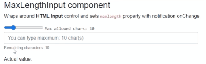
MaxLengthInput and MaxLengthInputText components
Blazor components that are wrapping around standard HTML <input>, <textarea> elements and sets maxlength property with notification onChange.
Can fit for any Blazor App e.g. when DB field has limited length and on UI same limited chars should be set. And on each chars entered the remaining allowed chars counter will be shown.
MaxLengthTextarea and MaxLengthInputTextArea components
Blazor components that are wrapping around standard exiting Blazor components. Rendered HTML result will be standard <input>, <textarea> as well.
Can fit for any Blazor App but use this only when you need Blazor provided FROM validation as well.
Properties
All components have exactly the same features only rendering different HTML elements, hence they have the same properties, events and functions as well.
Value:string? { get; set; }<br /> Value of the rendered HTML element. Initial field value can be set to given string or omitted (leave empty). Also control actual value can be read out. <br />* Note: in case ofDebounceInputTextandDebounceInputTextAreathis property is inherited from Blazor component and requires slightly different code with@bind, see usage example differences.MaxAllowedChars:int { get; set; }(default: 50) <br /> Maximum allowed characters to type in.CountdownText:string { get; set; }(default: "Remaining characters: ") <br /> Countdown label text to change or localize message.ShowRemainingChars:bool { get; set; }(default: true) <br /> Should show remaining character values at the end of theCountdownTextor not. Note: RemainingCharacters value can be acquired fromOnRemainingCharsChangedevent parameter.CountdownTextClass:string { get; set; }(default: "") <br /> Countdown label and value CSS class property to style message.InnerElementReference:ElementReference { get; }<br /> Exposes a BlazorElementReferenceof the wrapped around HTML element. It can be used e.g. for JS interop, etc.
Arbitrary HTML attributes e.g.: id="input1" class="form-control w-25" will be passed to the corresponding rendered HTML element <input> or <textarea>.
<MaxLengthInput
	id="in1"
	class="form-control w-25"
	placeholder="@($"You can type maximum: {_maxLengthInputTextAreaAllowed} char(s)")"
	... />
Will be rendered to:
<input id="in1" class="form-control w-25" placeholder="You can type maximum: 20 char(s)" ... />
Events
OnValueChanged:EventCallback<string>delegate <br /> Callback function called when value was changed.OnRemainingCharsChanged:EventCallback<int>delegate <br /> Callback function called when HTML control received keyboard inputs remaining allowed chars calculated and sent as even args. Can be used to style or change the Countdown message.
Configuration
Installation
Majorsoft.Blazor.Components.Inputs is available on NuGet.
dotnet add package Majorsoft.Blazor.Components.Inputs
Use the --version option to specify a preview version to install.
Usage
Add using statement to your Blazor <component/page>.razor file. Or globally reference it into _Imports.razor file.
@using Majorsoft.Blazor.Components.Inputs
MaxLengthInput and MaxLengthTextarea usage
Following code example shows how to use MaxLengthInput component in your Blazor App with model binding
on specific OnInput event. So it will enable two way binding between components. You can omit it and use Value directly for one way binding.
Note: using MaxLengthTextarea component basically the same but it will render HTML <textarea>.
<style>
	.countDownText {
		font-size: small;
		color: gray;
	}
	.countDownText.red {
		color: red;
	}
	.countDownText.right {
		width: 100%;
		text-align: right;
	}
</style>

<div class="row pb-2">
	<div class="col-12 col-lg-8 col-xl-5">
		<MaxLengthInput id="maxInput1" class="form-control w-100" placeholder="@($"You can type maximum: {_maxLengthInputAllowed} char(s)")"
						@bind-Value="@_maxLengthInputValue" @bind-Value:event="OnInput"
						MaxAllowedChars="@_maxLengthInputAllowed"
						CountdownTextClass="@_maxLengthInputTextClass"
						OnRemainingCharsChanged="MaxLengthInputRemainingCharsChanged" />
	</div>
</div>

<div>Actual value: @_maxLengthInputValue</div>

@code {
	//MaxLengthInput
	private int _maxLengthInputAllowed = 10;
	private string _maxLengthInputValue = "";
	private string _maxLengthInputTextClass = "countDownText";

	private void MaxLengthInputRemainingCharsChanged(int remainingChars)
	{
		_maxLengthInputTextClass = "countDownText";

		if (_maxLengthInputAllowed * 0.2 >= remainingChars)
		{
			_maxLengthInputTextClass = "countDownText red";
		}
	}
}
MaxLengthInputText and MaxLengthInputTextArea usage
Following code example shows how to use DebounceInputText component with model binding and form validation in your Blazor App.
Note: using MaxLengthInputTextArea component basically the same but it will render HTML <textarea>.
<style>
	.countDownText {
		font-size: small;
		color: gray;
	}
	.countDownText.red {
		color: red;
	}
	.countDownText.right {
		width: 100%;
		text-align: right;
	}
</style>

<EditForm Model="@exampleModel">
	<DataAnnotationsValidator />
	<ValidationSummary />
	<div class="row pb-2">
		<div class="col-12 col-lg-8 col-xl-5">
			<MaxLengthInputText id="maxInput2" class="form-control w-100" placeholder="@($"You can type maximum: {_maxLengthInputTextAllowed} char(s)")"
								@bind-Value="exampleModel.Name"
								MaxAllowedChars="@_maxLengthInputTextAllowed"
								CountdownTextClass="@_maxLengthInputTextTextClass"
								OnRemainingCharsChanged="MaxLengthInputTextRemainingCharsChanged" />
		</div>
	</div>
	<div class="pb-2">
		<button class="btn btn-primary" type="submit">Submit</button>
	</div>
</EditForm>

<div>Actual value: @(exampleModel.Name)</div>

@code {
	//MaxLengthInputText
	private int _maxLengthInputTextAllowed = 10;
	private string _maxLengthInputTextTextClass = "countDownText";

	private void MaxLengthInputTextRemainingCharsChanged(int remainingChars)
	{
		_maxLengthInputTextTextClass = "countDownText";

		if (_maxLengthInputTextAllowed * 0.2 >= remainingChars)
		{
			_maxLengthInputTextTextClass = "countDownText red";
		}
	}

	//Form model
	private ExampleModel exampleModel = new ExampleModel() { Name = "" };
	public class ExampleModel
	{
		[Required]
		[StringLength(10, ErrorMessage = "Name is too long.")]
		public string Name { get; set; }
	}
}
| Product | Versions Compatible and additional computed target framework versions. |
|---|---|
| .NET | net5.0 is compatible. net5.0-windows was computed. net6.0 was computed. net6.0-android was computed. net6.0-ios was computed. net6.0-maccatalyst was computed. net6.0-macos was computed. net6.0-tvos was computed. net6.0-windows was computed. net7.0 was computed. net7.0-android was computed. net7.0-ios was computed. net7.0-maccatalyst was computed. net7.0-macos was computed. net7.0-tvos was computed. net7.0-windows was computed. net8.0 was computed. net8.0-android was computed. net8.0-browser was computed. net8.0-ios was computed. net8.0-maccatalyst was computed. net8.0-macos was computed. net8.0-tvos was computed. net8.0-windows was computed. net9.0 was computed. net9.0-android was computed. net9.0-browser was computed. net9.0-ios was computed. net9.0-maccatalyst was computed. net9.0-macos was computed. net9.0-tvos was computed. net9.0-windows was computed. net10.0 was computed. net10.0-android was computed. net10.0-browser was computed. net10.0-ios was computed. net10.0-maccatalyst was computed. net10.0-macos was computed. net10.0-tvos was computed. net10.0-windows was computed. |
-
net5.0
- Microsoft.AspNetCore.Components.Web (>= 5.0.3)
NuGet packages
This package is not used by any NuGet packages.
GitHub repositories
This package is not used by any popular GitHub repositories.
See Releases here: https://github.com/majorimi/blazor-components/releases