Majorsoft.Blazor.Components.Notifications
1.6.1
dotnet add package Majorsoft.Blazor.Components.Notifications --version 1.6.1
NuGet\Install-Package Majorsoft.Blazor.Components.Notifications -Version 1.6.1
<PackageReference Include="Majorsoft.Blazor.Components.Notifications" Version="1.6.1" />
<PackageVersion Include="Majorsoft.Blazor.Components.Notifications" Version="1.6.1" />
<PackageReference Include="Majorsoft.Blazor.Components.Notifications" />
paket add Majorsoft.Blazor.Components.Notifications --version 1.6.1
#r "nuget: Majorsoft.Blazor.Components.Notifications, 1.6.1"
#:package Majorsoft.Blazor.Components.Notifications@1.6.1
#addin nuget:?package=Majorsoft.Blazor.Components.Notifications&version=1.6.1
#tool nuget:?package=Majorsoft.Blazor.Components.Notifications&version=1.6.1
Blazor Components Notification controls and HTML 5 service


About
Blazor injectable INotificationService service to handle HTML5 Notifications and ServiceWorker Notifications and components that renders customizable Alert and Toast notification message elements.
All components work with WebAssembly and Server hosted models. For code examples see usage.
You can try it out by using the demo app.
Components and services
Alert: RendersAlertcomponent which is a banner to show important application messages. Importance can be emphasized by Type and NotificationStyle styling with customizable content.ToastContainerandToast: Renders singleToastContainercomponent per application which can be placed to 6 different places of a page. With injectableIToastServiceservice individualToastcomponents can be added, removed or events tracked. By using Global settings or override all values per Toast notification.IHtmlNotificationService: InjectableIHtmlNotificationServiceservice which is a wrapper for Notification API to handle HTML5 notifications and ServiceWorker Notifications with Custom actions handled by registered Service Worker.
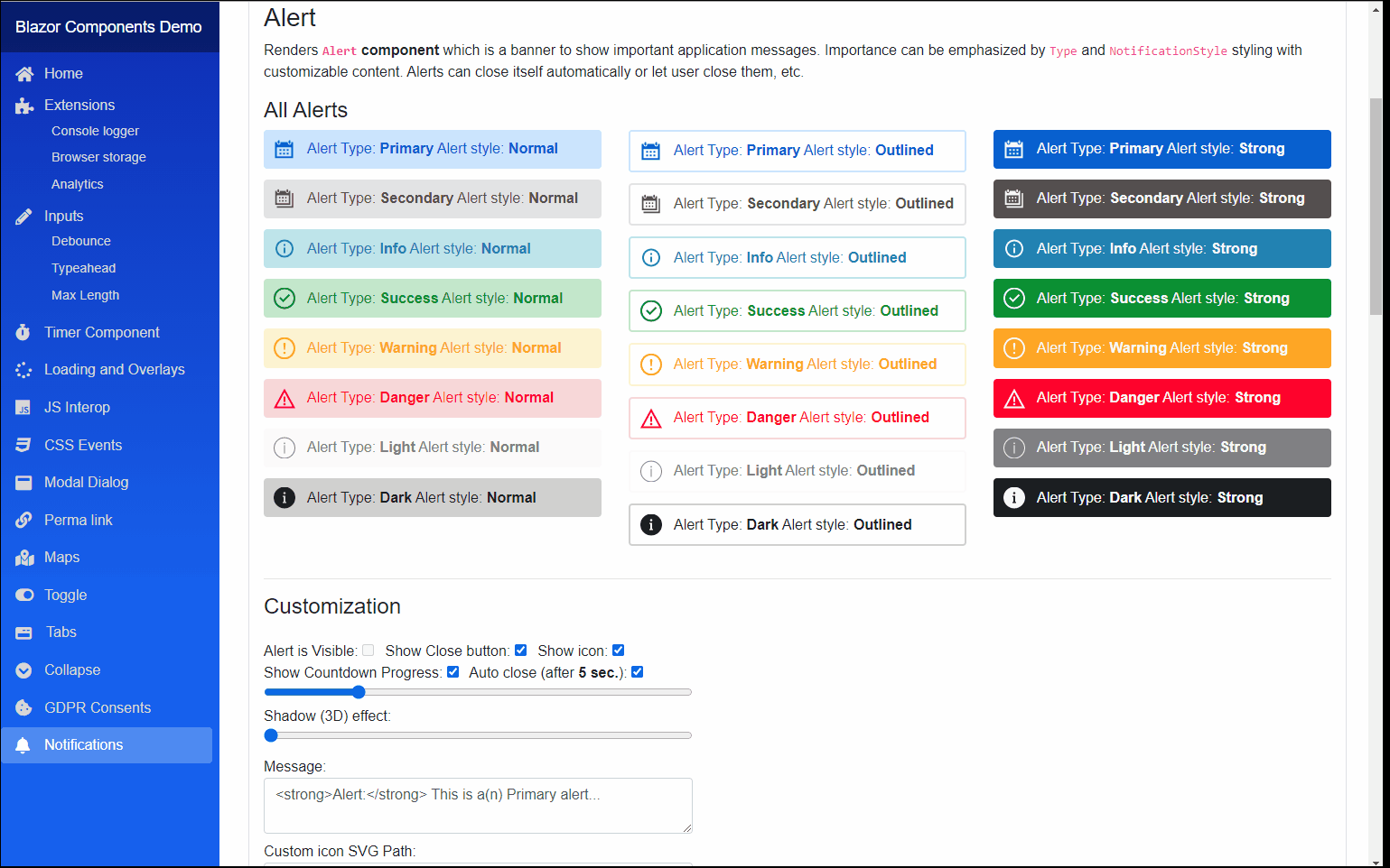
Alert component (See demo app)
Renders Alert component which is a banner to show important application messages.
Importance can be emphasized by Type and NotificationStyle styling with customizable content.
Alerts can close itself automatically or let user close them, etc.
Properties
IsVisible:bool { get; set; }(default: false) <br /> Determines weather the Alert message should be visible on UI or not.Content:RenderFragmentHTML content - Required <br /> Required HTML Content of the Alert notification. Can be any valid HTML.Type:NotificationTypes { get; set; }(default: NotificationTypes.Primary) <br /> Notification type or severity level.NotificationStyle:NotificationStyles { get; set; }(default: NotificationStyles.Normal) <br /> Notification style to show different variant of the sameTypeofAlert.ShowIcon:bool { get; set; }(default: true) <br /> When true Alert will show an icon corresponding to the <see cref="NotificationTypes"/>. Default icon can be overwritten.CustomIconSvgPath:string { get; set; }(default: "") <br /> Icon customization it accepts an SVGPathvalue to override the default icon. When empty or NULL it is omitted and default used.ShowCloseButton:bool { get; set; }(default: true) <br /> WhentrueAlert will show close "x" button.
Arbitrary HTML attributes e.g.: id="alert1" will be passed to the corresponding rendered root HTML element <div>.
Events
OnShow:EventCallback<br /> Callback function called when theAlertis showing.OnClose:EventCallback<br /> Callback function called when theAlertis closing.OnCloseButtonClicked:EventCallback<MouseEventArgs><br /> Callback function called when close x button was clicked.IsVisibleChanged:EventCallback<bool><br /> Callback function for two way bindings ofIsVisibleproperty.
Functions
DisposeAsync():Task DisposeAsync()<br /> Component implementsIAsyncDisposableinterface Blazor framework will call it when parent removed from render tree.
ToastContainer and Toast components (See demo app)
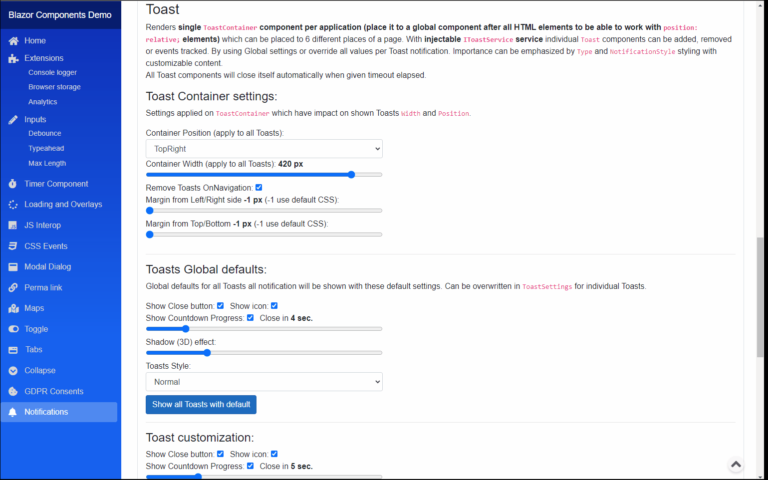
Renders single ToastContainer component per application (place it to a global component after all HTML elements to be able to work with position: relative; elements)
which can be placed to 6 different places of a page. With injectable IToastService service individual Toast components can be added, removed or events tracked.
By using Global settings or override all values per Toast notification. Importance can be emphasized by Type and NotificationStyle styling with customizable content.
<br />All Toast components will close itself automatically when given timeout elapsed.
ToastContainer
As the name suggests it is a container element for individual Toast notifications. Only 1 container per application is allowed.**
Place it to a global (Layout) component after all HTML elements to be able to work with position: relative; elements
Properties
Settings:ToastContainerGlobalSettings { get; set; }<br /> 'ToastContainersettings (default static values applied onToast` level).
Events
OnToastShow:ToastEvent<br /> Event triggered when one of theToastis showing.OnToastClosed:ToastEvent<br /> Event triggered when theToastis closing.OnToastCloseButtonClicked:ToastEvent<br /> Event triggered when closexbutton was clicked on one of theToast.
IToastService
Injectable service to handle Toast notifications and settings.
Note: Injected as Singleton so all components use the same instance do NOT dispose manually.
Properties
Toasts:IEnumerable<ToastSettings> { get; }<br /> Collection of Toasts notifications.GlobalSettings:ToastContainerGlobalSettings { get; set; }<br /> Global Toast Container and common Toasts settings with default values.
Events
CollectionChanged:NotifyCollectionChangedEventHandler<br /> Event triggered when Toasts collection changed.OnToastShow:ToastEvent<br /> Event triggered when one of theToastis showing.OnToastClosed:ToastEvent<br /> Event triggered when theToastis closing.OnToastCloseButtonClicked:ToastEvent<br /> Event triggered when closexbutton was clicked on one of theToast.
Functions
ShowToast():Guid ShowToast(string message, NotificationTypes notificationType = NotificationTypes.Info, NotificationStyles? notificationStyle = null)<br /> Service implementsIDisposableinterface.ShowToast():Guid ShowToast(RenderFragment content, NotificationTypes notificationType = NotificationTypes.Info, NotificationStyles? notificationStyle = null)<br /> Service implementsIDisposableinterface.ShowToast():Guid ShowToast(ToastSettings toastSettings)<br /> Shows a new Toast notification with givenToastSettings. It can be override all default values.RemoveToast():void RemoveToast(Guid id)<br /> Removes aToastnotification from collection and UI with given Id.ClearAll():void ClearAll()<br /> ClearsToasts collections and Removes all Toast notifications from UI.Dispose():void Dispose()<br /> Service implementsIDisposableinterface ().
ToastContainerGlobalSettings
Global Toast Container and common Toasts settings with default values. Some of settings will impact the ToastContainer which indirectly
determines some Toast settings e.g. Width of ToastContainer is limiting the width of a Toast notification.
Properties
RemoveToastsOnNavigation:bool { get; set; }(default: true) <br /> Determines if Toast notifications should be removed when user navigates to other page. Note: in order make it workToastContainercomponent must be applied only once per application in a common place e.g.: Layour.razor, etc.Position:ToastPositions { get; set; }(default: ToastPositions.TopRight) <br /> Toast Container position on screenToastPositions.Width:int { get; set; }(default: 400) <br />ToastContainerwidth inpxit will determine the shownToastwidth as well.PaddingFromSide:int { get; set; }(default: -1) <br /> Required space forToastContainerfrom page (left/right) side inpx. If -1 it is not applied default CSS style will be used.PaddingFromTopOrBottom:int { get; set; }(default: -1) <br /> Required space forToastContainerfrom page (Top/Bottom) side inpx. If -1 it is not applied default CSS style will be used.static DefaultToastsShowIcon:bool { get; set; }(default: true) <br /> Global config applied to allToastsif not set otherwise. When true Toast will show an icon corresponding to theNotificationTypes.static DefaultToastsShowCloseButton:bool { get; set; }(default: true) <br /> Global config applied to allToastsif not set otherwise. When true Toast will show close "x" button.static DefaultToastsAutoCloseInSec:uint { get; set; }(default: 10) <br /> Global config applied to allToastsif not set otherwise. Toast will close after set time elapsed in Sec.static DefaultToastsShowCloseCountdownProgress:bool { get; set; }(default: true) <br /> Global config applied to allToastsif not set otherwise. When it's true a progress bar will show the remaining time until Toast closes.static DefaultToastsNotificationStyle:NotificationStyles { get; set; }(default: NotificationStyles.Normal) <br /> Global config applied to all Toasts if not set otherwise. Notification style to show different variant of the same Type ofToast.static DefaultToastsShadowEffect:uint { get; set; }(default: 5) <br /> Global config applied to all Toasts if not set otherwise. Determines the shadow effect strongness which makes Toast elevated. Value should be between 0 and 20.
ToastSettings
Properties for individual Toast Notifications.
NOTE: most of the properties can be used with default values from ToastContainerGlobalSettings static properties.
Properties
Content:RenderFragment { get; set; }<br /> HTML Content of the<seeToastnotification.Type:NotificationTypes { get; set; }(default: NotificationTypes.Primary) <br /> Notification type or severity level.NotificationStyle:NotificationStyles { get; set; }(default: ToastContainerGlobalSettings.DefaultToastsNotificationStyle) <br /> Notification style to show different variant of the sameTypeToast.ShowIcon:bool { get; set; }(default: ToastContainerGlobalSettings.DefaultToastsShowIcon) <br /> When true Toast will show an icon corresponding to theNotificationTypes. Default icon can be overwritten.CustomIconSvgPath:string { get; set; }(default: "") <br /> Icon customization it accepts an SVGPathvalue to override the default icon. When empty or NULL it is omitted and default used.ShowCloseButton:bool { get; set; }(default: ToastContainerGlobalSettings.DefaultToastsShowCloseButton) <br /> When true Toast will show close "x" button.AutoCloseInSec:uint { get; set; }(default: ToastContainerGlobalSettings.DefaultToastsAutoCloseInSec) <br /> Toast will close after set time elapsed in Sec.ShowCloseCountdownProgress:bool { get; set; }(default: ToastContainerGlobalSettings.DefaultToastsShowCloseCountdownProgress) <br /> When it's true a progress bar will show the remaining time until Toast closes.ShadowEffect:uint { get; set; }(default: ToastContainerGlobalSettings.DefaultToastsShadowEffect) <br /> Determines the shadow effect strongness which makes Toast elevated. Value should be between 0 and 20.
Toast
An individual Toast showed in order of creation inside the ToastContainer. <br />
This component should not be accessed, created or manipulated directly! Please use injected IToastService instance ShowToast() methods.
Properties are not explained see IToastService, ToastContainer and ToastSettings above.
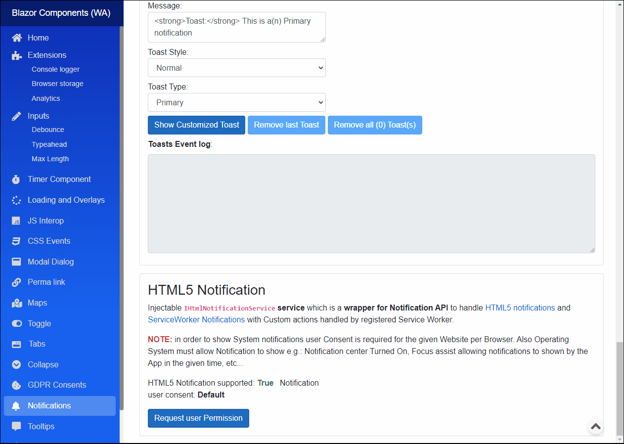
IHtmlNotificationService service (See demo app)
Injectable IHtmlNotificationService service which is a wrapper for Notification API to handle HTML5 notifications and ServiceWorker Notifications with Custom actions handled by registered Service Worker.
NOTE: in order to show system notifications user consent is required for the given website per browser. also operating system must allow notification to show e.g.: notification center turned on, focus assist allowing notifications to shown by the app in the given time, etc...
Functions
RequestPermissionAsync():ValueTask RequestPermissionAsync(Func<HtmlNotificationPermissionTypes, Task> callback)<br /> Prompts User Consent permission request popup to the User to decide whether to allow Notifications or not.CheckPermissionAsync():ValueTask<HtmlNotificationPermissionTypes> CheckPermissionAsync()<br /> Checks the Notification User Consent status.CheckMaxActionsAsync():ValueTask<int> CheckMaxActionsAsync()<br /> Returns maxActions attribute of the Notification interface returns the maximum number of actions supported by the device and the User Agent.IsBrowserSupportedAsync():ValueTask<bool> IsBrowserSupportedAsync()<br /> Checks if Browser supports HTML Notifications API or not.ShowsAsync():ValueTask<Guid> ShowsAsync(HtmlNotificationOptions notificationOptions)<br /> Shows a Notification with the givenHtmlNotificationOptionsoptions data.ShowsWithActionsAsync():ValueTask ShowsWithActionsAsync(HtmlServiceWorkerNotificationOptions notificationOptions)<br /> Registers the givenServiceWorkerfrom the URL and prompts Notifications with Options provided. ServiceWorker can handle Custom events with custom data provided.DisposeAsync():Task DisposeAsync()<br /> Service implementsIAsyncDisposableinterface.
Configuration
Installation
Majorsoft.Blazor.Components.Notifications is available on NuGet.
dotnet add package Majorsoft.Blazor.Components.Notifications
Use the --version option to specify a preview version to install.
Usage
Add using statement to your Blazor <component/page>.razor file. Or globally reference it into _Imports.razor file.
@using Majorsoft.Blazor.Components.Notifications
Dependences
Majorsoft.Blazor.Components.Notifications package depends on other Majorsoft Nuget packages:
- Majorsoft.Blazor.Components.CssEvents which handles CSS Transition and Animation events for the dialog animation.
- Majorsoft.Blazor.Components.Timer which handles Auto close timing.
Register services
In case of WebAssembly project register services in your Program.cs file:
using Majorsoft.Blazor.Components.CssEvents;
...
public static async Task Main(string[] args)
{
	var builder = WebAssemblyHostBuilder.CreateDefault(args);

	//Register dependencies
	builder.Services.AddCssEvents();
	builder.Services.AddNotifications();
}
In case of Server hosted project register services in your Startup.cs file:
using Majorsoft.Blazor.Components.CssEvents;
...

public void ConfigureServices(IServiceCollection services)
{
	//Register dependencies
	services.AddCssEvents();
	services.AddNotifications();
}
Alert usage
Following code example shows how to use Alert component.
Alert component must be placed to HTML DOM it cannot be added dynamically. But Alert can be hidden. Content of the alert with many more
settings can be customized. See properties for more details.
<Alert Type="@_alertTypeLevel"
	NotificationStyle="@_alertStyle"
	@bind-IsVisible="_alertIsVisible"
	AutoClose="@_alertAutoClose"
	AutoCloseInSec="@_alertAutoCloseInSec"
	ShowCloseButton="@_alertShowCloseButton"
	ShowIcon="@_alertShowIcon"
	ShadowEffect="@_alertShadowEffect"
	ShowCloseCountdownProgress="@_alertShowCountdownProgress"
	CustomIconSvgPath="@_alertCustomSvg"
	OnShow="OnShow"
	OnClose="OnClose"
	OnCloseButtonClicked="OnCloseButtonClicked">
	<Content>
		@((MarkupString)_alertText)
	</Content>
</Alert>

@code {
	private bool _alertIsVisible = false;
	private bool _alertAutoClose = true;
	private bool _alertShowIcon = true;
	private bool _alertShowCloseButton = true;
	private bool _alertShowCountdownProgress = true;
	private uint _alertAutoCloseInSec = 5;
	private uint _alertShadowEffect = 0;
	private string _alertText = $@"<strong>Alert:</strong> This is a(n) {nameof(NotificationTypes.Primary)} alert...";
	private string _alertCustomSvg;
	private NotificationTypes _alertTypeLevel = NotificationTypes.Primary;
	private NotificationStyles _alertStyle = NotificationStyles.Normal;

	//Alert events
	public async Task OnShow()
	{
		//TODO: handle Alert event
	}
	public async Task OnClose()
	{
		//TODO: handle Alert event
	}
	private async Task OnCloseButtonClicked(MouseEventArgs e)
	{
		//TODO: handle Alert event
	}
}
ToastContainer and Toast usage
Following code example shows how to use ToastContainer and Toast component.
First step to add a single ToastContainer to a common place e.g. MainLayour.razor
...
	@Body
...

@*Toast container initialized once per application at the bottom of the rendered HTML in order to work with all Relative elements!!*@
<ToastContainer />

@inject IToastService _toastService
@code {
	protected override void OnInitialized()
	{
		//Common settings can be set globally for ToastContainer and Toasts in IToastService
		_toastService.GlobalSettings.Position = ToastPositions.TopRight;
		_toastService.GlobalSettings.RemoveToastsOnNavigation = true;
		_toastService.GlobalSettings.Width = 420;
		_toastService.GlobalSettings.PaddingFromSide = -1;
		_toastService.GlobalSettings.PaddingFromTopOrBottom = -1;

		ToastContainerGlobalSettings.DefaultToastsAutoCloseInSec = 12;
	}
}
Then Toast notifications can be configured, prompted, removed and listened for events via injectable IToastService.
@inject IToastService _toastService
@implements IDisposable
@code {
	protected override void OnInitialized()
	{
		_toastService.OnToastShow += ToastShow;
		_toastService.OnToastClosed += ToastClosed;
		_toastService.OnToastCloseButtonClicked += ToastCloseButtonClicked;
	}

	private async Task ShowAllToast()
	{
		foreach (var item in Enum.GetValues<NotificationTypes>())
		{
			_toastService.ShowToast($@"<strong>Toast:</strong> This is a(n) {item} notification", item);
		}
	}

	private Guid _lastToastId;
	private string _toastText = $@"<strong>Toast:</strong> This is a(n) {NotificationTypes.Primary} notification";
	private bool _toastShowIcon = true;
	private bool _toastShowCloseButton = true;
	private bool _toastShowCountdownProgress = true;
	private uint _toastAutoCloseInSec = 5;
	private uint _toastShadowEffect = 5;
	private NotificationStyles _toastStyle;
	private NotificationTypes _toastTypeLevel;
	private async Task ShowCustomToast()
	{
		_lastToastId = _toastService.ShowToast(new ToastSettings()
		{
			Content = builder => builder.AddMarkupContent(0, _toastText),
			NotificationStyle = _toastStyle,
			Type = _toastTypeLevel,
			AutoCloseInSec = _toastAutoCloseInSec,
			ShadowEffect = _toastShadowEffect,
			ShowCloseButton = _toastShowCloseButton,
			ShowCloseCountdownProgress = _toastShowCountdownProgress,
			ShowIcon = _toastShowIcon
		});
	}

	private void ToastShow(Guid id)
	{
	}
	private void ToastClosed(Guid id)
	{
	}
	private void ToastCloseButtonClicked(Guid id)
	{
	}

	public void Dispose()
	{
		_toastService.OnToastShow -= ToastShow;
		_toastService.OnToastClosed -= ToastClosed;
		_toastService.OnToastCloseButtonClicked -= ToastCloseButtonClicked;
	}
}
IHtmlNotificationService usage
Following code example shows how to use IHtmlNotificationService service.
NOTE: in order to show System notifications user Consent is required for the given Website per Browser. Also Operating System must allow Notification to show e.g.: Notification center Turned On, Focus assist allowing notifications to shown by the App in the given time, etc...
This example shows how to check HTML notification is supported by Browser and ask User consent (permission) to prompt HTML notification:
HTML5 Notification supported: @_notificationSupported
Notification user consent: @_htmlNotificationPermission

@if (_htmlNotificationPermission != HtmlNotificationPermissionTypes.Granted)
{
	<button class="btn btn-primary" @onclick="RequestPermission">Request user Permission</button>
}


@inject IHtmlNotificationService _notificationService
@implements IAsyncDisposable

@code {
	protected override async Task OnAfterRenderAsync(bool firstRender)
	{
		if (firstRender)
		{
			_notificationSupported = await _notificationService.IsBrowserSupportedAsync();
			_htmlNotificationPermission = await _notificationService.CheckPermissionAsync();
			StateHasChanged();
		}
	}

	//HTML5 notification
	private bool _notificationSupported;
	private HtmlNotificationPermissionTypes _htmlNotificationPermission;

	private async Task RequestPermission()
	{
		await _notificationService.RequestPermissionAsync(async res =>
		{
			_htmlNotificationPermission = res;
			StateHasChanged();
		});
	}

	public async ValueTask DisposeAsync()
	{
		if (_notificationService is not null)
		{
			await _notificationService.DisposeAsync();
		}
	}
This example shows how to prompt "simple" (without Custom Actions with callbacks) HTML notification. In this case Notification events are available (Important NOTE: events are "non reliable" e.g. same events might not supported by some OS, or when Notification auto dismissed and later "clicked" in "Action Center" meanwhile your application already closed).
@inject IHtmlNotificationService _notificationService
@implements IAsyncDisposable

@code {
	//HTML5 notification
	private string _notificationTitle = "Notification Title";
	private string _notificationBody = "Notification Body";
	private string _notificationIcon = "blazor.components.png";

	private async Task ShowSimpeNotification()
	{
		var options = new HtmlNotificationOptions(_notificationTitle)
		{
			Body = _notificationBody,
			Icon = _notificationIcon,
			Vibrate = new int[] { 100, 200, 100},
			//events
			OnOpenCallback = OnOpen,
			OnCloseCallback = OnClose,
			OnErrorCallback = OnError,
			OnClickCallback = OnClick,
		};

		var id = await _notificationService.ShowsAsync(options);
	}

	public async Task OnOpen(Guid id)
	{
		//TODO: handle Alert event
	}
	public async Task OnClose(Guid id)
	{
		//TODO: handle Alert event
	}
	public async Task OnError(Guid id)
	{
		//TODO: handle Alert event
	}
	public async Task OnClick(Guid id)
	{
		//TODO: handle Alert event
	}

	public async ValueTask DisposeAsync()
	{
		if (_notificationService is not null)
		{
			await _notificationService.DisposeAsync();
		}
	}
}
This example shows how to prompt "simple" (Custom Actions with callbacks are possible with registered Service Worker) HTML notification.
@inject IHtmlNotificationService _notificationService
@implements IAsyncDisposable

@code {
	private string _notificationTitle = "Notification Title";
	private string _notificationBody = "Notification Body";
	private string _notificationIcon = "blazor.components.png";

	private async Task ShowWithActionsNotification()
	{
		var options = new HtmlServiceWorkerNotificationOptions(_notificationTitle, "_content/Majorsoft.Blazor.Components.TestApps.Common/sw.js")
		{
			Body = _notificationBody,
			Icon = _notificationIcon,
			//actions
			Actions = new NotificationAction[]
			{
			   new NotificationAction() { Action = "action1", Title = "Custom action"},
			   new NotificationAction() { Action = "action2", Title = "Other action"},
			},
			Vibrate = new int[] { 100, 200, 100 },
			Data = "any type of object.."
		};

		await _notificationService.ShowsWithActionsAsync(options);
	}

	public async ValueTask DisposeAsync()
	{
		if (_notificationService is not null)
		{
			await _notificationService.DisposeAsync();
		}
	}
}
| Product | Versions Compatible and additional computed target framework versions. |
|---|---|
| .NET | net5.0 is compatible. net5.0-windows was computed. net6.0 was computed. net6.0-android was computed. net6.0-ios was computed. net6.0-maccatalyst was computed. net6.0-macos was computed. net6.0-tvos was computed. net6.0-windows was computed. net7.0 was computed. net7.0-android was computed. net7.0-ios was computed. net7.0-maccatalyst was computed. net7.0-macos was computed. net7.0-tvos was computed. net7.0-windows was computed. net8.0 was computed. net8.0-android was computed. net8.0-browser was computed. net8.0-ios was computed. net8.0-maccatalyst was computed. net8.0-macos was computed. net8.0-tvos was computed. net8.0-windows was computed. net9.0 was computed. net9.0-android was computed. net9.0-browser was computed. net9.0-ios was computed. net9.0-maccatalyst was computed. net9.0-macos was computed. net9.0-tvos was computed. net9.0-windows was computed. net10.0 was computed. net10.0-android was computed. net10.0-browser was computed. net10.0-ios was computed. net10.0-maccatalyst was computed. net10.0-macos was computed. net10.0-tvos was computed. net10.0-windows was computed. |
-
net5.0
- Majorsoft.Blazor.Components.CssEvents (>= 1.6.1)
- Majorsoft.Blazor.Components.Timer (>= 1.6.1)
- Microsoft.AspNetCore.Components.Web (>= 5.0.3)
NuGet packages
This package is not used by any NuGet packages.
GitHub repositories
This package is not used by any popular GitHub repositories.
See Releases here: https://github.com/majorimi/blazor-components/releases