Majorsoft.Blazor.Components.Tooltips
2.3.0
dotnet add package Majorsoft.Blazor.Components.Tooltips --version 2.3.0
NuGet\Install-Package Majorsoft.Blazor.Components.Tooltips -Version 2.3.0
<PackageReference Include="Majorsoft.Blazor.Components.Tooltips" Version="2.3.0" />
<PackageVersion Include="Majorsoft.Blazor.Components.Tooltips" Version="2.3.0" />
<PackageReference Include="Majorsoft.Blazor.Components.Tooltips" />
paket add Majorsoft.Blazor.Components.Tooltips --version 2.3.0
#r "nuget: Majorsoft.Blazor.Components.Tooltips, 2.3.0"
#:package Majorsoft.Blazor.Components.Tooltips@2.3.0
#addin nuget:?package=Majorsoft.Blazor.Components.Tooltips&version=2.3.0
#tool nuget:?package=Majorsoft.Blazor.Components.Tooltips&version=2.3.0
Blazor Tooltips Components



About
Blazor component that renders a simple Tooltip with plain text any element on hover or focus. And customizable Popover (small popup) attached to any element type which clicked. It supports 4 positions, configurable show/hide delays, plain text or rich HTML content, an optional arrow, custom styling and show/hide events. All components work with WebAssembly and Server hosted models. For code examples see usage.
You can try it out by using the demo app.
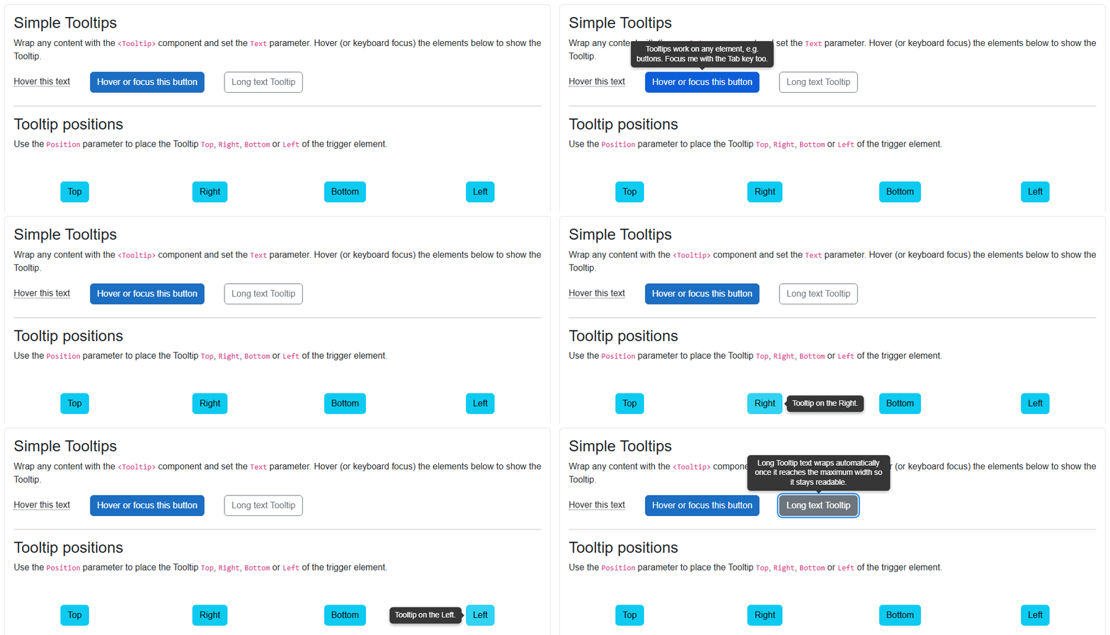
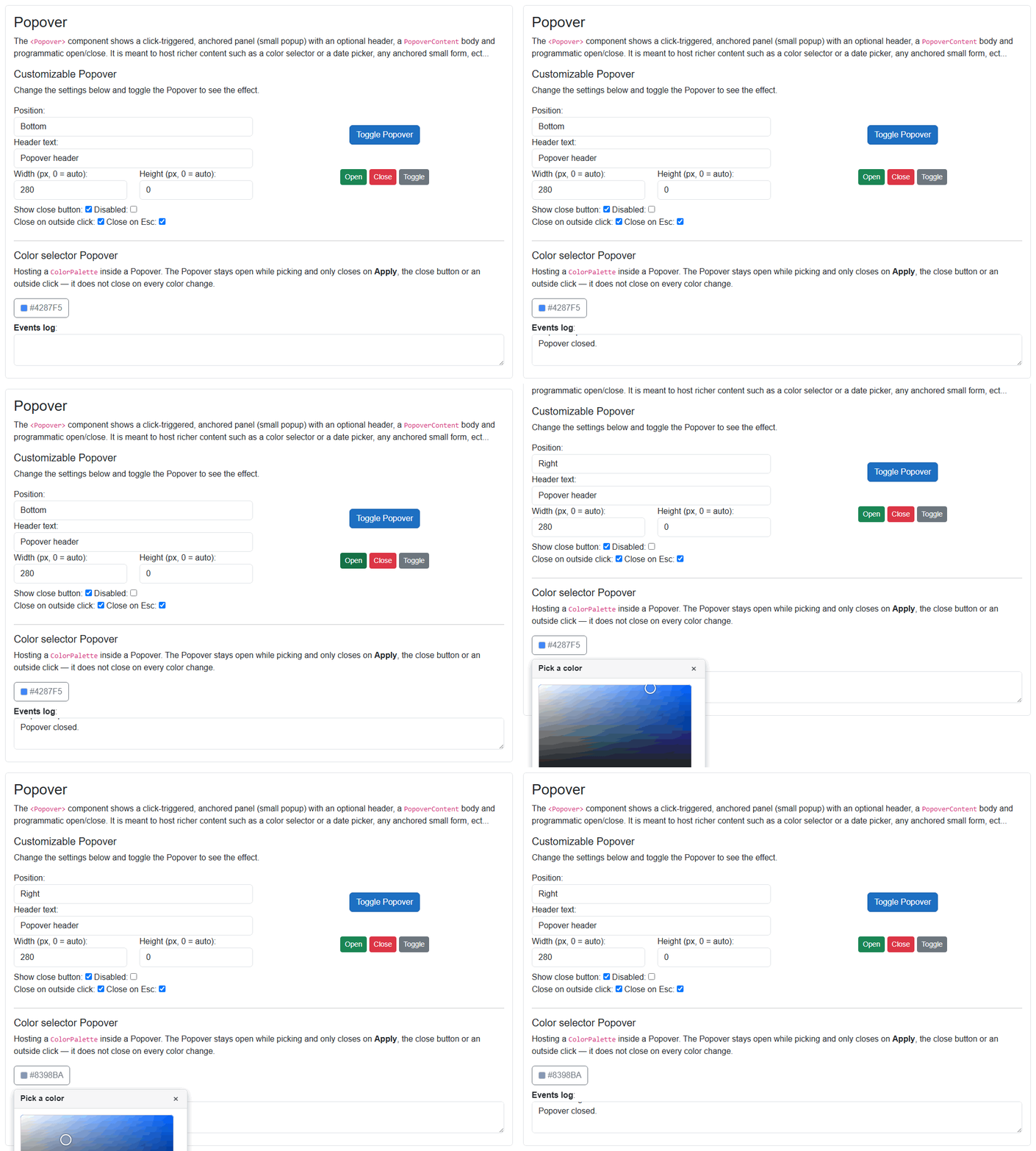
Features
- Wrap any element or component and show a popup attached to it.
Tooltip: lightweight, text or rich HTML, shown on hover or keyboard focus (accessible).Popover: richer, click-triggered anchored panel with optional header and close button, able to host any content (e.g. a color picker or a date picker).- 4 positions:
Top,Right,Bottom,Leftrelative to the trigger element. - Configurable show/hide delays (Tooltip) with anti-flicker handling.
- Optional arrow pointing to the trigger (Tooltip).
- Programmatic open/close and two-way
@bind-IsOpen(Popover). - Close on outside click and/or Esc key (Popover).
- Plain text or rich
RenderFragmentcontent, custom CSS class/style on both the trigger and the popup. - Show/hide (open/close) event callbacks.
Components
Tooltip: renders a small popup with plain text or rich HTML attached to any element, shown on hover or focus.Popover: renders a click-triggered, anchored popup panel with an optional header and a content body, meant to host richer content.
Both components share the TooltipPositions enum used to place the popup relative to the trigger: { Top, Right, Bottom, Left }.
Tooltip component (See: demo app)
Wrap any content with <Tooltip> and set the Text (or TooltipContent) parameter. The Tooltip is shown when the trigger is hovered or receives keyboard focus, and hidden when the pointer leaves or focus is lost. Quick enter/leave is debounced so the popup does not flicker.
Properties
ChildContent:RenderFragmentHTML content - Required <br /> The trigger content (element) the Tooltip is attached to and shown for on hover/focus.Text:string { get; set; }(default: "") <br /> Plain text content shown inside the Tooltip popup. Ignored whenTooltipContentis set.TooltipContent:RenderFragment? { get; set; }(default: null) <br /> Optional rich (HTML) content shown inside the Tooltip popup. Takes precedence overText.Position:TooltipPositions { get; set; }(default: TooltipPositions.Top) <br /> Position of the Tooltip popup relative to the trigger element. Values:{ Top, Right, Bottom, Left }.DelayBeforeShow:int { get; set; }(default: 0) <br /> Delay in milliseconds before the Tooltip is shown after the pointer enters the trigger.DelayBeforeHide:int { get; set; }(default: 250) <br /> Delay in milliseconds before the Tooltip is hidden after the pointer leaves the trigger.Disabled:bool { get; set; }(default: false) <br /> Whentruethe Tooltip is never shown (the trigger content still renders normally).ShowArrow:bool { get; set; }(default: true) <br /> Shows or hides the small arrow pointing from the Tooltip popup to the trigger element.Class:string? { get; set; }(default: null) <br /> Custom CSS class(es) applied to the root (trigger) container element.Style:string? { get; set; }(default: null) <br /> Custom inline style applied to the root (trigger) container element.TooltipClass:string? { get; set; }(default: null) <br /> Custom CSS class(es) applied to the Tooltip popup element.TooltipStyle:string? { get; set; }(default: null) <br /> Custom inline style applied to the Tooltip popup element. Use it to override the background color, text color, corner radius, font size, etc.
Arbitrary HTML attributes e.g.: tabindex="1" will be passed to the corresponding rendered root (trigger) HTML element <div>.
Events
OnShow:EventCallbackdelegate <br /> Callback function called when the Tooltip is showing.OnHide:EventCallbackdelegate <br /> Callback function called when the Tooltip is hiding.
Popover component (See: demo app)
Wrap any content with <Popover> to attach a click-triggered, anchored panel. Clicking the trigger toggles the panel. The panel can show an optional header (text or rich content) with a close button and renders PopoverContent in its body. It is meant to host richer content such as a color selector or a date picker. The Popover can also be opened/closed programmatically and supports two-way binding via @bind-IsOpen.
Properties
ChildContent:RenderFragmentHTML content - Required <br /> The trigger content (element) the Popover is attached to. Clicking it toggles the Popover (unlessDisabledistrue).PopoverContent:RenderFragmentHTML content - Required <br /> The HTML content rendered inside the Popover panel body. Can host any component, e.g. a color selector or date picker.HeaderText:string? { get; set; }(default: null) <br /> Plain text shown in the Popover header. Ignored whenHeaderContentis set.HeaderContent:RenderFragment? { get; set; }(default: null) <br /> Optional rich (HTML) header content. Takes precedence overHeaderText.ShowCloseButton:bool { get; set; }(default: true) <br /> Shows or hides the header close (x) button. The header is rendered when the close button is shown or any header content/text is set.Position:TooltipPositions { get; set; }(default: TooltipPositions.Bottom) <br /> Position of the Popover panel relative to the trigger element. Values:{ Top, Right, Bottom, Left }.Width:int { get; set; }(default: 0) <br /> Fixed Popover panel width in pixels. When0the width is sized to the content.Height:int { get; set; }(default: 0) <br /> Fixed Popover panel height in pixels. When0the height is sized to the content.CloseOnOutsideClick:bool { get; set; }(default: true) <br /> Whentruethe Popover closes when the user clicks outside of it.CloseOnEscapeKey:bool { get; set; }(default: true) <br /> Whentruethe Popover closes when the Esc (Escape) key is pressed while it has focus.Disabled:bool { get; set; }(default: false) <br /> Whentruethe trigger does not open the Popover and programmatic open requests are ignored.Class:string? { get; set; }(default: null) <br /> Custom CSS class(es) applied to the root (trigger) container element.Style:string? { get; set; }(default: null) <br /> Custom inline style applied to the root (trigger) container element.PopoverClass:string? { get; set; }(default: null) <br /> Custom CSS class(es) applied to the Popover panel element.PopoverStyle:string? { get; set; }(default: null) <br /> Custom inline style applied to the Popover panel element.IsOpen:bool { get; set; }(default: false) <br /> Gets or sets whether the Popover is open. Supports two-way binding with@bind-IsOpen. Set totrueto open it programmatically,falseto close it. Reading it returns the current open/closed state.
Arbitrary HTML attributes e.g.: id="pop1" will be passed to the corresponding rendered root (trigger) HTML element <div>.
Events
OnOpen:EventCallbackdelegate <br /> Callback function called when the Popover is opening.OnClose:EventCallbackdelegate <br /> Callback function called when the Popover is closing.IsOpenChanged:EventCallback<bool>delegate <br /> Callback for two-way binding. Invoked with the new open/closed state whenever the Popover opens or closes. Used by@bind-IsOpen.
Configuration
Installation
Majorsoft.Blazor.Components.Tooltips is available on NuGet.
dotnet add package Majorsoft.Blazor.Components.Tooltips
Use the --version option to specify a preview version to install.
Usage
Add using statement to your Blazor <component/page>.razor file. Or globally reference it into _Imports.razor file.
@using Majorsoft.Blazor.Components.Tooltips
Dependences
Majorsoft.Blazor.Components.Tooltips package depends on other Majorsoft Nuget packages:
- Majorsoft.Blazor.Components.Common.JsInterop
which the
Popoveruses to detect outside clicks for closing.
Register services
The Tooltip component works without any service registration. The Popover component relies on the JS Interop extensions to handle outside-click detection, so register them when you use Popover.
In case of WebAssembly project register services in your Program.cs file:
using Majorsoft.Blazor.Components.Common.JsInterop;
...
public static async Task Main(string[] args)
{
	var builder = WebAssemblyHostBuilder.CreateDefault(args);

	//Register dependencies
	builder.Services.AddJsInteropExtensions();
}
In case of Server hosted project register services in your Startup.cs file:
using Majorsoft.Blazor.Components.Common.JsInterop;
...

public void ConfigureServices(IServiceCollection services)
{
	//Register dependencies
	services.AddJsInteropExtensions();
}
Tooltip usage
Following code example shows how to use the Tooltip component. Wrap the trigger element and set the Text. The Tooltip is shown on hover or keyboard focus.
<Tooltip Text="I am a simple text Tooltip.">
	<span style="border-bottom: 1px dotted #555; cursor: help;">Hover this text</span>
</Tooltip>

<Tooltip Text="Tooltips work on any element, e.g. buttons. Focus me with the Tab key too.">
	<button class="btn btn-primary">Hover or focus this button</button>
</Tooltip>
This example shows a fully customized Tooltip with a custom position, delays, rich HTML content and custom styling plus show/hide events.
<Tooltip Position="@_position"
DelayBeforeShow="@_delayBeforeShow"
DelayBeforeHide="@_delayBeforeHide"
ShowArrow="@_showArrow"
Disabled="@_disabled"
TooltipStyle="@_customStyle"
OnShow="@OnTooltipShow"
OnHide="@OnTooltipHide">
<ChildContent>
<button class="btn btn-success">Hover me</button>
</ChildContent>
<TooltipContent>
<div class="text-left">
<strong>Rich Tooltip</strong>
<hr class="my-1" />
Tooltips can render any markup, e.g. an icon ★ or a
<a href="https://github.com/majorimi/blazor-components" target="_blank">link</a>.
</div>
</TooltipContent>
</Tooltip>
@code {
private TooltipPositions _position = TooltipPositions.Top;
private int _delayBeforeShow = 0;
private int _delayBeforeHide = 250;
private bool _showArrow = true;
private bool _disabled = false;
private string _customStyle = "background-color: #6f42c1; color: #fff; border-radius: 6px; font-size: 14px;";
private void OnTooltipShow()
{
//Write your event handling code here...
}
private void OnTooltipHide()
{
//Write your event handling code here...
}
}
Popover usage
Following code example shows how to use the Popover component with a header, programmatic control via @bind-IsOpen and open/close events.
<Popover @bind-IsOpen="_open"
		 HeaderText="Popover header"
		 Position="@TooltipPositions.Bottom"
		 Width="280"
		 ShowCloseButton="true"
		 CloseOnOutsideClick="true"
		 CloseOnEscapeKey="true"
		 OnOpen="@OnPopoverOpen"
		 OnClose="@OnPopoverClose">
	<ChildContent>
		<button class="btn btn-primary">Toggle Popover</button>
	</ChildContent>
	<PopoverContent>
		<p class="mb-0">
			Popovers can contain any HTML content. Click outside, press <kbd>Esc</kbd> or use the
			close button to dismiss (depending on the settings).
		</p>
	</PopoverContent>
</Popover>

@*Open/close the Popover programmatically through the bound field*@
<button class="btn btn-sm btn-success" @onclick="@(() => _open = true)">Open</button>
<button class="btn btn-sm btn-danger" @onclick="@(() => _open = false)">Close</button>
<button class="btn btn-sm btn-secondary" @onclick="@(() => _open = !_open)">Toggle</button>

@code {
	private bool _open;

	private void OnPopoverOpen()
	{
		//Write your event handling code here...
	}
	private void OnPopoverClose()
	{
		//Write your event handling code here...
	}
}
The Popover is well suited to host richer content. The example below hosts a ColorPalette (from the Majorsoft.Blazor.Components.Core/Color package) and keeps the Popover open while the user picks a color, closing it only on Apply, the close button or an outside click.
<Popover @bind-IsOpen="_colorOpen" HeaderText="Pick a color" Position="@TooltipPositions.Bottom" Width="340">
	<ChildContent>
		<button class="btn btn-outline-secondary">@_pickedColor.ToHtmlHex()</button>
	</ChildContent>
	<PopoverContent>
		<ColorPalette SelectedColor="@_pickedColor" OnColorChanged="@(c => _pickedColor = c)" />
		<div class="text-right mt-2">
			<button class="btn btn-sm btn-primary" @onclick="@(() => _colorOpen = false)">Apply</button>
		</div>
	</PopoverContent>
</Popover>

@code {
	private bool _colorOpen;
	private System.Drawing.Color _pickedColor = System.Drawing.Color.FromArgb(66, 135, 245);
}
| Product | Versions Compatible and additional computed target framework versions. |
|---|---|
| .NET | net8.0 is compatible. net8.0-android was computed. net8.0-browser was computed. net8.0-ios was computed. net8.0-maccatalyst was computed. net8.0-macos was computed. net8.0-tvos was computed. net8.0-windows was computed. net9.0 is compatible. net9.0-android was computed. net9.0-browser was computed. net9.0-ios was computed. net9.0-maccatalyst was computed. net9.0-macos was computed. net9.0-tvos was computed. net9.0-windows was computed. net10.0 is compatible. net10.0-android was computed. net10.0-browser was computed. net10.0-ios was computed. net10.0-maccatalyst was computed. net10.0-macos was computed. net10.0-tvos was computed. net10.0-windows was computed. |
-
net10.0
- Majorsoft.Blazor.Components.Common.JsInterop (>= 2.3.0)
- Majorsoft.Blazor.Components.Timer (>= 2.3.0)
- Microsoft.AspNetCore.Components.Web (>= 10.0.8)
-
net8.0
- Majorsoft.Blazor.Components.Common.JsInterop (>= 2.3.0)
- Majorsoft.Blazor.Components.Timer (>= 2.3.0)
- Microsoft.AspNetCore.Components.Web (>= 8.0.27)
-
net9.0
- Majorsoft.Blazor.Components.Common.JsInterop (>= 2.3.0)
- Majorsoft.Blazor.Components.Timer (>= 2.3.0)
- Microsoft.AspNetCore.Components.Web (>= 9.0.16)
NuGet packages (2)
Showing the top 2 NuGet packages that depend on Majorsoft.Blazor.Components.Tooltips:
| Package | Downloads |
|---|---|
|
Majorsoft.Blazor.Components.Inputs
Blazor Components by Imre Toth |
|
|
Majorsoft.Blazor.Components.ColorPicker
Blazor Components by Imre Toth |
GitHub repositories
This package is not used by any popular GitHub repositories.
See Releases here: https://github.com/majorimi/blazor-components/releases