ModernButtons.WinForms
1.0.0
dotnet add package ModernButtons.WinForms --version 1.0.0
NuGet\Install-Package ModernButtons.WinForms -Version 1.0.0
<PackageReference Include="ModernButtons.WinForms" Version="1.0.0" />
<PackageVersion Include="ModernButtons.WinForms" Version="1.0.0" />
<PackageReference Include="ModernButtons.WinForms" />
paket add ModernButtons.WinForms --version 1.0.0
#r "nuget: ModernButtons.WinForms, 1.0.0"
#:package ModernButtons.WinForms@1.0.0
#addin nuget:?package=ModernButtons.WinForms&version=1.0.0
#tool nuget:?package=ModernButtons.WinForms&version=1.0.0
ModernButtons.WinForms





Stop using ugly, 3D gray inputs. Upgrade to anti-aliased, hardware-accelerated Modern Buttons for Windows Forms.
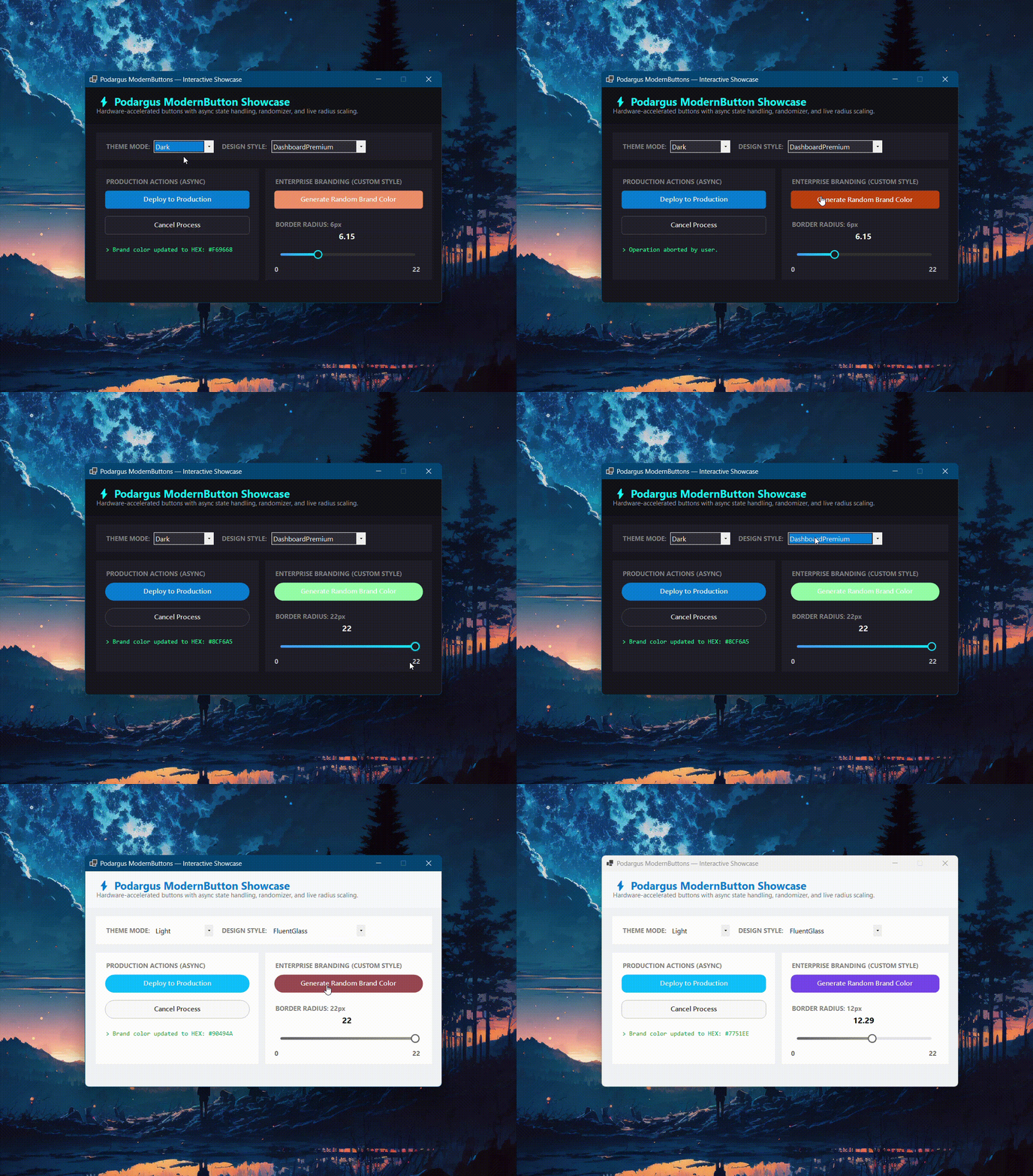
🛑 The Problem with Standard WinForms Buttons
The default WinForms Button is infamous for its harsh gray 3D borders. Achieving smooth rounded corners, custom hover states, and dynamic dark mode styling using the native control is virtually impossible without breaking the click boundaries or losing native routing support.
🟢 The Podargus Solution
ModernButtons.WinForms provides a premium, zero-dependency input. It completely overrides the GDI+ drawing engine to deliver flawless rounded edges and tactile hover/press animations, while perfectly maintaining inheritance from the native System.Windows.Forms.Button class.
This means features like DialogResult, AcceptButton, CancelButton, and standard click events work exactly as expected out of the box!
🚀 Key Features
- 🎨 Primary & Secondary Modes: Easily toggle between filled accent buttons (
IsPrimary = true) and outlined secondary buttons (IsPrimary = false). - ✨ Smooth Rounded Corners: Anti-aliased corner rendering with customizable border radii.
- 👆 Tactile Animations: Backgrounds dynamically lighten on hover and darken with a tactile shift when pressed.
- 🏢 Enterprise Branding: Set Style to
Customto unlock 100% control over Primary, Hover, Pressed, and Text hex colors to perfectly match your corporate brand guidelines. - 🌗 Native Dark Mode: Automatically adapts text and background contrast based on your active Theme mode.
- 🎭 5 Core Styles: Full support for the Podargus Design Matrix (
Dark/Light×DashboardPremium,FluentGlass,MaterialFlat,SoftNeumorphic,Cyberpunk).
📦 Installation
Package Manager Console
Install-Package ModernButtons.WinForms
.NET CLI
dotnet add package ModernButtons.WinForms
⚡ Quick Start & Code Examples
1. Global Theme Configuration
Instantly switch the look of your inputs to match your application's aesthetic.
using Podargus.UI.Controls.WinForms.ModernButtons.Enums;

btnSubmit.Theme = ThemeMode.Dark;
btnSubmit.Style = ButtonDesignStyle.DashboardPremium;
2. Creating a Primary Action Button
Creates a solid, glowing accent button intended for main actions (e.g., Save, Submit, Deploy).
using Podargus.UI.Controls.WinForms.ModernButtons;
using Podargus.UI.Controls.WinForms.ModernButtons.Enums;

var btnSave = new ModernButton
{
    Text = "Save Changes",
    IsPrimary = true,
    BorderRadius = 6,
    Theme = ThemeMode.Dark,
    Style = ButtonDesignStyle.DashboardPremium,
    Size = new Size(150, 40)
};

btnSave.Click += (s, e) => MessageBox.Show("Saved successfully!");
this.Controls.Add(btnSave);
3. Creating a Secondary Outline Button
Creates an outlined button intended for secondary or dismissive actions (e.g., Cancel, Close).
var btnCancel = new ModernButton
{
    Text = "Cancel",
    IsPrimary = false, // Renders as an outline button
    DialogResult = DialogResult.Cancel, // Works natively with WinForms!
    Theme = ThemeMode.Dark,
    Size = new Size(100, 40)
};

this.Controls.Add(btnCancel);
4. Fully Custom Branding
Need to match exact corporate hex codes? Use the Custom style to unlock manual color overrides.
var btnBrand = new ModernButton
{
    Text = "Custom Brand Button",
    Style = ButtonDesignStyle.Custom,
    CustomPrimaryColor = Color.Crimson,
    CustomHoverColor = Color.LightCoral,
    CustomPressedColor = Color.DarkRed,
    CustomTextColor = Color.White,
    BorderRadius = 12
};
this.Controls.Add(btnBrand);
🎨 Theme & Style Matrix
| Design Style | Aesthetic Concept | Key Visual Characteristics |
|---|---|---|
DashboardPremium |
Modern Executive Suite | Sleek rounded buttons with prominent blue/cyan focus glows (Default). |
FluentGlass |
Windows 11 Fluent | High-radius rounded buttons with electric cyan accents and smooth hover states. |
MaterialFlat |
Elevated Material Flat | Flat material-inspired geometry with deep purple/indigo fills. |
SoftNeumorphic |
Soft Embossed Surfaces | High-radius pill buttons with warm coral/orange accent colors. |
Cyberpunk |
High-Voltage Industrial | Stealth black 0px-radius buttons with high-contrast glowing neon emerald borders on hover. |
Custom |
Unlocked Enterprise | Full manual control over hover, press, and background hex colors. |
⚙️ Specifications
| Technical Metric | Underlying Architecture Profile |
|---|---|
| Package Identity | ModernButtons.WinForms |
| Component Type | Custom Hardware-Accelerated Button Control |
| Language Target | C# (Optimized for .NET Framework 4.7.2+ & .NET 6.0/8.0+) |
| Rendering Engine | Anti-Aliased Surface Vector Paint Mapping (GDI+) |
| Target Platforms | Microsoft Windows Desktop Environment (WinForms) |
| Dependencies | None (System.Windows.Forms Base Assembly Only) |
📄 License
Distributed under the MIT License. See the repository LICENSE file for details.
Maintained by Podargus
Building zero-dependency, ultra-performance developer workflows and hardware-accelerated UI components.
| Product | Versions Compatible and additional computed target framework versions. |
|---|---|
| .NET | net6.0-windows7.0 is compatible. net7.0-windows was computed. net8.0-windows was computed. net8.0-windows7.0 is compatible. net9.0-windows was computed. net10.0-windows was computed. |
| .NET Framework | net472 is compatible. net48 is compatible. net481 was computed. |
-
.NETFramework 4.7.2
- No dependencies.
-
.NETFramework 4.8
- No dependencies.
-
net6.0-windows7.0
- No dependencies.
-
net8.0-windows7.0
- No dependencies.
NuGet packages
This package is not used by any NuGet packages.
GitHub repositories
This package is not used by any popular GitHub repositories.
| Version | Downloads | Last Updated |
|---|---|---|
| 1.0.0 | 82 | 9/25/2026 |
v1.0.0 Initial Stable Release:
- Launched ModernButton featuring anti-aliased rounded corners, hover/press state animations, and native DialogResult routing.
- Supports Primary (filled) and Secondary (outlined) rendering modes.
- Native Dark/Light mode integration with 5 Podargus core design styles.
- High-DPI support and zero-flicker double-buffered rendering.