NumericSelector 0.1.0
See the version list below for details.
dotnet add package NumericSelector --version 0.1.0
NuGet\Install-Package NumericSelector -Version 0.1.0
<PackageReference Include="NumericSelector" Version="0.1.0" />
<PackageVersion Include="NumericSelector" Version="0.1.0" />
<PackageReference Include="NumericSelector" />
paket add NumericSelector --version 0.1.0
#r "nuget: NumericSelector, 0.1.0"
#:package NumericSelector@0.1.0
#addin nuget:?package=NumericSelector&version=0.1.0
#tool nuget:?package=NumericSelector&version=0.1.0
NumericSelector

Lookless WPF control for picking an integer value bounded to a range: there is no way for the control to hand out a value outside [Minimum, Maximum], so the consumer never has to validate the input. The bar is what picks the value; the main text is written over it and the number stays readable at all times.
The control is called BoundedNumericSelector and lives in the NumericSelector assembly.
Status: the API is settled and the control is ready for a first stable version. Still pending: NuGet packaging and CI.
What it gives you
- Discrete
intinput, with range, steps and a reset value. - The value is always visible, with no width jumps and no clipping, even with thousands, signs and culture changes.
- Mouse, keyboard and wheel interaction, careful not to interfere with a containing
ScrollViewer. - Configurable layout: the value box sits next to the bar (left or right) or drops down next to the detail row, driven by three simple properties.
- A display-only mode that keeps the appearance and still reflects changes made from code.
- Customizable template and colors, without inheriting
Slidersemantics.
| Platform | Assembly | Control | Value |
|---|---|---|---|
| .NET 10 · WPF · Windows | NumericSelector |
BoundedNumericSelector |
int |
Installing and getting started
For now, add a reference to the NumericSelector project from your WPF application. The NuGet package is planned, but not published yet.
<Window
    xmlns="http://schemas.microsoft.com/winfx/2006/xaml/presentation"
    xmlns:x="http://schemas.microsoft.com/winfx/2006/xaml"
    xmlns:ns="clr-namespace:NumericSelector;assembly=NumericSelector">

    <ns:BoundedNumericSelector
        Minimum="0"
        Maximum="100"
        Value="50"
        ResetValue="50"
        MainText="Volume"
        ValueChanged="Selector_ValueChanged" />
</Window>
private void Selector_ValueChanged(
    object sender,
    RoutedPropertyChangedEventArgs<int> e)
{
    // e.OldValue and e.NewValue
}
Value binds two-way by default, so Value="{Binding MyProperty}" is all it takes.
Layout gallery
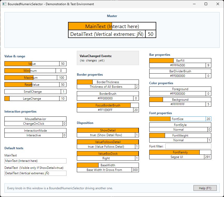
The preview shows the demonstration application that ships with the repository. Where the value box goes is decided by three independent properties (ShowDetail, ValueFollowsDetail and ValueBoxDock):
- No detail (
ShowDetail=false, the default): only the bar row, with the main text over the fill and the value box next to the bar, on the right by default. - Detail with the number on top (
ShowDetail=true,ValueFollowsDetail=false): bar and value box on top, the detail label taking the full width of the bottom row. - Number next to the detail (
ShowDetail=true,ValueFollowsDetail=true): the value box drops to the detail line and the bar is left alone; the box goes to the right or left of the detail according toValueBoxDock.
Interaction
Mouse
| Gesture | Effect |
|---|---|
| Click or drag on the bar | Takes the value to the pointer position. |
| Right click on the bar | Left 30% → Minimum; middle 40% → ResetValue; right 30% → Maximum. |
| Double click on the number | Restores ResetValue. |
| Vertical drag on the number | Changes by SmallChange; upwards increases. |
| Wheel | Changes by SmallChange, only if the control has the focus. |
The focus requirement on the wheel prevents accidental changes when the selector sits inside a ScrollViewer.
Keyboard
| Key | Effect |
|---|---|
←, ↓, - |
− SmallChange |
→, ↑, + |
+ SmallChange |
PageDown, PageUp |
∓ LargeChange |
Home, End |
Minimum, Maximum |
Delete, Insert |
ResetValue |
Focus is signalled with the border color (FocusBorderBrush) instead of WPF's default dotted rectangle.
Main API
Range and changes
| Property | Type | Default | Description |
|---|---|---|---|
Value |
int |
0 |
Current value, coerced to the range and bound TwoWay by default. |
Minimum |
int |
0 |
Lower bound of the range. |
Maximum |
int |
100 |
Upper bound; never ends up below Minimum. |
SmallChange |
int |
1 |
Step for keys, wheel and vertical drag. Between 1 and the width of the range. |
LargeChange |
int |
10 |
Step for PageUp/PageDown. Between 1 and the width of the range. |
ResetValue |
int |
50 |
Value used by reset; also coerced to the range. |
The range always keeps at least one unit of width. When one end is pushed against the other, that end is capped instead of dragging its counterpart along.
The steps are coerced on both sides. A step of 0 would leave the control inert, and one larger than the whole range would add nothing —it jumps from end to end exactly like the range width does— besides displaying an impossible number. Coercion is silent: with Minimum="0" Maximum="5", assigning LargeChange="10" leaves LargeChange at 5. If the range changes afterwards, the steps are re-evaluated against the new range.
Text, layout and size
| Property | Type | Default | Description |
|---|---|---|---|
MainText |
string |
MainText |
Caption over the bar fill. The placeholder text is the name of the property itself, so that it reads in the designer before anything is assigned to it. |
DetailText |
string |
DetailText |
Text of the bottom detail row. Same placeholder criterion as MainText. |
ShowDetail |
bool |
false |
Shows the framed detail row. |
ValueFollowsDetail |
bool |
true |
With ShowDetail, drops the value box down next to the detail; with false, it stays next to the bar. |
ValueBoxDock |
enum |
Right |
Side the value box takes (Right or Left) relative to its row partner. |
BorderThickness |
Thickness |
1 |
Thickness of the frames (inherited from Control, with a changed default). The Bottom side is also the thickness of the line separating the bar from the detail row, because that seam is drawn by the bottom border of the bar. |
BaseWidth |
double |
NaN |
Base width the control grows from to fit its content. NaN = automatic. |
Growth (BaseWidth) and fitting into a narrow container
BaseWidth is the base width the control grows from, and at the same time a floor that is kept whenever there is room. It is not a fixed width nor a hard constraint like WPF's Width/MinWidth: the control asks for max(BaseWidth, content) but never wider than the slot its container gives it. That way:
- There is room → the control grows to show everything and keeps at least
BaseWidth. - The container is narrow → the control stays within what is available and its borders are not clipped; if the text does not fit, main text and detail are truncated with an ellipsis (
CharacterEllipsis) instead of overflowing.
The number in the value box is always reserved by the template's hidden sizers (see "Readability guarantee"): it can scale with the width, but it is never asked for more than the available slot.
Interaction and appearance
| Property | Type | Default | Description |
|---|---|---|---|
MouseBehavior |
MouseInteractionBehavior |
ChangeOnClick |
Decides whether the mouse acts right away or demands focus first. |
InteractionMode |
UserInteractionMode |
Interactive |
ReadOnly keeps the appearance but blocks mouse, keyboard and tabbing. |
BorderBrush |
Brush |
Black |
Frames without focus. Inherited from Control, with a changed default (in WPF it is null). |
FocusBorderBrush |
Brush |
DodgerBlue |
Frames with focus. |
BarFill |
Brush |
Orange |
Proportional fill of the bar. |
BarDividerBrush |
Brush |
Black |
Stroke separating the filled portion from the empty one. |
All five are Brush and not Color, so they accept any brush, not just a flat color: a gradient in BarFill, an image, a VisualBrush. The names follow the WPF convention (BorderBrush, Fill), where the Brush suffix announces the type and is dropped when the property is the fill.
<ns:BoundedNumericSelector BarFill="{StaticResource MyGradient}" />
MouseInteractionBehavior.MustFocusFirst makes the first click —the one that takes the focus— leave the value alone; later gestures do change it. InteractionMode = UserInteractionMode.ReadOnly blocks the user, not the program: assigning Value from code still updates the control and raises ValueChanged.
The control is drawn as four independent cells —bar and value box on top, detail label and detail value box at the bottom—, each with its own frame. Which sides each one draws is resolved by a single seam matrix (ValueBorderResolver), with a single rule: the bar and the detail are the fixed frame, and the value box gives up the side facing its row partner. That way no edge is ever drawn twice. The horizontal seam between rows is always drawn by the bottom border of the bar row —the detail row gives up its top side—, and that same border acts as the bottom border of the control when there is no detail.
Each of the three layout properties does something at all times, with no invalid states and no degradations to document:
ShowDetaildecides whether the detail row exists.ValueFollowsDetaildecides, only when there is a detail, whether the value box drops to that row (true) or stays next to the bar (false).ValueBoxDockdecides which side of its row partner the value box lands on: the detail's if it dropped, the bar's if it did not.
There are no dependencies between properties: every combination is valid and produces a closed drawing.
IsEnabled = false (inherited from UIElement) also puts the control out of the user's reach, and unlike InteractionMode = UserInteractionMode.ReadOnly it does alter the appearance according to the theme. If the control had the focus when it was disabled, it releases it.
Readability guarantee
The width of the value box is reserved by the template's hidden sizers (one TextBlock with the Minimum and another with the Maximum, hidden but still taking up room): WPF takes the largest of the three and the cell will never be measured narrower than the longest number the range can produce. The measurement respects font, border thickness and Language, so the formats 1.000 (es-AR) and 1,000 (en-US) both reserve the right amount of space. The main text may be truncated; the number never is. No Width/MinWidth is written at runtime any more: growth comes from the natural measurement, and the narrow fit from capping to what is available.
Demonstration application
The NumericSelector.Demo project is where every property, font, color, range and gesture can be tried out visually. The control under test takes a fixed-height top row and the options are laid out in three columns.
dotnet run --project .\NumericSelector.Demo\NumericSelector.Demo.csproj
To build the whole solution:
dotnet build .\NumericSelector.slnx --configuration Release
Roadmap
- Horizontal control with an integer range, keyboard, mouse and wheel.
- Configurable layout (
ShowDetail,ValueFollowsDetail,ValueBoxDock), growth fromBaseWidth(floor) and display-only mode. - Interactive demo of the public properties.
- Automated tests for defaults, range coercions, steps, layout and events.
- Tests for focus, mouse gestures and growth (
BaseWidth). - Extend the tests to culture and number formatting.
- Template contract documented with
TemplatePart, to make alternative styles easier. - Explicit validation of invalid values in the public enumerations.
- Demo help on F1: why the test bench is built out of the control itself, plus the list of gestures.
- CI on GitHub Actions:
buildandteston every push and pull request. - NuGet packaging, semantic versioning and initial
0.xrelease. - An animated capture of the demo.
Current limits
- The domain is deliberately integer: there is no decimal support.
- The style's default
BaseWidthis300(the base width/floor it grows from). - The default
FocusVisualStyleis turned off; the focus indicator is the border.
Development and contributions
The repository ships a contribution guide, its security policy, the changelog and an MIT license.
Every push and pull request against main builds the solution in Release —with warnings treated as errors— and runs the test suite on a Windows runner: see .github/workflows/ci.yml.
| Product | Versions Compatible and additional computed target framework versions. |
|---|---|
| .NET | net10.0-windows7.0 is compatible. |
-
net10.0-windows7.0
- No dependencies.
NuGet packages
This package is not used by any NuGet packages.
GitHub repositories
This package is not used by any popular GitHub repositories.