Plugin.Maui.DebugRainbows
1.2.2
dotnet add package Plugin.Maui.DebugRainbows --version 1.2.2
NuGet\Install-Package Plugin.Maui.DebugRainbows -Version 1.2.2
<PackageReference Include="Plugin.Maui.DebugRainbows" Version="1.2.2" />
<PackageVersion Include="Plugin.Maui.DebugRainbows" Version="1.2.2" />
<PackageReference Include="Plugin.Maui.DebugRainbows" />
paket add Plugin.Maui.DebugRainbows --version 1.2.2
#r "nuget: Plugin.Maui.DebugRainbows, 1.2.2"
#:package Plugin.Maui.DebugRainbows@1.2.2
#addin nuget:?package=Plugin.Maui.DebugRainbows&version=1.2.2
#tool nuget:?package=Plugin.Maui.DebugRainbows&version=1.2.2

Plugin.Maui.DebugRainbows
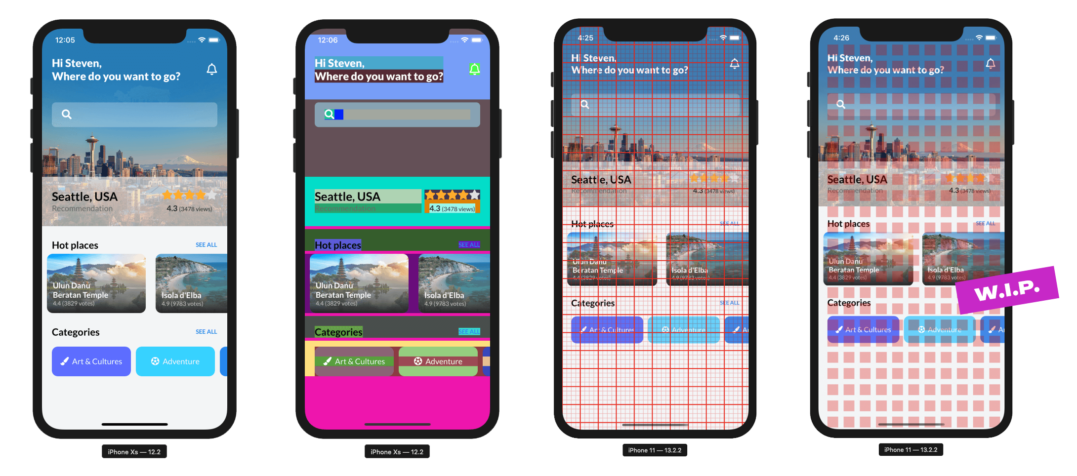
Have you ever had a piece of XAML code that didn't produce the layout you expected? Did you change the background colors on certain elements to get an idea of where they are positioned? Admit it, you have and pretty much all of us have at some point. Either way, this is the package for you! It adds some nice colorful debug modes to your ContentPages or specific visual elements that let you immediately see where all of your elements are located!

Install Plugin
Available on NuGet.
Install with the dotnet CLI: dotnet add package Plugin.Maui.DebugRainbows, or through the NuGet Package Manager in Visual Studio.
Supported Platforms
| Platform | Minimum Version Supported |
|---|---|
| iOS | 11+ |
| macOS | 10.15+ |
| Android | 5.0 (API 21) |
API Usage
Registration
You will first need to register DebugRainbows with the MauiAppBuilder by calling UseDebugRainbows():
public static MauiApp CreateMauiApp()
{
    var builder = MauiApp.CreateBuilder();
    builder
        .UseMauiApp<App>()

#if DEBUG
        // This will add the rainbow backgrounds by default.
        .UseDebugRainbows();

        // Alternatively provide an Options object:
        .UseDebugRainbows(new DebugRainbowsOptions
        {
           ShowRainbows = true,
           ShowGrid = true,
           HorizontalItemSize = 20,
           VerticalItemSize = 20,
           MajorGridLineInterval = 4,
           MajorGridLines = new GridLineOptions { Color = Color.FromRgb(255, 0, 0), Opacity = 1, Width = 4 },
           MinorGridLines = new GridLineOptions { Color = Color.FromRgb(255, 0, 0), Opacity = 1, Width = 1 },
           GridOrigin = DebugGridOrigin.TopLeft,
        });
#endif

    return builder.Build();
}
Scoping to DEBUG
You would be wise to wrap any of these calls in a preprocessor directive like #if DEBUG. Fancy colors in a production app might be fun, but not something I would recommend. Just use the directive that best matches the scenario where you want to use DebugRainbows and you should be good to go.
Features
Once you have set up DebugRainbows it will color all of your UI elements (everything inheriting from View) automatically.
This way you can verify which elements might be taking up unnecessary space or trace elements that might not be behaving as expected.
Additionally you have the option to overlay a visual grid onto your page. This grid is completely configurable and helps you identifying areas that might
not be adhering to the correct padding/margin and other constraints you're adding to your visual elements. Effectively its a digital ruler that you can use to tackle
all of your alignment problems.
DebugRainbowOptions Properties
ShowRainbows
Sets a value indicating whether or not the rainbow-colored backgrounds should be applied.
ShowGrid
Sets a value indicating whether or not the alignment grid should be shown.
HorizontalItemSize
Sets a value indicating the amount of display units between horizontal grid lines.
VerticalItemSize
Sets a value indicating the amount of display units between vertical grid lines.
MajorGridLineInterval
Sets a value indicating the interval at which a major grid line is drawn in relation to minor grid lines. A value of 4 means every 4th line will be a major grid line.
MajorGridLines
Sets a value representing the styling applied to every major grid line. This is set through the GridLineOptions class that exposes the properties Color, Opacity and Width to style a grid line.
MinorGridLines
Sets a value representing the styling applied to every minor grid line. This is set through the GridLineOptions class that exposes the properties Color, Opacity and Width to style a grid line.
GridOrigin
Sets a value representing the origin point of where the grid is initially drawn from. Valid values are:
TopLeft: The grid starts at the top-left corner of the screen.Center: There will be a major grid line at the center of the screen and additional grid lines will be drawn relative to this center line.
Acknowledgements
This project could not have come to be without these projects and people, thank you! ❤️
- The original DebugRainbows for Xamarin.Forms, also by me 😄
- The ever-inspiring Gerald Versluis
| Product | Versions Compatible and additional computed target framework versions. |
|---|---|
| .NET | net8.0 is compatible. net8.0-android was computed. net8.0-android34.0 is compatible. net8.0-browser was computed. net8.0-ios was computed. net8.0-ios18.0 is compatible. net8.0-maccatalyst was computed. net8.0-maccatalyst18.0 is compatible. net8.0-macos was computed. net8.0-tvos was computed. net8.0-windows was computed. net8.0-windows10.0.19041 is compatible. net9.0 was computed. net9.0-android was computed. net9.0-browser was computed. net9.0-ios was computed. net9.0-maccatalyst was computed. net9.0-macos was computed. net9.0-tvos was computed. net9.0-windows was computed. net10.0 was computed. net10.0-android was computed. net10.0-browser was computed. net10.0-ios was computed. net10.0-maccatalyst was computed. net10.0-macos was computed. net10.0-tvos was computed. net10.0-windows was computed. |
-
net8.0
- Microsoft.Maui.Controls (>= 8.0.100)
-
net8.0-android34.0
- Microsoft.Maui.Controls (>= 8.0.100)
-
net8.0-ios18.0
- Microsoft.Maui.Controls (>= 8.0.100)
-
net8.0-maccatalyst18.0
- Microsoft.Maui.Controls (>= 8.0.100)
-
net8.0-windows10.0.19041
- Microsoft.Maui.Controls (>= 8.0.100)
- System.Management (>= 7.0.0)
NuGet packages
This package is not used by any NuGet packages.
GitHub repositories
This package is not used by any popular GitHub repositories.
