SimpleRatingControl.MAUI
0.2.0
dotnet add package SimpleRatingControl.MAUI --version 0.2.0
NuGet\Install-Package SimpleRatingControl.MAUI -Version 0.2.0
This command is intended to be used within the Package Manager Console in Visual Studio, as it uses the NuGet module's version of Install-Package.
<PackageReference Include="SimpleRatingControl.MAUI" Version="0.2.0" />
For projects that support PackageReference, copy this XML node into the project file to reference the package.
<PackageVersion Include="SimpleRatingControl.MAUI" Version="0.2.0" />
<PackageReference Include="SimpleRatingControl.MAUI" />
For projects that support Central Package Management (CPM), copy this XML node into the solution Directory.Packages.props file to version the package.
paket add SimpleRatingControl.MAUI --version 0.2.0
The NuGet Team does not provide support for this client. Please contact its maintainers for support.
#r "nuget: SimpleRatingControl.MAUI, 0.2.0"
#r directive can be used in F# Interactive and Polyglot Notebooks. Copy this into the interactive tool or source code of the script to reference the package.
#:package SimpleRatingControl.MAUI@0.2.0
#:package directive can be used in C# file-based apps starting in .NET 10 preview 4. Copy this into a .cs file before any lines of code to reference the package.
#addin nuget:?package=SimpleRatingControl.MAUI&version=0.2.0
#tool nuget:?package=SimpleRatingControl.MAUI&version=0.2.0
The NuGet Team does not provide support for this client. Please contact its maintainers for support.
Simple Rating Control for .NET MAUI
A Simple Rating Control for .NET MAUI using an icon font.
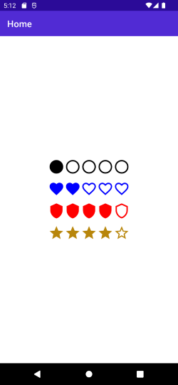
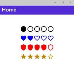
Screenshots
Android
Windows
Setup
Available on NuGet: SimpleRatingControl.MAUI

Just add the package to your .NET MAUI application.
API Usage
Initialize the package by calling UseSimpleRatingControl() on MauiProgram:
var builder = MauiApp.CreateBuilder();

builder
	.UseMauiApp<App>()
	.UseSimpleRatingControl()

    // other configurations

return builder.Build();
You must add this namespace to your xaml files:
xmlns:controls="http://www.tsjdev-apps.de/maui/controls"
Now you can use the SimpleRatingControl from this namespace:
<controls:SimpleRatingControl Amount="5"
                              CurrentValue="1"
                              AccentColor="Black"
                              FontSize="36"
                              RatingType="Circle" />
Available Properties
| Property | Type | Description | Default Value |
|---|---|---|---|
CurrentValue |
double |
Sets the value which should be used as the rating. | 0 |
Amount |
double |
Sets the maximum amount | 10 |
FontSize |
double |
Sets the size of each element. | 24 |
AccentColor |
Color |
Sets the color of the element. | Red |
RatingType |
RatingType |
Sets the type of the icon which should be used. | Star |
Resources
- Blog post explaining the process of creating the NuGet package: Medium
- Listed on nuget.org
- Listed on snppts.dev
| Product | Versions Compatible and additional computed target framework versions. |
|---|---|
| .NET | net8.0 is compatible. net8.0-android was computed. net8.0-android34.0 is compatible. net8.0-browser was computed. net8.0-ios was computed. net8.0-ios17.5 is compatible. net8.0-maccatalyst was computed. net8.0-maccatalyst17.5 is compatible. net8.0-macos was computed. net8.0-tvos was computed. net8.0-windows was computed. net8.0-windows10.0.19041 is compatible. net9.0 was computed. net9.0-android was computed. net9.0-browser was computed. net9.0-ios was computed. net9.0-maccatalyst was computed. net9.0-macos was computed. net9.0-tvos was computed. net9.0-windows was computed. net10.0 was computed. net10.0-android was computed. net10.0-browser was computed. net10.0-ios was computed. net10.0-maccatalyst was computed. net10.0-macos was computed. net10.0-tvos was computed. net10.0-windows was computed. |
Compatible target framework(s)
Included target framework(s) (in package)
Learn more about Target Frameworks and .NET Standard.
-
net8.0
- M.BindableProperty.Generator (>= 0.11.1)
- Microsoft.Maui.Controls (>= 8.0.82)
-
net8.0-android34.0
- M.BindableProperty.Generator (>= 0.11.1)
- Microsoft.Maui.Controls (>= 8.0.82)
-
net8.0-ios17.5
- M.BindableProperty.Generator (>= 0.11.1)
- Microsoft.Maui.Controls (>= 8.0.82)
-
net8.0-maccatalyst17.5
- M.BindableProperty.Generator (>= 0.11.1)
- Microsoft.Maui.Controls (>= 8.0.82)
-
net8.0-windows10.0.19041
- M.BindableProperty.Generator (>= 0.11.1)
- Microsoft.Maui.Controls (>= 8.0.82)
NuGet packages
This package is not used by any NuGet packages.
GitHub repositories
This package is not used by any popular GitHub repositories.
- Update to .NET8
- Code improvements
- Add icon to NuGet package