Westwind.Wpf.Statusbar
0.3.2
dotnet add package Westwind.Wpf.Statusbar --version 0.3.2
NuGet\Install-Package Westwind.Wpf.Statusbar -Version 0.3.2
<PackageReference Include="Westwind.Wpf.Statusbar" Version="0.3.2" />
paket add Westwind.Wpf.Statusbar --version 0.3.2
#r "nuget: Westwind.Wpf.Statusbar, 0.3.2"
// Install Westwind.Wpf.Statusbar as a Cake Addin
#addin nuget:?package=Westwind.Wpf.Statusbar&version=0.3.2

// Install Westwind.Wpf.Statusbar as a Cake Tool
#tool nuget:?package=Westwind.Wpf.Statusbar&version=0.3.2
WPF Statusbar Helper and Control


This is a small WPF library that provides Statusbar functionality in a couple of different ways.
- A basic statusbar control
- A Statusbar Helper you can apply against your own status bars
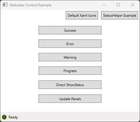
Here's an in-app example of the StatusHelper in a live application in Markdown Monster.
Features
Simple Status Bar Control
A basic status bar control that has an icon plus 3 status panels that can be individually accessed and managed. Control wraps a Statusbar instance that you can optionally customize with additional panels and custom panel content. VariousShowStatusXXX()methods update the main panel's icon and text.A Status Bar Helper
If you prefer to use your own layout for the Statusbar, you can instead use theStatusbarHelperto add the status bar update functionality to your own instances. Requires that your Statusbar has an iconImagecontrol and a mainTextBlockarea to update which is handled via the helper'sShowStausXXX()methods.
Both of these tools provide the following features:
- Easy to use, single method status updates from anywhere in your app
- Modes: Success, Error, Warning, Progress
- Status relevant icons change based on display mode
- Icons are animated for attention
- Spinning icon support typically for progress operations
- Status messages and icons can be timed out, to revert
back to a default status message and icon. - Status updates immediately update UI even in synchronous code
- Stock icons provided
- Icon customization available for overriding either
globally, per instance or per method using
ImageSource
Installation
You can install this library from NuGet:
> dotnet add package Westwind.Wpf.Statusbar
or you can include the source code from this repository into your project.
Statusbar Control
The status bar control can just be dropped onto a form by adding the following namespace:
<Window x:Class="SampleApp.MainWindow" ...
        xmlns:statusbar="clr-namespace:Westwind.Wpf.Statusbar;assembly=Westwind.Wpf.Statusbar"
>
and the actual control:
<statusbar:StatusbarControl Grid.Row="1" x:Name="Statusbar" />
In a window it looks like this:
<Window x:Class="SampleApp.MainWindow"
        xmlns="http://schemas.microsoft.com/winfx/2006/xaml/presentation"
        xmlns:x="http://schemas.microsoft.com/winfx/2006/xaml"

        xmlns:statusbar="clr-namespace:Westwind.Wpf.Statusbar;assembly=Westwind.Wpf.Statusbar"

        Title="MainWindow"
        Height="400" Width="450">


    <Grid>
        <Grid.RowDefinitions>
            <RowDefinition Height="*"/>
            <RowDefinition Height ="Auto"/>
        </Grid.RowDefinitions>

        <StackPanel Width="200" Margin="20">
        ... Content here
        </StackPanel>

        <statusbar:StatusbarControl Grid.Row="1" Name="Statusbar" />
    </Grid>
</Window>
Showing Status Messages
Once the control is on the page you can simply call the single line display methods to manipulate the status behavior.
The following are examples that demonstrate individual status operations:
// shows status and resets to default after default timeout
Statusbar.ShowStatusSuccess("Yay. The operation was successful!");
// shows status and resets to default  after 2 secs
Statusbar.ShowStatusError("Ooops. Something went wrong!",2000);
// *** Access the embedded StatusbarHelper directly (Statusbar.Status)
// shows status and resets to default  after 2 secs
Statusbar.Status.ShowStatusWarning("Careful... this might go sideways.", 2000);
// shows spinning icon indefinitely
Statusbar.Status.ShowStatusProgress("This may take a minute...");
Note that you can either use the control's methods directly (first two examples) or you can use the Status property (last two) which uses the StatusbarHelper instance which is the core component.
Updating Non-Primary Panels
The various status methods can be used to update the status bar's primary text panel and icon, but you can also set the optional center and right panels and assign text or content.
// set with plain text
Statusbar.SetStatusCenter("Center Panel Text");

// set with control content
var sp = new StackPanel() { Orientation = Orientation.Horizontal };
sp.Children.Add(new TextBlock() { Text = "Right Panel Text" });
sp.Children.Add(new Image { Source = StatusIcons.Default.SuccessIcon, Height=15, Margin = new Thickness(3, 0 ,0, 0)});

Statusbar.SetStatusRight(sp);

// Update the primary panel's text only
Statusbar.StatusText.Text = "Pull it!";
Modifying the Statusbar Layout
The status bar control is a UserControl with an embedded StatusBar control which is named - StatusbarInstance that you can directly access and manipulate. This means you can optionally customize the layout by adding or removing panels and adding custom content beyond the base layout.
Need a custom StatusBar Layout? Use
StatusbarHelperIf you plan on a custom Statusbar layout, my recommendation is to skip the control and use the
StatusbarHelperon your own custom layout in your host Window or control instead. As long as you have an iconImageand main panelTextBlockyou can use theStatusbarHelperto get all feature benefits plus full control over your StatusBar layout in your own XAML code.
Statusbar Helper
The StatusbarControl is a quick way to drop a basic status bar on a page, but if you want more control over your status bar layout you can also create and manage your own Status bar XAML layout. You can then attach the StatusbarHelper to take over the status message display.
Configuration
In order to use the StatusbarHelper class a few things are needed:
- A status bar with an icon
Imagecontrol and aTextBlockmain Status text control - If you add a default icon from the default icon collection make
sure to add the
icons.xamlresources to the Window or App resources. - Create a property to hold the
StatusbarHelperinstance - Initialize and assign property after
InitializeComponents()
Custom StatusBar XAML Configuration
For example you can embed a status bar control like this into your own Xaml with a default icon taken from the icons.xaml resources embedded in the library.
<Window x:Class="SampleApp.MainWindow" ...
        xmlns:statusbar="clr-namespace:Westwind.Wpf.Statusbar;assembly=Westwind.Wpf.Statusbar"
>
<Window.Resources>

 <ResourceDictionary Source="pack://application:,,,/Westwind.Wpf.Statusbar;component/Assets/icons.xaml" />
</Window.Resources>
...

<StatusBar
    Height="30"
    VerticalAlignment="Bottom" HorizontalAlignment="Stretch">
    <StatusBar.ItemsPanel>
        <ItemsPanelTemplate>
            <Grid>
                <Grid.ColumnDefinitions>
                    <ColumnDefinition Width="Auto" />
                    <ColumnDefinition Width="*" />
                    <ColumnDefinition Width="Auto" />
                    <ColumnDefinition Width="Auto"  />
                </Grid.ColumnDefinitions>
            </Grid>
        </ItemsPanelTemplate>
    </StatusBar.ItemsPanel>


    <StatusBarItem Grid.Column="0" Margin="2,1,0,0">
        <Image x:Name="StatusIcon" Source="{StaticResource circle_greenDrawingImage}" Height="14" />
    </StatusBarItem>


    <StatusBarItem Grid.Column="1">
        <TextBlock Name="StatusText">Ready</TextBlock>
    </StatusBarItem>


    <StatusBarItem Grid.Column="2">
        <ContentControl Name="StatusCenter"
                   Margin="10 0"
                   x:FieldModifier="public" HorizontalAlignment="Left" />
    </StatusBarItem>
    <StatusBarItem Grid.Column="3">
        <ContentControl x:Name="StatusRight" x:FieldModifier="public" HorizontalAlignment="Right" Margin="0 0 5 0" />
    </StatusBarItem>
</StatusBar>
Status Bar Recommendations
For best effect, there are a couple of recommendations for any custom status bars you use with
StatusbarHelper:
- Make the StatusBar a fixed height to avoid resizing on Flashing
- Make the icon a fixed height (13-15 is good)
Add the StatusbarHelper Instance Property
In the constructor of Window or Control that hosts this control you can then assign the StatusbarHelper as a property like this:
 public partial class MyWindow : Window
 {
    public StatusbarHelper Status { get;  }

    public MyWindow()
    {
        InitializeComponent();

        // Create the helper with text and icon passed in
        Status = new StatusbarHelper(StatusText, StatusIcon);

        ...
    }
 }
Use the Status instance
To use, you can now call the helper's methods to update the status bar:
private void BtnSuccess_OnClick(object sender, RoutedEventArgs e)
{
    // use the controls methods - uses Default Timeout
    Status.ShowStatusSuccess("Yay. The operation was successful! ");

    // shows status and resets to default  after 2 secs
    Status.ShowStatusWarning("Careful... this might go sideways.", 2000);

    // shows spinning icon indefinitely
    Status.ShowStatusProgress("This may take a minute...");
}
Class Interface
The following provides more detail on the interfaces for the StatusbarControl and StatusHelper classes.
StatusbarControl
The StatusbarControl is a UserControl that contains a 3 panel StatusBar control. The
Properties
StatusbarInstance
the 4 panel WPF StatusBar instance you can optionally manipulateStatus
TheStatusbarHelperinstance that does all the work for updating the status bar (see below).
Methods
The control has several methods that forward the StatusbarHelper methods to the control (more info below).
- ShowStatusSuccess()
- ShowStatusError()
- ShowStatusWarning()
- ShowStatusProgress()
In addition it has two methods to set the 2 non-primary status bar panels, with content or text:
- SetStatusCenter()
- SetStatusRight()
StatusBarHelper
The helper provides easy to use methods to update the icon and main status text of the statusbar that it's bound to. You pass in a TextBlock and Image that map to these panel items and that are updated as needed.
Properties
StatusText and StatusImage
The two controls captured in the constructor that are updated by this helper.StatusIcons
An instance ofItemSourceimages that describe the icons that are used for display messages. Defaults toStatusIcons.Defaultbut can be overridden with your own instance that replaces any of the defaultItemSourceImages. If you replaceStatusIconswe recommend you create a new instance to avoid overwriting the default icons unless you want to globally replace icons.DefaultStatusText
The default status text that the control reverts back to when the display timeout is expired.
<small>Related: The default icon is reset toStatusIcons.DefaultIcon.</small>StatusMessageTimeoutMs
Determines the default message timeout in milliseconds for operations that revert to the default message and icon after the timeout (Success, Error, Warning). You can always override this setting in the individual methods.OriginalIconHeight and OriginalIconWidth
Captures the original icon size of the icon so that it can be reset when 'flashing' the icon. If the value is non-zero the value provided is used. If default value of 0, we attempt to capture the size from theImagecontrol, and if that fails - likely because of auto-sizing - we default to 14. Preferrably you set the icon's height in the statusbar or provide at least an explicit height. If width can't be determined we use the same value as the height.
Methods Methods are pretty self-explanatory:
public void ShowStatusSuccess(string message, int timeout = -1,
    ImageSource imageSource = null, bool flashIcon = true)
public void ShowStatusWarning(string message, int timeout = -1,
    ImageSource imageSource = null,
    bool flashIcon = true)
public void ShowStatusWarning(string message, int timeout = -1,
    ImageSource imageSource = null,
    bool flashIcon = true)
public void ShowStatusProgress(string message, int timeout = -1,
    ImageSource imageSource = null, bool spin = true, bool flashIcon = false)
public void ShowStatus(string message = null,
    int timeoutMs = 0,
    ImageSource imageSource = null,
    bool spin = false,
    bool flashIcon = false,
    bool noDispatcher = false)
public void SetStatusIcon(ImageSource imageSource, bool spin = false)
public void SetStatusIcon() // resets to default
public void FlashIcon(Image icon = null)
Timeout Parameter Notes
The timeout parameter can be passed as a Milliseconds value, -1 or 0.
- Milliseconds - Explicit timeout in Milliseconds
- -1 - Use the default
StatusMessageTimeoutMs - 0 - No timeout - display the message and leave it up
Using Custom Icons
The status bar uses default icons that are internally provided via a icons.xaml XAML resource, but can be replaced with your own custom icons either globally, per instance or with each method call.
All icons are ImageSource objects, so they can be replaced with any new image source, which can come from other XAML resources, bitmap images or even from other libraries like the FontAwesome6 library - anything that can produce an ImageSource.
Default Icon Configuration - how it works
By default the StatusbarHelper and StatusbarControl are using default icons that are embedded as XAML resources in icons.xaml and that are assigned as DrawingImage instances to the ImageSource typed properties of StatusIcons.
The default resource icons are accessible via the following resource path and resource keys:
via XAML:
<Window.Resources>

 <ResourceDictionary Source="pack://application:,,,/Westwind.Wpf.Statusbar;component/Assets/icons.xaml" />
</Window.Resources>

<StatusBarItem Grid.Column="0" Margin="2,1,0,0">
        <Image x:Name="StatusIcon" Source="{StaticResource circle_greenDrawingImage}" Height="14" />
</StatusBarItem>
or via code:
public StatusIcons()
{
    var dict = new ResourceDictionary()
    {
        Source = new Uri("pack://application:,,,/Westwind.Wpf.Statusbar;component/Assets/icons.xaml")
    };
    if (!Application.Current.Resources.Contains("circle_greenDrawingImage"))
        Application.Current.Resources.MergedDictionaries.Add(dict);

    DefaultIcon = dict["circle_greenDrawingImage"] as DrawingImage;
    SuccessIcon = dict["circle_checkDrawingImage"] as DrawingImage;
    ErrorIcon = dict["triangle_exclamationDrawingImage"] as DrawingImage;
    WarningIcon = dict["triangle_warningDrawingImage"] as DrawingImage;
    ProgressIcon = dict["circle_notchDrawingImage"] as DrawingImage;
}
These icons are exposed as the default in:
StatusbarHelper.StatusIcons = StatusbarIcons.Default;
Overriding Default Icons
There are three ways to override the default icons:
- Globally - Overide the
StatusIcon.Defaulticon set - Per Control - Override the
StatusbarHelper.StatusIconsinstance - Per Call - Override the
imageSourceparameter on the variousShowStatusXXX()calls
Globally override StatusIcon.Default
The StatusIcon.Default static object contains the default icons provided by this library in the icons.xaml resource. The default icons are the default icon set assigned to a new instance of the StatusbarHelper and by extension the StatusbarControl which uses the helper for rendering.
You can assign a new set of icons to the StatusIcon.Default icon ImageSource properties. By overriding these ImageSource properties before any controls or helpers are created you are effectively globally overriding the value all icons that are rendered.
For example, to override the SuccessIcon you could use the following code:
// ImageAwesome creates a DrawingImage control
image = new ImageAwesome()
{
    PrimaryColor = Brushes.ForestGreen,
    Height = 15,
    Icon = EFontAwesomeIcon.Solid_SquareCheck
};

// globally override SuccessIcon for all instance that use the default icons
StatusIcons.Default.SuccessIcon = image.Source;
Override StatusbarHelper Instance
If you want to override behavior of a single StatusbarHelper or StatusbarControl you can do so via the Helper's StatusIcons class. You access it both directly on a StatusbarHelper.StatusIcons instance or on the StatusbarControl.Status.StatusIcons property.
Here's an example using the FontAwesome6 library which among other things can create ImageSources from FontAwesome icons using the ImageAwesome class. Here I'm assigning to a StatusbarControl and it's StatusIcons at the control level.
private void BtnToggleIcons_OnChecked(object sender, RoutedEventArgs e)
{
    ToggleState = !ToggleState;

    if (ToggleState)
    {
        ActiveIconSet = "Custom Images: Font Awesome 6";

        // You can override the control or StatusbarHelper icons

        // Create and assign a NEW icon set so we don't overwrite default icons
        var icons = new StatusIcons();
        Statusbar.Status.StatusIcons = icons;

        // if you want to retain existing icons assign them
        // icons.DefaultIcon = StatusIcons.Default.DefaultIcon

        // create new custom icons for the error icon from FontAwesome6 icons
        var image = new ImageAwesome()
        {
            PrimaryColor = Brushes.Green,
            Height = 15,
            Icon = EFontAwesomeIcon.Solid_House
        };
        icons.DefaultIcon = image.Source;

        image = new ImageAwesome()
        {
            PrimaryColor = Brushes.ForestGreen,
            Height = 15,
            Icon = EFontAwesomeIcon.Solid_SquareCheck
        };
        icons.SuccessIcon = image.Source;

        // create a custom icon for the error icon from FontAwesome6 icons
        image = new ImageAwesome()
        {
            PrimaryColor = Brushes.DarkGoldenrod,
            Height = 15,
            Icon = EFontAwesomeIcon.Solid_CircleRadiation
        };
        icons.WarningIcon = image.Source;

        image = new ImageAwesome()
        {
            PrimaryColor = Brushes.Firebrick,
            Height = 15,
            Icon = EFontAwesomeIcon.Solid_CircleExclamation
        };
        icons.ErrorIcon = image.Source;

        image = new ImageAwesome()
        {
            PrimaryColor = Brushes.SteelBlue,
            Height = 15,
            Icon = EFontAwesomeIcon.Solid_Spinner
        };
        icons.ProgressIcon = image.Source;
    }
    else
    {
        ActiveIconSet = "Default Xaml Icons";

        // using the Statusbar control
        Statusbar.Status.StatusIcons = StatusIcons.Default;

        // using the Statusbar Helper
        // StatusHelper.StatusIcons = icons;
    }

    btnToggleIcons.Content = ActiveIconSet;
    Statusbar.Status.SetStatusIcon();

    // Alternately you can also override the StatusIcon.Default icons
    // and have them overridden anywhere the default icons are used
    // as a 'global' icon override:
    //
    // StatusbarIcons.DefaultIcon = image.Source;  // overrides anywhere the default is used

}
Per call Icon Overrides
Each of the control and helper ShowStatusXXX() methods have a parameter override that let you specify an imageSource parameter that effectively lets you use any icon you want for just a single call.
private async void BtnRaw_OnClick(object sender, RoutedEventArgs e)
{
    var image = new ImageAwesome()
    {
        PrimaryColor = Brushes.SteelBlue,
        Height = 15,
        Icon = EFontAwesomeIcon.Solid_Spinner
    };

    // Use the custom ImageAwesome source
    Statusbar.Status.ShowStatusProgress("Custom icon spinner (from FontAwesome)",
                                       imageSource: image.Source, spin: true);
}
License
This library is published under MIT license terms.
Copyright © 2023 Rick Strahl, West Wind Technologies
Permission is hereby granted, free of charge, to any person obtaining a copy of this software and associated documentation files (the "Software"), to deal in the Software without restriction, including without limitation the rights to use, copy, modify, merge, publish, distribute, sublicense, and/or sell copies of the Software, and to permit persons to whom the Software is furnished to do so, subject to the following conditions:
The above copyright notice and this permission notice shall be included in all copies or substantial portions of the Software.
THE SOFTWARE IS PROVIDED "AS IS", WITHOUT WARRANTY OF ANY KIND, EXPRESS OR IMPLIED, INCLUDING BUT NOT LIMITED TO THE WARRANTIES OF MERCHANTABILITY, FITNESS FOR A PARTICULAR PURPOSE AND NONINFRINGEMENT. IN NO EVENT SHALL THE AUTHORS OR COPYRIGHT HOLDERS BE LIABLE FOR ANY CLAIM, DAMAGES OR OTHER LIABILITY, WHETHER IN AN ACTION OF CONTRACT, TORT OR OTHERWISE, ARISING FROM, OUT OF OR IN CONNECTION WITH THE SOFTWARE OR THE USE OR OTHER DEALINGS IN THE SOFTWARE.
| Product | Versions Compatible and additional computed target framework versions. |
|---|---|
| .NET | net6.0-windows7.0 is compatible. net7.0-windows was computed. net8.0-windows was computed. net8.0-windows7.0 is compatible. |
| .NET Framework | net472 is compatible. net48 was computed. net481 was computed. |
-
.NETFramework 4.7.2
- No dependencies.
-
net6.0-windows7.0
- No dependencies.
-
net8.0-windows7.0
- No dependencies.
NuGet packages
This package is not used by any NuGet packages.
GitHub repositories
This package is not used by any popular GitHub repositories.