WpfxCustomControls.ClockControl
0.1.0-alpha.3
dotnet add package WpfxCustomControls.ClockControl --version 0.1.0-alpha.3
NuGet\Install-Package WpfxCustomControls.ClockControl -Version 0.1.0-alpha.3
<PackageReference Include="WpfxCustomControls.ClockControl" Version="0.1.0-alpha.3" />
<PackageVersion Include="WpfxCustomControls.ClockControl" Version="0.1.0-alpha.3" />
<PackageReference Include="WpfxCustomControls.ClockControl" />
paket add WpfxCustomControls.ClockControl --version 0.1.0-alpha.3
#r "nuget: WpfxCustomControls.ClockControl, 0.1.0-alpha.3"
#:package WpfxCustomControls.ClockControl@0.1.0-alpha.3
#addin nuget:?package=WpfxCustomControls.ClockControl&version=0.1.0-alpha.3&prerelease
#tool nuget:?package=WpfxCustomControls.ClockControl&version=0.1.0-alpha.3&prerelease
Lookless clock custom control
WPF custom control built entirely in C# with the WPFX code-first framework.
ClockControl
ClockControl is a lookless custom control. It exposes:
- A dependency property and CLR property:
Timestamp(DateTime) - A routed event and CLR event:
TimestampChanged - A default
ControlTemplatebuilt in C# with WPFX
The default template contains a single TextBlock that displays the
template-bound Timestamp value as "dd/MM/yyyy HH:mm:ss".
Styling without generic.xaml
The control does not require a generic.xaml file. Its default style and
template are created in code. For convenience, the default style is exposed through the static DefaultStyle
property, but in most circumstances you should not need to use it.
A conventional WPF custom control automatically finds its default style in
generic.xaml through the StyleKeyProperty.
With this code-first approach and using the StyleProperty, a
user applying a new Style without BasedOn would normally lose the default
ControlTemplate. But our control provides a transparent correction to ensure the ControlTemplate survives.
When a user supplies a style without BasedOn, ClockControl handles the
style change automatically:
OnStyleChangeddetects that the new style has no explicitBasedOn.CloneStylecopies the complete user style, including setters, triggers, and resources.- The cloned style is based on
ClockControl.DefaultStyle. - The corrected style is applied back to the control.
This means a custom style can simply contain the values the application wants
to change. The user does not need to know about DefaultStyle or manually set
BasedOn, whether the style is created with WPFX or in standard XAML. The
original default setters remain available through style inheritance, including
the default ControlTemplate, so applying a local or global style does not
silently remove the control's template.
An explicitly supplied BasedOn is respected as-is.
For example, a WPFX style only needs to describe its custom values:
var style = StyleX<ClockControl>(
    setters: [
        SetterX(Control.ForegroundProperty, Brushes.DarkOrange),
        SetterX(Control.FontSizeProperty, 48d),
    ]
);
The same principle applies to a normal XAML style:
<Style TargetType="{x:Type local:ClockControl}">
    <Setter Property="Foreground" Value="DarkOrange" />
    <Setter Property="FontSize" Value="48" />
</Style>
Customising the ControlTemplate
The control can be used in its default state, or its complete visual
appearance can be replaced with a user-defined ControlTemplate. Build the
visual tree with WPFX, bind template elements to Timestamp using
RelativeSourceMode.TemplatedParent, and use converters where required to
transform the timestamp into values such as Text, Fill, or Visibility.
The template styles in the demos are ordinary styles: they provide a new
ControlTemplate while the automatic style handling supplies the default
style relationship.
Demo applications
The solution contains four small demo applications. Each app creates its WPF window entirely in C#.
Demo 01 - Local settings
Demo_01_LocalSettings shows the control in its default state. It changes
ordinary control properties directly on the instance, including foreground,
font family, font weight, and font size. This is the simplest way to use
ClockControl without creating a style.
Demo 02 - Local style
Demo_02_LocalStyle applies a style directly to one ClockControl. The style
changes visual properties such as the foreground, font, weight, and size
without needing to specify BasedOn. The control's default template is retained
automatically.
Demo 03 - Global style
Demo_03_GlobalStyle adds a style to Application.Resources using
typeof(ClockControl) as the resource key. The style is therefore applied
implicitly to the control, demonstrating the same automatic default-style
inheritance for an application-wide style.
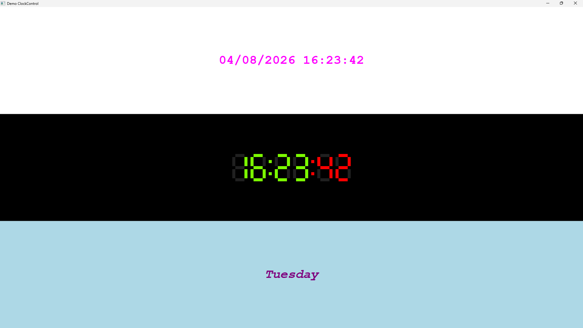
Demo 04 - Clock controls
Demo_04_ClockControls demonstrates three controls in one window:
- Row 0: The built-in default template, with a few local property values.
- Row 1: A seven-segment LED clock using
LedClockStyleandLedClockFillConverter. - Row 2: A weekday/date clock using
WeekdayClockStyleandWeekdayDayMonthConverter.
The two custom styles are registered in the application's
ResourceDictionary and then selected by key. Both templates are built
programmatically with WPFX.
Installation
For convenience, this library is available as a standalone NuGet package for
use in your own WPF applications. Install the control package; its dependency
on UserExtensions.Wpfx is installed transitively:
dotnet add package WpfxCustomControls.ClockControl
| Product | Versions Compatible and additional computed target framework versions. |
|---|---|
| .NET | net10.0-windows7.0 is compatible. |
-
net10.0-windows7.0
- UserExtensions.Wpfx (>= 0.1.0-alpha.12)
NuGet packages
This package is not used by any NuGet packages.
GitHub repositories
This package is not used by any popular GitHub repositories.
| Version | Downloads | Last Updated |
|---|---|---|
| 0.1.0-alpha.3 | 51 | 9/19/2026 |
| 0.1.0-alpha.2 | 75 | 8/26/2026 |
| 0.1.0-alpha.1 | 71 | 8/23/2026 |