XperienceCommunity.PreviewComponentOutlines
4.1.0
dotnet add package XperienceCommunity.PreviewComponentOutlines --version 4.1.0
NuGet\Install-Package XperienceCommunity.PreviewComponentOutlines -Version 4.1.0
<PackageReference Include="XperienceCommunity.PreviewComponentOutlines" Version="4.1.0" />
<PackageVersion Include="XperienceCommunity.PreviewComponentOutlines" Version="4.1.0" />
<PackageReference Include="XperienceCommunity.PreviewComponentOutlines" />
paket add XperienceCommunity.PreviewComponentOutlines --version 4.1.0
#r "nuget: XperienceCommunity.PreviewComponentOutlines, 4.1.0"
#:package XperienceCommunity.PreviewComponentOutlines@4.1.0
#addin nuget:?package=XperienceCommunity.PreviewComponentOutlines&version=4.1.0
#tool nuget:?package=XperienceCommunity.PreviewComponentOutlines&version=4.1.0
Xperience Community: Preview Component Outlines
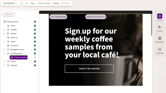
Enables outlines of Page Builder components in Preview mode for a page in a website channel.
This can help marketers and content managers visualize how various Page Builder components are composed on a page without the design limitations of the Page Builder edit mode.
Packages
PreviewComponentOutlines

Library Version Matrix
| Xperience Version | Library Version |
|---|---|
| >= 29.6.0 | 4.x |
| >= 29.3.0 | 3.x |
| >= 28.1.0 | 2.x |
| >= 25.0.0 | 1.x |
Dependencies
Setup
Install the XperienceCommunity.PreviewComponentOutlines NuGet package in your ASP.NET Core application:
dotnet add package XperienceCommunity.PreviewComponentOutlines
In your Program.cs add the following line where the rest of your services are configured:
builder.Services.AddPreviewComponentOutlines();
If you want to configure the styles of the outlines and labels, use the method overload:
builder.Services.AddPreviewComponentOutlines(o =>
{
    o.LabelFontColor = "#3a3a3a";
});
In your _ViewImports.cshtml add the following line to make the library's tag helper available in your Razor views:
@addTagHelper *, XperienceCommunity.PreviewComponentOutlines
In each Page Builder component you would like to have an outline and label, add the following tag helper to the most top-level HTML element of the component's view, where Component Widget|Section is the name of the component:
<div xpc-preview-outline="Component Widget|Section"></div>
Note: The name of the component must end in "Section" or "Widget" to ensure the styles are applied correctly.
Example:
<section xpc-preview-outline="Single Column Section">

</section>
If you added a wrapping HTML element to apply the tag helper to the component and you want to remove that element
when rendering for a live website request, you can use the xpc-preview-outline-remove-element attribute:
<div
  xpc-preview-outline="Single Column Section"
  xpc-preview-outline-remove-element="true"
>
  <section>
    <widget-zone name="left" />
  </section>

  <section>
    <widget-zone name="right" />
  </section>
</div>
The rendered output will include the children elements but not the wrapping parent:
<section>
  <widget-zone name="left" />
</section>

<section>
  <widget-zone name="right" />
</section>
Contributions
If you discover a problem, please open an issue.
If you would like contribute to the code or documentation, please open a pull request.
Please refer to the Code of Conduct when contributing to or opening issues for this repository.
| Product | Versions Compatible and additional computed target framework versions. |
|---|---|
| .NET | net8.0 is compatible. net8.0-android was computed. net8.0-browser was computed. net8.0-ios was computed. net8.0-maccatalyst was computed. net8.0-macos was computed. net8.0-tvos was computed. net8.0-windows was computed. net9.0 was computed. net9.0-android was computed. net9.0-browser was computed. net9.0-ios was computed. net9.0-maccatalyst was computed. net9.0-macos was computed. net9.0-tvos was computed. net9.0-windows was computed. net10.0 was computed. net10.0-android was computed. net10.0-browser was computed. net10.0-ios was computed. net10.0-maccatalyst was computed. net10.0-macos was computed. net10.0-tvos was computed. net10.0-windows was computed. |
-
net8.0
- Kentico.Xperience.WebApp (>= 29.6.0)
NuGet packages
This package is not used by any NuGet packages.
GitHub repositories
This package is not used by any popular GitHub repositories.
| Version | Downloads | Last Updated |
|---|---|---|
| 4.1.0 | 3,070 | 10/28/2024 |
| 4.1.0-prerelease-8-1 | 156 | 10/28/2024 |
| 4.0.0 | 253 | 10/23/2024 |
| 4.0.0-prerelease-7-1 | 160 | 10/23/2024 |
| 3.0.0 | 548 | 8/18/2024 |
| 3.0.0-prerelease-6-1 | 173 | 8/18/2024 |
| 2.0.0 | 715 | 1/15/2024 |
| 2.0.0-prerelease-5-1 | 166 | 1/14/2024 |
| 1.0.0 | 291 | 5/28/2023 |
| 1.0.0-prerelease-3-1 | 236 | 5/28/2023 |
| 1.0.0-prerelease-2-1 | 248 | 5/6/2023 |
| 1.0.0-prerelease-1-1 | 267 | 5/6/2023 |