tsjdevapps.MauiControlsLib
1.0.0
See the version list below for details.
dotnet add package tsjdevapps.MauiControlsLib --version 1.0.0
NuGet\Install-Package tsjdevapps.MauiControlsLib -Version 1.0.0
<PackageReference Include="tsjdevapps.MauiControlsLib" Version="1.0.0" />
paket add tsjdevapps.MauiControlsLib --version 1.0.0
#r "nuget: tsjdevapps.MauiControlsLib, 1.0.0"
// Install tsjdevapps.MauiControlsLib as a Cake Addin
#addin nuget:?package=tsjdevapps.MauiControlsLib&version=1.0.0

// Install tsjdevapps.MauiControlsLib as a Cake Tool
#tool nuget:?package=tsjdevapps.MauiControlsLib&version=1.0.0
Controls Library for .NET MAUI
This repository contains some custom made controls for your .NET MAUI application. This library is currently under development and for the moment there is only a RatingControl available.
Installation
Install the package via NuGet.
Initialization
Open the class MauiProgram and call UseMauiControlsLib() on the MauiAppBuilder.
MauiAppBuilder builder = MauiApp.CreateBuilder();
builder
    .UseMauiApp<App>()
    .UseMauiControlsLib() // <--
    .ConfigureFonts(fonts =>
    {
        fonts.AddFont("OpenSans-Regular.ttf", "OpenSansRegular");
        fonts.AddFont("OpenSans-Semibold.ttf", "OpenSansSemibold");
    });

return builder.Build();
In order to make use of the control within XAML you can use this namespace:
xmlns:controls="http://www.tsjdev-apps.de/controls/maui"
Available Controls
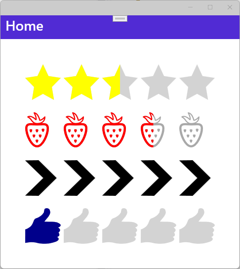
RatingControl
You can use the RatingControl in your .NET MAUI application.
The following table explains all the available properties and their default value.
| name | type | default value | description |
|---|---|---|---|
Amount |
int |
5 |
Indicates the number of rating items to be displayed |
CurrentValue |
float |
2.5f |
Indicates the current rating value to be displayed |
ItemSize |
float |
24f |
Indicates the size of each rating item |
ItemSpacing |
float |
6f |
Indicates the spacing between each rating item. |
FillColor |
Color |
Colors.Yellow |
Indicates the fill color to be used for each rating item |
UnfillColor |
Color |
Colors.LightGray |
Indicates the unfill color to be used for each rating item |
Path |
string |
<Star> |
Indicates the path used to draw each rating item |
Screenshot of RatingControl on Android

Screenshot of RatingControl on Windows
| Product | Versions Compatible and additional computed target framework versions. |
|---|---|
| .NET | net7.0 is compatible. net7.0-android was computed. net7.0-android33.0 is compatible. net7.0-ios was computed. net7.0-ios16.1 is compatible. net7.0-maccatalyst was computed. net7.0-maccatalyst16.1 is compatible. net7.0-macos was computed. net7.0-tvos was computed. net7.0-windows was computed. net7.0-windows10.0.19041 is compatible. net8.0 was computed. net8.0-android was computed. net8.0-browser was computed. net8.0-ios was computed. net8.0-maccatalyst was computed. net8.0-macos was computed. net8.0-tvos was computed. net8.0-windows was computed. |
-
net7.0
- M.BindableProperty.Generator (>= 0.11.1)
-
net7.0-android33.0
- M.BindableProperty.Generator (>= 0.11.1)
-
net7.0-ios16.1
- M.BindableProperty.Generator (>= 0.11.1)
-
net7.0-maccatalyst16.1
- M.BindableProperty.Generator (>= 0.11.1)
-
net7.0-windows10.0.19041
- M.BindableProperty.Generator (>= 0.11.1)
NuGet packages
This package is not used by any NuGet packages.
GitHub repositories
This package is not used by any popular GitHub repositories.
- First Release