Dirkster.NumericUpDownLib
2.3.1
See the version list below for details.
dotnet add package Dirkster.NumericUpDownLib --version 2.3.1
NuGet\Install-Package Dirkster.NumericUpDownLib -Version 2.3.1
<PackageReference Include="Dirkster.NumericUpDownLib" Version="2.3.1" />
<PackageVersion Include="Dirkster.NumericUpDownLib" Version="2.3.1" />
<PackageReference Include="Dirkster.NumericUpDownLib" />
paket add Dirkster.NumericUpDownLib --version 2.3.1
#r "nuget: Dirkster.NumericUpDownLib, 2.3.1"
#addin nuget:?package=Dirkster.NumericUpDownLib&version=2.3.1
#tool nuget:?package=Dirkster.NumericUpDownLib&version=2.3.1


Overview
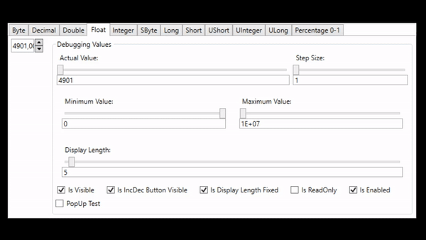
This library implements numeric up down WPF controls to edit a value:
- by dragging the mouse vertically/horizontally (see recording below) or
- by clicking up/down arrow (repeat) buttons or
- up/down or left right cursor keys or
- spinning mousewheel up down on mouseover or
- editing a textbox
The initial values are: MinValue = 0, Value = 0, MaxValue = 0
Each control maintains the condition: MinValue <= Value <= MaxValue at all times. This means, if you want to setup a Min/Max value range you have to be careful to do this in the right order:
Positive Range:
MaxValue = 12, Value = 1, MinValue = 1
→ Value is editable in the range of 1 and 12: [1, 12].Negative Range:
MinValue = -12, Value = -1, MinValue = -1
→ Value is editable in the range of -1 and -12: [-1, -12].
and so forth... see also Issue #4 for more details.
Each control implementation is specific for a certain .Net data type:
| Data Type | Control |
|---|---|
| byte | ByteUpDown control |
| decimal | DecimalUpDown control |
| double | DoubleUpDown control |
| float | FloatUpDown control |
| integer | IntegerUpDown control |
| long | LongUpDown control |
| sbyte | SbyteUpDown control |
| short | ShortUpDown control |
| ushort | UshortUpDown control |
| uint | UintUpDown control |
| ulong | UlongUpDown control |
Percentages can be edit at [0-100] while backend viewmodels handles [0-1] values, see FactorToDoubleConverter and PercentageUpDownDemo in demo clients at project site.
Controls are fully themeable. Project site contains demos for:
- Dark/Light theme and
- Generics theme test clients.
More Features:
- Small Increments and Decrements can be configured to be 1 or any greater value than 1.
- Large Small Increments and Decrements can be configured to be 10 or any other value greater 1.
- The width of the control can be configured to be fixed (textbox will scroll inside when text is too large)
- Up/Down button is disabled when min or max limit is already reached
- Up/Down button can be configured to be invisible
- Mouse drag mode for editing value can be enabled/disabled
- SelectAll on GotFocus of TextBox
- IsReadOnly property disables the textbox portion but leaves all other funtions for Increment/Decrement available
LargeStepSize and StepSize
There are mouse and keyboard input methods that support 2 different configurable increment/decrement values.
Mouse Drag Mode
The user can hover the mouse over the textbox portion of the control and:
- left click/drag vertically or
- left click/drag horizontally
to change the current value with the size configured in StepSize or LargeStepSize dependency property.
Mouse Wheel
The user can hover the mouse over the textbox portion and spin the mouse wheel with:
- no modifier key pressed or
- a modifier key pressed
to change the current value with the size configured in StepSize or LargeStepSize dependency property.
The modifier key for changing the value with LargeStepSize can be configured in the MouseWheelAccelaratorKey dependency property.
Cursor Keys
The user can click into the textbox portion of the control and:
- press cursor left or right or
- press cursor up and down
to change the current value with the size configured in StepSize or LargeStepSize dependency property.
Demo Applications
There is a demo application that shows the usage of the control (Light/Black themes enabled) and documents the features, such as, the ability to configure a minimum and maximum value that can be used to keep the resulting value within a given bound.
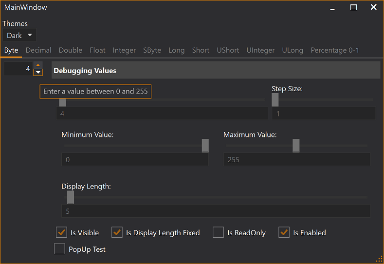
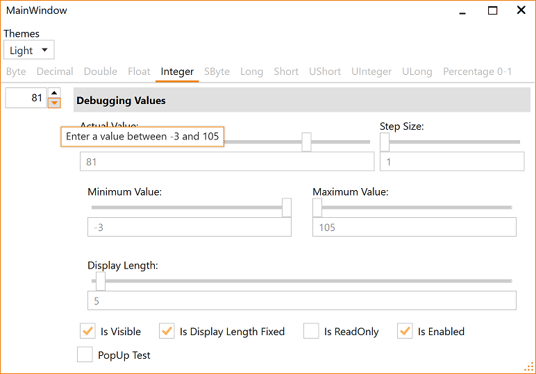
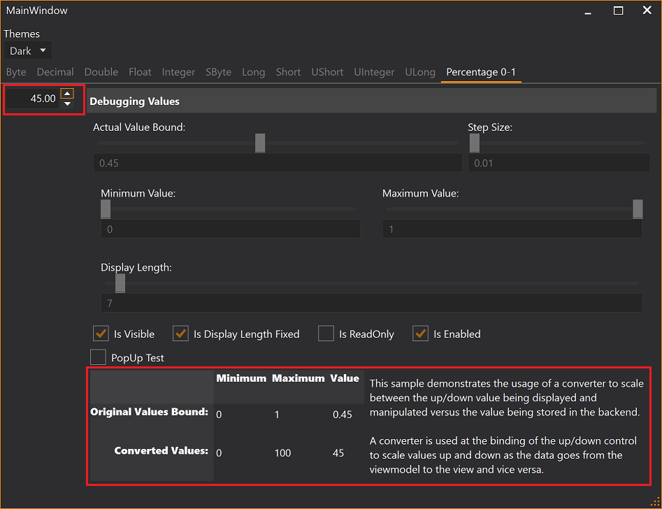
Theming
Load Light or Dark brush resources in you resource dictionary to take advantage of existing definitions.
    <ResourceDictionary.MergedDictionaries>
        <ResourceDictionary Source="/NumericUpDownLib;component/Themes/DarkBrushs.xaml" />
    </ResourceDictionary.MergedDictionaries>
    <ResourceDictionary.MergedDictionaries>
        <ResourceDictionary Source="/NumericUpDownLib;component/Themes/LightBrushs.xaml" />
    </ResourceDictionary.MergedDictionaries>
These definitions do not theme all controls used within this library. You should use a standard theming library, such as:
- MahApps.Metro,
- MLib, or
- MUI
to also theme standard elements, such as, button and textblock etc.
Visit the project's Wiki for mode details.
| Product | Versions Compatible and additional computed target framework versions. |
|---|---|
| .NET Framework | net40 is compatible. net403 was computed. net45 was computed. net451 was computed. net452 was computed. net46 was computed. net461 was computed. net462 was computed. net463 was computed. net47 was computed. net471 was computed. net472 was computed. net48 was computed. net481 was computed. |
This package has no dependencies.
NuGet packages (1)
Showing the top 1 NuGet packages that depend on Dirkster.NumericUpDownLib:
| Package | Downloads |
|---|---|
|
Dirkster.ColorPickerLib
Provides a .Net implementation of a WPF color picker control supporting HSV and RGB. |
GitHub repositories (3)
Showing the top 3 popular GitHub repositories that depend on Dirkster.NumericUpDownLib:
| Repository | Stars |
|---|---|
|
Dirkster99/AvalonDock
Our own development branch of the well known WPF document docking library
|
|
|
DaxStudio/DaxStudio
DAX Studio is a tool to write, execute, and analyze DAX queries in Power BI Desktop, Power Pivot for Excel, and Analysis Services Tabular.
|
|
|
Dirkster99/Edi
Edi - The open source text editor IDE based on AvalonDock and AvalonEdit
|
| Version | Downloads | Last Updated |
|---|---|---|
| 3.4.0 | 18,469 | 3/24/2023 |
| 3.3.1 | 2,363 | 12/20/2022 |
| 3.3.0 | 876 | 11/22/2022 |
| 3.2.0 | 1,002 | 10/20/2022 |
| 3.1.0 | 2,111 | 7/20/2022 |
| 3.0.0 | 3,986 | 11/6/2021 |
| 2.4.2.2 | 4,235 | 12/14/2020 |
| 2.4.2.1 | 3,516 | 9/2/2020 |
| 2.4.2 | 53,250 | 5/23/2020 |
| 2.4.1 | 718 | 5/3/2020 |
| 2.4.0 | 133,090 | 9/3/2019 |
| 2.3.1 | 1,430 | 7/28/2019 |
| 2.3.0 | 1,624 | 3/5/2019 |
| 2.2.2 | 904 | 2/21/2019 |
| 2.1.1 | 1,559 | 8/27/2018 |
| 2.1.0 | 1,759 | 8/26/2018 |
| 1.1.0 | 1,757 | 8/17/2018 |
| 1.0.3 | 1,204 | 6/28/2018 |
| 1.0.2 | 1,880 | 1/3/2018 |
| 1.0.1 | 1,651 | 8/15/2017 |
| 1.0.0 | 1,190 | 8/2/2017 |
Using a more symetrical up/down arrow default stlye (see issue #5).