Fili.MudAvalonia.Theme
1.2.1
dotnet add package Fili.MudAvalonia.Theme --version 1.2.1
NuGet\Install-Package Fili.MudAvalonia.Theme -Version 1.2.1
<PackageReference Include="Fili.MudAvalonia.Theme" Version="1.2.1" />
<PackageVersion Include="Fili.MudAvalonia.Theme" Version="1.2.1" />
<PackageReference Include="Fili.MudAvalonia.Theme" />
paket add Fili.MudAvalonia.Theme --version 1.2.1
#r "nuget: Fili.MudAvalonia.Theme, 1.2.1"
#:package Fili.MudAvalonia.Theme@1.2.1
#addin nuget:?package=Fili.MudAvalonia.Theme&version=1.2.1
#tool nuget:?package=Fili.MudAvalonia.Theme&version=1.2.1
Fili - MudAvalonia Theme




This theme is based on MudBlazor, a wonderful Material Design component library for Blazor (GitHub). MudAvalonia brings the two together: Avalonia's cross-platform controls, drawn with MudBlazor's design. All the credit for the look - the palette, the elevation, the typography, the metrics of every component - goes to the MudBlazor team; this package transcribes it from their source. It is an independent project, not affiliated with or endorsed by MudBlazor.
Fili - MudAvalonia Theme is that look for Avalonia 12, in light, dark and high contrast. Every
control arrives themed by type, and MudBlazor's variants are style classes with MudBlazor's names,
so <Button Classes="filled primary"> is <MudButton Variant="Variant.Filled" Color="Color.Primary">.
Read the docs, laid out as
mudblazor.com is: a page per component with live examples, their code, a link to the MudBlazor
page and a parity table. The site is the gallery app itself, built with the theme it documents and
compiled to WebAssembly; every page has its own address (#button, #tooltip).
It is a theme, not a component library: no new control types, no services, and one public type.
Quick start
dotnet add package Fili.MudAvalonia.Theme
Then two includes in App.axaml, base first and Fili second, because later styles win:
<Application.Styles>
  <StyleInclude Source="avares://Fili.Theme.MudAvalonia/Themes/Base/FiliBaseTheme.axaml" />
  <StyleInclude Source="avares://Fili.Theme.MudAvalonia/FiliTheme.axaml" />
</Application.Styles>
No FluentTheme, no SimpleTheme, no Avalonia.Themes.* package: the base is this package's own
fork of Avalonia's Simple templates (The base). Then use classes for variants
and tokens by key:
<Border Classes="paper elevation4" Padding="16">
  <StackPanel Spacing="4">
    <TextBlock Classes="h6" Text="Section" />
    <TextBlock Classes="caption" Text="Supporting line" />
    <TextBlock Classes="body2 error" Text="Could not reach the store" />
    <Button Classes="filled primary" Content="Retry" />
  </StackPanel>
</Border>

<Border Background="{DynamicResource FiliPrimaryBrush}" />
Always DynamicResource, never StaticResource, for a token. A misspelt key resolves to
nothing in Avalonia, silently, and a StaticResource freezes the light value, so that control
stops following the variant. Switch variants on the Application:
using Avalonia;
using Avalonia.Styling;          // ThemeVariant
using Fili.Theme.MudAvalonia;    // FiliThemeVariants

Application.Current!.RequestedThemeVariant = ThemeVariant.Dark;               // or Light
Application.Current!.RequestedThemeVariant = FiliThemeVariants.HighContrast;
In XAML, high contrast is an x:Static, never x:Key="HighContrast", which is not a variant:
<Application xmlns:theme="using:Fili.Theme.MudAvalonia"
             RequestedThemeVariant="{x:Static theme:FiliThemeVariants.HighContrast}">
Publish with ReadyToRun for a faster start: loading the theme the first time is mostly the JIT
compiling its XAML, about 300 ms on a desktop, and under 100 with
<PublishReadyToRun>true</PublishReadyToRun> in the app's project.
Where to read what
| If you want to | Read |
|---|---|
| write a MudBlazor screen in AXAML | From MudBlazor: the same UI written both ways |
| use one control | its page on the docs site: examples, code and behaviour |
| find the class or key for one parameter | the parity table on its component's page; MudBlazor parity lists every component |
| know what is not there | MudBlazor parity, "What is not here", and each page's Missing rows |
| theme it: colours, type, high contrast, right to left, reduced motion | the docs site's Customization pages, from Theming |
| upgrade | Versions: what changed, and what to change; Compatibility: what a version promises not to change |
| find out why a control is not themed or a key does nothing | Troubleshooting |
| work on the theme itself | Contributing, Traps, The base, Testing, Releasing |
| know what it does for accessibility, and what it leaves to the app | Accessibility, and the docs site's Accessibility page |
| report a bug or ask for a component | an issue with the Avalonia and package versions, the variant, and the smallest XAML that shows it |
| report a security problem | the security policy: privately, never in an issue |
Install
The NuGet package keeps its original id, Fili.MudAvalonia.Theme: a nuget.org id is
permanent, and this one already has downloads. Everything else - the assembly, the namespaces,
the avares:// paths and the repository - is Fili.Theme.MudAvalonia. dotnet add package
(Quick start) adds the newest release, the version on the NuGet badge; under
Central Package Management it writes the version into Directory.Packages.props.
Keep every Avalonia* package on one version, at least the one the theme depends on (below).
An app pinned to an older 12.1 patch fails restore with NU1605 (a package downgrade): raise
the app's Avalonia, Avalonia.Desktop, Avalonia.Browser and the rest together. The templates
are forked from that version, so a control type a later Avalonia 12 adds stays unthemed until a
theme release covers it (Compatibility).
| Package | Fili.MudAvalonia.Theme on nuget.org, with symbols (.snupkg) |
| Target framework | net10.0 |
| Depends on | Avalonia 12.1.5 or later, below 13, and nothing else. Avalonia.Controls.DataGrid is optional: built against 12.1.0, themed from 12.1.0 up to 13 when the app references it. Which versions are supported |
| Fonts | Roboto (Light, Regular, Medium) embedded, under the SIL Open Font License |
| Licence | MIT for this project's own code; the package as a whole, with the material it bundles, is MIT AND Apache-2.0 AND MS-PL AND OFL-1.1 (Licence and attribution) |
Classes are variants
Every control the theme templates is keyed to its type, so it arrives themed with no markup
change. A class only ever names a MudBlazor variant - Button.primary, TextBox.filled,
ProgressBar.large - as Color.Primary and Variant.Filled do there. Two classes are Material's
rather than MudBlazor's, and named so: material-fixed-tabs on a tab bar and
material-elevation-overlay on a container, the dark-theme elevation overlay.
An unclassed <Button> is the text button, because MudButton.Variant defaults to
Variant.Text; and a colour class is only a colour, so primary alone is a primary text
button. Most components default to Color.Default, which is grey, not primary.
A MudBlazor option that is one property of its control is that property, not a class.
Square on a paper is CornerRadius="0", a data grid's Bordered is
GridLinesVisibility="All", a toolbar's Gutters="false" is Padding="0". The whole list is in
MudBlazor parity, "Properties, not classes".
Grep your app before adopting
The class names are MudBlazor's vocabulary, and they collide on purpose: primary, small,
flat, outlined, error are not namespaced, because API familiarity is the point. The cost is
that an app that already uses those words gets its controls retemplated the moment it includes
the theme. One early adopter collided on primary in 20 places on its first day: nothing broke
visibly, but hover and press were driven by its own fill and the theme's state layer at once. The
fix is to let the theme own shape and interaction and keep the app's colour. Grep for
Classes=" against this list, which is a published interface
(Compatibility): ClassVocabularyTests fails when the theme's selectors
use a class this table does not list, or the table lists one they do not use.
All 184 classes:
Type ramp (TextBlock) |
h1–h6, subtitle1, subtitle2, body1, body2, button, caption, overline |
Surfaces (Border; a popover's through FlyoutPresenterClasses, or on a ContextMenu) |
paper, appbar, square, elevation0 to elevation25 (all 26 of MudBlazor's levels) |
Overlay (Border) |
overlay, dark-background, light-background |
Colour (Color) |
primary, secondary, tertiary, info, success, warning, error, dark, inherit; default on a toggle only, whose no-class colour is primary |
Shape (Variant) |
text, filled, outlined, rounded, flat |
Size (Size) |
small, medium, large, dense |
| Placement | inset, middle, vertical, light, underline, no-underline, border, centered, hide-indicator |
| Component | icon, button-group, chip, divider, fab, extended, list-item, alert, avatar, badge, card, skeleton, subheader, circle, rectangle, counter, circular, nav, toolbar, drawer-header, normal, newest-on-top, expansion-panels |
Card parts (a StackPanel, DockPanel, Grid, WrapPanel, Border, TextBlock, Button or Image) |
card-header, card-header-avatar, card-header-content, card-header-actions, card-media, card-content, card-actions |
Badge (Origin, Dot, Bordered, Overlap), and the table's Bordered |
top-left, top-center, center-left, center-center, center-right, bottom-left, bottom-center, bottom-right, dot, bordered, overlap |
| Behaviour | always-show-scroll-buttons, arrow, arrows-top, arrows-bottom, bullets-top, bullets-center, check-mark, clearable, dense-items, editable, helper-on-focus, hide-close, hide-icon, hover, loading, multi-expansion, multi-selection, no-animation, no-arrows, no-bullets, no-gutters, no-outline, no-paper, placeholder, required, shrink-label, value-label, striped, wave |
Label placement (LabelPlacement) |
label-start, label-top, label-bottom |
| Icons in content | start-icon, end-icon |
Material, not MudBlazor (the overlay on a window, a UserControl, a layout panel, Border, ScrollViewer or ContentControl) |
material-fixed-tabs, material-elevation-overlay |
Tab indicator colour (SliderColor) |
indicator-primary, indicator-secondary, indicator-tertiary, indicator-info, indicator-success, indicator-warning, indicator-error, indicator-dark |
Unchecked colour (UncheckedColor) |
unchecked-primary, unchecked-secondary, unchecked-tertiary, unchecked-info, unchecked-success, unchecked-warning, unchecked-error, unchecked-dark, unchecked-inherit |
Select arrow colour (AdornmentColor) |
adornment-primary, adornment-secondary, adornment-tertiary, adornment-info, adornment-success, adornment-warning, adornment-error, adornment-dark, adornment-inherit |
Switch thumb icon colour (ThumbIconColor) |
thumb-primary, thumb-secondary, thumb-tertiary, thumb-info, thumb-success, thumb-warning, thumb-error, thumb-dark |
Behaviour worth knowing
- Button labels are uppercase, as MudBlazor's
Typography.Button.TextTransformmakes them; tabs always, as.mud-tabhard-codes it.<x:String x:Key="FiliButtonTextTransform">none</x:String>in the application's resources changes all button labels; in a container's resources it changes labels in that subtree, and in one button's resources it changes only that button's label (Button, "Label case"). - A press ripples, from the pointer, on buttons, chips, toggles, tabs, rows and the halo of a
checkbox, radio or switch.
FiliRippleOpacityandFiliRippleOpacitySecondaryset to0turn it off in the application when set in its resources. Set either key in a container's resources to override matching ripple hosts in that subtree, or in one ripple host's resources to change only that control; filled buttons useFiliRippleOpacitySecondary. - Reduced motion is one key, which MudBlazor does not have:
FiliReducedMotionset toTruein the application's resources stops the ripple and every fade, slide, pulse and transition the theme draws, in every window and popup; only an indeterminate progress indicator keeps moving (Reduced motion). - Keyboard focus draws a ring, which MudBlazor does not: two adjacent 2px strokes in the text
and white colours round the control focused by Tab or the arrows, never one clicked or touched.
At least one contrasts with its surrounding surface, including a coloured app bar.
FiliFocusRingset toFalsein the application's resources keeps the tint alone, MudBlazor's look;FiliFocusRingBrush,FiliFocusRingInnerBrushandFiliFocusRingThicknesschange its colours and width, for an accent ring or a heavier one on a television (Keyboard focus). - A
DataGridis MudDataGrid with nothing to opt into. The package does not depend onAvalonia.Controls.DataGrid; when the app references it, the theme finds it and themes its controls by type (Data grid). - Unclassed text keeps the font's natural line height. The type ramp sets
LineHeighton its own classes and never on everyTextBlock, so an app's own headings are not clipped. - The package ships no icon set: only the glyphs its templates draw, each a key an app can set
in a control's
Resourcesto swap that control's icon, as MudBlazor's icon parameters do.
Accessibility
The theme draws what a template can: a keyboard focus ring (FiliFocusRing, on by default in
every variant), a high-contrast variant, one Tab stop per control, field labels, helper text and
validation errors exposed to screen readers (the error as the field's ItemStatus), localisable
names for its templates' icon buttons (FiliString*) and a reduced-motion key. It makes no claim
of WCAG conformance, and it leaves to the app:
- Following the system. It does not switch to high contrast or reduced motion when the operating system asks; the app reads the setting and sets the variant or the key.
- Names for the app's own icon-only buttons. A button with no text and no
AutomationProperties.Nameis announced by its type name. - Colour contrast of the default palettes. They are MudBlazor's, and some pairs fall below AA in light and dark: dark primary as text (3.0:1), error text (3.7:1), white on the warning, success and tertiary fills (about 2:1), field outlines (under 3:1). High contrast meets them.
The Accessibility page has the details and the contrast table.
Tokens
| Group | File | Notes |
|---|---|---|
| Palette | Themes/Palette.axaml |
Light, dark and high contrast. Every colour has a *Color and a *Brush key: bind the brush. |
| Elevation | Themes/Elevation.axaml |
Levels 0–25, MudBlazor's shadows, the same in light and dark; a 1px ring in high contrast. |
| Typography | Themes/Typography.axaml |
Roboto, embedded; base size 14px, not 16. |
| Controls | Themes/ControlThemes.axaml |
One file per control under Themes/Controls/, keyed by type. |
| Icons | Themes/Icons.axaml |
The Material glyphs the templates draw. Not an icon set. |
| Geometry | Themes/Geometry.axaml |
4px radius, 4px spacing scale, app bar and drawer sizes. |
| Strings | Themes/Strings.axaml |
The names a screen reader hears for the templates' icon buttons, in English: set one to translate it. |
Every key is listed in Published keys. The primary differs by variant:
#594AE2 in light, #6F62E6 in dark (MudBlazor's #776BE7 a shade darker, so its white text
reaches 4.5:1), #D3C4FF in high contrast.
Fonts, and the browser
Roboto is embedded in the three weights the theme uses, and covers Latin, Greek and Cyrillic. On
desktop a script it lacks falls back to the operating system's fonts. A browser build has no
system fonts, so Arabic, Hebrew or CJK text renders as nothing until the app embeds a face for it
and registers it with FontManagerOptions.FontFallbacks. Which scripts to ship is the app's
decision; the gallery's GalleryFonts is a worked example, with Noto Sans Arabic.
The gallery
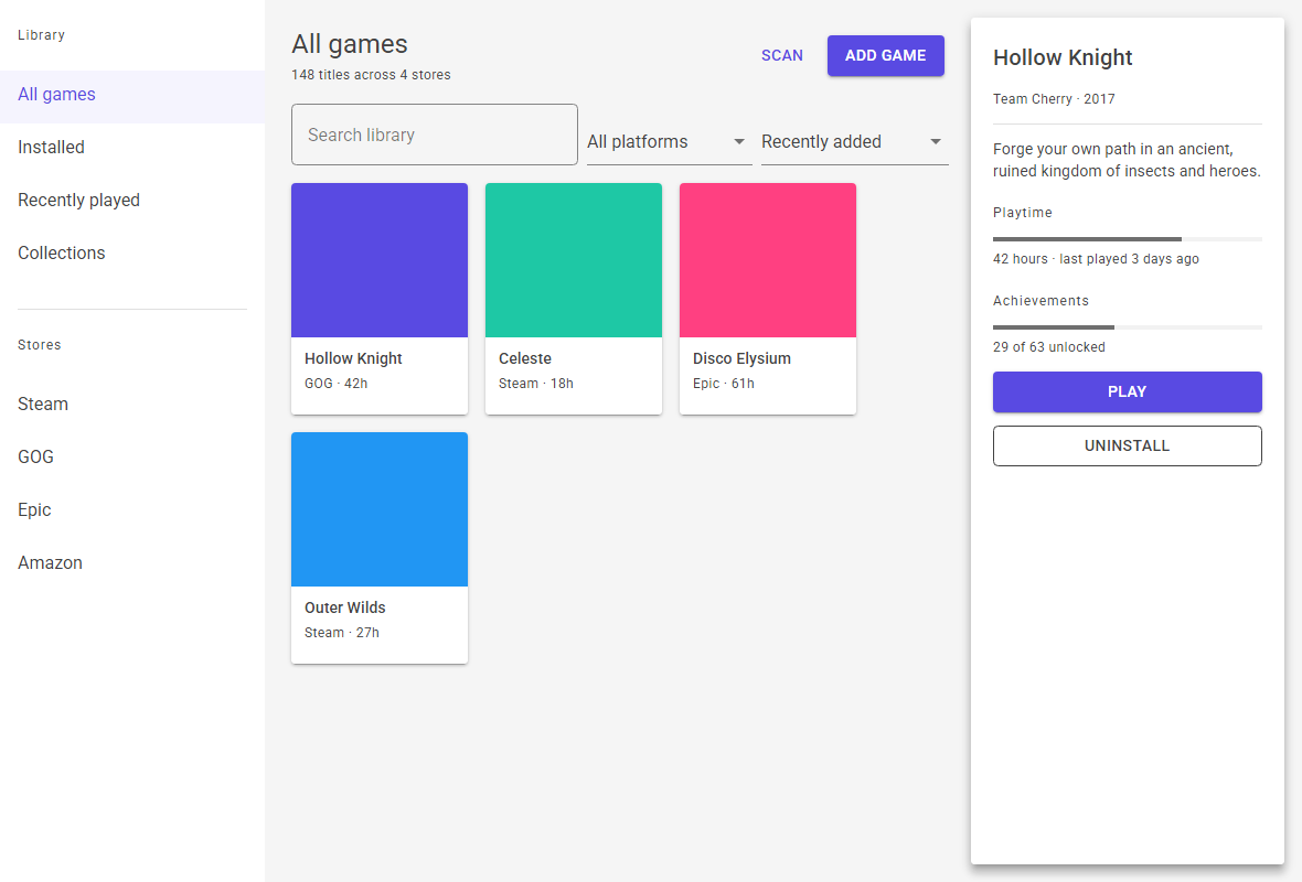
The gallery's sample screen, also in dark and high contrast; each is a pixel frame the test suite compares on every build. The docs site runs locally too, on desktop or in the browser:


dotnet run --project src/Fili.Theme.MudAvalonia.Gallery.Desktop
dotnet workload install wasm-tools     # once, for the browser head
dotnet run --project src/Fili.Theme.MudAvalonia.Gallery.Browser
Its app bar switches light, dark and high contrast, the primary colour and right to left at runtime, and its performance toggle shows Avalonia's frame and layout graphs with each page's visual count and build time.
Working on it
src/Fili.Theme.MudAvalonia                  the theme (the NuGet package, id Fili.MudAvalonia.Theme)
src/Fili.Theme.MudAvalonia.Gallery          gallery and docs site, shared across heads
src/Fili.Theme.MudAvalonia.Gallery.Desktop  desktop head
src/Fili.Theme.MudAvalonia.Gallery.Browser  browser head (WebAssembly), deployed to GitHub Pages
tst/Fili.Theme.MudAvalonia.UnitTests        headless tests of resources, templates and states
tst/Fili.Theme.MudAvalonia.PixelTests       gallery frames diffed against committed PNGs, and the docs site
tst/Fili.Theme.MudAvalonia.NoDataGridTests  the theme in an app without the DataGrid package
How to build, test and send a change is in Contributing.
Licence and attribution
This project is MIT licensed - see LICENSE. The licence covers its own code, XAML
and gallery; the third-party material in it keeps its own terms, which is why the package's
licence expression is MIT AND Apache-2.0 AND MS-PL AND OFL-1.1.
THIRD-PARTY-NOTICES.md, packed into the NuGet package, carries each
notice:
- The templates under
Themes/Base/are copied from Avalonia's Simple theme (MIT); eight of the date and time ones keep the Silverlight Toolkit's Microsoft Public License (Ms-PL) header. - The icon glyphs are Google's Material Icons (Apache-2.0), their path data transcribed from
MudBlazor's
Filled.cs. - The design values - palette, shadows, typography, layout and component metrics - are transcribed from MudBlazor (MIT). No MudBlazor component code is used: the controls are Avalonia's own.
This project is not affiliated with, endorsed by, or connected to MudBlazor. The name is descriptive: an Avalonia theme in MudBlazor's visual idiom.
Roboto is © 2011 The Roboto Project Authors, under the SIL Open Font License 1.1; the licence
travels with the fonts in src/Fili.Theme.MudAvalonia/Assets/Fonts/OFL.txt and is packed into the
NuGet package. OFL requires that the licence stays with the font files and that they are not sold
on their own - neither constrains this use, but the file must not be removed.
| Product | Versions Compatible and additional computed target framework versions. |
|---|---|
| .NET | net10.0 is compatible. net10.0-android was computed. net10.0-browser was computed. net10.0-ios was computed. net10.0-maccatalyst was computed. net10.0-macos was computed. net10.0-tvos was computed. net10.0-windows was computed. |
-
net10.0
- Avalonia (>= 12.1.5 && < 13.0.0)
NuGet packages
This package is not used by any NuGet packages.
GitHub repositories
This package is not used by any popular GitHub repositories.
| Version | Downloads | Last Updated |
|---|---|---|
| 1.2.1 | 95 | 11/6/2026 |
| 1.2.0 | 95 | 11/6/2026 |
| 1.1.0 | 90 | 11/6/2026 |
| 1.0.1 | 98 | 11/5/2026 |
| 1.0.0 | 95 | 11/5/2026 |
| 1.0.0-rc.2 | 63 | 11/4/2026 |
| 1.0.0-rc.1 | 64 | 11/4/2026 |
| 0.33.0 | 96 | 11/4/2026 |
| 0.32.0 | 92 | 11/3/2026 |
| 0.31.0 | 107 | 11/2/2026 |
| 0.30.0 | 102 | 11/2/2026 |
| 0.29.0 | 111 | 11/1/2026 |
| 0.28.0 | 109 | 11/1/2026 |
| 0.27.0 | 102 | 11/1/2026 |
| 0.26.0 | 105 | 10/30/2026 |
| 0.25.0 | 98 | 10/29/2026 |
| 0.24.0 | 98 | 10/28/2026 |
| 0.23.0 | 103 | 10/27/2026 |
| 0.22.0 | 95 | 10/27/2026 |
| 0.21.0 | 104 | 10/24/2026 |
A patch that closes the one gap 1.2.0 left in its text contrast. A selected list row or select option under the pointer turned grey and its coloured text fell to 2.9:1 in dark; it now keeps its colour, a little deeper, and its text reads at 4.5:1 in every variant.
What changed, and how to upgrade: https://github.com/FiliArrochada/Fili.Theme.MudAvalonia/blob/5f2dd5fedb73ae0e43f3850d4a8b3802f2cecbf0/docs/versions/1.2.1.md