Syncfusion.Shared.WPF
26.2.5
Prefix Reserved
dotnet add package Syncfusion.Shared.WPF --version 26.2.5
NuGet\Install-Package Syncfusion.Shared.WPF -Version 26.2.5
<PackageReference Include="Syncfusion.Shared.WPF" Version="26.2.5" />
paket add Syncfusion.Shared.WPF --version 26.2.5
#r "nuget: Syncfusion.Shared.WPF, 26.2.5"
// Install Syncfusion.Shared.WPF as a Cake Addin #addin nuget:?package=Syncfusion.Shared.WPF&version=26.2.5 // Install Syncfusion.Shared.WPF as a Cake Tool #tool nuget:?package=Syncfusion.Shared.WPF&version=26.2.5
Syncfusion WPF components
This package contains WPF Busy Indicator, WPF Button, WPF Split Button, WPF Calendar, WPF Carousel, WPF Chromeless Window, WPF Color Picker, WPF ComboBox, WPF Date-time edit, WPF Double TextBox, WPF Tile View, and WPF Up-down components for WPF application.
System Requirements
WPF Busy Indicator
The WPF Busy Indicator control enables users to know when the application is busy.

Features Overview | Docs | Online Demo | Support | Forums | Feedback
Getting Started
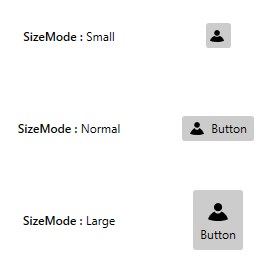
WPF Button
The WPF Button is an advanced component that offers features such as checkable support, multiline support, image size options, different button size modes, and icon templates. A split button and dropdown button are extended from the WPF Button with different characteristics to meet different application needs. The Button control is compatible with the MVVM design pattern.
Features Overview | Docs | Online Demo | Support | Forums | Feedback
Getting Started
WPF Split Button
The WPF Split Button is a combination of a button and a menu control. The button itself provides a default selection or when the arrow is clicked, displays a dropdown list for other possible selections.
Features Overview | Docs | Online Demo | Support | Forums | Feedback
Getting Started
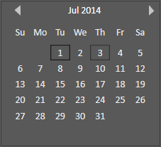
WPF Calendar
The WPF Calendar component (month calendar) can be utilized to navigate to any day of any year. The fully touch-enabled control allows you to navigate to the next or previous month of the calendar with an intuitive swipe. It provides multiselect date support, custom tooltips for dates, date selection ranges, the ability to display today’s date at the bottom, a week numbers display, and complete customization of date, day name, and special dates cells.
Features Overview | Docs | Online Demo | Support | Forums | Feedback
Getting Started
WPF Carousel
The WPF Carousel component provides navigation through a list of items with smooth animations. It allows arranging items in a user-defined path, including 3D, linear, and circular layouts. It also supports scaling and skewing the carousel items, and provides options to choose the rotation direction.

Features Overview | Docs | Online Demo | Support | Forums | Feedback
Getting Started
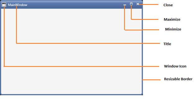
WPF Chromeless Window
The WPF Chromeless Window is used to create customizable windows that have a great UI. With these windows, you have control over the entire window, including the borders and headers. This feature includes resizing, dragging, and moving the window. It implements several other customizable features to present an appealing user interface to the end users.
Features Overview | Docs | Online Demo | Support | Forums | Feedback
Getting Started
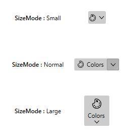
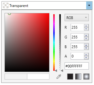
WPF Color Picker
The WPF Color Picker allows users to select a color visually in a WYSIWYG manner. Provides RGB and HSV modes of color selection. Also supports eye dropper to pick colors from any application.
Features Overview | Docs | Online Demo | Support | Forums | Feedback
Getting Started
WPF ComboBox
The WPF ComboBox component is a rich, multiselect combo box implementation that provides a flexible dropdown list with support for single and multiple selection. Delimiters are used to separate the selected items. The control’s rich feature set includes a select-all option, checkboxes in dropdown items, and the easy customization of its appearance using templates.

Features Overview | Docs | Online Demo | Support | Forums | Feedback
Getting Started
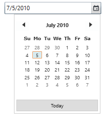
WPF Date-time edit
The WPF Date-time edit component provides a simple and intuitive interface for picking DateTime. In other words, users can quickly navigate and select dates using months, years, and decades of calendar. The DateTimePicker comprises text box and a dropdown with calendar and clock to pick or edit a date with time. It supports watermark, minimum and maximum dates, date format, nullable, date validation, and much more. In addition, it supports month and year selection by disabling date selection.
Features Overview | Docs | Online Demo | Support | Forums | Feedback
Getting Started
WPF Double TextBox
The WPF Double TextBox component restricts input to double values with support for data binding, watermark, null value and support for culture. It provides various customization options to improve its appearance and suit an applications.

Features Overview | Docs | Online Demo | Support | Forums | Feedback
Getting Started
WPF Tile View
The WPF Tile View component displays items as tiles that can be minimized and maximized. Let users reposition tiles with smooth animations by dragging and dropping them. The control supports virtualization, different views for minimized and maximized tile items, and options to maximize and close items interactively.

Features Overview | Docs | Online Demo | Support | Forums | Feedback
Getting Started
WPF Up-Down
The WPF Up-down compoennt provides a intuitive interface to increment and decrement value.It also allows to localizable,used skinnable editor controls and also allows the control to provide different culture based inputs.

Features Overview | Docs | Online Demo | Support | Forums | Feedback
Getting Started
License
This is a commercial product and requires a paid license for possession or use. Syncfusion’s licensed software, including this component, is subject to the terms and conditions of Syncfusion's EULA. You can purchase a license here or start a free 30-day trial here.
About Syncfusion
Founded in 2001 and headquartered in Research Triangle Park, N.C., Syncfusion has more than 27,000+ customers and more than 1 million users, including large financial institutions, Fortune 500 companies, and global IT consultancies.
Today, we provide 1700+ components and frameworks for web (Blazor, Flutter, ASP.NET Core, ASP.NET MVC, ASP.NET Web Forms, JavaScript, Angular, React, Vue, and jQuery), mobile (.NET MAUI, Flutter, Xamarin, UWP, and JavaScript), and desktop development (WinForms, WPF, WinUI, .NET MAUI, Flutter, Xamarin, and UWP). We provide ready-to-deploy enterprise software for dashboards, reports, data integration, and big data processing. Many customers have saved millions in licensing fees by deploying our software.
sales@syncfusion.com | www.syncfusion.com | Toll Free: 1-888-9 DOTNET
| Product | Versions Compatible and additional computed target framework versions. |
|---|---|
| .NET | net6.0-windows7.0 is compatible. net7.0-windows was computed. net8.0-windows was computed. |
| .NET Framework | net40 is compatible. net403 was computed. net45 was computed. net451 was computed. net452 was computed. net46 was computed. net461 was computed. net462 is compatible. net463 was computed. net47 was computed. net471 was computed. net472 was computed. net48 was computed. net481 was computed. |
-
- Syncfusion.Licensing (>= 26.2.5)
NuGet packages (47)
Showing the top 5 NuGet packages that depend on Syncfusion.Shared.WPF:
| Package | Downloads |
|---|---|
|
Syncfusion.Tools.WPF
This package provides the functionality to utilize the features of Syncfusion WPF AutoComplete, Card View, CheckedListBox, DockingManager, Document container, Navigation Pane, Hierarchy Navigator, Range Slider, Ribbon, Tab, Tab Navigation, Tab Splitter, Taskbar, Tree View, Wizard, Combobox, and Badge. |
|
|
Syncfusion.Grid.WPF
This package provides the functionality to utilize the features of Syncfusion WPF Cell Grid control and more. |
|
|
Syncfusion.SfGrid.WPF
This package provides the functionality to utilize the features of Syncfusion WPF DataGrid, TreeGrid, and MultiColoumn DropDown. |
|
|
Syncfusion.SfInput.WPF
This package provides the functionality to utilize the features of Syncfusion WPF Calculator, DatePicker, Domain Updown, GridSplitter, MaskedTextBox, Range Slider, Rating, TimePicker, NumericUpDown, and Radial Slider. |
|
|
Syncfusion.OlapShared.WPF
This package provides the functionality to utilize the features of Syncfusion WPF Olap Shared control and more. |
GitHub repositories (3)
Showing the top 3 popular GitHub repositories that depend on Syncfusion.Shared.WPF:
| Repository | Stars |
|---|---|
|
HenJigg/wpf-abp
Cross-platform mobile project and WPF client based on ABP framework Xamarin.Forms
|
|
|
syncfusion/wpf-demos
This repository contains the samples for Syncfusion WPF UI Controls and File Format libraries and the guide to use them.
|
|
|
syncfusion/winforms-demos
This repository contains the samples for Syncfusion Windows Forms UI Controls and File Format libraries and the guide to use them.
|
| Version | Downloads | Last updated |
|---|---|---|
| 26.2.5 | 123 | 7/25/2024 |
| 26.2.4 | 638 | 7/24/2024 |
| 26.1.42 | 1,754 | 7/15/2024 |
| 26.1.41 | 1,786 | 7/8/2024 |
| 26.1.40 | 2,591 | 7/1/2024 |
| 26.1.39 | 1,844 | 6/24/2024 |
| 26.1.38 | 2,135 | 6/18/2024 |
| 26.1.35 | 2,644 | 6/11/2024 |
| 25.2.7 | 2,705 | 6/3/2024 |
| 25.2.6 | 2,837 | 5/28/2024 |
| 25.2.5 | 6,782 | 5/21/2024 |
| 25.2.4 | 2,152 | 5/14/2024 |
| 25.2.3 | 1,832 | 5/8/2024 |
| 25.1.42 | 2,757 | 4/29/2024 |
| 25.1.41 | 2,533 | 4/23/2024 |
| 25.1.40 | 2,918 | 4/15/2024 |
| 25.1.39 | 3,885 | 4/8/2024 |
| 25.1.38 | 2,350 | 4/1/2024 |
| 25.1.37 | 2,111 | 3/26/2024 |
| 25.1.35 | 5,041 | 3/15/2024 |
| 24.2.9 | 8,837 | 3/4/2024 |
| 24.2.8 | 4,333 | 2/26/2024 |
| 24.2.7 | 5,578 | 2/19/2024 |
| 24.2.6 | 3,724 | 2/14/2024 |
| 24.2.5 | 3,909 | 2/12/2024 |
| 24.2.4 | 5,597 | 2/5/2024 |
| 24.2.3 | 4,903 | 1/31/2024 |
| 24.1.47 | 6,046 | 1/22/2024 |
| 24.1.46 | 5,221 | 1/16/2024 |
| 24.1.45 | 7,630 | 1/8/2024 |
| 24.1.44 | 5,758 | 1/2/2024 |
| 24.1.43 | 5,295 | 12/27/2023 |
| 24.1.41 | 7,742 | 12/18/2023 |
| 23.2.7 | 9,674 | 12/6/2023 |
| 23.2.6 | 8,200 | 11/28/2023 |
| 23.2.5 | 5,879 | 11/23/2023 |
| 23.2.4 | 9,413 | 11/20/2023 |
| 23.1.44 | 13,096 | 11/6/2023 |
| 23.1.43 | 7,596 | 10/30/2023 |
| 23.1.42 | 6,700 | 10/23/2023 |
| 23.1.41 | 7,086 | 10/16/2023 |
| 23.1.40 | 10,576 | 10/10/2023 |
| 23.1.39 | 8,671 | 10/4/2023 |
| 23.1.38 | 8,010 | 9/26/2023 |
| 23.1.36 | 17,316 | 9/15/2023 |
| 22.2.12 | 10,655 | 9/5/2023 |
| 22.2.11 | 8,882 | 8/28/2023 |
| 22.2.10 | 7,739 | 8/22/2023 |
| 22.2.9 | 8,556 | 8/14/2023 |
| 22.2.8 | 8,934 | 8/7/2023 |
| 22.2.7 | 8,661 | 8/2/2023 |
| 22.2.5 | 11,237 | 7/27/2023 |
| 22.1.39 | 10,617 | 7/18/2023 |
| 22.1.38 | 8,755 | 7/11/2023 |
| 22.1.37 | 18,172 | 7/3/2023 |
| 22.1.36 | 10,120 | 6/28/2023 |
| 22.1.34 | 14,428 | 6/21/2023 |
| 21.2.10 | 12,252 | 6/12/2023 |
| 21.2.9 | 11,143 | 6/6/2023 |
| 21.2.8 | 11,079 | 5/30/2023 |
| 21.2.6 | 10,455 | 5/22/2023 |
| 21.2.5 | 9,953 | 5/15/2023 |
| 21.2.4 | 10,292 | 5/9/2023 |
| 21.2.3 | 12,507 | 5/3/2023 |
| 21.1.41 | 16,388 | 4/19/2023 |
| 21.1.39 | 11,848 | 4/10/2023 |
| 21.1.38 | 12,177 | 4/3/2023 |
| 21.1.37 | 15,977 | 3/29/2023 |
| 21.1.35 | 14,160 | 3/23/2023 |
| 20.4.0.54 | 17,879 | 3/13/2023 |
| 20.4.0.53 | 13,738 | 3/7/2023 |
| 20.4.0.52 | 17,431 | 2/28/2023 |
| 20.4.0.51 | 13,279 | 2/21/2023 |
| 20.4.0.50 | 14,692 | 2/14/2023 |
| 20.4.0.49 | 18,706 | 2/7/2023 |
| 20.4.0.48 | 15,724 | 2/1/2023 |
| 20.4.0.44 | 16,451 | 1/18/2023 |
| 20.4.0.43 | 19,866 | 1/10/2023 |
| 20.4.0.42 | 15,718 | 1/4/2023 |
| 20.4.0.41 | 15,871 | 12/29/2022 |
| 20.4.0.40 | 13,771 | 12/28/2022 |
| 20.4.0.38 | 16,317 | 12/21/2022 |
| 20.3.0.61 | 20,221 | 12/12/2022 |
| 20.3.0.60 | 18,339 | 12/6/2022 |
| 20.3.0.59 | 16,383 | 11/29/2022 |
| 20.3.0.58 | 20,438 | 11/21/2022 |
| 20.3.0.57 | 17,969 | 11/15/2022 |
| 20.3.0.56 | 23,982 | 11/8/2022 |
| 20.3.0.52 | 20,109 | 10/27/2022 |
| 20.3.0.50 | 23,716 | 10/17/2022 |
| 20.3.0.49 | 24,886 | 10/11/2022 |
| 20.3.0.48 | 20,053 | 10/5/2022 |
| 20.3.0.47 | 22,404 | 9/29/2022 |
| 20.2.0.50 | 23,979 | 9/20/2022 |
| 20.2.0.49 | 21,630 | 9/13/2022 |
| 20.2.0.48 | 21,125 | 9/6/2022 |
| 20.2.0.46 | 22,684 | 8/30/2022 |
| 20.2.0.45 | 26,224 | 8/23/2022 |
| 20.2.0.44 | 20,698 | 8/16/2022 |
| 20.2.0.43 | 22,796 | 8/8/2022 |
| 20.2.0.40 | 23,577 | 7/26/2022 |
| 20.2.0.39 | 23,736 | 7/19/2022 |
| 20.2.0.38 | 23,982 | 7/12/2022 |
| 20.2.0.36 | 61,333 | 6/30/2022 |
| 20.1.0.61 | 26,805 | 6/20/2022 |
| 20.1.0.60 | 22,070 | 6/14/2022 |
| 20.1.0.59 | 21,835 | 6/6/2022 |
| 20.1.0.58 | 27,825 | 5/30/2022 |
| 20.1.0.57 | 21,470 | 5/23/2022 |
| 20.1.0.56 | 23,458 | 5/17/2022 |
| 20.1.0.55 | 34,728 | 5/12/2022 |
| 20.1.0.52 | 27,997 | 5/2/2022 |
| 20.1.0.51 | 21,852 | 4/26/2022 |
| 20.1.0.50 | 21,907 | 4/19/2022 |
| 20.1.0.48 | 25,322 | 4/12/2022 |
| 20.1.0.47 | 30,135 | 4/4/2022 |
| 19.4.0.56 | 44,797 | 3/14/2022 |
| 19.4.0.55 | 23,257 | 3/8/2022 |
| 19.4.0.54 | 24,259 | 2/28/2022 |
| 19.4.0.53 | 23,387 | 2/21/2022 |
| 19.4.0.52 | 31,996 | 2/15/2022 |
| 19.4.0.50 | 22,149 | 2/8/2022 |
| 19.4.0.48 | 31,329 | 1/31/2022 |
| 19.4.0.47 | 21,801 | 1/24/2022 |
| 19.4.0.43 | 24,165 | 1/18/2022 |
| 19.4.0.42 | 29,110 | 1/10/2022 |
| 19.4.0.41 | 16,356 | 1/4/2022 |
| 19.4.0.40 | 15,186 | 12/28/2021 |
| 19.4.0.38 | 23,017 | 12/17/2021 |
| 19.3.0.59 | 15,516 | 12/14/2021 |
| 19.3.0.57 | 16,467 | 12/7/2021 |
| 19.3.0.56 | 16,406 | 11/29/2021 |
| 19.3.0.55 | 17,764 | 11/23/2021 |
| 19.3.0.54 | 16,448 | 11/17/2021 |
| 19.3.0.53 | 17,214 | 11/12/2021 |
| 19.3.0.48 | 20,431 | 11/3/2021 |
| 19.3.0.47 | 17,388 | 10/26/2021 |
| 19.3.0.46 | 21,027 | 10/19/2021 |
| 19.3.0.45 | 18,149 | 10/12/2021 |
| 19.3.0.44 | 19,157 | 10/5/2021 |
| 19.3.0.43 | 20,898 | 9/30/2021 |
| 19.2.0.62 | 21,830 | 9/13/2021 |
| 19.2.0.60 | 17,686 | 9/7/2021 |
| 19.2.0.59 | 22,381 | 8/30/2021 |
| 19.2.0.57 | 20,353 | 8/24/2021 |
| 19.2.0.56 | 18,035 | 8/17/2021 |
| 19.2.0.55 | 18,785 | 8/11/2021 |
| 19.2.0.51 | 18,363 | 8/2/2021 |
| 19.2.0.49 | 20,393 | 7/26/2021 |
| 19.2.0.48 | 18,333 | 7/19/2021 |
| 19.2.0.47 | 18,063 | 7/13/2021 |
| 19.2.0.46 | 19,680 | 7/6/2021 |
| 19.2.0.44 | 49,130 | 6/30/2021 |
| 19.1.0.69 | 24,046 | 6/14/2021 |
| 19.1.0.67 | 18,097 | 6/7/2021 |
| 19.1.0.66 | 21,779 | 5/31/2021 |
| 19.1.0.65 | 17,827 | 5/24/2021 |
| 19.1.0.64 | 18,342 | 5/19/2021 |
| 19.1.0.63 | 21,328 | 5/13/2021 |
| 19.1.0.59 | 26,627 | 5/3/2021 |
| 19.1.0.58 | 17,660 | 4/26/2021 |
| 19.1.0.57 | 17,564 | 4/20/2021 |
| 19.1.0.56 | 20,110 | 4/12/2021 |
| 19.1.0.55 | 17,924 | 4/6/2021 |
| 19.1.0.54 | 19,266 | 3/30/2021 |
| 18.4.0.49 | 16,458 | 3/22/2021 |
| 18.4.0.48 | 15,514 | 3/16/2021 |
| 18.4.0.47 | 16,312 | 3/9/2021 |
| 18.4.0.46 | 16,271 | 3/2/2021 |
| 18.4.0.44 | 15,185 | 2/23/2021 |
| 18.4.0.43 | 16,714 | 2/15/2021 |
| 18.4.0.42 | 16,064 | 2/9/2021 |
| 18.4.0.41 | 15,032 | 2/2/2021 |
| 18.4.0.39 | 15,344 | 1/28/2021 |
| 18.4.0.35 | 15,579 | 1/19/2021 |
| 18.4.0.34 | 14,491 | 1/12/2021 |
| 18.4.0.33 | 14,715 | 1/4/2021 |
| 18.4.0.32 | 17,970 | 12/30/2020 |
| 18.4.0.31 | 14,759 | 12/22/2020 |
| 18.4.0.30 | 21,096 | 12/17/2020 |
| 18.3.0.53 | 22,819 | 12/8/2020 |
| 18.3.0.52 | 17,233 | 11/30/2020 |
| 18.3.0.51 | 15,991 | 11/23/2020 |
| 18.3.0.50 | 41,819 | 11/17/2020 |
| 18.3.0.48 | 16,385 | 11/10/2020 |
| 18.3.0.47 | 17,719 | 11/5/2020 |
| 18.3.0.44 | 32,028 | 10/27/2020 |
| 18.3.0.42 | 17,115 | 10/20/2020 |
| 18.3.0.40 | 16,764 | 10/12/2020 |
| 18.3.0.38 | 16,454 | 10/7/2020 |
| 18.3.0.35 | 41,728 | 10/1/2020 |
| 18.2.0.59 | 21,402 | 9/22/2020 |
| 18.2.0.58 | 20,760 | 9/15/2020 |
| 18.2.0.57 | 16,115 | 9/8/2020 |
| 18.2.0.56 | 16,165 | 9/1/2020 |
| 18.2.0.55 | 16,131 | 8/24/2020 |
| 18.2.0.54 | 15,773 | 8/18/2020 |
| 18.2.0.48 | 19,043 | 8/4/2020 |
| 18.2.0.47 | 16,538 | 7/28/2020 |
| 18.2.0.46 | 17,080 | 7/21/2020 |
| 18.2.0.45 | 30,798 | 7/14/2020 |
| 18.2.0.44 | 66,157 | 7/6/2020 |
| 18.1.0.59 | 102,425 | 6/23/2020 |
| 18.1.0.57 | 16,893 | 6/15/2020 |
| 18.1.0.56 | 15,868 | 6/9/2020 |
| 18.1.0.55 | 19,136 | 6/2/2020 |
| 18.1.0.54 | 44,776 | 5/26/2020 |
| 18.1.0.53 | 16,191 | 5/19/2020 |
| 18.1.0.52 | 36,563 | 5/13/2020 |
| 18.1.0.48 | 15,812 | 5/5/2020 |
| 18.1.0.46 | 15,939 | 4/28/2020 |
| 18.1.0.45 | 16,601 | 4/20/2020 |
| 18.1.0.44 | 15,639 | 4/14/2020 |
| 18.1.0.43 | 15,505 | 4/7/2020 |
| 18.1.0.42 | 21,354 | 4/1/2020 |
| 18.1.0.36-beta | 10,315 | 3/19/2020 |
| 17.4.0.55 | 22,804 | 3/10/2020 |
| 17.4.0.53 | 15,703 | 3/3/2020 |
| 17.4.0.51 | 16,994 | 2/25/2020 |
| 17.4.0.50 | 16,166 | 2/18/2020 |
| 17.4.0.49 | 15,715 | 2/11/2020 |
| 17.4.0.47 | 15,571 | 2/5/2020 |
| 17.4.0.46 | 16,581 | 1/30/2020 |
| 17.4.0.44 | 15,968 | 1/21/2020 |
| 17.4.0.43 | 15,382 | 1/14/2020 |
| 17.4.0.41 | 15,465 | 1/7/2020 |
| 17.4.0.40 | 16,193 | 12/24/2019 |
| 17.4.0.39 | 21,351 | 12/17/2019 |
| 17.3.0.34 | 16,153 | 12/10/2019 |
| 17.3.0.33 | 14,571 | 12/4/2019 |
| 17.3.0.30 | 17,136 | 12/3/2019 |
| 17.3.0.29 | 15,472 | 11/26/2019 |
| 17.3.0.28 | 14,657 | 11/18/2019 |
| 17.3.0.27 | 14,921 | 11/12/2019 |
| 17.3.0.26 | 17,376 | 11/5/2019 |
| 17.3.0.21 | 15,393 | 10/29/2019 |
| 17.3.0.19 | 15,052 | 10/22/2019 |
| 17.3.0.17 | 16,286 | 10/15/2019 |
| 17.3.0.14 | 19,470 | 10/3/2019 |
| 17.3.0.9-beta | 9,952 | 9/20/2019 |
| 17.2.0.51 | 24,048 | 9/10/2019 |
| 17.2.0.49 | 14,967 | 9/3/2019 |
| 17.2.0.47 | 15,061 | 8/27/2019 |
| 17.2.0.46 | 15,244 | 8/22/2019 |
| 17.2.0.41 | 15,121 | 8/13/2019 |
| 17.2.0.40 | 14,741 | 8/6/2019 |
| 17.2.0.39 | 14,758 | 7/30/2019 |
| 17.2.0.36 | 14,855 | 7/23/2019 |
| 17.2.0.35 | 14,578 | 7/17/2019 |
| 17.2.0.34 | 33,851 | 7/11/2019 |
| 17.2.0.28-beta | 9,618 | 6/27/2019 |
| 17.1.0.53 | 16,569 | 6/25/2019 |
| 17.1.0.52 | 14,336 | 6/18/2019 |
| 17.1.0.51 | 14,453 | 6/11/2019 |
| 17.1.0.50 | 18,443 | 6/4/2019 |
| 17.1.0.49 | 14,904 | 5/28/2019 |
| 17.1.0.48 | 15,448 | 5/21/2019 |
| 17.1.0.47 | 15,744 | 5/14/2019 |
| 17.1.0.44 | 13,692 | 5/7/2019 |
| 17.1.0.43 | 14,309 | 4/30/2019 |
| 17.1.0.42 | 14,288 | 4/23/2019 |
| 17.1.0.41 | 13,810 | 4/16/2019 |
| 17.1.0.40 | 13,385 | 4/9/2019 |
| 17.1.0.38 | 18,195 | 3/29/2019 |
| 17.1.0.32-beta | 9,145 | 3/13/2019 |
| 16.4.0.54 | 17,184 | 2/19/2019 |
| 16.4.0.53 | 14,134 | 2/13/2019 |
| 16.4.0.52 | 18,139 | 2/5/2019 |
| 16.4.0.48 | 15,580 | 1/22/2019 |
| 16.4.0.47 | 13,557 | 1/16/2019 |
| 16.4.0.46 | 13,717 | 1/8/2019 |
| 16.4.0.44 | 13,490 | 12/24/2018 |
| 16.4.0.42 | 19,421 | 12/17/2018 |
| 16.4.0.40-beta | 8,887 | 12/10/2018 |
| 16.3.0.36 | 14,275 | 11/27/2018 |
| 16.3.0.35-beta | 8,845 | 11/23/2018 |
| 16.3.0.29 | 17,873 | 10/30/2018 |
| 16.3.0.21 | 18,324 | 9/21/2018 |
| 16.3.0.17-beta | 7,755 | 9/12/2018 |
| 16.2.0.50 | 14,420 | 8/28/2018 |
| 16.2.0.46 | 18,046 | 8/10/2018 |